
Your website is not broken.
It is just doing the wrong job.
Most contractor sites look fine. Some look great. Clean layouts. Nice photos. Modern fonts. Then the phone does nothing. That disconnect is the problem.
Owners tell us the same things over and over.
“We get traffic, but no leads.”
“People visit and disappear.”
“We paid for a redesign and nothing changed.”
Here is the hard truth. A home service website is not there to impress. It is there to remove hesitation. When a homeowner lands on your site, they are not judging your creativity. They are asking one question. Can I trust you enough to call?
Traffic alone does not answer that. Design alone does not answer that. In fact, both can make things worse when they distract instead of clarify.

Home service websites that convert are built around decisions, not aesthetics. They guide stressed homeowners toward one clear next step and make that step feel safe.
This guide breaks down why most contractor websites fail at that job and what actually causes people to call, book, or submit a form in 2026.
How Homeowners Actually Buy Home Services Online
Homeowners do not “shop” for home services the way they shop for shoes.
They triage.
Something is broken. Something is leaking. Something feels urgent or expensive or risky. And the clock is already ticking in their head before they ever land on your site.
That mindset matters more than any design trend.
There are two buying modes at play, and most contractor websites fail because they treat them the same.
Emergency mode looks like this:
- Phone in hand
- One problem, right now
- Zero patience
When the heat is out or water is pouring onto the floor, homeowners are not exploring options. They are scanning for signals. Are you nearby. Are you available. Do you look legitimate. Can I trust you enough to call without regretting it.
This is why mobile-first is not a buzzword in 2026. It is reality. Emergency decisions happen on phones. Fast. Messy. One thumb. If your site hides the phone number, buries availability, or forces scrolling before clarity, you are out.

Planned services look calmer, but they are not low-stress.
Roof replacements. System upgrades. Big installs. These trigger research behavior, but not curiosity. Fear.
Fear of overpaying.
Fear of choosing the wrong contractor.
Fear of being sold to.
This is where decision paralysis kicks in. Too many options feel unsafe. Too much creativity feels like distraction. Homeowners slow down not because they are interested, but because they are unsure.
Across both modes, the question is the same.
Can I trust you enough to take the next step?
That is why clarity beats creativity every time. Clear service explanations reduce risk. Clear next steps reduce hesitation. Clear proof reduces fear.
Clever layouts do the opposite. They ask homeowners to think when they already feel stressed.
The data backs this behavior up. On mobile, Google’s paid search averages conversion rates above 11% across industries. Nearly 88% of those clicks are incremental to organic results. Translation. When intent is high and friction is low, people act. They do not browse. They decide.
The Parts That Make a Website Earn the Call
Most contractor websites do not fail because they are missing features.
They fail because the essentials are unclear, hidden, or fighting each other.
A converting site is not clever. It is decisive.
Think of this section as a contractor website audit checklist. If any of these break down, leads leak. If they line up, calls follow.
A Value Proposition That Ends the Guessing
Your value proposition answers one question immediately.
Why should I call you instead of the other five companies on my screen?
Not your years in business. Not your mission statement. Not your certifications.
💡 Homeowners want to know:
- What you do?
- Who you help?
- Why you are safe to choose?
If they have to scroll to figure that out, you already lost them.
Strong value propositions are specific and plain. “Same-day AC repair you can trust” beats a paragraph about excellence every time.
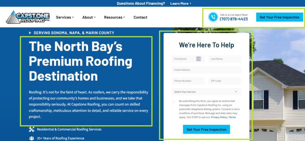
Above-the-Fold Messaging That Carries the Weight
Above the fold is where decisions start.
This area needs to do three jobs fast:
- Confirm the service
- Confirm the location
- Confirm the next step
No sliders. No rotating messages. No guessing.
When homeowners land, they should instantly know they are in the right place and what to do next.
Obvious Next Steps That Remove Hesitation
Calls and forms should not be hidden. They should be obvious and easy.
One important detail many sites miss. When actions are clearer, people act more. Data shows that making CTAs more descriptive can lift click-through rates. Even small wording changes matter. “Request Service Today” outperforms vague buttons like “Submit.”
The same logic applies across the site. Exposing tools instead of hiding them works. For example, showing a search bar instead of hiding it behind an icon increases engagement significantly. Less friction equals more movement.
Minimal Distractions, Fewer Choices
Every extra option competes with the main action.
Multiple CTAs. Competing buttons. Endless navigation. All of it creates hesitation.
Converting sites do the opposite.
- One primary action
- One clear path
- Repetition without pressure
Fewer choices feel safer. Safer choices convert.

Trust Reinforcement That Never Stops
Trust is not built once. It is reinforced constantly.
This includes:
- Reviews placed near decision points
- Real photos instead of stock
- Service area clarity
- Simple guarantees or expectations
Trust signals should appear where doubt shows up, not buried on a separate page.
When these elements work together, you get what actually matters. Home services website components that drive leads, not just attention.
If your site looks good but skips these fundamentals, it will always struggle. When these are locked in, design becomes a bonus instead of a crutch.
The Structure That Turns Clicks Into Calls
Design gets the credit. Structure does the work.
Most contractor websites fail here because they look at pages as artboards instead of decision paths. Homeowners are not exploring your site. They are moving through it, fast, with one goal in mind. Figure out if you are the right choice without making a mistake.
This is where structure beats aesthetics every time.
The Homepage Is a Decision Filter, Not a Welcome Mat
Your homepage has one real job. Confirm three things immediately.
- You offer the service they need
- You serve their area
- There is a clear next step
Anything that delays those answers creates friction.
High-performing homepages follow a predictable pattern because it works. Clear headline that names the service and location. One primary call to action above the fold. Supporting proof directly underneath. Reviews. Guarantees. Service area confirmation.

Rotating sliders, abstract headlines, or clever taglines feel modern, but they slow decisions. Many contractor website design trends 2026 focus on visual polish. Conversion-focused sites focus on clarity and repetition.
If a homeowner has to scroll just to confirm you do what they searched for, the page has already failed.
Service Pages That Answer “Should I Call You?”
A service page is not an essay. It is a reassurance engine.
Strong service pages follow a tight structure.
- Clear service definition at the top
- Who this service is for and when it is needed
- What happens when they call
- Proof you have done this before
- A repeated, obvious call to action
For example, an AC repair page that explains common symptoms, outlines response times, shows recent reviews, and repeats the phone number will outperform a beautifully designed page that talks about craftsmanship but never addresses urgency.
The best service pages do not try to educate deeply. They remove doubt quickly.
Contact Pages That Do Not Sabotage the Conversion
This is where many leads die quietly.
Common mistakes show up everywhere. Long forms that ask for too much. Multiple CTAs competing for attention. No reassurance about what happens next.
A converting contact page is boring on purpose.
- One primary form
- One phone number
- Clear expectation of response time
- Minimal navigation
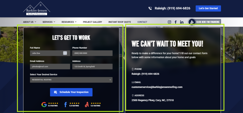
If someone makes it to your contact page, they are already leaning yes. The structure should not give them a reason to hesitate.
CTA Placement and Repetition That Feels Natural
Calls to action should not be rare or dramatic. They should be obvious and familiar.
High-converting sites place CTAs:
- Above the fold
- After key trust sections
- At natural stopping points
Repetition does not feel pushy when it is consistent. It feels helpful. Homeowners should never have to scroll back up to figure out how to contact you.
Why Fewer Choices Convert Better
Every extra option is a delay.
Multiple CTAs, expanded menus, and competing offers create decision paralysis. This is especially damaging for stressed homeowners who want a safe, simple choice.
The most effective contractor websites reduce options intentionally.
- One primary action
- One clear path
- Secondary actions kept subtle
When the structure supports the decision, design becomes a bonus instead of a distraction.
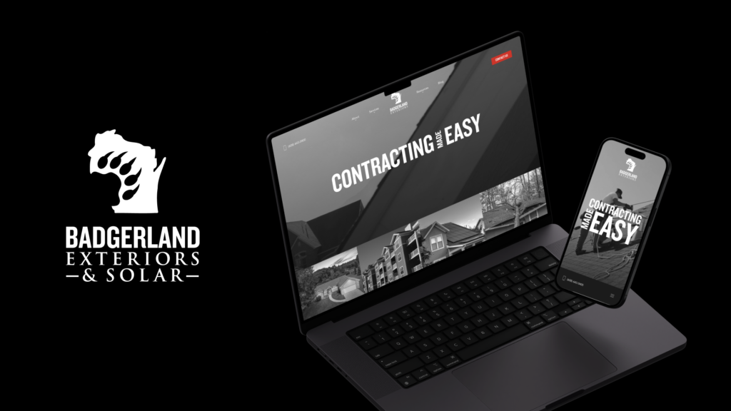
Here’s what that looks like when it’s applied to a real contractor site.
A roofing company we worked with, Badgerland Exteriors, is a clear example of how structure turns traffic into qualified leads.
Before working with Hook, their website and campaigns looked fine, but intent was diluted. Roofing and solar services were blended together, messaging was unfocused, and landing pages weren’t aligned with how homeowners actually decide. The result was wasted spend and inconsistent lead quality.
We rebuilt the system around clarity. Services were separated, landing pages were designed to match homeowner intent, and conversion paths were simplified for mobile-first behavior.
The outcome:
- $143 average cost per conversion
- $291 per qualified roofing lead
- 121 marketing-qualified leads on a $3,500 monthly budget
Nothing flashy. Just disciplined structure doing the work.
View the full Badgerland Exteriors case study →
Mobile Experience and Site Speed Are Where Revenue Leaks
Most contractor websites do not fail because of bad messaging.
They fail because homeowners never wait long enough to see it.
By 2026, mobile is the default way people find and choose home service businesses. Nearly 64% of global web traffic now comes from mobile devices, up from just 50% in 2016. That shift alone explains why so many owners say their website not converting leads even when traffic looks healthy.
Mobile Is Not a Smaller Desktop
Homeowners do not browse your site from a couch with time to kill.
They are usually standing in a hot house, a wet basement, or a dark room. One hand on the phone. One problem in their head. Very little patience.
That context changes everything.
Pages are skimmed, not read. Buttons need to be obvious. Forms need to be short. Anything that requires zooming, hunting, or re-reading feels like work. When a site is designed desktop-first and simply “shrunk” for mobile, homeowners feel that friction immediately and they leave without thinking twice.
Here’s a clear example of what mobile-first thinking actually looks like in practice.
First, look at the desktop experience.
On a desktop, the layout can breathe. Messaging has room. Visual hierarchy guides the eye without rushing the decision.

Now compare that to how the same site is handled on mobile.

This is not a resize. It’s a re-prioritization.
Page Speed Is a Trust Signal
Speed is not about comfort anymore. It is about credibility.
Google’s data shows that 53% of mobile users abandon sites that take longer than three seconds to load. Each extra second cuts conversions by roughly 32%. That drop happens before the homeowner ever reads your headline.
Slow sites feel unreliable. Google sees the exits and quietly reduces trust signals tied to your domain.
Code Bloat Is the Silent Killer
Most contractor sites are weighed down by things no one asked for.
Heavy themes. Animations. Sliders. Multiple page builders stacked together. Tracking scripts layered on top of each other. All of it adds friction on mobile.
The result is a site that looks polished but performs poorly when it matters most.
Template Overload Creates Mobile Friction
Templates are not the problem. Overusing them is.
Most templates are built to serve every industry. Home service sites need very little. Clear service information. One primary action. Strong trust cues.
When templates are not stripped down, mobile users pay the price in load time and usability.
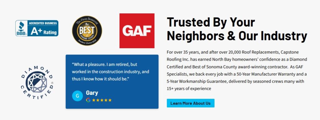
Trust Signals That Actually Make a Homeowner Say “Okay, Call Them”
Homeowners are not looking for reassurance in theory.
They are looking for proof that choosing you will not turn into a regret story.
That is why most “trust signals” fail. They exist, but they do not answer the fears running through a buyer’s head in 2026.
Here is what actually moves the needle.
Reviews That Answer the Question Behind the Question
Homeowners are not counting stars. They are scanning for relevance.
They look for reviews that sound like their situation.
- “AC stopped working at night”
- “Water heater leaking on a Sunday”
- “Roof damage after a storm”
A five-star review that says “great service” is invisible. A four-star review that explains what broke, how fast you showed up, and whether the problem stayed fixed builds trust.
Where those reviews appear matters too. Reviews buried on a testimonials page get ignored. Reviews placed next to a call button or booking form reduce hesitation at the exact moment it shows up.

Photos That Prove You Exist in the Real World
Stock photos fail because homeowners recognize them instantly.
What actually builds trust are photos that answer unspoken questions.
- Is this a real team
- Do they actually show up in neighborhoods like mine
- Are these trucks on the road or just on the website
Jobsite photos, team photos, and vehicles with branding outperform polished imagery every time. This is where too many sites prioritize beautiful website color schemes over believability. Design should support trust, not replace it.
Licenses, Badges, and Guarantees That Reduce Risk
Badges only work when they mean something to the homeowner.
A long row of unfamiliar logos does nothing. What works is clarity.
- Licensed and insured in this state
- Background-checked technicians
- Clear workmanship guarantees
Homeowners want to know what protects them if something goes wrong. If that is not obvious, badges become decoration.
Local Proof That Confirms You Belong Here
Local trust is specific, not implied.
Homeowners look for signs that you actually operate in their area.
- Clear service area listings
- Mentions of nearby neighborhoods
- Team members shown as real people, not placeholders
This is where leadership for home service businesses plays an outsized role. A visible owner, even briefly, signals accountability. Someone stands behind the work.
Video Trust Signals That Shorten the Decision
Short videos work because they humanize.
A quick owner introduction. A technician explaining what happens next. A simple walkthrough of the service process. These do not need to be polished. They need to feel real.
This also ties naturally into social media for home service businesses. The same videos that build trust on social platforms reinforce credibility when embedded on the website.
The strongest trust signals all share one trait.
They make the business feel familiar before the first call.
When trust is clear, conversion feels safe.
Content That Gets the Call Instead of Just the Click
Most contractor websites are full of content.
Very little of it helps someone decide to call.
That gap shows up clearly in performance.
Across home services, average website conversion rates sit around 7.8%. But the range tells the real story. Plumbing sites with clear service explanations routinely hit 12–16%, while vague roofing sites often struggle between 3–7%. Same traffic. Different outcomes.
The difference is not SEO.
It is content that removes hesitation.
Service explanations do the heavy lifting. When a homeowner lands on a page, they are looking for fast confirmation:
- Is this my problem
- Can you fix it
- What happens if I call
Pages that answer those questions convert. Pages that drift into general advice do not.
Blogs still matter, but only when they support a decision. A post explaining when a leak is an emergency can push someone toward action. A post written to fill a calendar creates movement without results.
FAQs are where many calls are won or lost.
Not the generic ones. The uncomfortable ones:
- How fast can someone actually get here
- Do you charge extra after hours
- What if the repair does not hold
When these are answered clearly, homeowners keep moving forward instead of backing out to “think about it.”
Pricing content works the same way. It is not about listing exact numbers. It is about setting expectations. Even rough ranges or clear explanations reduce anxiety. Silence creates suspicion. Overconfidence creates regret.
Visual proof reinforces everything.
- Before-and-after photos
- Simple step-by-step process explanations
- What to expect once the truck arrives
These calm nerves more than polished copy ever will. Homeowners fear surprises more than price.
One thing consistently kills conversion. Keyword stuffing.
Content written for algorithms feels artificial. Repetitive phrasing. Awkward language. Over-explaining. We flag this constantly during a plumbing website audit because even high-ranking pages fail when they do not sound human.

SEO and Conversion Only Work When They Stop Competing
For years, contractors have been told they have to choose.
Rankings or leads. SEO or conversion.
That debate is outdated. And expensive.
In 2026, SEO that does not convert is wasted spend. Conversion without visibility is stalled growth. The sites that win treat both as the same system doing two jobs.
Rankings Without Conversion Are a Leak, Not a Win
Getting traffic feels productive. It is also meaningless if nothing happens next.
A page can rank well and still fail because it answers Google better than it answers the homeowner. We see this constantly. Pages optimized to hit keywords but vague on services, unclear on next steps, and light on trust signals.
Local SEO signals already live on your site. Service clarity. Location reinforcement. Reviews. Engagement. When those signals are baked into the page structure, rankings improve and conversion follows.
Schema plays a quiet role here. You do not need to overthink it. Basic local business and service schema help search engines understand what you offer and where. That clarity supports visibility, but it also reinforces trust when your listings and pages match exactly.
SEO should get the right people to the page.
Conversion should make the decision feel obvious.
When those two are disconnected, traffic turns into noise.
Structure Is the Common Ground Between SEO and UX
Site structure is where SEO and conversion finally agree.
Clear hierarchies help Google crawl and understand your site. They also help homeowners move without thinking. Service pages that live where they are expected. Locations that are easy to find. CTAs placed where hesitation usually shows up.
This is why structure beats clever layouts every time. Fewer distractions. Fewer choices. Repeated calls to action that feel helpful, not aggressive.
When pages are structured around real behavior, both Google and users respond. Rankings stabilize. Bounce rates drop. Calls increase.

Standard vs. Custom Websites: Choosing the Right Fit
This decision is not about better or worse. It is about timing and traction.
Both standard and custom websites can support strong Local SEO when they are built correctly. The difference is how quickly you need to launch, how complex your market is, and how much the website needs to carry the business.
Standard websites are designed for speed and clarity. They get the fundamentals right quickly and reliably.
They are often the right fit when:
- You need to launch or relaunch fast
- You are in an early or mid-growth phase
- The website supports other lead sources like referrals or ads
- Your services and service areas are straightforward
- You want a proven structure that converts without overbuilding
A standard site removes friction and creates a clean foundation. It prioritizes mobile usability, clear service paths, and fast load times without the overhead of custom architecture.
Custom websites are built for scale and differentiation.
They become a core growth asset, not just a digital presence.
They make sense when:
- The website is a primary driver of inbound leads
- You operate in multiple markets or highly competitive areas
- Your service mix, locations, or brand story require flexibility
- You need deeper customization for content structure, UX, or integrations
- The site must support long-term expansion without rework
Custom sites allow more control over structure, messaging, and user flow as complexity increases. They are not about aesthetics. They are about removing constraints as the business grows.
| Reality | Template Site | Custom Site |
| Visual differentiation | Familiar, proven layouts | Designed to stand out in-market |
| Mobile behavior focus | Optimized for common use cases | Optimized around specific user behavior |
| Conversion paths | Clear, standardized flows | Purpose-built for services, markets, and scale |
| Structural flexibility | Efficient, repeatable | Highly adaptable as complexity grows |
| Long-term performance | Strong early results | Compounds as traffic and markets expand |
This is why Hook Agency designs both standard and custom websites, depending on where a business is in its growth.
Home services are urgent, trust-driven, and local. Every website we build is structured around those realities. Standard sites focus on speed, clarity, and proven conversion paths. Custom sites add flexibility and depth for companies operating at larger scale or in more competitive markets.
The outcome is never a cosmetic upgrade. It’s clearer decisions for homeowners, stronger mobile performance, and a website that supports your business today, without limiting where it needs to go next.

The Website Mistakes That Cost Contractors Real Leads
Most website problems are not technical.
They are predictable.
We see the same mistakes across HVAC, plumbing, roofing, and electrical sites, especially when businesses grow past the basics. These errors do not crash your site. They quietly drain conversions.
Leading With Features Instead of Benefits
Homeowners do not care about your tools, systems, or process. They care about outcomes.
“State-of-the-art equipment” means nothing if you do not explain how it helps them. Faster service. Cleaner work. Fewer callbacks. When sites lead with features, homeowners have to translate value themselves. Most will not.
Benefits remove that work. They answer why calling you is safer.
Too Many CTAs Fighting Each Other
Call now. Book online. Request a quote. Chat with us. Download a guide.
All at once.
Multiple CTAs create hesitation, especially for stressed homeowners. Converting sites choose one primary action and repeat it consistently. Secondary actions stay secondary.
When everything is important, nothing feels safe to choose.
Navigation That Makes People Think
Navigation should feel invisible.
Confusing menus, deep dropdowns, or clever labels force homeowners to think when they are already under pressure. If they cannot immediately find their service or confirm you serve their area, they back out.
Clear, predictable navigation reduces cognitive load and keeps momentum moving forward.
No Clear Service Area Signals
This mistake is more costly than it looks.
Homeowners want confirmation you actually serve their location. If cities, neighborhoods, or response areas are unclear, doubt creeps in. Many leave rather than risk calling the wrong company.
Clear service-area signals build confidence fast.
Ignoring Mobile UX Entirely
Designing desktop-first is still one of the fastest ways to lose leads.
Buttons too small to tap. Forms that feel endless. Phone numbers that are not clickable. These are silent conversion killers on mobile, where most decisions happen.
If the site feels awkward on a phone, trust drops immediately.
Designing for Ego, Not the Buyer
This is the hardest mistake to see from inside the business.
Beautiful animations, clever headlines, and trendy layouts feel good internally. But they often slow decisions externally. Homeowners want clarity, not creativity.
The most effective home service websites feel simple on purpose.
Your Website Is the System Everything Runs Through
Most marketing does not fail because of bad ads or weak SEO.
It fails because the website cannot finish the job.
In 2026, your website is not a brochure. It is the conversion engine behind every channel. Ads may drive the click, SEO may earn the visibility, and social may build familiarity, but the site is where the decision actually happens. If it is unclear, slow, or unconvincing, every channel costs more and converts less.
Here is how it all connects.
- Ads bring urgency. The website turns that urgency into a call or booking.
- SEO builds trust. The website reinforces it with proof and clarity.
- Social builds familiarity. The website confirms it with real photos, reviews, and process.
- Sales teams rely on it. Homeowners check the site before they commit, even after a phone conversation.

Your Website Is Already Working. The Question Is How.
Every homeowner who lands on your site makes a decision in seconds.
Call you. Skip you. Or move on.
Right now, your website is either helping that decision or quietly hurting it.
In 2026, the gap between websites that look good and websites that actually produce is wide. The difference is not more traffic or better design. It is clarity, structure, and trust.
That is what Hook Agency builds.
If you want to know whether your site is supporting growth or leaking leads, book a website strategy call with Hook Agecy. We will show you what is working, what is not, and what would actually make your website pull its weight.