
Someone lands on your contact page because they are close to hiring.
They are not browsing anymore. They are checking one last thing before they call, submit a form, or move on to the next contractor.
That is why this page matters more than most businesses treat it.
A lot of home service websites put serious effort into service pages, SEO, and ads, then leave the contact page doing the bare minimum. A generic form. A phone number in small text. No urgency. No reassurance. No reason to act now.
That is where leads stall.
The strongest contact page elements that convert are not flashy. They remove hesitation. They make the next step feel obvious, quick, and safe, especially for homeowners who already know what they need and just want a company that feels easy to trust.
What Every High-Converting Contact Page Needs First
Before design starts trying to impress anyone, the page has to answer one basic question: does this feel easy enough to act on right now?
That is where many contact pages fail. A homeowner is ready to reach out, then hits a page that asks too much, explains too little, or makes the next step feel strangely uncertain. The highest performing home service websites that convert usually fix that by stripping the page down to what matters most.
One Clear Action Beats Five Equal Choices
A contact page should not feel like a menu. If the page asks visitors to call, request financing, chat live, subscribe, and browse services all at once, hesitation goes up fast. Too many equal options make people pause, and pause is dangerous when another contractor is one back click away.

Pick one dominant action and make it obvious:
- Call now
- Request an estimate
- Schedule service
Even the button language matters. Personalized CTAs convert far better than generic ones, with some studies showing tailored wording can lift conversions by 200% compared to generic buttons. For a contractor, “Get My Roof Estimate” usually works harder than “Submit.”
Keep the Form Short Enough to Finish
This is where good leads quietly disappear. 81% of people abandon a form after they start filling it out, which means every extra field needs to justify its existence.
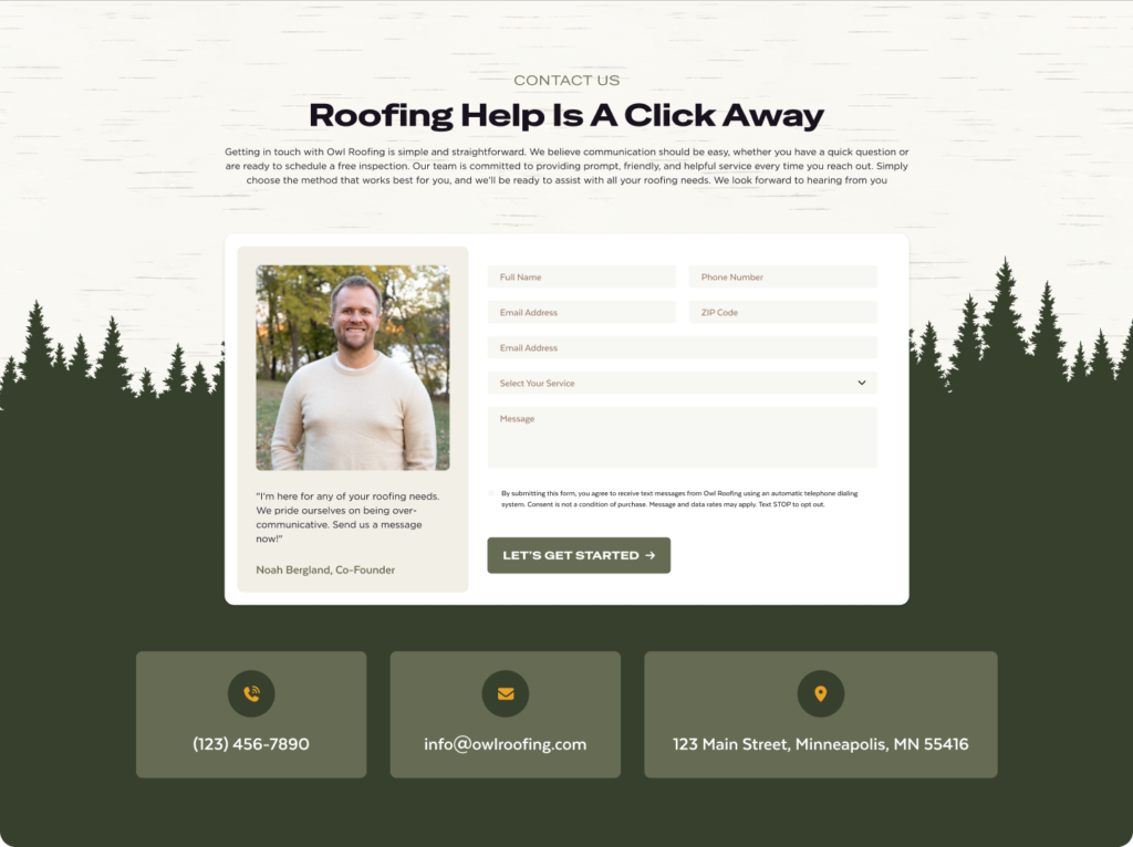
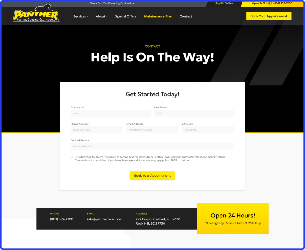
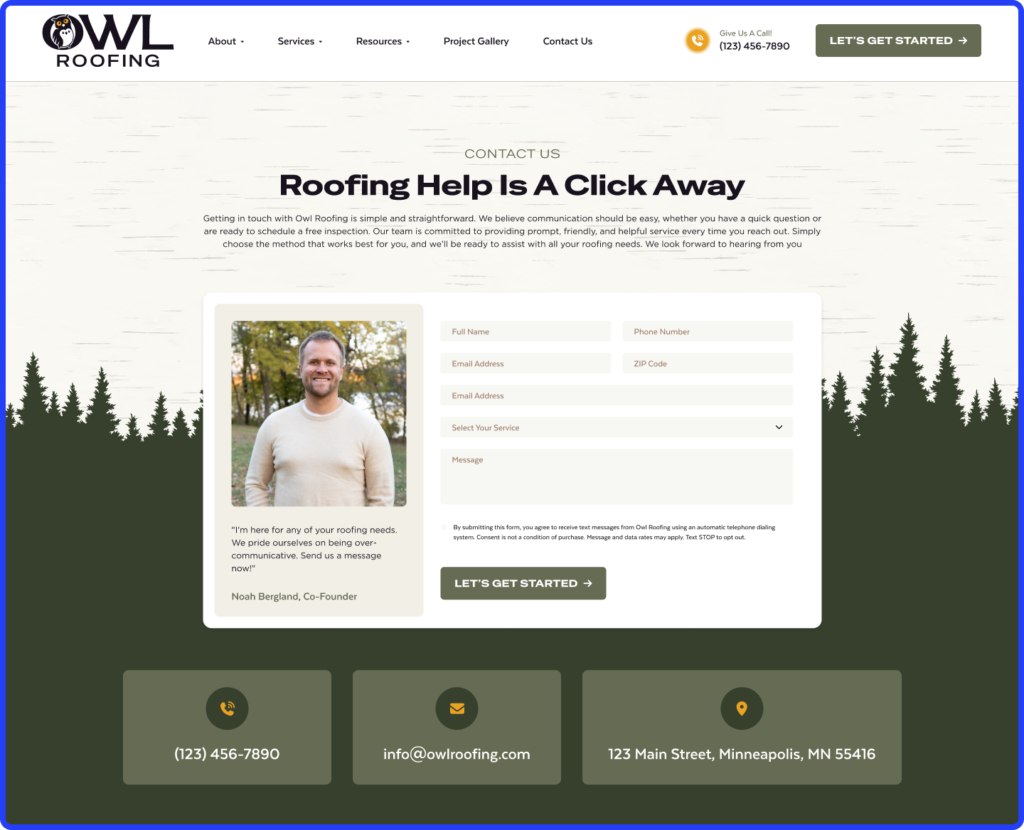
A strong contact form usually stops at:
- Name
- Phone
- Service needed
- Zip code
That is enough to qualify the lead without making the form feel like paperwork. Ask for square footage, full address, budget range, or preferred appointment window too early, and submissions start dropping. Every extra field costs you.
Make the Phone Number Feel Like the Fastest Option
A ready-to-hire homeowner should not have to search for your number.
It needs to appear where the eye naturally lands, near the main CTA, and again near the form. On mobile, it should be clickable immediately because many contact pages still lose calls through basic mobile UX mistakes like tiny tap targets or buried headers.
If someone has urgent plumbing or HVAC trouble, calling should feel easier than typing.
Put Trust Next to the Decision Point
The moment before form submission is where doubt shows up. That is why trust signals belong beside the form, not buried elsewhere on the site.
A few things that consistently help:
- Recent reviews from nearby customers
- Licensing badges
- A response promise like “We reply within 15 minutes”
- A clear reminder of service areas covered
A homeowner in Plano responds differently when they see proof that you already work in Plano.
Local Proof Changes the Way the Page Feels
The best contact pages feel local before the form is even submitted. Mention nearby cities. Reference recent jobs. Use local credibility naturally.
A roofing company serving Dallas and Frisco should not sound like it serves “all of Texas” if most booked jobs come from two nearby markets. The more specific the local signal, the less friction the page creates.
Contact Page Elements That Quietly Kill Conversions
A contact page can look clean and still lose leads all day. Most of the time, the problem is not obvious. It is a few small choices that make reaching out feel slower, less clear, or slightly harder than calling the next contractor.
Too Many Fields Make the Form Feel Like Work
If someone needs a roofer after storm damage, they do not want to answer eight questions before saying hello.
The longer the form gets, the more it feels like a commitment before trust is built. Asking for project details, full address, preferred dates, and budget too early usually pushes people out.
Too Many Actions on One Page Split Attention
A contact page should answer one question: what should I do next? But many contractor sites stack everything together, call buttons, chat widgets, financing banners, careers links, even newsletter boxes.
That is where momentum drops. Strong conversion data keeps showing the same pattern: one clear action usually wins. In broader CTA testing across 71 client datasets, full-page pop-up content download offers reached 13.6% conversion because the ask was simple and obvious.
Generic Copy Makes the Page Feel Forgettable
“Fill out the form below” sounds like every other site. A line like Need a quote today? Tell us what is happening sounds like someone is actually waiting to help. That difference matters more than most standard vs custom websites account for.

The Last Second Trust Gap Still Costs Leads
A contact page without reviews, licensing, or a clear response promise leaves too much unanswered right before submission. And if the website loads slowly, especially on mobile, many visitors never wait long enough to decide at all.
Why Simpler Pages Usually Convert Better
The highest converting contact pages often look almost unfinished, and that is usually a good sign. By the time someone reaches this page, they are not looking for more persuasion. They have already seen enough to consider contacting you. What they need now is a clear path without extra friction.
That is why simpler pages keep winning. The less thinking required, the faster people act.
A contact page starts slipping the moment it asks visitors to make unnecessary decisions. If someone sees a form, a financing banner, a careers link, a chatbot, and three buttons fighting for attention, the page stops feeling immediate.
The strongest pages usually strip that down to one obvious next move:
- Call now if the issue feels urgent
- Request an estimate if they are comparing options
- Submit the form if they want a quick response
How to Optimize for Mobile and Local Intent
Most contact page decisions now happen on a phone, usually fast, often while the homeowner is distracted, stressed, or comparing two companies at once.
That changes what matters. A contact page that feels perfectly fine on desktop can still lose calls on mobile if the action takes one extra second, one extra tap, or one moment of doubt about whether you actually serve that area.
A few details make a bigger difference than most contractor sites expect:
- Make calling feel easier than filling out the form.
If someone has urgent HVAC trouble or a plumbing leak, they should not need to scroll to find your number. A sticky phone button and tap-to-call placement near the top usually outperform buried contact details because urgency favors speed.
- Keep the form short enough for one thumb.
On mobile, long forms feel longer. A few fields, larger tap targets, and buttons that sit naturally within thumb reach usually hold more submissions than compact desktop style layouts squeezed onto a phone.
- Remind people where you actually work.
A short line near the CTA like Serving Plano, Frisco, and North Dallas often removes hesitation because homeowners instantly know whether they are in range.
- Use a map only if it adds trust.
If you have a real office customers recognize, a map helps. If it is only there to fill space, it usually adds clutter without helping conversion.
The Last Click Should Not Be the Hardest One
A contact page does not need to do a lot, but it does need to get one thing exactly right: make reaching you feel immediate.
By the time someone lands there, they are already evaluating whether your company feels easy to deal with, responsive enough to trust, and local enough to call first. Small friction at that point, even one extra field or one unclear next step, can quietly send them back to search results.
If your website is getting traffic but your contact page is not producing enough calls or form submissions, Hook Agency can help you tighten the experience and build a site that turns more ready homeowners into real leads.