
Here’s the uncomfortable reality. Most home service websites don’t have a traffic problem. They have a mobile problem.
Before you blame SEO, ads, or competition, open your site on your phone. Try to call yourself. Try to fill out your own form. Try to find your service area in under five seconds. If it feels even slightly annoying, you’re losing leads.
The biggest mobile UX mistakes home service websites make are not design trends or aesthetic issues. They are friction points. Small, avoidable problems that cost real jobs. Tiny call buttons. Slow load times. Overloaded pages. Forms that feel like paperwork.
And here’s the part most contractors miss. Mobile UX issues usually cost more leads than SEO issues. You can rank well. You can pay for clicks. But if your mobile experience is clunky, traffic does not turn into revenue.
Let’s look at the specific mistakes that are quietly killing conversions and what to fix first.
Mistake #1: Hard-to-Tap CTAs and Phone Numbers
Your “Call Now” button exists. It just isn’t easy to use.
On a lot of contractor sites, we see tiny phone numbers buried in the header, buttons that shrink on mobile, no sticky call bar, or numbers that are not actually click-to-call. It looks fine on desktop. On a phone, it’s frustrating.
If someone has to zoom in or reposition their thumb just to contact you, your website is not converting leads the way it should.
Why It Costs You Jobs
Now look at the GenZ Ryan homepage below.
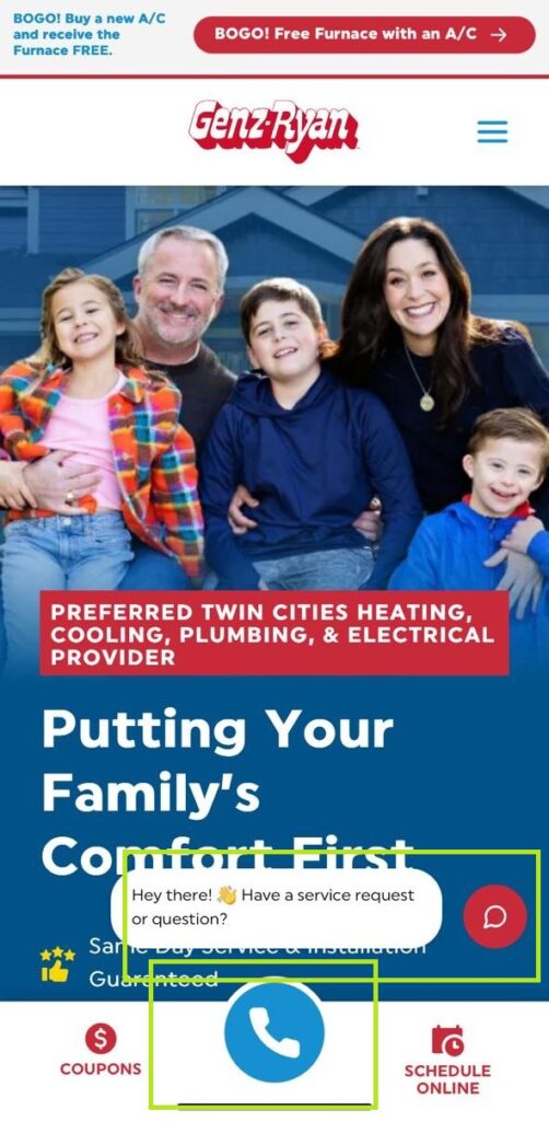
This is a good example of how to reduce friction instead of creating it.
Notice what’s happening on that first screen. There is a large, thumb-friendly call button fixed near the bottom. It’s visually distinct. It’s easy to reach. You don’t have to hunt for the phone number or zoom in to tap it.
That’s intentional. Mobile users are in action mode. They want to tap and call immediately. On a well-designed mobile experience like this, there is no guessing. The primary action is obvious.
Even with a promotional banner and a chatbot present, the call action still stands out because it is large, clear, and positioned where a thumb naturally rests.
We’ve seen conversion rates jump just by tightening this up.
- Add a sticky mobile call bar that stays visible.
- Increase button size so it’s clearly thumb-friendly.
- Make your phone number bold and obvious above the fold.
No redesign. Just fewer obstacles.
Mistake #2: Slow Load Times on Mobile Networks
“Does it matter if my website loads slow? It works fine for me.”
It works fine for you because you’re on office WiFi. Your customers aren’t.
They’re on 5G that drops to LTE. In driveways. In basements. On older phones. And in 2025, mobile traffic accounts for more than 60% of total web visits. That means most of your potential leads are experiencing your site under imperfect conditions.
Google’s own developer documentation confirms that sites failing core speed thresholds see traffic drops of 15 to 32%. Even more blunt, 53% of users abandon pages that take longer than 3 seconds to load on mobile.
Three seconds. If your site takes four or five, you are losing people before they even see your offer.
What’s usually causing it?
- Massive hero images
- Uncompressed image files
- Bloated page builders
- Excessive scripts running in the background
- Too many plugins stacked together

Mistake #3: Overloaded Pages and Hidden Key Info
This one is everywhere. Contractor homepages that try to say everything at once.
We see sites that list 10 to 12 services above the fold. Multiple banners. Paragraphs of copy. Sliders. Promotions. Financing. Careers. Blogs. All fighting for attention on a screen that fits in your hand.
Mobile is not desktop. You do not have room to “explain your whole company.” You have one narrow screen and a few seconds of attention. If visitors have to scroll just to figure out what you do or where you work, you are already losing clarity.
Here’s what overload usually looks like:
- Too many services competing above the fold
- Phone numbers buried or visually weak
- Trust badges pushed below the first scroll
- Reviews hidden instead of highlighted
- No clear hierarchy guiding the next step
It doesn’t look broken. It just feels noisy. And noise kills momentum.
The best home service websites that convert are ruthless about clarity. They do not try to impress. They try to guide.
What Must Be Visible Immediately
When someone lands on your mobile homepage, they should instantly see:
- A clear headline that says exactly what you do
- The service area you cover
- A strong, obvious CTA
- Trust badges or guarantees
- Reviews or proof of credibility
Mistake #4: Forms That Are Painful on Mobile
This is where a lot of leads quietly die. Someone decides to contact you. They tap the form. And instead of momentum, they get friction.
We’ve seen contractor sites ask for full address, detailed project descriptions, multiple dropdowns, referral sources, checkboxes, and long message fields before the user has even committed to the idea of working with you.
On mobile, that feels like paperwork. Every extra field slows them down. Every required paragraph increases abandonment. If the phone field does not auto-format, if autofill is not enabled, if the tap targets are tight and easy to miss, frustration builds fast.
This is one of the biggest differences between standard vs custom websites. Template sites often come with bloated, generic forms designed to “capture everything.” Custom conversion-focused sites are designed to capture just enough to start the conversation.
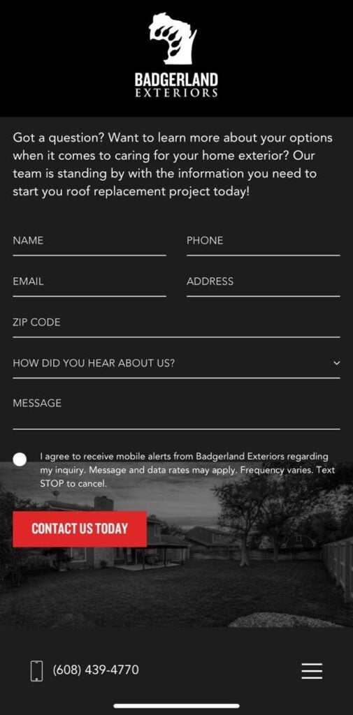
Look at the Badgerland Exteriors example below. When we designed that form, the goal was clarity and completion rate, not data volume.
What makes it work:
- Clean spacing between fields so thumbs do not mis tap
- Clear labels that do not require guessing
- A strong, obvious CTA button
- A focused set of essential fields instead of an interrogation
The Bigger Takeaway: Mobile UX > Minor SEO Tweak
Here’s the hard truth. Most contractors think they have a traffic problem. In reality, they often have a conversion problem.
- Moving from position 5 to position 3 will not fix a 4 second mobile load time.
- Ranking for one more keyword will not help if your call button is buried.
- More clicks will not matter if 50 percent of users abandon your form halfway through.
We’ve reviewed sites that were ranking well and still underperforming. The pattern is consistent. When mobile UX is weak, traffic turns into bounce. When mobile UX is tight, the same traffic produces more booked jobs. This is why minor SEO tweaks rarely move revenue as fast as fixing friction.
Before You Buy More Traffic, Fix the Leaks
If your mobile experience is clunky, more traffic is not the solution. It’s just more wasted opportunity.
Most home service business owners assume they need better rankings. Sometimes that’s true. But more often, the real issue is friction. Slow pages. Hard-to-tap buttons. Overloaded screens. Forms that feel like paperwork.
You don’t need a prettier site. You need a tighter one.
The good news is this: small mobile UX improvements can produce fast revenue gains. No algorithm updates. No waiting six months for SEO momentum. Just fewer obstacles between urgency and action.
If you want an honest look at whether your site is quietly leaking leads, book a call with Hook Agency. We’ll review your mobile UX, identify the conversion gaps, and show you where you’re losing jobs.
Traffic is expensive.
Let’s make sure your site actually converts it.