For the first year in some time, I wholeheartedly agree with a lot of the trending colors for 2024!
That’s right – color contrarian himself, Tim Brown – often hates the trending colors, and this time he loves (many of) them.
In a nutshell – here’s what’s trending for 2024:
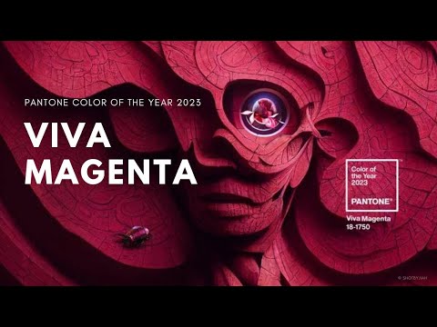
- Pantone – has a bright magenta for their color of the year
- Paint companies – have several rich, deep greens and neutral colors (ooo la la!)
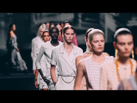
- High fashion – is elevating Black + white and tans (and some navy’s and greens.)

High fashion brands always take some crazy shots on color as well
Besides a ton of black clothes on the runway in the run-up to 2024 – we saw many wild shots and bright and crazy colors.
But all-in-all the most common and enduring threads were refreshingly simple:
- Black dominated – meaning my favorite color to wear is now in again.
- White, Tan, Taupe and Light Brown matured – no longer an odd new addition from the last few years, these colors are accessible and everywhere.
- Light pink, Navy, and greens tickled – this is where it starts to cross over and have some similarities to paint colors of the year.
Pantone’s Color of The Year Takes The Spotlight
Usually when there’s a Pantone color of the year, the other colors ‘keep up’ and are kind of similar…
This year, they gave us very understated tan, khaki, light blue, grey and light greens and said – Viva Magenta is your star!


Sherwin Williams and others bring in the natural + neutral
Love this take by Krylon! Spanish Moss. According to Better Homes & Gardens:
“Green is quickly becoming the new neutral as homeowners opt for comforting colors in lieu of the crisp, bright whites of decades past. For its 2024 color of the year, Krylon selected Spanish Moss, a deep forest green that nods to nature. The spray paint shade easily upgrades furniture and decor, plus plays well with practically everything.”
- Viva Magenta by Pantone.
- Spanish Moss by Krylon.
- Raspberry Blush by Benjamin Moore.
- Terra Rosa by Dunn-Edwards.
- Redend Point by Sherwin-Williams.
- Canyon Ridge by Better Homes & Gardens at Walmart.
- Blank Canvas by Behr.
- Vining Ivy by Glidden.

Wrapping Up
It’s been fun taking a chance to focus on color for a bit. This yearly Color Forecast gives us a chance to step back, analyze, and prepare for the upcoming color trends, and we love to share all of our findings so that you can stay on top of the trends before they become obsolete. But as we’ve seen, do trends ever really become obsolete? It’s all about getting your timing right, and we hope this helps you stay ahead.

Check out all of our other color guides below to reminisce a bit on the trending colors of the past couple of years!
For the SEVENTH year in a row, we’re back with our annual Color Trend forecast. In case you haven’t been keeping up, for the past couple of years, I have been taking inspiration from high fashion brands, paint companies, and Pantone to bring you a value-packed color guide that you can reference whenever you need a bit of color inspiration. (Scroll a bit to check out the guides from 2021 through 2016).
It’s always good to stay up on color trends, and we’ve done our research to bring you the dominating shades that we predict will be everywhere in 2022.
Here’s a quick run-down of what we are seeing for this upcoming year:
- High Fashion brands are highlighting bright colors and classic neutrals in their Spring 2022 collections
- Most paint color companies agree that Muted Green is the ground-breaking color of the year
- Pantone’s color of the year, Very Peri might be the exact shade we need “post”-pandemic
High Fashion Brands
The Spring 2022 Ready-to-wear collections have given us a wide range of color options to take inspiration from, but the overall themes we are seeing for the upcoming year are bright, neon colors from Tom Ford and Bottega Veneta. It’s interesting to see their unique stances on neon colors that seem to come in and out of style every couple of years. From Louis Vuitton, Fendi, and Chanel, we are seeing more neutral palettes that feature muted earth tones as well as some pastels.
“In a sense, the spring/summer 2022 color palette is self-contradictory as it envelops quiet tones as well as bold colors – acts of defiance— where the more energetic colors shine bright as if to lift your spirits high celebration of rebirth.” — Joseph DeAcetis, Forbes
Tom Ford: Vivid 80’s Neons, 40 years Later

Nothing’s new under the sun, and Tom Ford has taken this phrase to a whole new level. These electric shades of blue, fuchsia, and lime green are very 80’s disco, and not necessarily in a good, nostalgic way. It feels like every couple of years there is one brand that chooses to go with a brighter (borderline obnoxious) palette in hopes of taking a new stance. However, these shades come in and out of the color trend cycle so often that attempting to use them to be unique seems contradictory. These shades are very Instagrammable though, which may have been Ford’s intention all along as he states, “Increasingly people don’t dress in fashion for day, but only for night, or for social media. Instagram may actually be what saves fashion in the end.” So it seems that there was a method to his madness, and again, maybe I’ll eat my words regarding these fluorescent shades.
Bottega Veneta: Classic Highlighter Tones

Bottega Veneta is new to our Color Forecast this year, and there’s definitely something to be said about the way they approached brighter shades in their Spring collection. By choosing one focal shade, this lime green hue that has been trending since 2019 in both fashion and graphic design, Bottega went bright in a better way than Tom Ford, in my opinion. This collection is still easy on the eyes, but in no way boring, which can tend to be a difficult line to navigate. These classic highlighter shades of tangerine, fluorescent yellow, and neon green complement one another but are still revitalizing and energetic, which is exactly what we need to see in the color trend cycle after the past couple of years we have just had.
Louis Vuitton: Black is Actually the New Black

Louis Vuitton’s collection proves to me that, yes, black will always be on-trend and in style. Some could argue that they chose to play it safe with this year’s color choices because they didn’t do anything technically revolutionary. However, I can’t help but admire the straight-to-the-point combination of classic primary colors and shades of black that are highlighted in this collection. Plus the hints of satin, leather and metallic accents add an edge without being too overpowering. So I guess you could say there’s sophistication in simplicity, and Louis has definitely shown this.
Fendi: Fresh Neutrals and Pastels

Fendi’s color choices feel like a breath of fresh air amongst the jolting, busier, and “tension-causing” palettes that some of the other high fashion brands have chosen. They have proven yet again that neutrals are no longer boring, and they haven’t been for a long time. Similar to 2020’s Fendi collection, the tan and brown shades compliment the fresh pastels in a way that is pleasing to the eye and upbeat.
Chanel: Cotton Candy Tones Take the Stage

These gentler shades of pink, purple, and beige feel classic but yet still exciting in their own ways. Similar to Fendi, Chanel takes a stab at these vintage neutral colors, but makes them a bit more refreshing by adding brighter shades of bubblegum pink and lilac. Complemented with the white and gold accents, Chanel makes these vivid shades more digestible unlike Tom Ford, perhaps. Nothing extremely groundbreaking to be said about this particular collection, but a nod to the 90s, whether that be in color selection or silhouette, is always embraced, especially by the younger generations.
Paint Color Companies

Out of all of the painting color companies’ “2022 Color of the Year”s that have been announced thus far, there is one shade that seems to be a crowd-favorite: Muted Green. For interior design and decor, this silvery-sage shade has been taking the world by storm, and it’s not hard to see why.
What makes this shade so popular?
Well, I think people nowadays are looking to feel calm and at ease in their own homes when everything else about the world often feels up in the air. Navigating life “post”-pandemic can be draining, and what we need now more than ever is a chance to take a step back to focus on growth and this muted green symbolizes that.
“This year’s color of the year reflects our reality having gone through (and still going through) a worldwide pandemic. Green is often associated with healing and growth, and while it’s simple speculation on our part, it’s easy to correlate the selection for this year’s interior color schemes with what we have realized we really needed over the last year and a half: a calm, safe space.” – Samantha Allen, Forbes
Pantone Color of the Year: Very Peri
I think I love the name of this shade more than anything, but I digress. Blue is also a shade that is comforting to the soul after the pandemic. Blue symbolizes intuition and stability, and it communicates a sense of trust when used in branding, as you might’ve learned in any college 101 Marketing class ever taught. Pantone combines a classic periwinkle blue with a violet-red undertone to create Very Peri, a dynamic shade that “encourages courageous creativity and imaginative expressions,” during these unprecedented times. I love this shade, and using it in any of your upcoming design projects would be a solid choice in my book.
PREVIOUS YEAR – 2021 COLOR FORECAST
What color schemes do you think will be big in 2021? I’ve been following color trends in high fashion and predicting what will be big then next year – for 5 years!
I love color – here’s what I’m seeing for the next year:

2021 Color Forecast
Here’s my forecast – of what I think will be huge in 2021!
1. Jewel Tones – deep rich color (paint companies) 2. Tan, white, pale pink, khaki green (fashion) 3. Greenery + white space (decor)
Other continuations of existing trends:
1. Pastels 2. Bright complementary colors
(Would love to hear your thoughts – in the comments below!)

Why Pantone isn’t the end-all, be-all of color
Pantone chooses a color every year to represent the newest, freshest in color.
But – they often play it safe.
I’d consider Pantones choice of a smooth, buttery grey, and a violent fresh tinge of yellow as relevant if you want your house to be out-dated in 2 years – or if what you’re designing doesn’t need to last that long.

- I’d say Pantone’s colors tend to be on the “trendy” side rather than “stylish” (longer lasting)
- Certainly this years pops of color feel a bit more in the moment, but are gorgeous as far as that goes.
- Pantone’s Executive Creative Director said the pairing is “Practical and rock solid but at the same time warming and optimistic, this is a color combination that gives us resilience and hope.”
Certainly – understandable, the approach with these two colors to show the “bleakness + beauty” difficult and hard parts about this past year. It’s super interesting to go back through the years and look at Pantone’s choices the past 5 years (below) as well.
The 2021 Colors of the Year conjure “feelings of thoughtfulness with the optimistic promise of a sunshine-filled day.” https://t.co/rJSgnsVm0j
— ADWEEK (@Adweek) December 21, 2020
Fendi loves tans, pinks and pastels
Not a huge departure from previous years, but this was pretty consistent throughout a lot of Fendi’s 2021 lines.

Louis Vuitton leads with some bold complementary colors
I actually really love these looks, and think Louis V. delivered here with fresh, and sophisticated splashes of color.

Marc Jacobs plays it safe with pastels for 2021
This is more of a 2020 look to me – but who knows, street fashion is completely upended!

Paint colors pushing on deep rich color, and of course white space and greenery
Clean open space and live plants – literally still dominating and conversation with color. Make up hues etc, bring a well rounded look for decor, fashion, and even web design.

Previous Year – 2020 Color Forecast
I’ve realized my normal yearly color forecast is a little self-indulgent – so in less than 5 minutes, I’m going to give you the entire download of my research for 2020 color trends. (Followed by a recap of the past 5 years of color trends.)
- I’ve done a deep dive on what the top fashion designers are representing in your their 2020 lines.
- I believe starting with high-fashion gives us the best chance to see what really will dominate the color landscape for the next year.
- Then I move on to paint companies and Pantone, all who have a huge interest in nailing colors, as their businesses depend on these colors being heavily used and they have tons of well-paid color researchers.
- I have also included the color trend posts for 2019, 2018, and 2017 below this years so you can see the progression.
The first thing I want to mention about my color forecast – is that after doing this the past 3-4 years, It doesn’t feel like anything is changing that dramatically.
I also believe a lot of designers are playing it safe this year. Compared to some predominating bright colors and wild far-flung bright colors the last couple years (except Marc Jacobs – he’s willing’ out,) there seem to be some safe colors this year – and maybe that’s the riskiest move of all in high-fashion.
Blues Everywhere – Louis Vuitton goes on a blue rampage
Louis Vuitton – at least is consistent with a ton of great blues, and complimentary calm blacks, greys and whites. No huge shifts, but safe silvers, grays and simplicity – sets the tone for our 2020 trends, including the fact that Sherwin Williams chose a deep blue as their color of the year, seemingly in cahoots with Louis V.

Soft greens from high fashion to paint companies
Hermes is in cahoots with Behr paint, and chooses soft greens as a lead part in it’s 2020 lines. Rather than bright and bold – these greens are mossy, muted, and comfy looking. You can’t go wrong embracing a natural green for your next year products and designs.

Khaki, Tans, and Complimentary Patterns
Dolce & Gabbana leads with a soft khaki, tan, and complimentary greens and patterns – Other designers seem to agree with lots of dark tan, light tan, light greens and other prints – sometimes with translucent covering over bright printed patterns on white.

Deep, dark navy blue wins overall top color of 2020
CELINE hits the nail on the head with mostly very wearable jean and deep blue heavy line. CELINE is new to our trend analysis, but is highly regarded in the fashion industry, and so we’ll keep an eye on how their colors change and evolve over the next couple years.

Bright colors, in bold complementary tones – MEH.
Marc Jacobs goes against the muted tides – with this borderline hobo clown level of ensembles. Of course, the temptation for those watching will be to be contrarian and say – this is the one they like for 2020 color trends, and I certainly commend the riskiness. But if you look at the last couple years – this isn’t very risky at all, and instead is a little boring, and ‘on the nose’ for fashion week.

Whites, Creams, and Pinks continue to be very on trend for 2020
Fendi rocks the pinks, tans, and subtlety to it’s great success. Fendi has been one of those that went over the top with bright colors in the past, but embraces the smooth tans, and light pinks throughout it’s lines for an extremely pleasant set of trend-setting colors. This is consistent with the last couple years, but even lighter takes on these colors keeps the vibe fresh and upbeat for 2020.

Sherwin Williams picks ‘Naval’ Blue for color of the year in 2020
Sherwin Williams – certainly makes us feel great about our brand colors in 2020. Naval Blue, here complimented with Gold, is about as close to our brand colors as you can get without copying us outright. Certainly, I doubt Sherwin Williams is stalking us, but their are a lot of people betting on a deep navy-esque blue in 2020.

Behr color of the year – a soft green called ‘Back to Nature’
Behr hits on the lighter side with a pleasant light green called ‘back to nature’ and it really is a smooth, and kind of edgy choice in my humble opinion. I like that there are very few other authorities on color using this color, and it feels like a fun – and unique take on 2020.

Pantone goes bright with Flame Scarlet, Saffron, Classic Blue and Biscay Green for Top colors of 2020
Pantone has not announced it’s color of the year as of writing this – but Flame Scarlet leading the colors they have announced – certainly seems like they are buying into the bright hype of Marc Jacobs.
I would say this is a bit of a let down for me

Wrapping up – Blue, Greens, Pinks, and Tan Win 2020
You won’t see anything revolutionary – and I’d say that that’s the most revolutionary part about the 2020 color trends – our forecast usually has a lot more brights and bolds.
Below – we’ll be sharing the last 4 years of color trends – and thank you for reading the 2020 color forecast – our 5th color forecast!
Previous Year – 2019 Color Forecast
It’s that time of year again – this is my FOURTH annual color forecast! Every year I do a deep dive on high fashion and figure out what the top designers like Gucci and Fendi are doing in color – what the paint companies like Pantone and Sherwin Williams are doing, and finally what Pantone and other color experts are predicting. All of this – to bring you the most definitive, and powerful color guide for 2019.
Check out 2016, 2017 and 2018 color forecasts to take a look back, but join me as I share the secrets of the COLOR OBSESSED – and curate the best and most prominent color trends of 2019!

Table of Contents
Paying attention to high fashion
Why should you pay attention to high fashion brands colors?
Fashion designers spend all day looking for colors that will appeal to a high-end audience. In addition to the textures, shapes, fit and layering that they are constantly perfecting – their eye for color is always being sharpened.
A fashion designer – can spot a trend from a mile away, and needs to make a decision to whether they want to avoid it, or to ride it. As a designer myself (albeit of the web / graphic variety) I try to avoid the ‘trendiest’ color palettes – and instead opt for simple, classy, and timeless ones. That way, my style won’t be completely out of fashion in a year or two.
That being said – here are the trends!

Brown is big.
Cavern Clay is Sherwin Williams color of the year, and it’s hard to say what cam first – this prediction, or all of the fashion all directed at it. Certainly – there’s something in the water, and light to medium shades of brown seem to have gotten into many of the high-end lines I looked at for this article.
Amongst the tans, mauves, and olive greens – this strong color, stands prominently in our color forecast.
It seems to be more fresh than any of the other color trends I identified, and frankly I’m happy there’s something new to report! The tans, olives, ‘confetti style’, blues and blacks below – are all stronger trends than ever, but this one to me feels entirely new, and refreshing. I love how much this shows up, and am excited to use this in some upcoming designs.

Black and Blue
A bright, uncut blue has been making it’s way onto the scene for awhile – from graphic designers utilizing it in there portfolio’s to brand identities that embrace it with a fervor a color so bold doesn’t normally get. Along side it softened blues get there play this year as well – often paired with earth tones, and along side black. All black outfits are in – according to many fashion designers, and I’ll take it – since I wear black so much.
I’m definitely curious if the bright blue trend will see it’s year – or if this is just the end fizzle of what has been brewing for years now.

Tan, Olive Green, and Earth Tones
Kanye seemed to be coming out the wild with his burlap sack inspired fashion statements at album releases – crowds of models standing there in the same tan outfit like zombies.
But what do we have here?
The fashion world has embraced the tan, earth tones, and olive green more than ever in the 2019 lines – and the trend is successfully blossoming into a full-blown phenomenon. My favorite look here is the olive green, paired with white and tan.
I’m just curious to see how this plays out into normal folks wardrobes over the next year – will people embrace this simplicity, or will it be reserved for the high fashion lines and few fashion forward individuals?

White with bright / translucent pattern on top
I like to think of this style as being inspired by confetti cake – but not all of the iterations in this vein can be summed up this way. The overarching idea is that brighter and lighter colored patterns on white fabric have been growing in popularity for a couple years now – and perhaps it’s reaching a point now where they’ve gotten really cool and somewhat sophisticated.
Why is this – almost 90’s trapper keeper style design taking off now? Perhaps the generation that is defining style heavily now barely remembers the last time of some of this was big, making it feel novel.

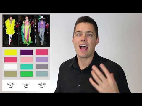
Boring Brightness is back, Gucci lost the plot
I’m usually so complimentary of Gucci – it kind of makes me sad, that I just can’t get behind their color decisions this year. Frankly – these colors are fine, but 3-5 years ago these kinds of colors were prominent, and to me you either have to wait longer – or not wait so long.
Bright colors to me are not a trend. I could be wrong, or I may just disagree with a part of fashion – I usually don’t take a stance, as much as I share and analyze a bit, but to me this direction feels wrong and kind of cheesy.
I don’t say this lightly – because there are so many cool and worthwhile new directions in color for 2019, but it looks like Gucci just got bored and started throwing stuff up on stage without really considering where they were in the color trend cycle. Or I’ll eat my words and be praising fluorescents next year!
Why you should pay attention to Pantone & paint company predictions
You know who cares about color?
Companies that depend on being somewhat right about color for their revenue.
I love sorting through color predictions – color forecasts, and color ideas posts – here are a couple to kick you off if you haven’t checked the others out yet.
1. “These Color Trends Will Be Huge in 2019” – Elle Decor

2. Behr – 2019 Color Trends – and ‘Blueprint’ as color of the year

3. HouseBeautiful – 2019 Color Forecast


Pantone names ‘Living Coral’ as 2019 Color of The Year
No doubt the context for this color matters a lot (I love this Living Coral against this bluish backdrop)– but Pantone also did release some colors during and after Fashion Week – here are some that I like:

Sherwin Williams
Sherwin Williams comes in strong this year with ‘Cavern Clay’ as it’s color of the year. A very strong – deep color, that jives with some of the loveliest elements from 2019 high fashion lines.

Benjamin-Moore
Playing it safe – Benjamin Moore gives an understated grey as it’s color of the year. Based on all of the earth tones in other’s predictions and lines – designing around subtlety and shadow is not a bad bet, it’s just also not a bold bet.
Wrapping Up
I’ve enjoyed taking this deep dive into color for 2019 – and can’t wait to hear what your favorite colors are for 2019!
Won’t you share a color in the comments that myself and other readers can check out?
Take issue with something I said, or have a completely different take (on Gucci for instance)? I’d love to hear why you think differently, and would love to consider other ideas.
Thank you so much for reading – and join me next year for my 5th Annual color forecast!
Previous Year – 2018 Color Forecast
This 2018 Color Forecast – is based on high fashion, paint companies, and Pantone trends. I use these three broader points, and curation according to my tastes to create my third (!) annual color forecast of yearly color trends.
Check out 2016, and 2017 color forecasts to take a look back, and join me for this delightful tour of new designer’s lines and drawing conclusions based on their choices and other color expert ideas for 2018!

Table of Contents
Paying attention to high fashion
Why do I start every color forecast with particular attention to high fashion? I’m not sure – I do know a lot of times high fashion designers are ahead of the curve. Although this being the third year of diving deep on this subject, these trends are slow and mercurial. I don’t feel the fashion designers are moving that quickly.
Pale pink was highly present this year in high fashion lines – but I’m shifting focus this year to a different, very close relative since my past years have both focused on pale pink. Give up the spotlight already!
Beige is back!

I do feel like this year; beige is becoming even more present in high fashion than last year – it has taken a bigger role than pale pink, and now is not just the paint color in your grandparent’s basement bathroom, it’s been given new life. It looks great on people whose skin matches it, and on darker skin tones as well – because well… beige is back. (If you’ve been stowing away your beige jumpsuit from 15 years ago, you may be in luck.)
Pale Gold and Matte Black
Many brighter colors are coming in this year, rich tones, whose cousins were stylishly muted only three or four years ago, are now out and proud. Rich purples, greens, reds, and blues. A consistent though mutated trend is gold and matte black, both muted this year and often coupled with earth tones like brown and money green.
Silver, Silvery Purple & Green, oh my
Silvery colors have been peeking around the corner for years. Perhaps this year they will make a more robust showing in street styles and broader design trends like interior design, print design, etc. The trick in the high fashion designer’s palette seems to be keeping it somewhat matte, and/or mixing it with purple, green, or another color to add interest along with diagonal lines and various textures.
Deep Red & Blue
You may notice that I have a special affinity for Gucci color schemes, and perhaps that skews my take on what is 2018 related, and what is just beautiful, solid Gucci color may be broader, more along the lines of a 10-year trend. I love Gucci’s deep red and blue – along with the occasional accompanying green stripe. The tendency for other designers to run with full saturation, rich colors do seem to be present as well for 2018 fashion lines.

Other Color Experts and Why They Matter
If you’re a designer, you’re likely very familiar with Pantone’s color of the year, which usually gets a lot of press (at least for industries that focus a lot on color). I like to take a good hard look at all of their other color predictions, and other sources like paint companies, as their businesses depend on making accurate and attentive choices in what they are selling. The pressures of the free market push these companies to make intelligent and savvy choices when suggesting color trends, so it makes sense to examine their choices.
Pantone
“The color palette showcases an appreciation for the complexity and distinctiveness of color and the expression of it, which is something that evolves and can be played with,” said Eiseman. “Consumers need more variety, and this expanded palette embraces the lack of gender and seasonal borders we see within the fashion industry.”

Their mainstays suggestions are more along the lines of the aforementioned muted gold, deep ‘sailor blue’ beige or mauve, and silver/grey. They suggest these because they think that the colors are getting brighter, richer, and deeper and need some simpler tones as the mainstays so the overall palette of peoples’ wardrobes will be ‘anchored’ in these simpler colors.

This brings me to the phenomenon of the ‘Groutfit’ – my one foray into ‘male-centric’ fashion for 2018.
A Groutfit is a grey outfit, and Gucci is banking on groutfits, as well as other designers, are working in grey alongside the silver and more intense colors.


Sherwin Williams

What a lovely palette – Sherwin Williams doesn’t miss with its delightful choice for color of the year – a deep blue they call ‘Oceanside’ – my take on Gucci’s deep red and blue seems to be right on point! Here’s their video about this color of the year for 2018:
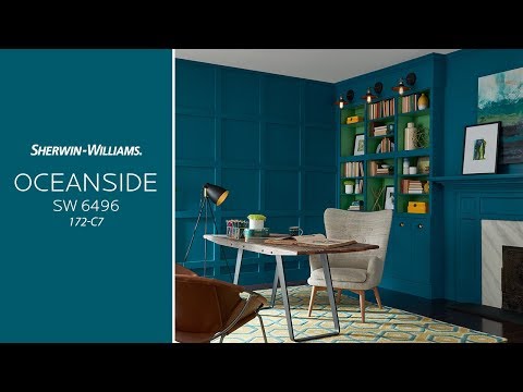
With this take on blue, and Benjamin Moore’s take on red – it may just be the year of very bold color walls. It’s been happening for a bit now, but if their predictions are a strong indication of where people will go, we’ll be seeing a lot more!
Benjamin-Moore
Benjamin Moore – chooses ‘Caliente’ or a rich, deep red as its color of the year. They suggest in the video below that it symbolizes boldness and joy. Check it out!
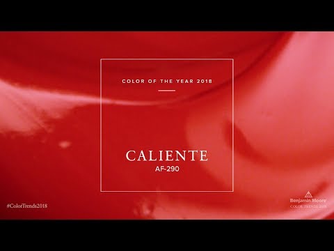
As we mentioned above, deep red and deep blue are very ‘in’ this year, and perhaps will be for a few more years, seeing as there was a step into more muted colors for some years (2011-2015.) Bold and deep colors likely will have a reign longer than one or two years.
Wrapping Up
All of this is a survey of the existing information out there about color leaders and experts’ take on 2018 – with a little bit of my perspective mixed in. I hope you’ll further explore with your own lens, and determine your own bold steps for color in your designs for 2018.
There’s a bit more opportunity in my estimation to use color boldly in anticipation of this new appetite for strong colors, and finding ways to complement the silver, mauves, and matte blacks that have been a mainstay for a couple of years.
I hope you’ve enjoyed this “Ultimate Designer’s Color Guide 2018” and I hope to share with you this annual forecast again next year. If you enjoyed the article, please leave a comment and/or share with your friends and followers!
Previous Year – 2017 Color Forecast
This Ultimate Designer’s Color Guide for 2017 has been created for your study and adoration. I spent more time on it than I probably should have, but hey… your boy’s got to be up on the latest trends. Yes, there may be some grammatical flaws – but the insights and breakdowns of colors for 2017 will be absolute fire. Not only because of my insights, but because of the curation of organizations like Pantone, Sherwin Williams and Gucci. These companies have not only been studying fluctuations in people’s color preference, but also dictating where they will go, with the mere swing of a their proverbial paintbrush. All of this was written for your enjoyment, and also hopefully you’ll link to it in your next roundup, or tweet it to your friends!

Table of Contents
Why do I start with high fashion when thinking about color schemes?
I’m dead set on coming up with the best look I possibly can on the Minneapolis web design projects I work on, and by making sure to closely inspect what these designers are working on – I can get a look at where the money is going in regards to fashion. You bet your bottom dollar that people like Coach and Marc Jacobs are spending a lot of time on being dead center of where trends are headed, as their clothing fetches more money when they do hit it on the head.
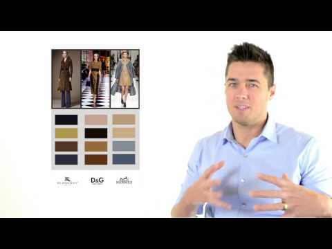
This year’s women’s line from Coach has a earthy punk, rusted metals vibe, mixing in some dusty earth tones – building on Sherwin Williams prediction this past year that industrial colors would rule the color realm in 2016. Personally, I love the rockabilly vibe and think if the color trends in 2017 match up with this video – I’m going to enjoy 2017’s style.
Who are the designers featured in this resource and why?
The designers featured are the best of the 14 most expensive luxury brands, many of which are household names.
- Marc Jacobs
- Fendi
- Hermes
- Ralph Lauren
- Versace
- Burberry
- Armani
- Dolce & Gabbana
- Gucci
- Dior
- Chanel
- Prada
- Louis Vuitton
- Oscar De La Renta
Whether it’s the aggressively earthy tones that permeate all of these major designers lines for 2017, the rusty metal, dusty greens, yellows and pinks, or your pale creams and pinks that carry over from this past year – color trends are definitely more subdued this year. It seems to be bold in 2017 – is to go underground. Pulling from punk with vintage graphic tees, baby doll pinks, an overall dirtiness animates the look of so many of these fashion industry stalwarts.

What is the point of color in design? Well it’s decoration, and it’s also used to separate one item from the other – it can be used as a kind of ‘color blocking’ to give shape to things – it has emotional implications like bright, clean, open, closed, dark, brooding, fresh, and flirty. 2017 is a year of subtlety in color – the high minded designers at least have muted their tones somewhat dramatically and are flying under the radar.
Why is metal and pale so prevalent in 2017 fashion lines?
I suppose I could assign meaning where they may be none. To me – it’s a vintage thing. Not a vintage thing like the 60’s, 70’s or even the 90’s – it’s a vintage thing like the 1890’s. Like what was clothing like before the first car. It was browns, and silvers, and bronzes, and pale colors. I would say there are clearly departures from this whole direction – but there’s enough evidence in the lines for 2017 that to over-simplify might be an homage to similar days before you could order dominoes with a tweet – and probably more importantly, before we were blinded with overstated colors on every package and ad, and drenched in color while staring at screens all day.
It’s an homage to a simpler time.
The Louis Vuitton outfit on the far left smacks a little 90’s to me, pushes the metal theme hard. Bronze, golden yellow, silver and pale pink purse – this has to be the most 2017 outfit of the bunch.
The Dolce and Gabbana outfit second from the left shows a type of flower pattern that’s been around for the past couple years, with a bit more of a mature color palette – the blue green mixed in, with a very pale cream background indicates these repeating patterns on white and variations of white are around to stay for a while here. Very well done – and fresh with that blue green being a different than what you might expect. Tropical without feeling hokey.
The Louis Vuitton outfit third in is maybe not something I would wear personally, but maybe just draw some inspiration from – bronze to gold arms, with a deep red shirt and yellow tinged shoes. Maybe one of the louder of these outfits – this one goes for vintage without calling to mind a specific era, except maybe stoner – hipster – 90’s – into rage against the machine – but also into die antwoord kind of way.
The Fendi outfit second from the right is an even better example of the pattern on white trend continuing into 2017 – pale pink top accenting the pattern’s complimentary colors.
The Coach outfit on the far right is showing a clear black and white color scheme – with just a little brown and blue mixed in for good measure. I’m of the mind that black is always in – but I think with the pale and metal color theme I’ve identified in 2017 fashion lines, black and white being pretty common seems to make sense.
Simplicity and understatement being the common thread.

So this not necessarily a ‘high fashion’ website – but this website I designed in 2016 showcases my identification of pale pink as an important color this past year. It’s fortunate that this also means that the user interface for the website compliments skin tones well. Considering that the lines would likely be shifting year to year, I wanted to identify how I could match up with one consistent element, which more me was pinkness in some of the models skin – and the pink would likely comfortably compliment darker skin models as well.
Picking out some trends and patterns from 2017 high fashion lines colors
 Rusty metal
Gold, brown, silver, grey, silver, bronze – anything you’d see on a rusted truck in the country or some old farm equipment that never made it to the paint stage – this is now a major theme and these colors a centerpiece for 2017.
Never mind the why, these colors are heavily represented in many of the top designers spring and summer lines. These is one major departure from 2016’s lines, with pale pinks and blues and deep blue and red being pretty popular in both years lines.
The tricky thing about color is that whenever one movement of color trends reaches critical mass – it will often be abandoned in droves by these top designers. There are a couple color choices that shirk that trend – one of them being gold and another being pale pink, which are dominating this year and next.

Pales pinks and blues
What was my favorite color of 2016? A pale pink – this pale blue and pink motif carries through into 2017. Anything pale and simple in large amounts – really seems to be a hit in these lines.
Nothing says marketable and classy like a high-end looking dress or outfit that is pale pink – and in that way for graphic designers looking to class up their designs, if you can mix these huge swathes of pale pink with skin tones and lots of space with an object in one third of the space.
The application of pale colors seems to be coupled with another trend, which is the fact that designers are using it in large flat spaces and not just little pieces of fabric intermingled.
 The outliers – Bright or Deep colors used in blocky ways
When there are brighter colors represented in 2017 color lines, they seem to be used in somewhat blocky ways, like a set of gaudy 90’s earrings, or bad dentist wall art. Not the colors per say, but the diagonal lines and blockiness to the patterns – the colors are delightful off the beaten path and bold in a fresh way. Perhaps the designers take them very seriously, but I feel like these designs are almost a little humorous in there overly dramatic lines and blockiness.
If you want to throw some bright colors in with your dark olive, khaki, black and pale colors in 2017 – be sure shoot for diagonal lines, and use a bit dustier of variations. The day-glow and light-bright colors are not fashionable to say the least this next year unless they are at least cut with a little bit of grey or a more moderate tint.
What about other color experts? – Pantone goes brighter than most
Pantone always baffles me with it’s disregard for high fashion consideration. For the reason, we have to look into how Pantone makes it’s money. Pantone’s 120 employees have shifted from ink mix-masters to color economists, and color psychologists – with 60 experts canvassing the world at any time to continue their expertise in color.

Many designer’s rush to follow Pantone’s lead and mix in their predicted colors into their lines immediately – the standardization of these colors and the right to use them is what much of the value of their company and it’s hues money-making abilities go to. So licensing and a stack of it’s shades, being that it’s one of the most recognizable standards for color is it’s primary generator of revenue.
Perhaps pale colors don’t demand the refreshing of your stack of colors in quite the same way as it’s generally brighter picks. That’s my guess for why Pantone’s colors are always so much brighter than what I’m seeing in major fashion lines.
I do love the Kale, Pale Dogwood, and Hazelnut and Island Paradise – a little acknowledgement to the pale and earthy goodness that predominates so much of high fashion in 2017.
Sherwin Williams predicts deep colors, and light pale colors intermingled with white
Sherwin Williams goes all in on the dark shades and white and pale colors – as opposed to anything bright or loud. Deepness, darkness, worldliness predominate – I love their example decor, demonstrating a mediterranean hominess.


Benjamin Moore picks “Shadow 2117-30” as it’s color of the year for 2017
Benjamin Moore chose ‘Simply White’ last year, and I found it to be incredibly ingenious of them, because it was all about locking people into their proprietary shade of white, and giving credo to what people already wanted – white space, space in general, and a big breath of ‘fresh air.’
So what happens when your color pick for last year turned out well, and you want to take a similar approach but you can’t choose the same thing? Go for the opposite. And they did – shoot for the shadow instead of the light. But in this situation, they made an even more savvy decision; they went for purple. A dark purple, that likely will take an even savvier eye to match directly with a competing paint brand. So why not just buy Benjamin Moore?
This particular hue of purple is delightfully on trend with the other deep blues and reds trending into 2017.

White with pattern on the top – reaching critical mass
The flower patterns that reached a new height in 2016 blossomed into a wide array of many other patterns, now over white more predominantly in 2017.
Whether it’s ice cream cones in a pattern on a t-shirt, or these crazy wild patterns at a fashion show, patterns on white and pale colors will continue to crop up and make 2017 the year of the pattern.
Opt out of the more common pattern and steer towards more original ones. No matter how delightful you feel like a piece of clothing is, if it’s in a super commonly frequented store and it’s a distinctive piece – you’re going to be sad when you’re out and about and you see it on someone else. So for these more original type patterns, look in less common places.

Masculine colors and trends
On the deep dark color side of 2017, it’s a great year for men’s fashion. Much of the color trend line already is well-suited to the often sedated traditional masculine side of color. If many men don’t feel the desire to replace their wardrobe’s every time a shade goes in or out of style – they can simply stay on the ‘safe side’, where the colors don’t move so quickly. Dark blue and dark red, brown, black and tan are all often in that safe zone.
Whether or not all men feel this is the case (that they don’t want to have to replace their fashion often,) for me it is definitely the case. Strangely enough, after putting in all this work on identifying color patterns in fashion – this next year I’ll likely spend more than half the time wearing black, white, and grey. I really just like to spend my time matching colors in Adobe Photoshop and Illustrator rather than in my clothing lines.
Color Tools, Resource and Links
1. The Ultrabright Color Forecast – Slow to update, but brilliant picks for current stylish color schemes, curated in clean and classy mood boards.

2. Design Seeds – This is an incredible tool where you use the sliders to search for palettes with a particular color. I appreciate the way they pull the colors out of a photograph that’s displayed to make the palette as it gives you some real-world context and is very pleasant.

3. Chir.ag Name that Color – a radical tool to let you know what a particular hex or CMYK color is called.
4. Name That Hue – Another awesome tool to do the same.
5. 10 Beautiful Gradients for Web Design – A curated group of lovely gradients, as I’ve come to love gradients in my designs – when appropriate.
6. UI Gradients – Another curated set of gradients from another designer. A very nice resource that gives you the CSS for each gradient.
7. Examples of Great Web Design Color Palettes with Hex Codes – I wrote this in four main parts with a ton of radical examples curated from around the web. If you need a quick shot of color palette inspiration, this post has it – with the exact hex codes and color combinations you could use to achieve the same look.

8. Trendy Web Color Palettes and Material Design Color Schemes & Tools – A very helpful resource for showing web design color palettes in action and giving you the hex numbers for them very quickly.

9. What is White Space, and How to Use it in Web Design – From yours truly, I share some glorious way to use web design to showcase the things you’re trying to emphasize in your designs. Tons of very well done design inspirational examples.

10. Coolors – A very nice tool to mix and match color schemes when you’re in a rush.
My Picks for the Colors of 2017
If color and the lack of color can bring meaningful emotional connotation to our designs, our fashion and our decor – why not pay close attention and even project where we feel color will go and our favorites? I personally love these 7 and think they will dominate the world in 2017:

And glossy, matte black, grey and shades of white used to provide clean context for these other colors.
My final thoughts for color trends in 2017: It’s a subtle and subdued year for color. The cycle is longer than a year, but oscillates back and forth from pale and understated to bright in your face decadence. If I had to guess, in mid-2018 brighter, more intense colors will take root again.
Previous Year – 2016 Color Forecast
This Ultimate Designer’s Color Guide for 2016 has been lovingly created for your enjoyment, perusal, backlash and inevitable bookmarking. Link to it in your round up, tweet about it if your bored, but don’t forget to check out the tools resource towards the end, and of course my top picks for colors to use in 2016. I emphasize top fashion designers because fashion lines have proven to be great indicators to where color trends are moving, but I talk about other color authorities and web design authorities like Awwwards.com as well, the Web Design Awards site as digital designers are also the tastemakers of 2016. So without further ado, here’s the table of contents so you can skip to any part of the resource.

Table of Contents
Why pay attention to high fashion for color schemes?
While creating beautiful web design in Minneapolis for clients, I want to come up with the most compelling designs that utilize current shades of color, that draw in the eye with their vividness but also with the way they strike the viewer as high-value or high-end. I often say “I make shit look expensive,” and following high fashion and what the top designers and most expensive fashion lines are doing I can continue to wield that keen eye.
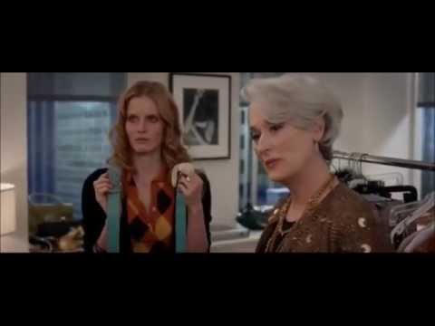
A clip from “A Devil Wears Prada” describes with exquisite condescension why color should matter to designers. Maybe you can relate to this kind of attention to color, or perhaps this scene makes you hate the fashion industry, but either way if you use color in your job, taking color more seriously will make an impact on your effectiveness at work and increase your ability to retain and expand your livelihood.
Who are the designers featured in this resource and why?
The designers featured are the best of the 14 most expensive luxury brands, many of which are household names.
- Marc Jacobs
- Fendi
- Hermes
- Ralph Lauren
- Versace
- Burberry
- Armani
- Dolce & Gabbana
- Gucci
- Dior
- Chanel
- Prada
- Louis Vuitton
- Oscar De La Renta
From there, I will also talk through what other credible sources are forecasting for color trends in 2016. Each of the outfits and color schemes represented here are from the fashion designers 2016 lines. I lay out the colors below the outfits as well so that designers can use their eyedropper tool to grab the color scheme, and for quick reference if you’re looking for inspiration. So without further ado, the first color schemes on the chopping block:

Color, and the taste for color is so arbitrary. Taste-makers and designers can argue all day, and as another designer I work with likes to say, color is something that inspires very strong opinions from everyone. But let me tell you, if there’s any people that have proven time and time again that they can affect the direction of western culture’s taste for color, it would be the designers I am talking about here. Of course there are many different fashion lines, but I will attempt to follow the thread of the trends in high fashion and identify brilliant color schemes and discuss patterns I can identify amongst the many.
The first Gucci color scheme above pairs a deep purple with a bright to mustard yellow, and don’t forget the black and white represented in the outfit. To me half of the game of color is in the quantity, not just the colors involved, the deep purple being secondary of course to the big swath of yellow in this instance.
The Fendi color scheme above is one of the most brilliant and complex color schemes I came across with it’s deep blue with a hint of green, the goldenrod to mustard yellow and surprisingly a dark blue with a hint of purple and a dark olive green bordering on brown. It’s earthy, but progressive with it’s intense blue and purple, dramatically complementing the quick but smooth angles of the clothing.
The Armani color scheme above is representative of much of the clothing I reviewed on the way to this article, with it’s nudes and blacks almost striving to match the color of the woman’s skin. To me this is a little harder to imagine using in web or graphic design, unless of course you were creating a website design specifically for a fashion designer. To me white and black are the color of web design and UI for fashion though, used often so that the colors of the photographs themselves pop and the structure of the interface doesn’t intrude on the photos.
The second Gucci color scheme above shows the deep navy blue and raspberry splashed red that I saw quite a few times while sifting through high fashion lines for 2016. With the hint of darkened brilliant yellow with a touch of green the color scheme gets a just enough sophistication for the runway. Without the pop of yellow in the shoes, the outfit would be bold but as basic as a Pumpkin Spice Latte.
The last Gucci color scheme above is one of the most risky I saw that was successful, and the strength and complexity of these three Gucci color schemes were why I couldn’t help think Gucci is head and shoulders above the other fashion designers from my perspective. Who would’ve guessed you could get shades of red, yellow, pink, and green to play so well together. One color scheme I also found popping up quite a bit was this pairing of the dark red and variations on a darker green/blue. I’ve also seen this scheme done very well in web design, like a fellow designer’s hard work on this website that utilizes the blue green and red tastefully without crossing into dreaded accidental christmas territory.

Picking out some trends and patterns from 2016 high fashion lines colors
Light Blue and Canary Yellow or Dark Blue and Mustard
 Not to say that any of the fashion designs here are pushing the limit, but this classic combination is taking many different shapes in 2016. Use blue and yellow with an earthtone like the tiger in the Gucci dress, or some kind of earth toned photography for graphic or web design and you have a magnetic duo.
My tastes have always been attuned to a bit of blue and yellow together, particularly when green is used as well and as you can see, two of these designs use a bit of dark blue green to accent the combination of yellow and blue.
Rather than tons of bright colors (with the exception of Versace’s crazy green, purple’s and oranges and yellows) for this next year, I saw quite a few deep and bold colors offset with some kind of earth-tone anchor to add sophistication or an element of maturity perhaps.

Diving Deeper into Blue-green and Red
Green and red are not always seen together for one fairly significant reason; Christmas. But the variation of deep blue green seen more often amongst these designs doesn’t really smack of Christmas.
Red and Blue green can be used savely together, and very tastefully too. I’m excited for this pairing more, especially with a color scheme like the Gucci one on the right here, where there’s a blue-kissed, silvery white and black that can be paired with these two heros.
The other two color schemes have some kind of warm earth tone to draw back the brightness of the colors, once again this pattern seems to be common for many high fashion color schemes going into 2016.
What about other color experts? – Pantone goes brighter than most
 To write an ultimate designer’s color guide for 2016 it would be quite incomplete without at least touching on what Pantone is predicting.
Not quite sure when variations of these green chartreuse will be making their way out of the top colors of the year, I for one am a little exhausted of seeing it. I definitely saw evidence of the pale pink and the peach in the designers work as well as smatterings of the rest for sure, so the same types of things are cropping up. The only difference is in the proportions as the brighter colors in this palette seemed to show up more as accents in the high fashion lines, and the deeper more rich colors similar to Pantone’s Snorkel Blue or Fiesta took a precedent, or were represented in more quantity overall.
To me the lesson here is definitely that it’s not only the colors chosen for a color palette in design but how much those colors take up space that will make or break a color scheme.
Sherwin Williams predicts an ‘earthy industrial’ color palette
Rooted in the “recovery from the recession,” Sherwin Williams color predictions are said to be inspired “small batch” and artisanal companies finding their own version of industrial revolution. Pale nudes, pinks and metallic blue and bronze show up in full force, echoing the other industry designs and predictions.

Sherwin Williams color mix PDF speaks of this in more depth on this. The combination of earth tones and rusted metals make me think of a future where we all go back to a kind of stone age, but are happier there. Standing around a well with rusted factories mostly gone, but a couple bright deeply tinted flowers in bloom. Thank you for allowing me a brief poetic rabbit hole, back to color.


The Nouveau Narrative and the Trajectory sections of the Sherwin Williams color predictions drive awareness to deep dark colors again, paired with earth tones. This along with an occasional little bright accent color seems to be a common thread of the whole “Ultimate Designer’s Color Guide for 2016.” So if you’ve learned nothing else, apply this to your web design, graphic design, and clothing color palettes – perhaps drop in some dark deep reds, blues and yellows and offset that rich color with a brown, gold or another earthy shade.


Benjamin Moore picks “Simply White” as it’s color of the year for 2016

One of the first things designers learn in school is that white space is your friend. I think what the Benjamin Moore color of the year video really speaks to is all of the ways white can be used. With the texture shown within the video, and the shapes laid on top of each other, demonstrate how white can be used as a force in it’s own right. I remember when I first started using white on top of colored canvases in painting classes to show light, and in that I learned that white has it’s own presence besides being just an emptiness. Also the variations of the color white are important are well, whether used by themselves or alongside another color. White is often the sidekick, but a faithful one which draws out the beauty of other colors in contrast.
So many things I observed while studying the taste-makers choices of color in the next year’s lines, didn’t fall directly under the category of color. Texture and pattern both were in full force during my deep dive into the top designers. 3 of my favorite patterns I saw amongst the top 16 most expensive designers were these three. From left to right; Fendi, Gucci, and Oscar De La Renta.

Note the recurrence of the yellow and blue, both pastel in the Fendi on the left, and the deep blue/green and red Gucci dress in the middle.
The Predominance of White and Texture, Nudes/Pale Pinks
 Something my lovely fiance has been obsessed with for the past year has been trying to get her hair to match her skin. Something I found strange and fascinating, but one common thread through the designers and color experts observations is a deep respect for the pastel creams, use of white and different textures, and pale pinks. Everyone from Sherwin Williams, Pantone, Burberry, Armani and Chanel is displaying a cyclical resurgence of pastels and perhaps it’s not just coming back for 2016, but has been back for a little while now. Hair died pale pink and other pale colors has been showing up in my neighborhood of Uptown Minneapolis, amongst the often black-clad street people that pop in and out of our breweries. Isn’t that where the best color trends start?
Of course, what is one of the most classic color schemes of all? Black on black on black. Or white on creme on white. Or a combination of white and black, but I saw quite a bit of white in different textures paired together in the top designers work I observed.
Masculine and Feminine Color Subtleties
Men wear different colors, but much of the clothing is affected by the more involved color politics of women’s clothing. Even though I’m fascinated by the evolution of color trends, I go for days wearing black jeans and a black shirt as I like to simplify things which can be distracting and stay focused on my work. But I believe staying up on color and fashions allow me to be a better web and graphic designer.
As you can see below in this small grab of some forward thinking designs for men, much of the color is muted even more than the color trends for women. Deep gold, Brown, and Green with flashes of orange, green and red on the more adventurous Gucci designs.

Color Tools, Resource and Links
1. The Ultrabright Color Forecast – This isn’t updated as often as I would like, and that was partly the reason for creating this resource for people, but the colors represented on the site are brilliant and very tasteful and stylish.

2. Design Seeds – This is an incredible tool where you use the sliders to search for palettes with a particular color. I appreciate the way they pull the colors out of a photograph that’s displayed to make the palette as it gives you some real world context and is very pleasant.
3. RGB.to Allows you to search for pantone by hex, or vice versa and allows fairly seemless cross color format translation.
4. Name That Hue – Originally made for the colorblind, this tool allows you to check on the name of any color, so you won’t be sitting there looking like a chump trying to figure out if something is canary yellow or mustard pecan salamander orange.
5. 10 Beautiful Gradients for Web Design – This is a resource I created with some of the best gradients I’ve seen. UI Gradients is another tool for this, but I felt a lot of the gradients were a bit too dramatic to be usable, so I curated some more subtle ones.
6. Material Palette – Allow yourself to look at your colors in a user interface quickly, with variations on the color quickly.
Here’s a brief video about Material palette:

7. StylifyMe.com – Allows you to type in the address of any website and see the colors, styles and even fonts it’s using and download them quickly as a PDF for later reference. This tool is very fun to mess around with. Here’s a screengrab of me using it on Starbucks.com.

8. 20 Websites of The Day from Awwwards.com with great color Schemes – Though this article is named “great color tools” it’s real glory is the examples of work with excellent web design color palettes as seen in the wild on extremely well-done websites. Pretty progressive stuff for June, 2015. Here’s an excellent example of the collection:

9. 5 Web Design Color Palettes – From yours truly, I share examples of 5 palettes I think are strong and the types of situations I might use them within. HEX values included.
10. Coolors – Fairly similar to Adobe’s Kuler, this tool has been featured on CoDrops, Smashing Magazine, and Wired, partly because it churns out some pretty excellent color palettes, and has some nice features. According to the Wired article, Coolors uses a database of hundreds and hundreds of palettes made by people. Out of the database, computationally the algorithm compares values and comes up with new design palettes. It seems to do it in a way that feels very human-made, which I like a lot, from there you can modify one of the values and save palettes.
My Picks for the Colors of 2016
My independent color analysis is complete, and I’ve come to a couple conclusions. Here are the colors that made the biggest impact on me; my picks for the best colors for designers in 2016.
And of course every shade of black and white you can imagine up in your magical brain.
Thank you for reading this analysis of the top designers and color tastemakers color choices and my favorites amongst them. It has been a pleasure writing “Ultimate Designer’s Color Guide for 2016“, partly because I think color is a very fun thing to talk about, write about and weigh in on. Kind of like music, or anything else based on taste, the subjectivity is what makes it fun. If you have any favorite colors, or your top picks for 2016 please tweet at me or leave a comment below.
Thank you for taking a walk through memory lane for the last 5 years + of color trends
Make sure to book mark hookagency.com/color-forecast and visit next year around the beginning of November to see what the next year has in store, as we will be updating this post for future forecasts so people can return at any time!
Thanks again for reading the ‘Color Forecast’!


