

Absolutely we care, because that’s where your leads actually live.
You’re not getting calls from people sitting at a desktop. Your next customer is on their phone, maybe standing in a flooded basement, maybe on their lunch break at a job site. They’re looking for help now, not in 8 seconds when your site finally loads.
At Hook Agency, we build every site with mobile conversion intent, not just responsive design, but clean, fast, lead-focused mobile experiences that convert under pressure.
Why?
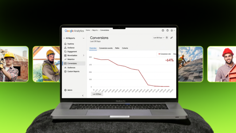
Because when 64% or more of your traffic comes from mobile, a clunky site can potentially kill your leads. If you’re a contractor wondering if we actually care about how your mobile website design performs.. this post is your answer📲.
Your Next Customer Is on Their Phone
Let’s be real. Your next roofing lead probably isn’t sitting at a desk. They’re on their phone, maybe standing in the rain searching “roof repair near me,” or scrolling while dealing with an emergency. More than half of all contractor website traffic now comes from mobile, and if your site doesn’t load fast or look sharp, that customer is moving on.
Mobile users are in a hurry.
They don’t want to zoom in to read tiny text or dig through a cluttered menu to find their phone number. A slow or confusing mobile site creates instant frustration, and frustration kills trust.
First impressions matter. And in the mobile world, you only get a few seconds to earn that trust. A streamlined layout, bold buttons, and clear calls to action give people confidence that you’re reliable and ready to help.

The takeaway? A strong mobile site isn’t optional anymore. It’s a must-have if you want to win the trust (and business) of today’s customers.

Why Mobile Website Design Experience Drives Everything
Mobile traffic is dominating. For roofing and home service businesses, more than half of all website visitors are coming from mobile devices. And when those visitors land on your site, they expect it to work fast, look clean, and make it obvious how to take the next step.
That’s why mobile performance is at the core of Hook’s website philosophy. It’s not something we check off at the end. It’s something we design for from the very beginning.
Let’s take a closer look at how we do it.
Hook Builds for Mobile From the Start
Mobile-first design doesn’t mean making your desktop site smaller. It means thinking like the user. Picture a homeowner standing in their kitchen, phone in hand, trying to get a quote for a roof inspection. They’re looking for answers, fast.
At Hook, we build layouts that feel intuitive on mobile:
- Sections are stacked clearly with visual breathing room
- Fonts are large enough to read comfortably without zooming
- Buttons are big, thumb-friendly, and clearly labeled
- CTAs like “Call Now” or “Get a Free Estimate” are placed where people can find them instantly
We remove distractions, focus attention, and design every page with usability and conversion in mind.
Want to see what that looks like in action?
👇 Here’s a website we recently designed:

Notice how the phone number and navigation menu stay anchored at the bottom of the screen? That’s intentional. Homeowners browsing on their phones can quickly tap to call or explore the site without searching or scrolling.
It’s these small mobile touches that make a big impact.
Curious about other ways your website might be turning customers away? Check out our blog post: 5 Signs Your Home Service Website Is Repelling Customers to learn what to fix and how to start converting more visitors into leads.
Fast Sites Win. Slow Sites Lose Leads.
Speed is more than a technical issue. It’s a conversion killer if ignored. Studies show that a delay of even one second in mobile load time can reduce conversions by up to 20 percent. For a roofer, that’s the difference between booking a $12,000 job or losing it to a faster competitor.
Here’s what we optimize to keep our sites lightning-fast:
- Compressing images and videos without sacrificing quality
- Minimizing code and removing anything that clogs the pipeline
- Using lightweight frameworks that keep things lean
- Hosting on performance-optimized platforms
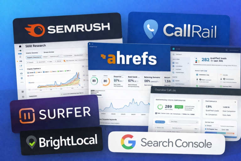
We’re constantly inspired by strategies like those in Tommy Mello’s 10X Leads Formula.

Mobile Design Impacts SEO in a Big Way
Mobile UX isn’t just about pleasing users. It directly affects how search engines rank your site.
Google uses mobile-first indexing, which means it evaluates your mobile site before anything else. So if your site looks good on desktop but performs poorly on phones, it’s going to cost you traffic, leads, and revenue.
Here’s what poor mobile design signals to Google:
- Slow load times suggest poor site health
- Small fonts and difficult navigation suggest bad user experience
- Hidden content or CTAs hurt relevance and authority
That’s why Hook blends technical SEO and mobile UX right from the start. Clean design and smart on-page SEO are two sides of the same coin. We don’t stop at launch either. We monitor how pages perform in real time and make data-informed tweaks to drive visibility and engagement.
If you want a deeper look at how our team tackles search visibility for roofers, explore our contractor SEO services, or see how our team approaches home service web design that’s both functional and beautiful.
Common Mobile Mistakes (And How Hook Avoids Them)
Most contractors don’t lose leads because their service is bad, it’s because their mobile site frustrates users before they can even call.
Here are some of the most common mistakes we see (and exactly how Hook makes sure your site avoids them):
Tiny Text & Poor Readability 📱
If your fonts are too small to read comfortably on a phone, users will bounce fast. At Hook, we use mobile-friendly typography that’s legible at a glance, with proper spacing to reduce eye strain.
Buttons That Are Too Small to Tap 👍
Ever try to click a tiny button with your thumb and accidentally hit the wrong thing? That’s a conversion killer. Our buttons are thumb-friendly, well-labeled, and placed where users can easily reach them, no awkward tapping or zooming required.
Slow-Loading Images 🐢
Images that aren’t optimized for mobile can slow your site to a crawl. We compress every image without sacrificing quality, ensuring lightning-fast load times that keep your visitors engaged.
Annoying Pop-Ups 🚫
Nothing says “leave this site” like a full-screen pop-up that covers everything. Hook avoids intrusive pop-ups and instead uses smart, timed prompts that enhance the experience instead of blocking it.

At Hook, Mobile Optimization Isn’t an Afterthought; It’s Baked In
At Hook, mobile optimization is never just a box we check at the end. It’s part of the process from day one because most home service leads come in on mobile. If your site doesn’t load quickly, look clean, and function perfectly on a phone, you’re losing business.
We make sure your site isn’t just “responsive.” We engineer it to perform in real-life mobile situations, where your customers are making split-second decisions.
Here’s how we do it:
- Real-device testing on phones and tablets, not just simulators
- Live scenario reviews (e.g., iPhone 12, 9 a.m., weak signal, on the go)
- Mobile-specific UX checks: from thumb-friendly buttons to tap zones and scroll experience
- Performance optimization: fast load times, compressed visuals, minimal layout shifts
Because if your site doesn’t work when a homeowner’s standing outside their garage trying to find someone to fix it, you’ve already lost the lead.
Want to hear what real clients and industry pros say about the difference Hook makes?

Ready for a Website That Converts on the First Tap?
Most of your customers are finding you on their phones so your site needs to work there. At Hook, we design mobile-first from the ground up: clean layouts, clear CTAs, and lightning-fast performance.
Want to see what that looks like in action?
Check out our website portfolio / lookbook and see how we help home service pros win more leads, right from the first tap.
Let’s build something that works where it matters most.