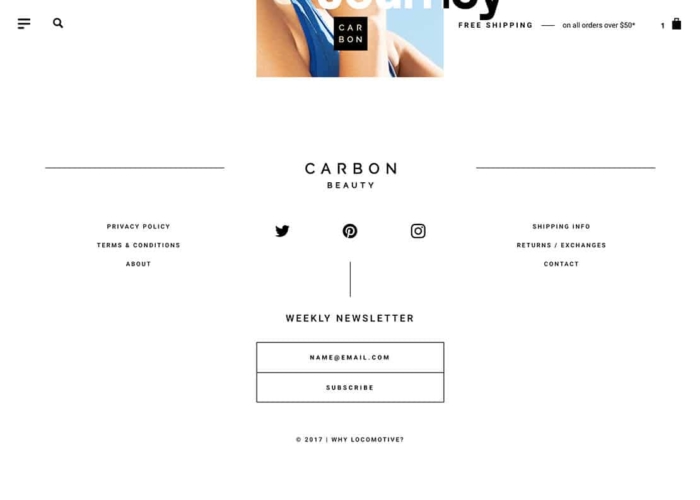
Website footers are the most under-rated, and powerful element of website design. Great footer design caps off the end of the site, are an amazing place for ‘calls-to-action’, contact information, and navigation. They seem to be under-rated because some people focus exclusively on the ‘header’ or the top of the website, and the ‘billboard’ of the website, ‘above-the-fold’ / or visible before you scroll.
Though the top of the site matters – the footer can be extremely powerful and serves as the other half of the ‘frame’ of a website – or the other element that stays consistent throughout the site, despite the middle content that swaps out on every page. Because you see the footer on every page, if it’s done right – all of the work is compounded in a positive way throughout the whole site’s design.
Amazing Examples of Website Footers
For each of these awesome footers – I’m going to briefly go through what I love about footer design in 2019, and how you could potentially use the principles from these footers for your footer designs as well.
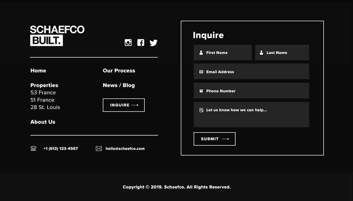
Minimal black and white footer
We recently designed this for a luxury condo construction client. What I love about it is that while it’s dark, simple, contrasty, it utilizes a variety of almost black color hexes to still show a clear division of elements within the UI.
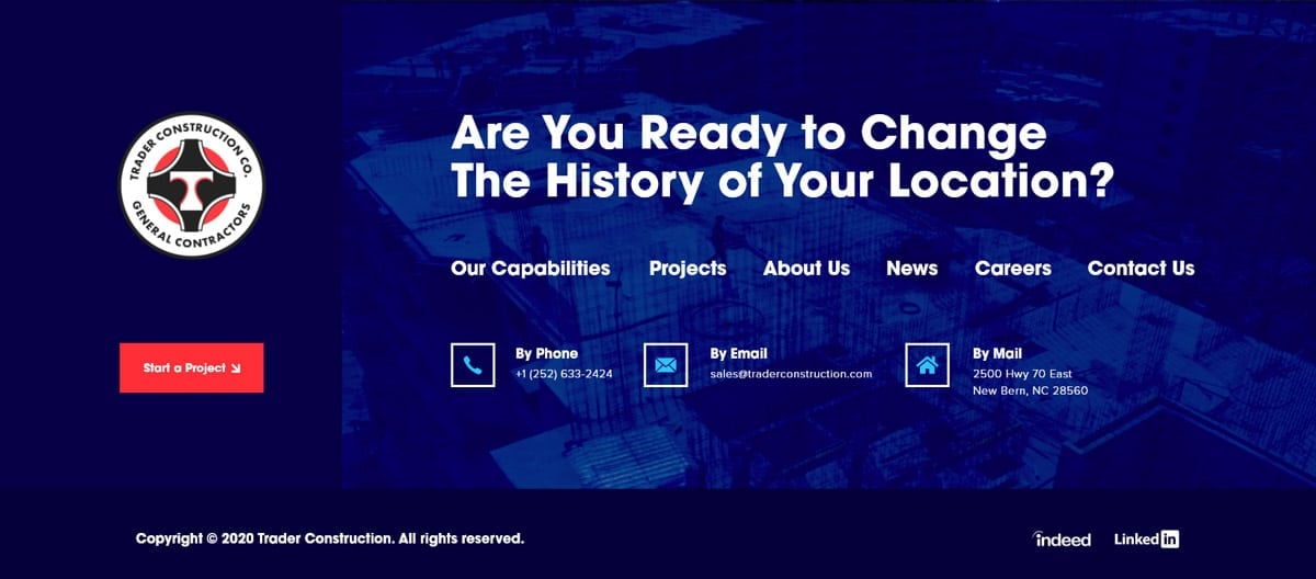
Blue footer
This is a footer we designed for a heavy civil construction client. This footer works well because of the white bold font (Gilroy) over the blue overtoned image, as well as the engaging headline question. I love the idea that even in the footer, you aren’t done answering and solving your clients problems.
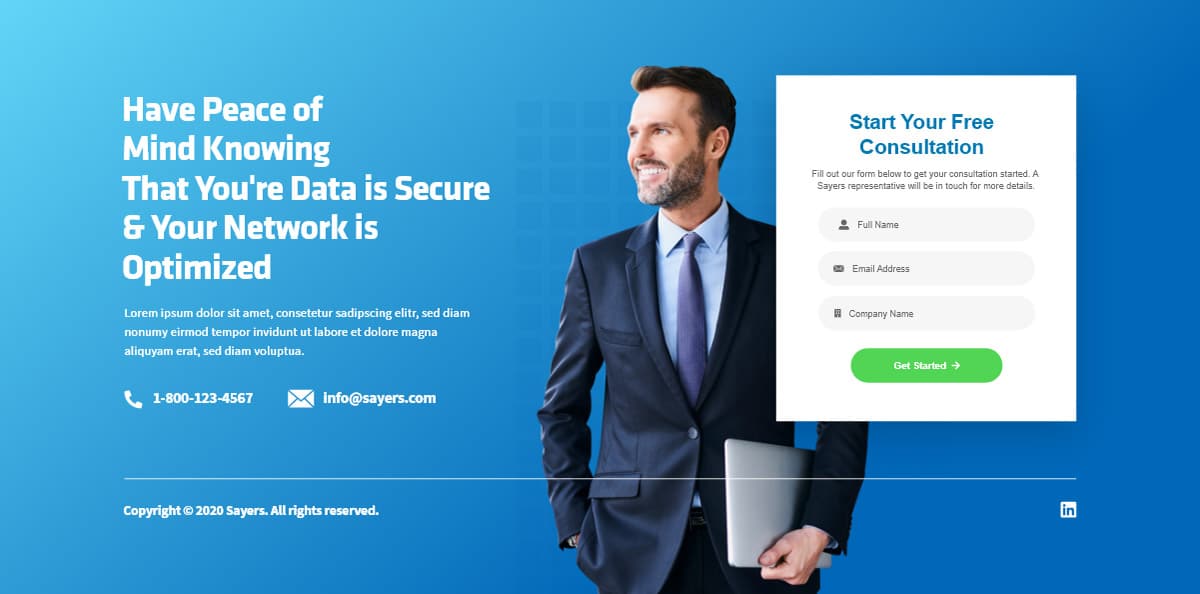
PPC landing page footer
PPC landing pages are a lot of fun to design because they can defy a lot of the convetional UX we might use for a regular website. We can more precisely guide what interactions we want the user to take to keep them hooked in an on the page. This footer works well with the engaging hero image combined with the CTA and lead cap form.
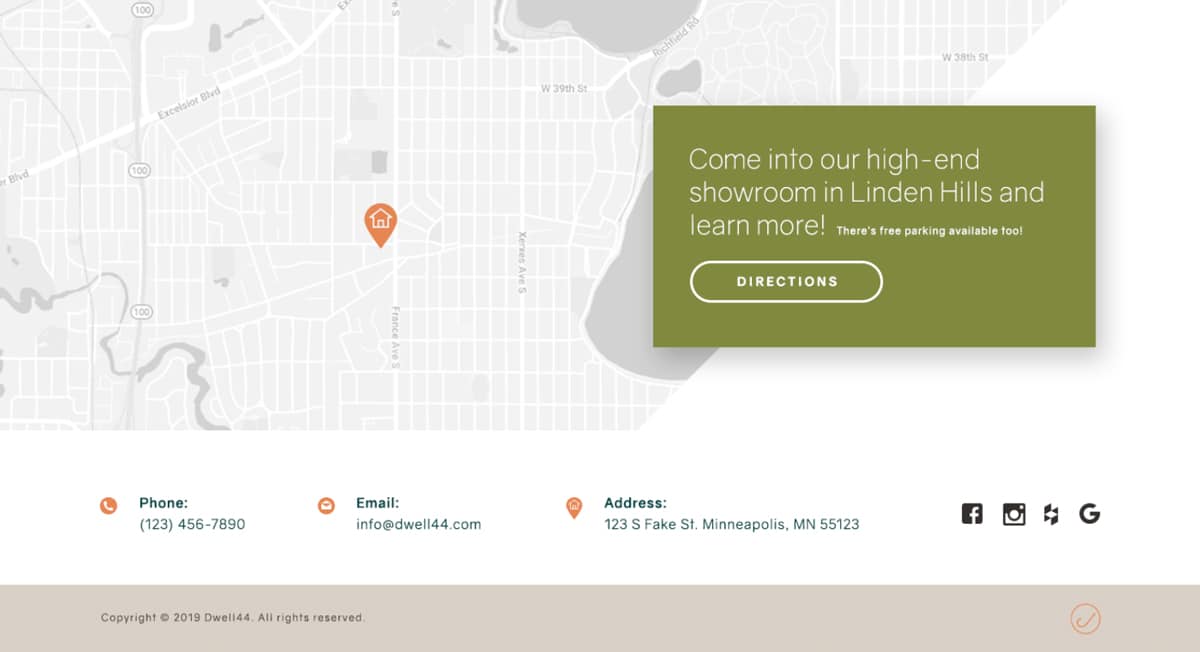
Minimal white footer
Many might see it as a risky move to not put sitemap links in the footer but in my opinion it really matters on the scale and goals of the business. We designed this footer as part of a website for a side project of an already existing client and it works because their business is currently small and focused on getting leads into their space. We focused on that goal by leaving out extraneous items and having a prominent map with contact info.
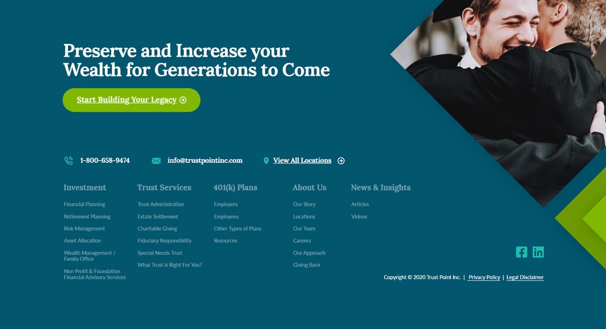
Financial services footer design
This is a new footer we designed for a financial services client of ours. We knew from the beginning their footer had to contain a lot of links so we took advantage of the size and added additional emotional imagery and headlines to keep the user engaged. We followed the notion that no space should be left untouched with this design.
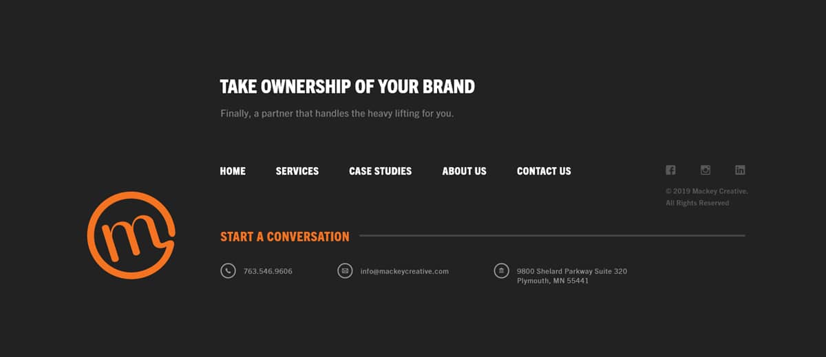
Creative agency footer
This is a footer we designed for a client in a creative agency industry. What I love about this is that it utilizes columns and big vertical spacing to create different sections. By using gray on gray tones with font, we’re able to give emphasis to some elements over others and guide the user to what it is we want them to do.
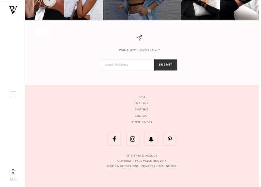
Pink and white footer design
I’ve been really digging this light pink for a couple of years now, and this footer delivers on a lot of things that make love design. The strong contrast between the logo, UI elements and the submit button – as well as the bold simplicity and centering of the menu, and social icons. (Check out this 26 website color schemes post too.)
Super simple black and white footer design
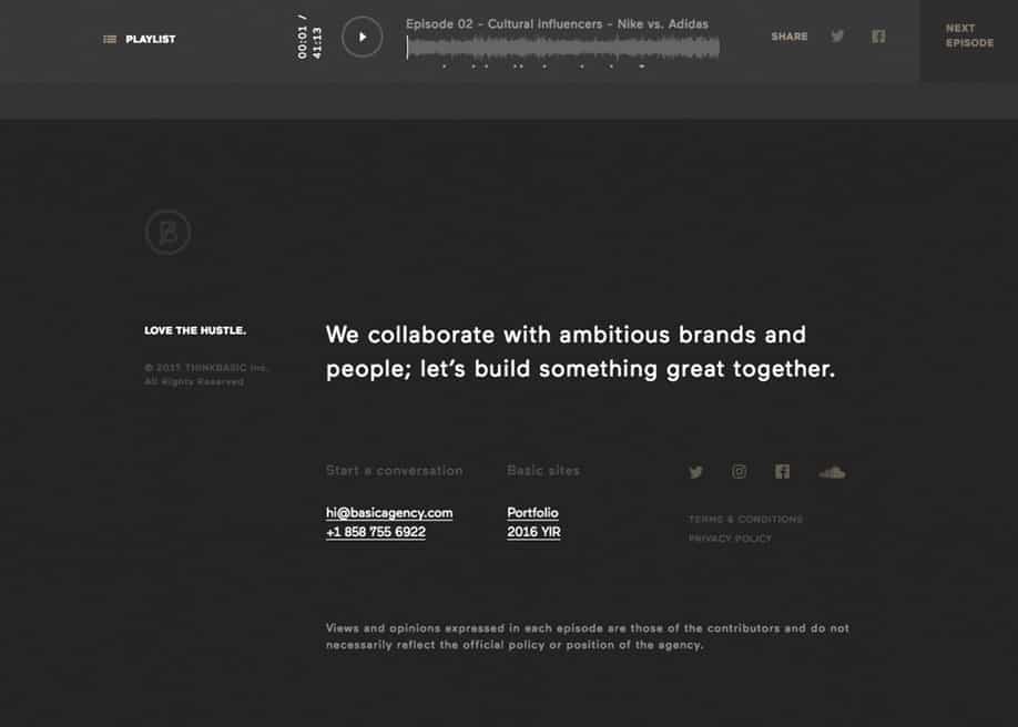
This marketing agency doesn’t shy away from utilizing the bottom of every page, with a quick sentence about what makes them special. Then it moves into copyright, a ‘start a conversation’ call-to-action, a couple of key items they may want you to view, social icons and functional ‘terms/privacy policy’ pages. They then have a caveat about the opinions of the people on their podcast. Use this concept by being open to dropping elements back with a grey that’s not much different than the dark grey background. This makes the other elements stick out more.
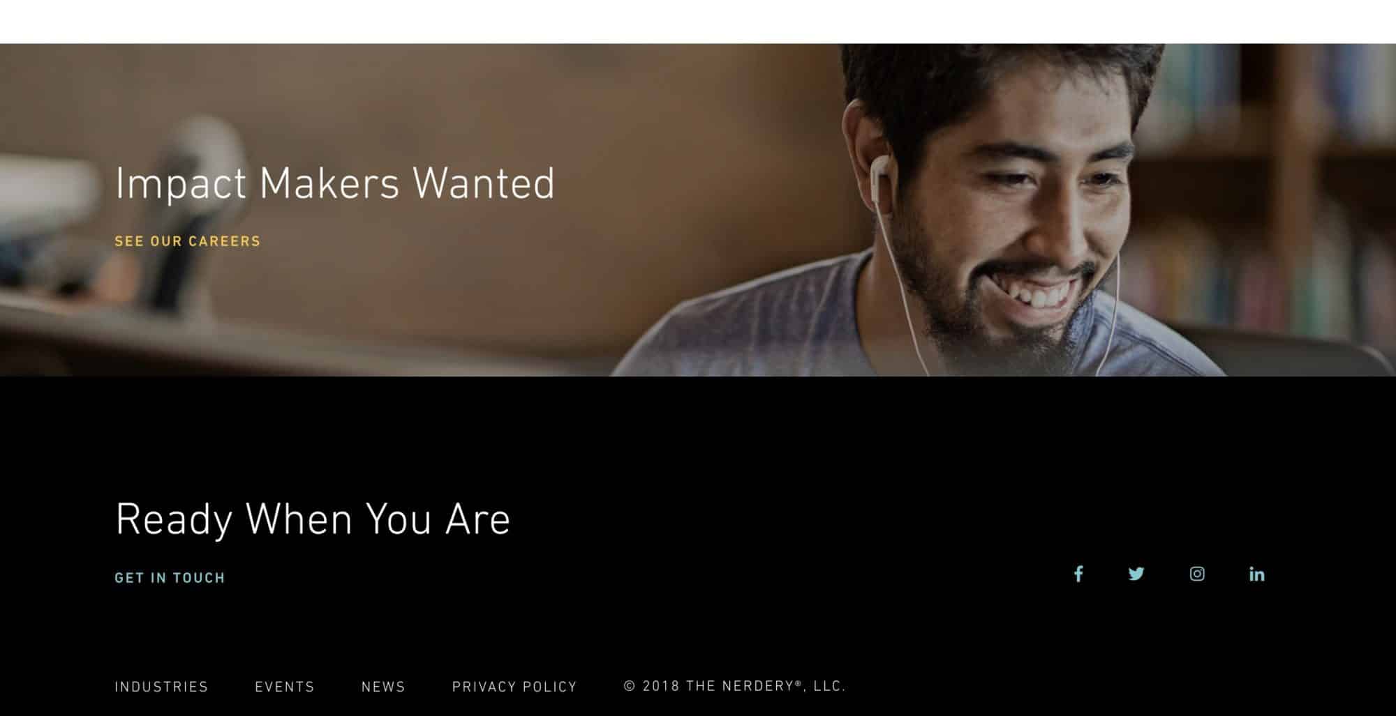
Nerdery – a web development agency’s awesomely simple footer
Clearly – this agency is much more focused on recruiting great talent (with a kind-looking, smiling face of course, as a background photo) than just getting more business on their home page. They’ve opted for brutal simplicity in their website footer, with just a conversational call-to-action, a slim navigational element, and social icons. Use this concept by really simplifying down to just a very few next actions you’d think people would want to take.
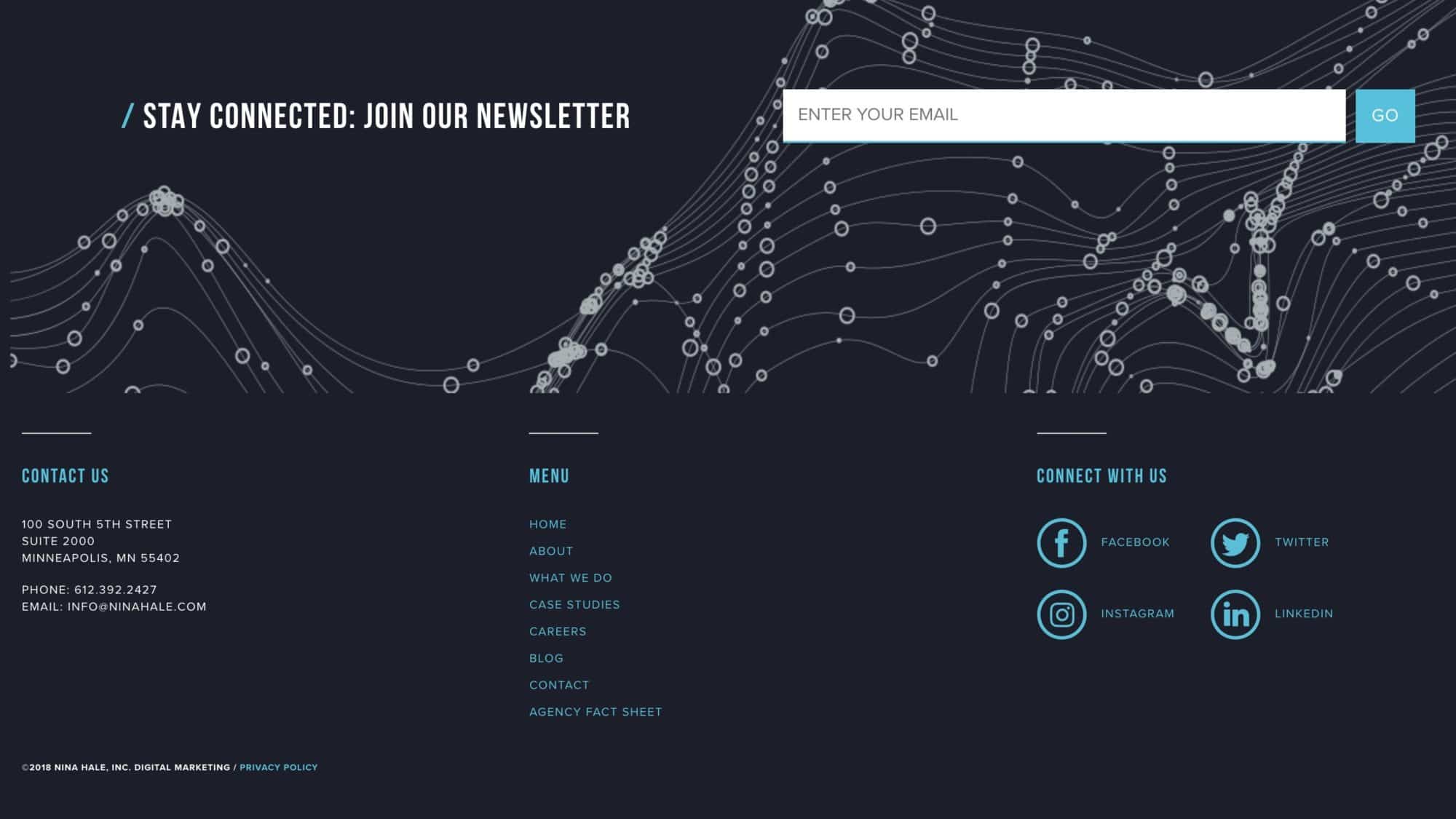
A wonderful Minneapolis agency footer – Nina Hale.
A powerful and open footer design that makes ample use of white space.
My god, this footer is good. Perhaps I’m just a sucker for black and white color schemes, but when you have this simple of a color palette, the layout of the elements has to be extremely thoughtful in the way they’re arranged. Use this concept, by balancing the number of navigational elements on either side – and centering a few of the next (obvious next step) actions you’d want people to take.

A lovely example of an agency website’s colorful footer design.
If you want to amp up the color instead of playing it down, what about a rainbow-esque footer? Use this concept by making introductions of each of your key pages at the bottom of your site, each with their own corresponding color.

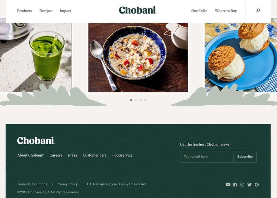
Major brand Chobani shows the power of simplicity with their footer design.
Just the logo in white, the navigation, a subscription box, Terms links, social icons, and a copyright. Use this concept by opting for a little more built out footer, without going too far. Of course you’ll need your logo in white – it’s funny how nice this looks, as I’ve tried this recently on a lot of designs, and it really adds a pleasant little touch.
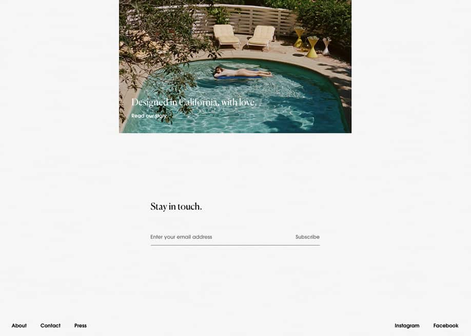
“Stay in touch” minimalist footer design.
This is for a fashion brand, and having worked on clothing company websites before – I can say it’s a unique place to be able to express yourself with brutally simple elements. The context of this type of footer is key of course – as not a lot of companies could get away with this. Use this concept on your next clothing brand website, by cutting out all the clutter, sticking with one action, and 5 links at the bottom of the page (in this design’s case – two of them are social media links.)
Spinx – a los angeles digital marketing agencies functional footer
I love contact forms in footers. This is a wonderful example of a very robust footer, that still comes across as clean to me. Use this concept by incorporating a contact form in your footer on 1/3rd or half the design, and calling out recent blog posts in the the other half under your contact information.

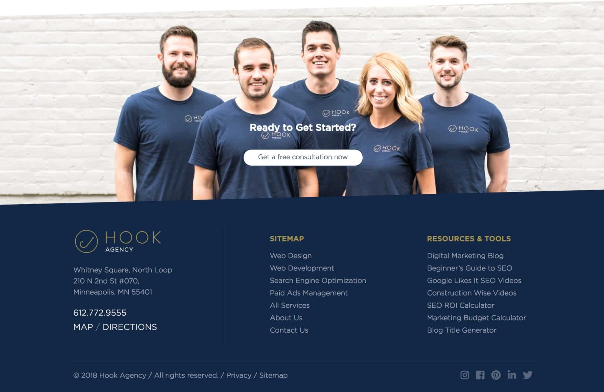
Our old footer design – don’t act like you’re not impressed 😉
We fit a lot into our footer design, without making it feel cluttered. Use this concept – by moving towards a very simple 3 column layout with understated typography.
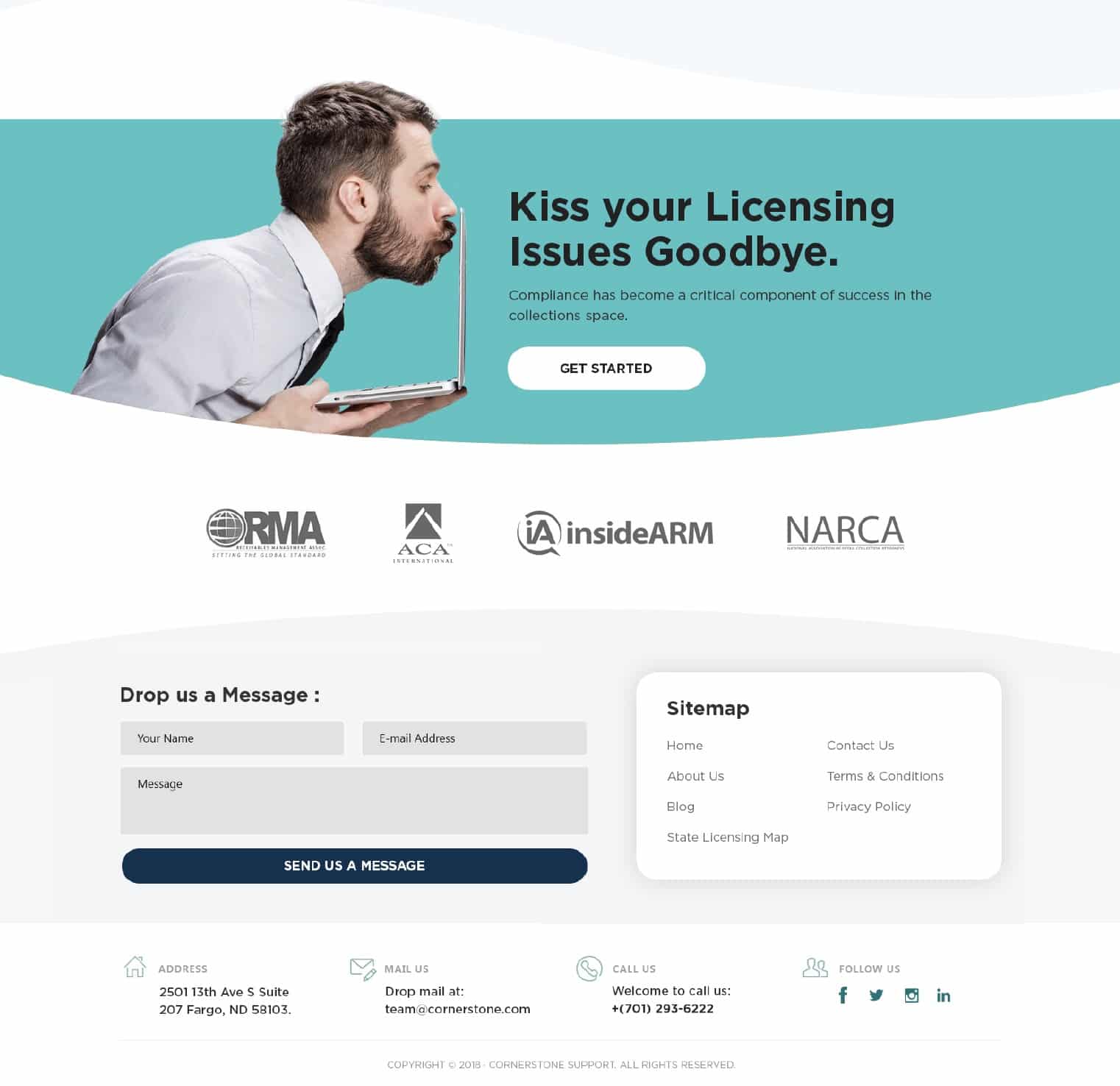
A recent footer we designed for a Cornerstone Support.
A little note on the ideal footer design:
You want your website footer to be functional, not just beautiful. We know to expect navigational elements at the end of the page, but people expect to see contact info as well. Here are a couple of other things that may make sense to include in a footer design.
- Obvious next steps – they’re done with the website now, so what would they do now ideally?
- What is a list of possible next actions they might take?
- Ideally, perhaps a contact form, if you want it to be super simple for them to get in touch?
- I like having badges of organizations a company is a part of so that people can understand the company is part of a community and is trustworthy, not some lone wolf company that doesn’t follow best practices.
- Social icons so they can join in on the discussion, and perhaps follow you on other platforms.
- If you’re on WordPress – check out this article: “How to Edit a Footer in WordPress“
- I love the Cornerstone example above because of the colorful / attention-grabbing call-to-action before the footer. This is our signature move on client sites.
Thank you for reading ’17 Website Footer Designs – Hall of Fame Examples and Best Practices (2022 Update)’ – leave your favorite website footer in the comments.


