Who is your ideal customer?
How does your current color palette speak to that person.
Minimal color palettes can draw the eye, and say more about your company than you might think.
- Minimal color schemes – make it easier to stay consistent because you don’t have 15 colors to include in every piece of marketing material.
- Minimal color palettes – generally give off a high-end feel, allowing you potentially to charge more as you’re less likely to ‘look cheap’ and ‘feel cheap.’
- These minimal color palettes for 2022 – were made with home service businesses in mind, but of course could be used for anything from the kids room, to a creative business.
We hope you enjoy!
1. Honeypot – Minimal Color Palette
This fresh and clean color-vibe, is modern – simple, and full of vibrancy. Could be used for an HVAC company, or a bold specialty contractor of any type. Green, orange and navy blue with a tan grey, and a very light grey. Lots of options for depth and intensity.

2. The Lush – Minimal Color Palette
The Lush is modeled after that wino interior designer who splashes brilliance into every home she touches. Clean, simple pale pink, great and a kiss of purple in a deep grey. A blue/grey for simplicity sake leads the palette, but immediately moves into a bright punchy, purple splash. Always simply elegant, but never boring – The Lush should only be used by those with a powerful personality to back it up.

3. Springer – Minimal Color Scheme
More ‘springtime bliss’ than ‘Jerry springer’ – this color scheme was clearly made by someone who really likes ‘Blue/green.’ Pale blue, light tan, and light purple finish off this palette that would make for a sophisticated and modern landscaping brand – with an easter egg finish.

4. Black + Blue – Minimalism Color Scheme
Don’t let your indecision beat you up. Need a quick decision – these clean blues, tan, and light grey can clean you right up. Made to be an easy decision for someone looking for a couple fresh blues, this sweet, sweet simple palette could be your new best friend. Don’t let me get on my ‘color psychology’ soap box, but people love blues!

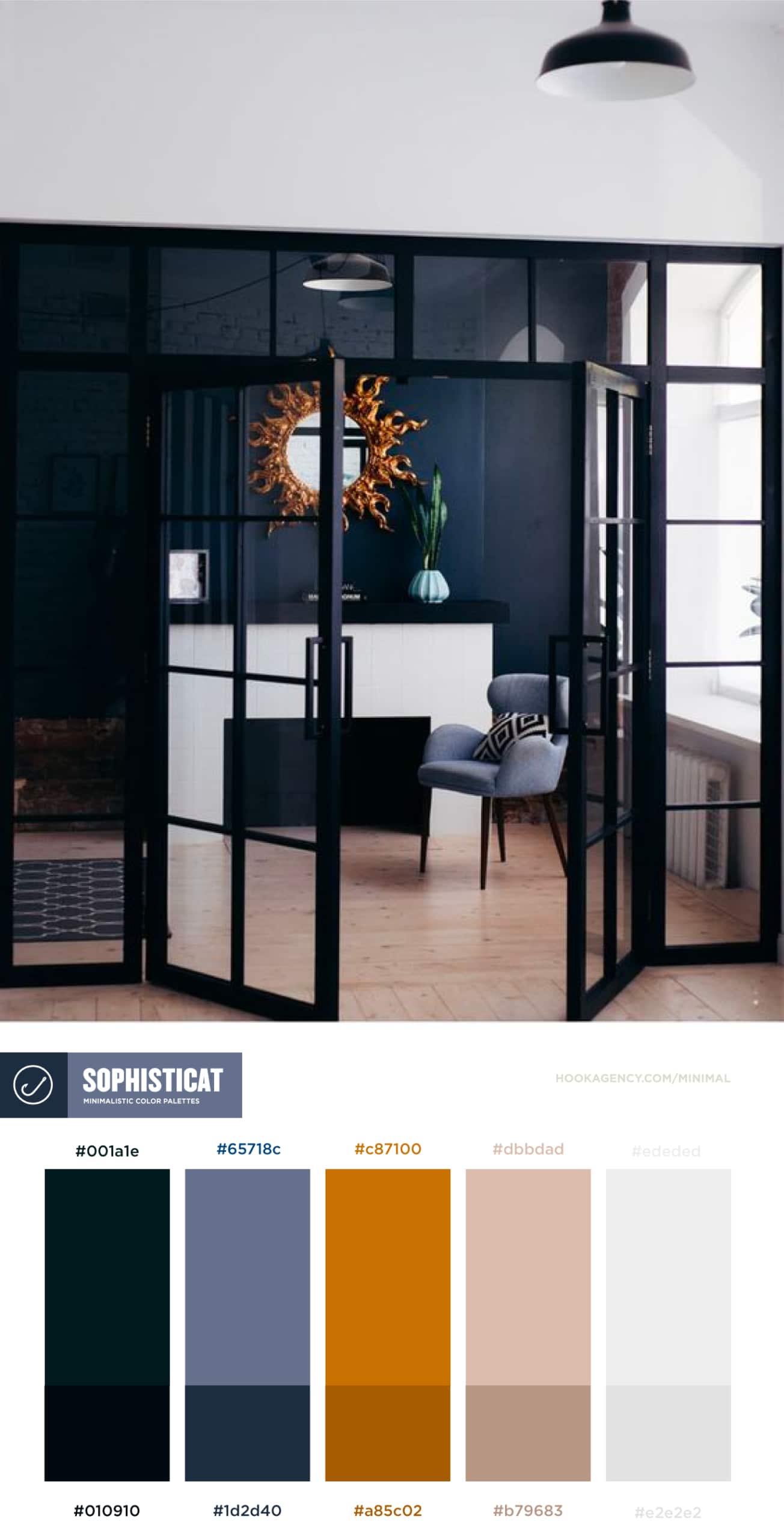
5. Sophisticat – Minimal Color Scheme
Sophisticated interior design color scheme – meet deep, rich, sexy tones. Cold mixed with warm – and a lot of dark, clean lines mixed in. Inspired by long scrolls on the Pinterest, and sleepy entries late at night on fashionable color palettes on the blog.

6. Moar – minimal color scheme for 2022
To call this a ‘minimalistic color scheme’ might be a stretch. It has red, green and gold in it for god’s sake. But at the same time, it’s on the subtler side of those tones, and it’s comfy and understated rather than bold and brash. So if you don’t mind, on the more vibrant side of minimal – may I present “Moar.”

7. Basket Weaver – minimal color scheme for 2022
Did we save the best for last? Perhaps – I certainly wouldn’t mind sitting a veranda with this calming color scheme. Versatile, simple, comfortable – this basket weaver will let you down easy, after a hard day – or it will work hard to support your brand, from a graphic design sense. What am I talking about? Good thing it’s the end of the article! And that you’re probably scanning to the goods, and you’re likely not here for my lovely prose!

Other great places to find Minimalistic Color Palettes for designers:
I love finding minimal color schemes – so I’ve collected a few of my favorite ‘haunts’ for hunting them down:
- Pinterest – search for ‘minimalistic color palettes’
- Behance – search for ‘minimalistic color palettes’
- Dribbble – search for ‘minimalistic color palettes’
Designers – pull from interior designers, and interior designers – pull from web designers.
It’s the circle of life, look for inspiration in daily life, and the unexpected.


