Most plumbing websites are polite.
That is the problem.
They say the right things, look decent, and still fail to get the call. Not because homeowners hate them. Because nothing on the page gives a clear reason to choose them now.
In 2026, plumbing website design is not about impressing other contractors or winning design awards. It is about winning a five-second decision from a stressed homeowner on their phone. Someone who is comparing two tabs, scanning for trust, and ready to bounce the moment things feel unclear.
The websites that convert do a few things brutally well. They show proof immediately. They remove hesitation. They make the next step obvious without begging for it.
This post is not design inspiration for inspiration’s sake. It is a breakdown of plumbing websites that actually pull their weight. Real examples. Real decisions. Real reasons these sites turn traffic into booked jobs while others sit there looking “fine.”
9 Plumbing Websites Built to Convert, Not Just Look Good
Every website below earned its spot for one reason.
It works.
These are not gallery pieces or trend showcases. They are home service websites that convert. Sites designed to earn trust fast, guide homeowners clearly, and turn visits into booked calls.
Each example highlights a specific principle we consistently recommend to plumbing companies that want more leads, not just more traffic. From how trust is shown above the fold to how calls-to-action are placed, these sites do the fundamentals exceptionally well.

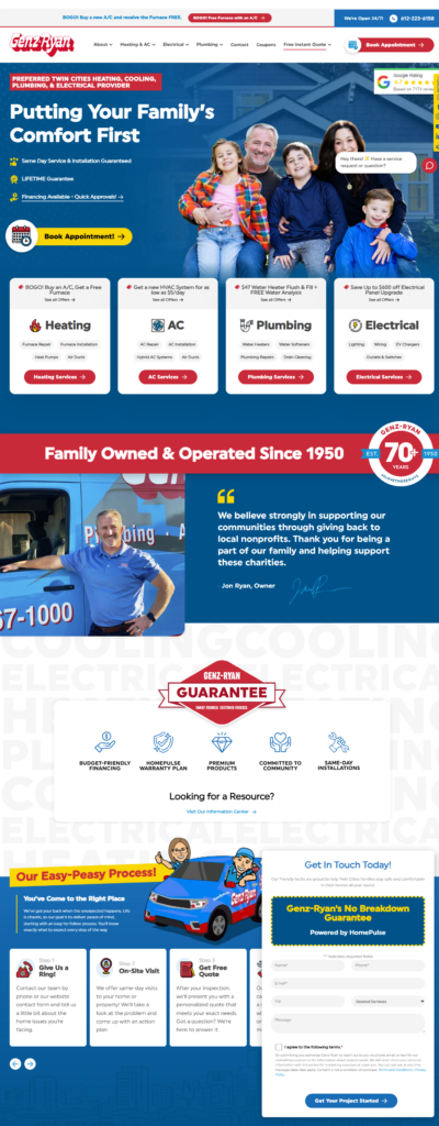
1. Genz-Ryan Plumbing Website (Designed by Hook Agency)
Conversion-first structure with zero hesitation points
This site is built to answer homeowner questions immediately and remove friction before it appears.
Why it converts
- Trust above the fold with visible reviews that feel real, not decorative
- Clear differentiators like same-day service, lifetime guarantees, and fast financing spelled out early
- Primary CTA everywhere with a “Book Appointment” button locked into the header
In 2026, this matters more than ever. AI summaries and mobile users both reward clarity. Genz-Ryan makes it obvious who they are, what they offer, and how to take the next step without thinking.
Conversion takeaway: Speed and certainty beat clever design every time.
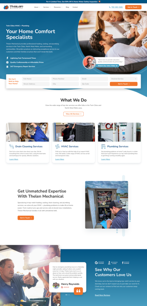
2. Thelen Mechanical (HVAC and Plumbing Website by Hook Agency)
Emotional trust paired with immediate action
This site does not wait to explain itself. It shows who they serve and what to do next within seconds.
Why it converts
- Family-centered imagery that signals safety and reliability
- Lead form visible immediately without forcing a scroll
- Visual service icons that reduce cognitive load on mobile
The real win here is performance, not aesthetics. A 10x increase in keywords and traffic six months in shows how conversion-focused design and visibility reinforce each other.
Conversion takeaway: When trust and action live above the fold, growth compounds faster.
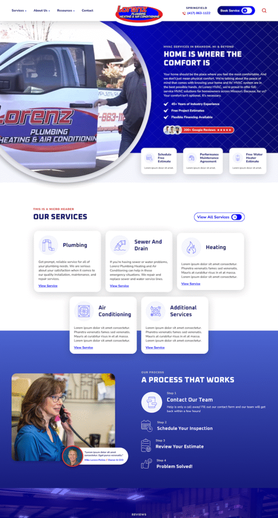
3. Lorenz Plumbing, Heating & Air Conditioning Website (Designed by Hook Agency)
High confidence, low friction decision-making
This is a site that instantly feels established and dependable.
Why it converts
- Video hero with real trucks builds authenticity fast
- Benefit-driven messaging paired with long-term proof like years in business and review volume
- Multiple CTAs without clutter, giving users options without confusion
- Clear service separation so homeowners never wonder “do they do this?”
- Process transparency that removes anxiety about what happens after booking
In a 2026 landscape where AI often summarizes brands before clicks happen, this level of clarity strengthens both human trust and machine understanding.
Conversion takeaway: Show the process and the proof, and homeowners relax.
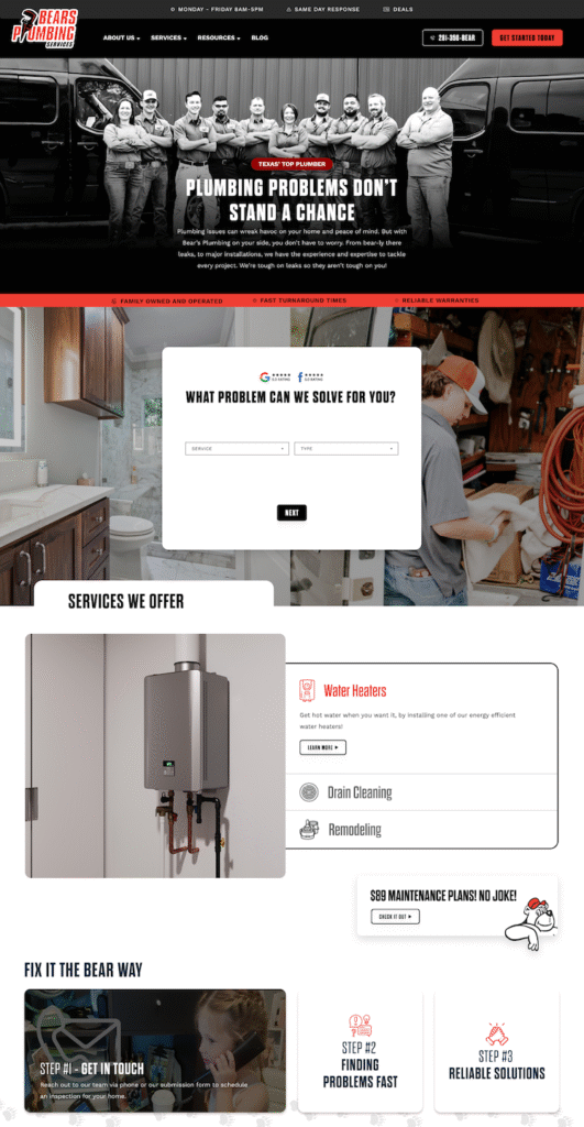
4. Bears Plumbing Services Website (Designed by Hook Agency)
This site perfectly balances personality and professionalism — proving that a plumbing brand can be tough, Personality used as a conversion asset, not a distraction
This site proves branding can be bold without sacrificing trust.
Why it converts
- Strong hero imagery that feels unified and confident
- Memorable headline that reframes fear into control
- Interactive problem selector that guides users instead of overwhelming them
- Consistent CTAs that keep momentum going
The playful elements work because the fundamentals are solid. Reviews, structure, and clarity do the heavy lifting.
Conversion takeaway: Personality works when the decision path stays clear.
5. Mr. Rooter
Frictionless entry with enterprise-level clarity
This site removes barriers quickly, which is why it performs.
Why it converts
- Immediate phone visibility
- Clear service breakdown without scrolling
- Friendly imagery that lowers resistance
‘There’s a reason they call us Mr.’ has to be one of the weirder / more vague taglines we’ve seen in quite a long time. A good reminder that the MESSAGING on your site is just as important as the design. It needs to be persuasive and clear. “If you confuse, you lose.”
Conversion takeaway: If the message is unclear, design cannot save it.

6. MCH
Minimalism that helps, then holds back
This site shows the upside and risk of simplicity.
Why it converts
- Uncluttered layout that highlights what is present
- Easy scanning on mobile
Where it struggles is reassurance. In 2026, homeowners expect proof fast.
What’s missing
- Team imagery
- Clear phone prominence
- Trade badges or affiliations
- Process explanation
Conversion takeaway: Simple works until it creates unanswered questions.

7. Williams Mechanical
Strong hierarchy with underused content
This site feels calm and trustworthy at first glance.
Why it converts
- Clear visual hierarchy
- Distinct brand personality without noise
Where it loses momentum is dense text blocks meant for search engines, not humans.
Conversion takeaway: Content still matters, but it must be skimmable to support decisions, not stall them.

8. Benjamin Franklin
Process clarity done right
This site understands urgency.
Why it converts
- Phone number immediately visible
- Quick process bullets that tell homeowners what happens next
- Clean, bright design that signals professionalism
The only missed opportunity is stronger service signaling in imagery, but overall this is a strong example of reducing friction.
Conversion takeaway: Clear next steps outperform flashy visuals.

9. Cornerstone Plumbing
Human-first visuals with brand risk
This site leans into warmth and relatability.
Why it converts
- Happy, real imagery that humanizes the brand
- Centered navigation that feels stable and intentional
Where it struggles is color psychology. The color scheme feels a little heavy and not particularly trustworthy – we’re not sure you want brown as the main color if you’re a plumber.
Conversion takeaway: Human imagery builds trust, but visual tone still shapes confidence.

What Converts in 2026 (Not What Designers Think Converts)
Let’s be honest. The plumbing websites that get attention today look nothing like the sites that actually convert visitors into calls and booked jobs.
In 2026, the rules have changed. Homeowners no longer scroll with patience. Most are on phones. Most decide in seconds. And Google’s AI is watching, even before a human clicks.
Here’s what the data and real behavior tell us:
More than 90% of websites now use responsive design, compared to around half a decade ago. That’s because 63% of global traffic comes from mobile devices. If your site does not feel native on a phone — fast, intuitive, and action-ready, you are already behind before anyone reads a single headline.
And design isn’t just about fitting a screen.
Minimalist layouts dominate 70% of high-converting pages. The reason is simple: whitespace and clear typography reduce cognitive load and speed up decisions. That focus alone adds about 20% faster load times, which means visitors stay, engage, and act more often.
So what separates sites that convert from sites that exist?
1. Clarity beats clever every time.
Homeowners want to know who you are, what you fix, and how to get you on the phone without guessing.
2. Trust must show up before the click.
Reviews, badges, real photos, and consistent contact info are not decorative. They are credibility signals for both users and AI-generated search summaries.
3. Action should feel immediate, not buried.
Buttons need to be obvious. Forms need to be short. Paths to conversion need to be friction-free.
4. Content should answer real questions fast.
If someone lands and still wonders “How long will a fix take?” they have already lost confidence.
How can you make your plumbing website more effective?
Having a beautiful plumbing website might not be enough to really drive new sales.
Certainly you want to have the basics in place, here’s 3 I suggest on every website:
- A reviews carousel, with who left the review and the logo of where it was left, with a 5-star icon.
- At least 500 words on each selling page so search engines have context, and people can get the important information they need.
- Headlines and images that are focused on happy customers, and how the company helps solve their problem (not focused on how cool the company is.)
Great photos – ideally means they are original photos, but that takes time and effort to get, so if nothing else, make sure the photos aren’t cheesy old stock photos, make sure they feel modern and not of a too-clean or ‘overused’ style.
What is the best Plumbing website builder?
I strongly suggest working with a professional on a custom website design, and my favorite platform is WordPress, because it’s best in class for SEO, and it’s open source so people are always creating new add-on’s for it that are great for marketing.
That being said – it’s hard getting started on that, so if you are going to make it yourself, I might suggest:
- Squarespace – clean templates, spacious and sparse. Perhaps start with the Nueva template.
- Weebly – ton’s of options. Perhaps start with the Plumber Theme from Roomy Themes.
- Wix – Older design / look – but there are plumber options like the Plumber Wix Theme.
Plumbing website template
If you can find someone to help, or you’re willing to put in 20 hours learning the basics of using a WordPress template or theme – here are 5 WordPress themes for plumbers to consider:
- ProHauz – Handyman or Plumber WordPress Theme ($69)
- Plumber – Construction or Repair Man WordPress ($49)
- Plumbing SPL – WordPress Plumbing Theme ($59)
- Kempner – WordPress Plumbing Theme ($33)
- Homefix – Plumbing & Home Maintenance Theme ($59)
But Tim – why are you sharing all these cheap WordPress themes for plumbers?
Aren’t you scared that will make people not want to buy your custom website services?
Not really –
- Our best customers have tried templated websites before and decided they wanted to go the professional route by the time they get to us.
- If your website could mean the difference between a slow season and your phone ringing off the hook, it makes sense to spend more. Totally possible – when we do Search Engine Optimization for clients, just look at what Jim Alberts of AJ Alberts Plumbing said about our services:

Tips For Writing Plumbing Website Content
We handle blogging and landing page writing for Plumbing companies, but we don’t suggest having an outside company write your main selling pages, and the about pages on your website – why?
- You should actually put your personality into your main page content.
- Focus on your best customers and write a ‘sales letter’ to them, pretend like you’re talking to one customer.
- Share examples of happy customers, and boil the main BENEFITS into headlines and bullet points so people can skim.
- But certainly – try to make sure that each key page has at least 500 words on it for Search Engine Optimization purposes.
Your Website Is Either Working for You or Against You
By now, the difference should be obvious.
The plumbing websites that perform are not just well designed. They are built to create trust fast, work flawlessly on mobile, and make the next step clear without friction.
That kind of site does not come from guessing.
Hook Agency works exclusively with contractors and home service businesses, building conversion-driven websites that turn visits into booked jobs. With 50-plus five-star Google reviews, our results speak for themselves.
If you are ready for a website that does more than exist, let’s build one that earns the call.
What should I put on my plumbing website?
A google place to start might be pictures of before and after work, or pictures of happy customers, and a brief explanation of your process. You want people to very clearly understand how they can work with you and take the next step. Direct them to fill out a form, or give you a call. To take it to the next level, use our ‘Winning Website Formula’ – it’s primarily 5 key points: 1. Trust factors like testimonials and badges. 2. Clear visual call-to-actions. 3. Persuasive images and headlines demonstrating why you’re different. 4. SEO consideration throughout the process (make sure you have 500+ words on every page, and pages for every service you offer.) 5. Really clear differentiating features (what can your competitor NOT SAY.)
How do I create a plumbing website?
You can create one yourself on Weebly, Wix, Webs, Squarespace, or Godaddy website builder. You can pay for a cheaper web designer 2-10k to make you one on WordPress (usually via a pre-built template that other people might have as well,) or you can have a professional web design team like Hook Agency handle the process for you and create something persuasive and custom that fits your company like a glove. Many times people will go the cheap route one or two times before coming to us, or a company like ours. We are the ONLY high-end web design company that only works with contractors, and actually does relentless and consistent SEO.
How should I handle plumbing website content?
If you have sold for the company – it will be way easier. Just type out the common questions people have (How do you price, how long does it take, what is your process?) and then clearly and concisely answer all of those questions, and mix in real images of work, and happy customers. The best content is written IN-HOUSE at a company, because you have the most intimate knowledge of your customers pain-points and how you help solve them. Lead with the PROBLEM, and why YOU’RE DIFFERENT, and a SIMPLE PROCESS.
How can you make your plumbing website get more leads?
You have to either (A.) Pay for ads on Facebook and Google. (B) Push content out on the website, and slowly but surely work on your sites ‘Search Engine Optimization’ to get you higher on Google. Hook’s specialty is where Visual Design and SEO Combine to make a more effective website, we can also help you drive traffic with paid ads as well.
Looking for more plumbing website inspiration?
These examples are just the beginning. The best websites aren’t cookie-cutter — they’re crafted to highlight what makes your company unique: your team, your reputation, and the quality of your work.
If you’re ready for a site that looks incredible and drives real results, get in touch with our team today — we’ll help you build a plumbing website you’re proud to call your own.