Having a good looking web design is more important than might think. You could have every other conversion optimization tactic in the books going at full force, but if your website looks crappy, then it’s not really going to matter.
Just like most companies out there, you probably want a website that attracts more business on a regular basis and helps to attract employees as well.
To stay ahead of the game in the competitive marketplace that is out there, paying attention to your web design is not just important, but critical.
These high-end website design principles that will be discussed are game changers and can bring you closer to your business goals.
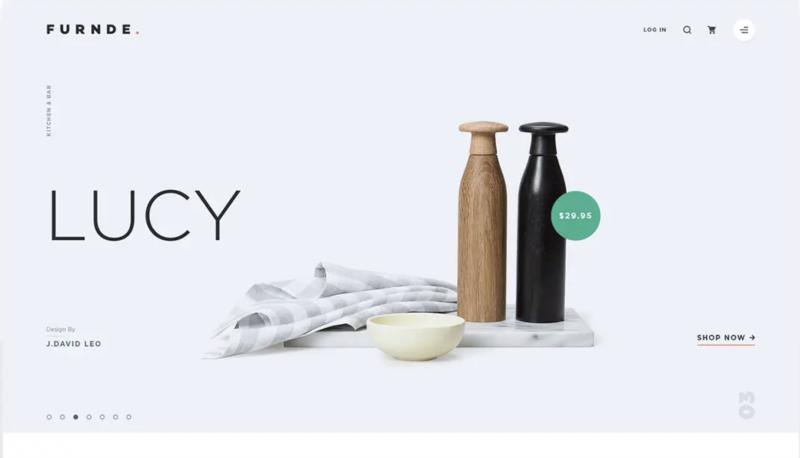
1. Negative Space:
Why do it:
When you have negative space around key objects in your design, it will give them more emphasis.
And while this may seem like a lazy man’s tactic, it actually takes more restraint and discipline to allow more negative space into the design. A natural tendency many designers and stakeholders in a website project will have is to fill up that space with the unneeded business that draws the attention away from where you want it.
When you have negative space incorporated in the design, you give people a feeling of relief and allow them to enjoy the site rather than strain themselves to find what they are looking for.
How to do it:

- Narrow down the most important elements of each section of the design.
- Have a few people that are savvy with good taste in design help with the final decisions made on the design.
- Instead of stuffing every little thing into one area, declutter it and have a site that scrolls longer vertically.
- Don’t forget about the 1/3rd – 2/3rd principle of photography. This is where the main object is in one-third of the photo, and the rest is open space.
2. Complementary Typography
Why do it:
When fonts have a similar feel, but aren’t identical to each other make for an easier and better viewing experience for people coming onto your website.
Some people will go to the lengths of saying that great design is invisible. What is meant by that is that the functionality, ease of use, and the intuitiveness of the interface are more important than the flashy design elements that capture your attention.
If a font is well-chosen, it won’t be something that most people coming into the site will notice. This is because the content itself plays a stronger role and takes center stage, whereas the fonts are just the vehicle.
Having a clean and simple font is a great place to start. However, if you do have a contrast between the two fonts you are using, it can allow you to present a balanced and let the content be seen in the order that was intended.
How to do it:
- As I mentioned, the use of thick and thin fonts in your content to make a distinction in your copy and help to give clear hierarchy and order to the content as well.
- When it comes to choosing your font, live by the moto – simple is better.
- Check out some of the more established and high profile brands out there. You will notice that they are using simple and easy to ready fonts electing to give their users the best experience possible.
- Take a peek at our list of 32 Modern Fonts and use that as a starting place.

3. Visual Hierarchy
Why do it:
Visual hierarchy is the arranging of certain elements to show their order of importance.
When it comes to design, this plays a big part.
If a designer can implement elements logically and strategically, they are able to influence perceptions of users and draw them towards the desired action.
When you are looking at an image for example, what are your eyes drawn to first?
Odds are that they will be drawn to the largest items, and then the next largest, and the next largest.
How to do it:
- Identify the most important items for people to see right away when they go onto your home page.
- After you’ve made your identifications, ensure that there is a significant difference between the size of the items with the most important items being the largest and most visible.
- Whenever you can, make your headlines shorter in order to create more of an emphasis on them.
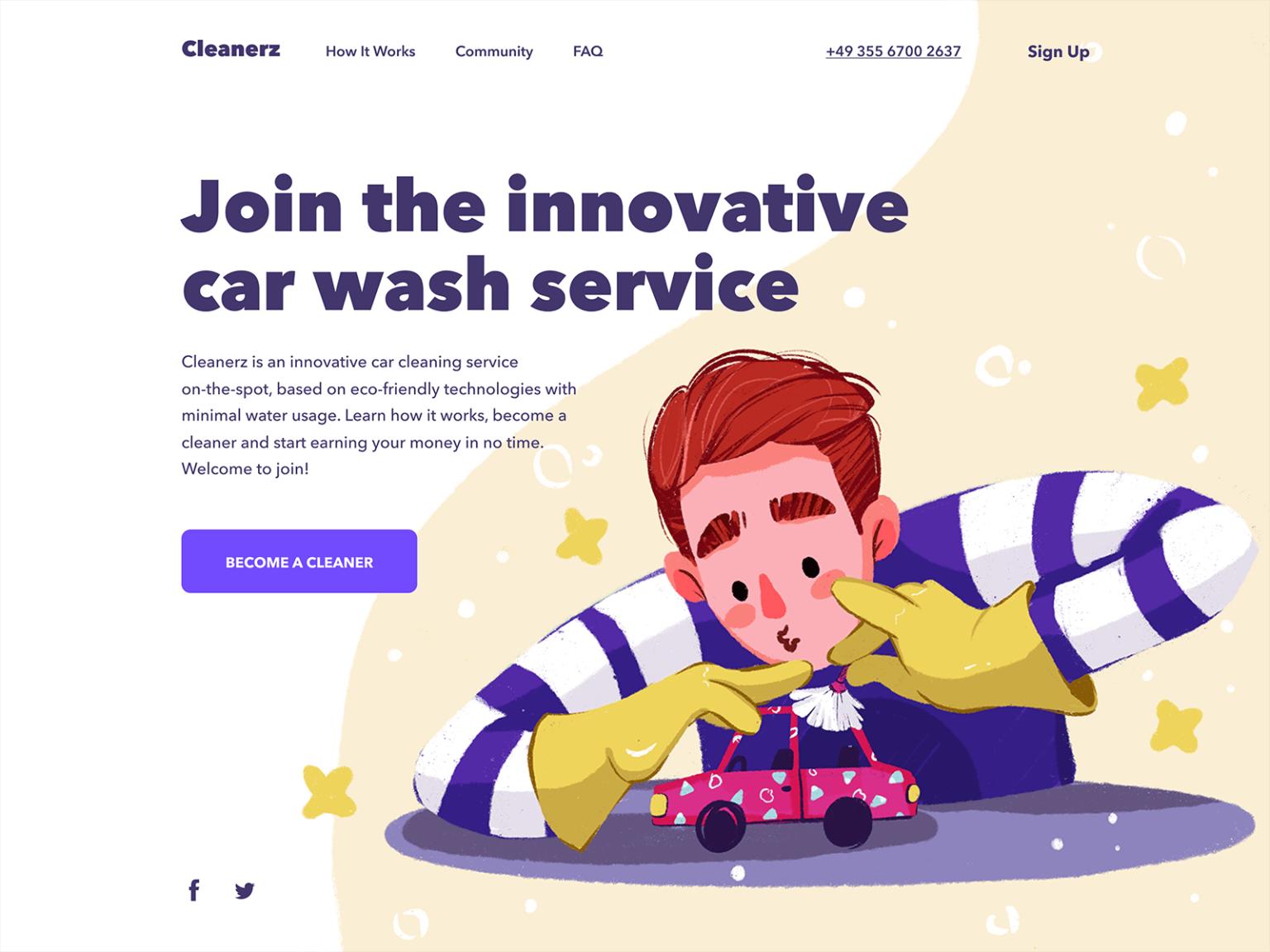
4. Simple and Bold Color Schemes
Why do it:
Having a good color palette will impact the perception your audience has of your brand and can be a key factor in things like how long they stay on your site, to if they are clicking the buy button or not.
When it comes to your colors, simple is good. Having too many colors on your website can make things look a little sloppy.
And while there is no strict rule around it, limiting colors can give you more of a consistent feeling around your site and really bring it together.
When you use bold and contrasting color schemes, you are able to create a unique vibe by pairing opposing colors and creating a bolder effect.

How to do it:
- Avoid basic colors and instead, go for colors that are slightly different and are different from every other website out there.
- Look for inspiration from different decor, paint companies, and see how they get color to intertwine with shape, shadows, and lighting.
- High-end fashion designers are another great place to look. Check out some of the top designers like Gucci and Marc Jacobs to see the color schemes they are putting together.
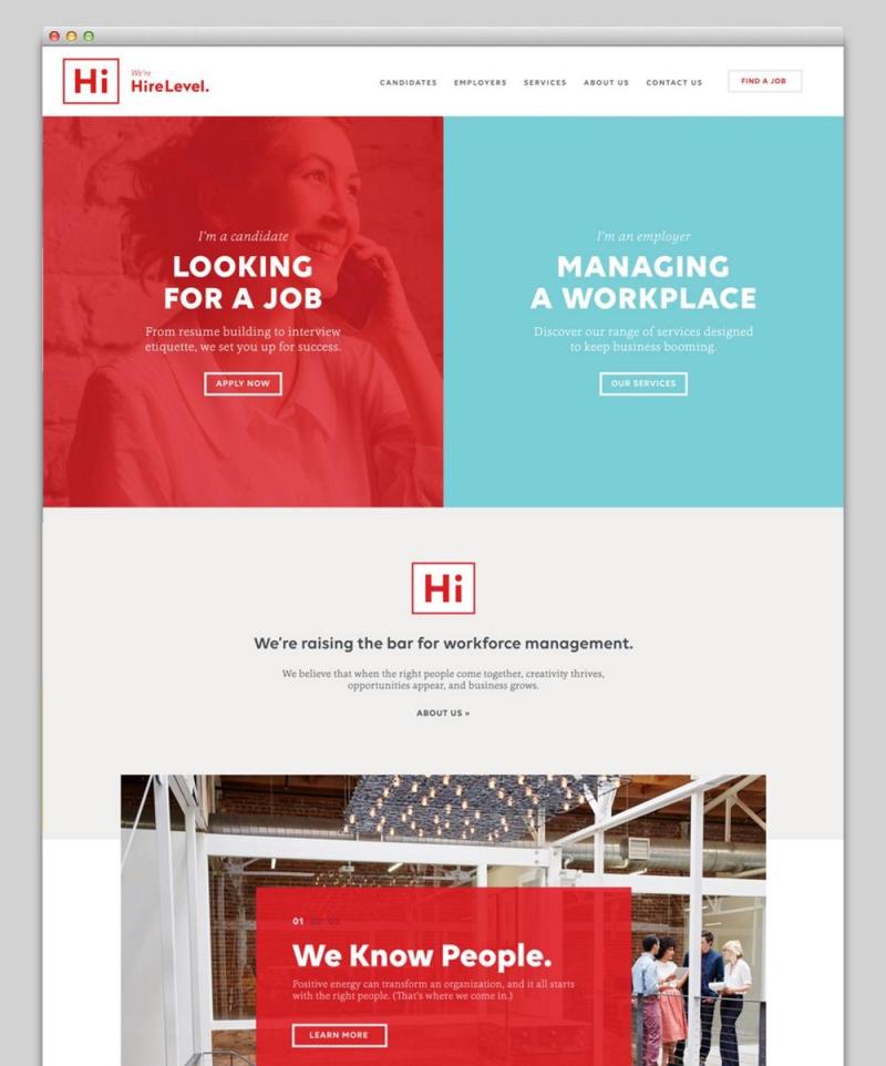
5. High Contrast
Why do it:
When you are able to make things easy to see through things like using a light background and dark text, or a dark background and light text, it helps people not to have to strain their eyes when looking at the content on the site.
This is why many high-end designers have decided to move away from using overlays on photos as often as they did in the past. Now they are moving towards shapes and cutouts to place the text on backgrounds beside those photos. This makes it easier to view the text and doesn’t sacrifice the visibility of the images.
This doesn’t mean that you shouldn’t have text overlaying an image, but when you do, have the text and background be high contrast. For example, if there is a light spot on the image, you can use a dark text to have more contrast, and the same goes for if there is a dark spot on the image, you can use a light spot.
How to do it:
- If you are trying to figure out if your website has good contrast in place, a good way to do that is by looking at it through grayscale or black and white.
- Use organic cutouts and shapes for your text as opposed to overlays to make it easier readability.
- If you do end up using overlays, try and use 80% or more opacity of light or dark so the text comes across more visible.

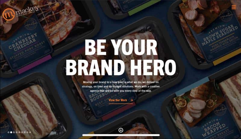
6. High-end Dramatic Photography and Videography
Why do it:
Having images on your website is crucial because it is one of the biggest factors in capturing your visitor’s attention. Having great copywriting is great and will really help in other areas, but if you are looking to capture someone’s attention instantly, an image is going to be your best option.
A big part is because people respond to visuals instinctually and is actually a better and easier way for them to absorb information faster. Whether you have a close-up of a product or a wide-angled and more dramatic drone shot, the visual element is oftentimes going to be the first thing that people are drawn towards.
Having photography and videography is a good first step, especially if it’s original. However, the quality of that content matters and speaks volumes to the quality of your service and can say a lot about the quality of your service.
How to do it:
- Use tight angles, symmetry, and “the eye of professionals” to capture interesting and better-looking images that will create more allure.
- If you are selling a service, find what the most emotionally evocative moment in the buyers journey and share that emotion through visual storytelling.
- When you have photos and videos, you should always try to use original if you can. Yes, not everyone can afford high-end videography and photography, but when you can, you should apply it to your top earning products and services.

7. Big Copy… (+copywriting principles that complement design)
Why do it:
So many websites these days are filled to the brim with text because people are scared they won’t get their message across. If you can summarize your message down to the key points, make it super short, and then make that text huge – you’re going to do well.
This helps people know what they should be focusing on and takes away the distractions that aren’t necessary.
How to do it:
- For your headlines, make them short. When you have shorter headlines, you are able to bring up the font size and bring attention to the things that matter.
- If you don’t know what you are doing with design, bring a designer into the discussion and discuss the copy that will be on your site, and how you can get the most out of it.
- Encourage your designers to learn and level up their copywriting skills so they can make headlines that not only work but look good in the design process.
Conclusion
Using these high-end website design principles will help to improve your website and improve your website.
Also, don’t feel like you need to implement all of these at once, or at all. Everyone’s business is different and some things that may not normally work for other businesses may be working for you, so take that into account as well. But just remember that this list wasn’t just pulled out of thin air and these principles have been proven to work and can be valuable to your business.