Out with the old and in with the new – Web Design Inspiration 2017!
If you’ve been following this blog for any number of posts (or years) it’s often about web design inspiration, but time slows for no man, and this web design inspiration 2017 list is intended to get the juices flowing for what will be your best year yet in your digital marketing efforts!
Some web design inspiration 2017 elements that might work their way into your designs?
- Full width photographic elements with angles for transitions to flat color sections (see the first site for an example)
- Angles in general on the full-width elements
- Gold on dark, and gold on white
- Transparent boxy elements overlayed on photos (see the second site for an example)
- Incredible attention to typography (Make them say this type is “so considered!”)

Mauna Kea – Adventure Sports
This page has mostly cold yet vivid colors give the website a peaceful feeling. The only really warm color in the website is the red of the woman’s jacket. This demonstrates that she must be an important figure, and makes her a focal point. Although the website is pushing the boundaries when it comes to design, the navigation is standard which makes the website user friendly. The menu’s small text buttons, separated by the logo in the center provide a great sense of balance.
The alternation from dark backgrounds to light (white) backgrounds combined with the use of diagonals (as opposed to straight, horizontal lines) give it a unique look. The website is definitely not “static”. The use of the diagonals definitely lead your eyes around the page. There is a lot of negative space used in the design, preventing it from appearing cluttered or overly busy. The fonts and colors used make the text very legible. The overall minimal layout of this website makes it visually pleasing and emphasizes the importance of the content within the page.

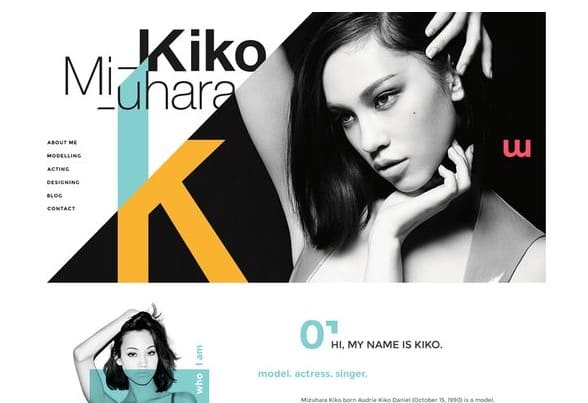
Kiko Miuhara
The soft shades of primary colors behind the grayscale images really makes them stand out. The distribution of color is attention grabbing, but doesn’t draw you away from the text completely. A standard sans serif font is used which makes the text very readable. The placement of the type is spaced out nicely, surrounded by a good amount of white space, so it doesn’t look cluttered. The menu at the top left of the page is standard making the navigation process easy. The alteration of shapes on one side with text on the other keep your eyes moving around.
The sites header is quite large, making it the main area of focus, which isn’t necessarily a bad thing. The letters “K” and “M” in the header stand out the most because they are the only areas that are colored. The emphasis on the models initials may be important I suppose, and the color used does make this an interesting design element. One thing I don’t understand is whether the colored “K” or sideways “M” at the top or the “K” or upside down “M” at the bottom are all logos. I think she needs to find a logo and stick to it. In this website I’m seeing three, maybe four different logos. The footer could use some work too. It just repeats the letters and is tiny compared to the massive header. And the Chinese text in the footer is a bit confusing too?

Acolytes
Okay, I’ll admit that I have no idea what this webpage says, but the layout looks very nice to me. I like the alteration from text on left and picture on right to text on right and picture on left. It forces your eyes to move throughout the page. Assuming that the images aren’t totally unrelated to the sections, they work well. The subtle gray to white gradient backgrounds look good with the black text. They chose a light enough gray for the text to remain readable.
The large, bold headers for each section are positioned well and I like the Sans Serif font they chose because it doesn’t look too spread out or condensed (proper kerning). Bold subheads are good, but what I don’t like is that all of the text (apart from the headers) is italicized. In my opinion, italicized type should not be used for an entire body of text. Italic type is generally used to call attention to a specific area of text or emphasize certain words. Overall I feel that it is a nice site though. There is plenty of white space or “negative space” which prevents the site from looking cluttered or overwhelming. The amount of content within the site is enough to inform without making the viewer feel like they are reading a novel.
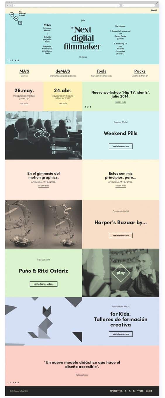
Next Digital Filmmaker
Ok, just by coincidence I stumbled upon another non-english page, well, mostly non-english. The site looks pretty sharp at first glance. I like the soft pastel colors they chose. They used interesting photographs which are laid out well.
Now let’s talk about the text a bit. The font is very readable, but I feel like the placement of the text is very “scattered” and inconsistent. I’m also not a big fan of centered text, unless there is a good reason for it to be centered. All of the bodies of text on this page are centered for no apparent reason. Just keep it left aligned unless there is a good reason not to! Centering all of your test makes it look awkward and in my opinion, shitty.
As far as areas of color, whitespace and images, I’ll give this site a thumbs up. But the arrangement of text gets a thumbs down. And where the fuck is the navigation? Are those boxed in words buttons? I would have to drag my mouse around waiting for the cursor to become a hand in order to find links, or, maybe there aren’t any links… I don’t know, It’s in Spanish.
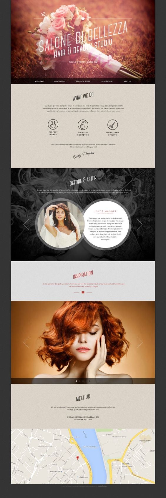
Salon Di Bellezza
This is an example of good web design. Beautiful Header image, clear navigation, great use of negative space, clearly defined sections, stunning images, nice fonts, great color choices, etc. Also, not an overwhelming amount of information which would clutter up the page and deter the viewer from wanting to read any of it. I don’t know about you, but if the amount of text looks like it would take more than about 45 seconds to read I’m like “Fuck this!”.
One thing I am usually not a fan of is centered text, but I can’t necessarily say that the centered text doesn’t work here. In this case there is very little text and each body of text is centered on the page. This keeps your eyes focused on the center of the page and not wondering all over the place. The entire design of this page is centered, so the centered text makes sense.
I like the fact that they have used large arrows as well as buttons in their galleries. There is definitely no confusion as to where the gallery is or whether there are galleries in the first place. The use of a thick black border (which also serves as the footer) keeps your attention on the page, not wandering to other areas on your screen. The grainy, tan background is soft and a nice change up from a standard white or black. The large angled text in each section of the page saves the viewer from any confusion as to where one section ends and the next begins. My one issue with this site is the huge map at the bottom. It definitely takes away from the beauty of the page as a whole. But overall, I think this is a very nicely designed website. Way to keep it simple!
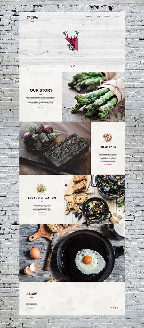
Ce Soir Restaurant
This website is kind of irritating me at the moment because it just made me realize how hungry I am. I want that asparagus! I want that egg! Very outstanding images which do exactly what they are intended to do I would assume, which is stimulate ones appetite. Like a lot of websites are, this website alternates images on the right and text on the left with images on the left and text on the right. The white painted brick background is a unique choice. I imagine the restaurant to be an upscale, health conscious type of joint, probably in a unique old building which has been renovated several times. But then again, I might be totally wrong, in which case it would be a misleading design element.
The headers for each body of text are large and bold which make it very readable. The bodies of text under the headers are definitely not easy to read though. The text is very small and the font does not work well, at least at that size. And like so many other sites, ALL of the text is centered. But the arrangement of the text is irrelevant if it can’t be read in the first place.
I also like the minimal use of the color pink in the site. It really emphasizes certain areas, including their logo. And finally, their logo… it it way to complicated and IT’S A FRIGGIN DEAR’S HEAD! Even if they happen to serve a lot of dishes containing venison, this logo is garbage. But I’m critiquing websites, not logos, so I’ll shut up now.

Vinto – Creative Portfolio
I like the use of repetition with the diamond shapes here. Black, white and red is a favorite minimal color scheme of mine. I don’t know how I feel about the color photo of the woman in the center of the page. I think that if she were in B&W as well, it would not only match the rest of the color scheme, but provide a “retro” sort of feel which might be cool. The white space used works well. It emphasizes what needs to be seen on the page. The subtle top, horizontal navigation looks nice and simple to navigate. It looks like there are two menus at the top though, one main navigation and one for areas of the portfolio. Perhaps the portfolio menu could be in the main navigation as a drop down or something… I just don’t know how I feel about the two navigation menus, both at the top of the page. And the contact area at the bottom of the page is HUGE! Perhaps it wouldn’t look as balanced if it were smaller. IDK, I’d have to see it I guess.

Uniq-X Unique Template Design
The images are the first thing I notice on this page. They are clear and colorful and look quite nice. The site looks very classy with the exception of the set of photos in the center (the creepy clown, the goat, etc…). It looks like a really nice, classy site with some kids shit thrown in the center. The pastel colors don’t seem to match the rest of the page. I think there would have been a better design solution for these images, rather that throwing them in the middle of the site (literally like half way down). And that clown… Ugh!!! It looks pretty psychotic. In my opinion it should go, or at least be replaced with an image of a more pleasant looking clown. The images combined with the text do a good job of leading the eyes from one element to the next. Got no issues with the standard, up top horizontal navigation. I prefer simplicity when it comes to navigation. There’s no reason to get experimental with menus. Keep it simple and user friendly, like this site does.
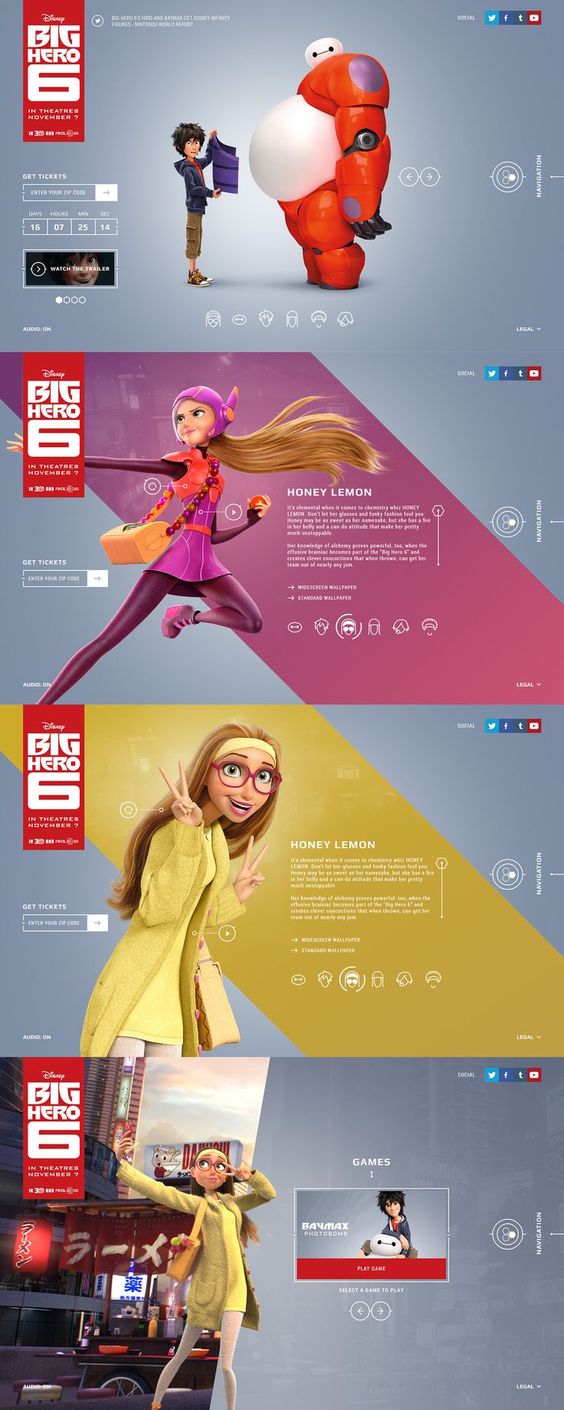
Disney’s Big Hero 6
Sweet anime! I like the distinct sections (4 of them) which make up the page. The colors are great and will definitely want to make kids check this out. The pages have a right hand navigation which may not be the easiest to follow, but I’m sure most of us could figure it out. I love the icon buttons for the galleries. I like what they have done with the scroll bars I think that’s what they are next to the bodies of text). I don’t see custom designed scroll bars too often, pretty cool. The white sans serif font is pretty legible and works well with the rest of the site. Nice futuristic look, but may be a bit complicated to navigate for the computer illiterate or young children. It is a fun website though which can be enjoyed by all ages. Good job Disney!

Carsonified
I love science, so I was drawn to this website right away. How can you not be with those sweet illustrations on super vivid colors? The dashed line with the scissors (to make it look like coupons) is an awesome idea. I haven’t seen that used yet, so to me it seems like a great original idea. Perfect, clear place for the navigation (upper right). The highlighting of the active ensures that one will always know where they are in the site. Getting lost in websites is a pain. If I have to use that default, browser back arrow the designer did something very wrong. But that’s not the case here. This website is successful on many levels – visually, functionally, legibly… And there is enough negative space to prevent it from looking cluttered. It is a very fun website, but doesn’t lack a seriousness when it comes to promoting their business.
We hope you enjoyed this “Web design Inspiration 2017” collection – and I don’t want you to flit off unless you’ve seen some other places we like to get inspired for web design projects.
Consider tapping these web design inspiration resources as well!
The number one thing I’d think about is that ‘nothing is original!’ so take elements that inspire you and apply them to anything you’re making. The number one most important thing is that the design does it’s job! Whether it be selling a product, an idea, or a cause.
The distinction between art – and design is the function of design is not merely intended to entertain, or stimulate. The function of design is to accomplish some specific goal or end. If you create a beautiful and stimulating visual piece that accomplishes no other goal than to be beautiful to look at, it’s still wonderful – but it’s more art than design. That doesn’t mean there aren’t artistic elements in design – and these pieces curated prove that!
Bonus! 3 Amazing Websites
These websites blew me away with their inspiring layout, friendly interfaces and cohesive user experience. For my benefit and yours I will touch on what makes them so effective, incredibly beautiful, and unique.
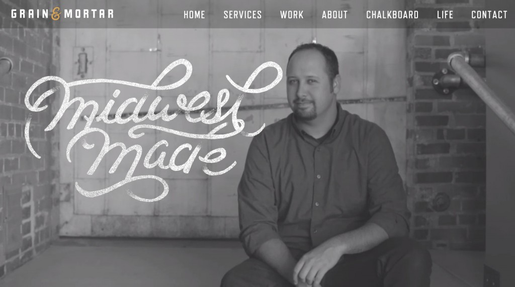
1. Grain & Mortar Digital Agency
Well, of course a digital agency would have an almost sexually appealing website. I’d say that with the SVG/Vector logo in the header giving that expensive feel, the half-desaturated darkened background photo, and the black and white +1 (Gold) color scheme, this site has my heart from the beginning. I can tell that this agency is committed to visual taste because of the emphasis on space, typography, and supremely well-done illustrations.
Check out this screen shot of (hand-lettered and vectorized?) typography over black in white video.
Actionable for our future designs:
If you are not already, take note of well done full-width videos. Consider using them when appropriate. I rave about this site really not to say that it’s a conversion centric website, but that the visual appeal level is ridiculously high. For a conversion centric site, consider adding a call to action over the naturally magnetic video in a place where key elements of the video are not covered up. Since this is a design studio, it’s understandable that visual appeal is completely central throughout.
Add highly thought out typographic elements to draw attention to central ideas. Perhaps you can’t add hand-lettered elements to every heading on the website, nor would you want to, but I believe hand-lettered elements when pain-stakingly hand-crafted are wielded thoughtfully, they increase visual interest and a strong sense of the hand-made. (In the digital sense.)
In the attention to detail category: Very subtle CSS transitions can be added to give a little luxurious touch. I think this is something a lot of designers are already employing, but I think the key here is subtlety. Check out Chris Coyier’s article on CSS Tricks about CSS Transitions And use a .25 second transition on hover effects like Grain & Mortar’s Work Page. It might be tempting to use this at a slower pace to make it more dramatic (say .5 seconds) but it feels a little juvenile at that point.
Example from their website
.transition {-webkit-transition: opacity .25s ease;

transition: opacity .25s ease;}
2. Just a Reflektor – (Arcade Fire)
Lets Just say this site had me dancing. It’s really hard to describe what the experience is without visiting it. You connect your desktop and you phone and the effects on the video respond to your movements.
Actionable for our future designs:
I think just the connection between mobile device, and computer at the same time is key here.
Once again, its hard for me to convey fully this without you experiencing it, but incorporating the response of the person using the site into the site interactively is going to bring us into the future. This speaks to the whole smart-devices movement and is a bit playful at this point, but could be used for some seriously useful interactions down the line.
3. Web Field Manual
– By Jon Yablonski
This designers’ work is beyond inspiring, and the look, feel and content of this site should be a reminder to almost every web designer out there that ‘they are not there yet,’ and to keep learning.
Actionable for our future designs:
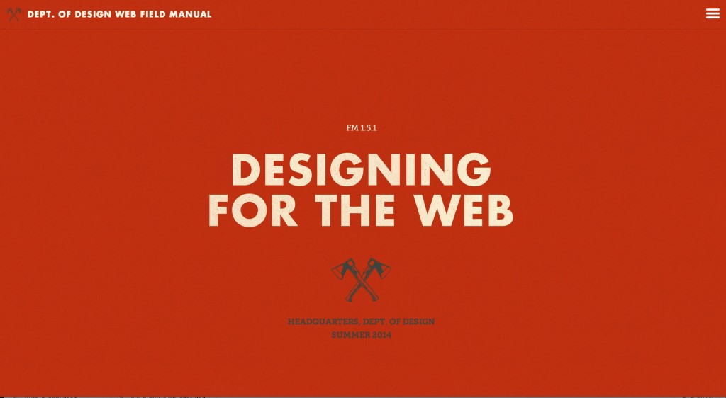
The one color texture background with a main heading, illustration and sub-heading gives a cohesive picture of the website is about, without getting in too deep just yet. The visitor to the site may not care about much, so a common thread in design here is baiting the user with just a little bit of text, but not so much yet that they’ll have to ignore some of it to move on.
The subtle CSS transitions while vertically scrolling lead the user down the page and on to the next part of the content. I’m struck by how this design was probably never highly developed in photoshop, but seems as though it was natively developed in browser and in code, because of it’s general use of sophisticated developer-centric techniques. Not only does this increase the innate native feel, but it allowed him to use texture on his typography but still allow the headings that are using it to be seen by Google.
The really centrally shareable part of this site is the epic content, and that is why this site serves as such a beacon of light towards the future of web. The designer integrated everything he knows about the best practices of web design, laid them out for people to see and design really just complements that excellent content. The key takeaway here is that even with unbelievably cool design, people are only going to share your site if it has seriously interesting content.
Honorable Mentions (I considered putting these in here but refrained):
Coulee Creative – Design Agency
Jim Basio – Design Portfolio
Square – Payment System


