
Technology companies often have the most fun when it comes to their website designs. They have A/B tested them, analyzed the heck out of them, and come up with the most effective solutions for their situations. So if you’re looking for places to get inspired – technology company website designs may be the best bet!
In this article, we cover Slack, Asana, Quickbooks, Stripe, Salesforce, and Drip – companies who live and die by their digital products, but FIRST – they have to get people to TRY THEM. Meaning if they can’t convert someone through their website – they’re not likely to grow their revenue, making the design insanely important for the companies long-term success.
Great places to look for good design.
1. Slack
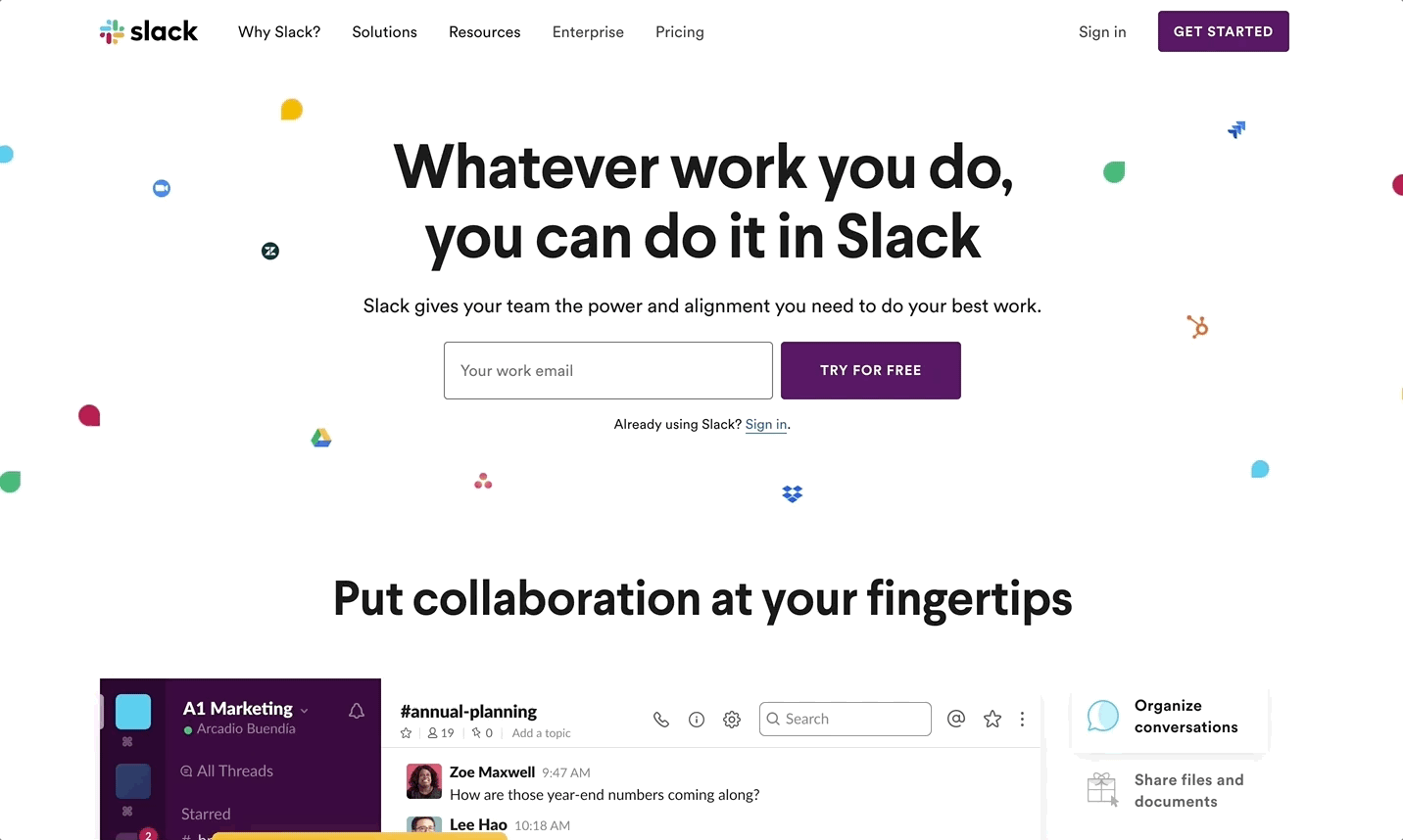
Slack isn’t just the most popular business chat tool – their marketing is also incredibly potent.
Who would’ve guessed!
These tech companies
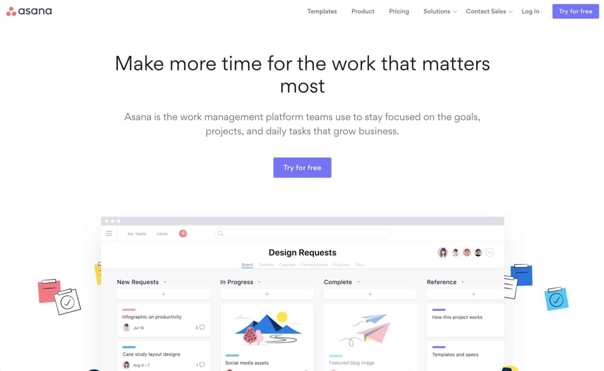
2. Asana – Messaging is everything.
By getting under people’s skin – Asana is catching their ideal customers attention.
Notice how they are appealing to leaders, mentioning that their time is what will make them most likely to purchase a system like Asana, and offering a free trial, as they know freemium users are a powerful way to get people over the hump, or anxiety of paying just to try a product that they might not use.
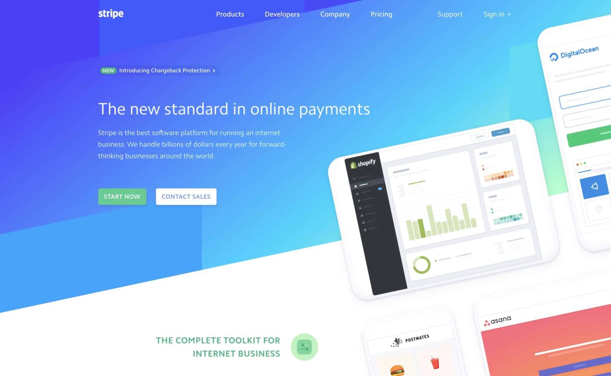
3. Stripe – Key featured companies, gradients, and geometric shapes
Stripe went ‘design-forward’ on this site, and uses these white mobile mockups juxtaposed over an angled hero with geometric gradients, giving it a fresh and bright and airy look that puts many other payment processor companies designs to shame?

The best part about innovative design is that people can’t help but see you like the most technology-forward of all of your competitors just at a glance. Of course, your products and systems have to back that up, but in Stripe’s case – at least people are going to be more likely to try you out if your design is striking and getting started is super easy on your website.
4. Quickbooks – Always testing, always innovating their website design
The old Quickbooks site had more video, and pushed a deal right away – as well went over specific verticals with the imagery that it showed.

The new Quickbooks.com pushes products instead, and I applaud Quickbooks for trying different things on their website on a regular basis to understand what works in the real world.
They are still pushing deals, but they played down the video and pushed on benefits for everyone instead of trying to go after contractors or specific verticals. Either way – if you check out Quickbooks.com in another 6 months from writing, it will likely have a different style.
If we all tested our website as much as Quickbooks does, I think our sites would be better for it, because every time you find another component that works well and incorporate what you learned into the next design.

5. Salesforce – A Well thought out footer design that instills trust

If you imagine that Salesforce has enough money/capital on-hand to A/B test their website footer to make sure it’s the most likely to convert possible design – you’d be absolutely right.
I am a footer fan.
I absolutely love when companies spend more time on their website footer, because:
A. It’s a component that shows up on every page, giving it much more visibility than almost any component, except perhaps the ‘header’ of the site.
B. Because it’s so common, things like Salesforce used to create trust (awards, write-ups, testimonials) can then be shown around the site, and get a lot more visibility. Rather than just putting these elements on the homepage and thinking everyone is going to land there, put them in universal components that get shown all over the site for more play.
For more gorgeous website footers, check out our post – the Website Footers Hall of Fame.
6. Drip.com – (Previous Design)
Ridiculously good-looking redesign and imaginative parallax effect over at @getdrip https://t.co/udvwzWMe20 👌👌👌 pic.twitter.com/N05b4IFhHx
— Hook Agency – Home Service Marketing (@HookAgency) August 7, 2018
I love how imaginative this design is – press play on the above tweet to see the awesome scroll effect Drip implemented, that almost has a double/triple vision – or like you were looking through 3d glasses. Along with the messaging, this effect really was impactful for me, when I saw it in 2018.
Overall, technology companies often do website design right
So if you’re looking for cool, innovative styles – it’s a great place to look.
However, as this last example indicates:
- Just because it looks really cool, doesn’t mean it’s actually effective at getting the result you want – use discretion, and your conversion rate as guiding principles, not Awwwards.com (a website that features innovative designs, that probably rarely get actual results.)
- Very fancy javascript, huge images, and crazy effects often are a massive load time, so even though companies try them out – the smart one’s usually downgrade to something that’s still cool, but takes less time to load.
- Heavy loading sites also have a negative effect on SEO, so you should be careful to blend beauty and speed.
If you are going to go with some parallax effects or really high res pictures, make sure to use caching and other page speed optimization tools and tricks to get your site below 2 seconds or suffer a possibly fatal blow to your rankings in Google search results pages.


