Real Estate Web Design Inspiration for your enjoyment!
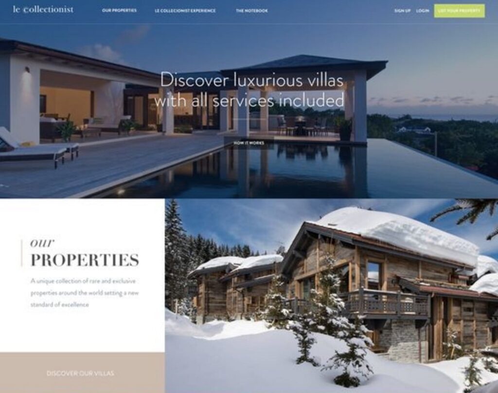
Le Collectionist
If I had the money I’d be on the phone with these guys right now! These are beautiful pictures that just give you a cozy feeling. Every one of these residencies is my dream home, or perhaps, dream vacation home. The website is very elegant and shouts the message “We will find you the house of your dreams”. Web layout is extremely important, but without pictures that make the residencies desirable to potential clients, you got nothing! But the layout of this website is great as well!

Starting with the small logo in the upper left – it is exactly where it should be and it is not overwhelmingly large or bright. Then, there are two menus which is great in the case. The first menu (to the right of the logo) appears to be strictly informational, with just three simple options to choose from. The second menu is also to the right of the logo, but all the way to the right of the header. This menu is an action menu, also with three options. Keeping these menus apart clearly expresses the message that they are for totally different purposes. One very important element to menu number two is that it emphasizes the “list your property” section. This is done in order to call your attention to this section of the menu, because it is the most important action they want you to take. This is a very important thing to do.
Like a lot of sites I have seen recently, the photos have dark overlays which allow light colored text or other lighter images to be placed on top of them. The dark overlays help the images to appear as more of a background image and make the text significantly more readable. The fonts used are very elegant and seem to work very well with the overall aesthetic of the page. Great colors used. I really like the sort of earth tone green used with the light lavender. Very soft colors and pleasing to the eye. The whole site makes me relaxed, especially when I see that second picture which is destined to be my future vacation home in the mountains!

Sotheby’s International Realty
This is a pretty well designed site. I like the fixed header and the video footage. I’m not exactly sure if a video gallery is necessary on the home page, but the footage is beautiful so I’m not slamming it. The menu is easy to read, in a good spot, and there aren’t an overwhelming amount of actions involved – just properties, destinations, lifestyles, blog and professionals. There is a sign in button on the right side of the header which I suppose could be a call to action, but it isn’t very vivid and eye catching. I’m not sure if that is the main reason for this site, to get people to sign in, but having that button over there makes it seem important.
Another thing I like about this site is that it is easy to navigate. You don’t ever have to resort to using that default back button that is built into the browser. I also like the simplicity of the site. It is just beautiful images on a white background. It doesn’t look cluttered and there aren’t all kinds of unnecessary fancy effects, well, other than a parallax an the home page gallery which I wouldn’t consider “overdoing it”. For a real estate site this is really well done, which I can honestly only say about 1 out of 20 real estate pages. Get a quality web designer realtors! Contact Tim B. Design for God’s sake!!!

Realty One Group
This site has a good color scheme. I like the golden/tan/white/black sorta thing going on. It doesn’t look like a pack of Skittles which is cool. It looks classy! I like the alternating sections, something very popular these days. The menu is in the header on top and is simple. It has four options with sub heads that drop down. It’s super easy to navigate and you can always find your way back to the page you were at before. I like how the home page has a huge call to action right smack in the middle of the page – “Find Your Home” with a search engine and some options. Looks pretty easy to use, even for those who aren’t very internet savvy!
The images on this site are very positive. Lots of people smiling and in love & stuff. I think this is great! Newlyweds are a huge target market for realtors. But this site doesn’t target newlyweds exclusively. There is one page that has black text on very dark images which could use some fixing, but other than that it looks pretty nice!
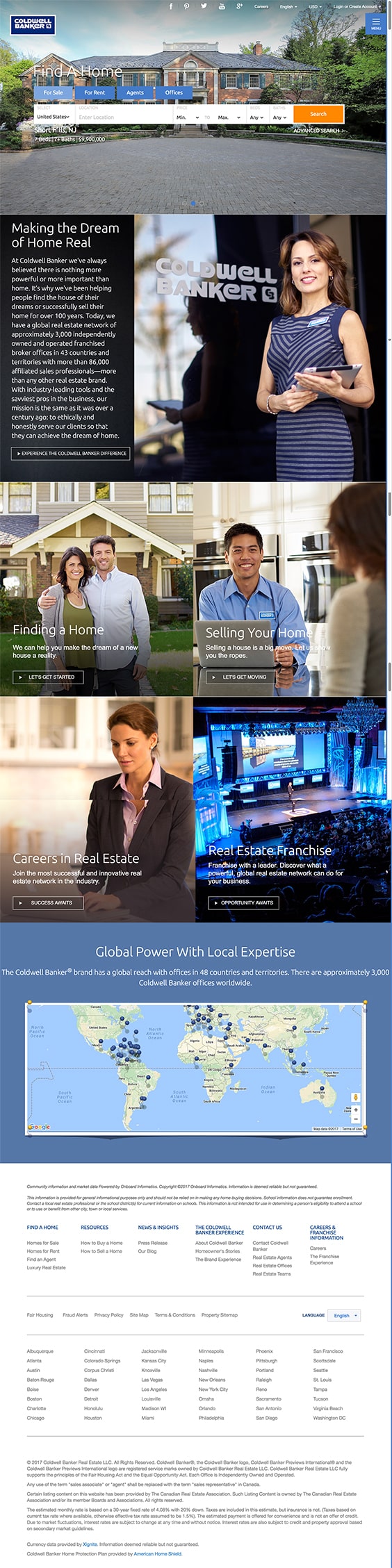
Coldwell Banker
I’m not surprised that Coldwell Banker has a nice site. I like the images and having the search engine right smack in the middle of the page illustrates the importance of taking an action. There is also a more subtle menu that folds out from the right with some of the same buttons that are in the middle of the page, and a couple different ones. The site is easy to navigate and includes links to their social media pages, which is very important.

This site is very user friendly. There are different pages to the site, and a lot of information, but each page is laid out in a tall scrolling fashion which has become almost universal in all professionally designed websites. It is easy to find exactly what you are looking for here. There aren’t a whole lot of interesting design elements here, which is just fine for a real estate site. It’s just beautiful images arranged in sections with legible type and plenty of calls to action. And if anyone is having trouble locating exactly what they want to find, they can resort to using the footer for navigation. Functionality is key, and this page is a great example of that. Straight to the point using great imagery. No crazy animations or Parallax effects. I think that any client would be satisfied using this site, as long as the search engine works well, which I’d assume it does by the look of things.
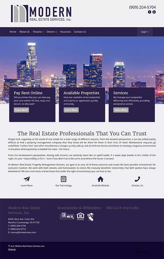
Modern Real Estate Services Inc.
I like their logo, simple and it would work in B&W too. The header has a lot of white space which is ok, but the phone number and social media links (only two of them?) look kind of jammed into the upper right. Give this info a little breathing room for fuck sake! And get some more social media accounts. Having two makes it look like an incomplete menu, but more importantly, they would probably get more business if they were marketing on more platforms than Facebook and LinkedIn. The menu is in a good spot and is easy to navigate. They could lose the home button though. A good percentage of the people using the site will probably know that clicking the logo will take you “home”, and for the rest, they can use the browser back button. There is no need for home buttons in this day and age. There is a twitch in the menu when you click vacancies or contact and that’s kind of annoying. And having three call to actions that just say “learn more” seems kind of pointless. I feel like these sections (pay rent online, available properties and services) could be worked into the main menu, perhaps in a sub menu drop down style thingy. They should go with one main call to action, not three.
What I like about this site is the colors, the images, the easy navigation, the obvious calls to action (although having so many makes me wonder what the most important action to take is), the basic layout, and the fact that there aren’t a bunch of crazy animations or advanced design elements (real estate doesn’t need to be all artsy fartsy). It is clear that they are here to do business, and they’re not resorting to unnecessary means to win people over. That kind of shit really just makes a real estate company look desperate. Save the animations and advanced design stuff for your portfolio site, if even that! I feel like in some senses web design is getting away from complexity, and in other ways getting more complex with reveal and parallax effects. I suppose it depends on the what the website is about. It can be fun and make things interesting I guess, but it is used unnecessarily in so many places. This site does not do that, which is nice.

Brix Real Estate
As usual, I’ll start at the top with the header. Nice logo & nice menu, exactly what you need in a header. It doesn’t hurt to have social media links, but personally I think the footer is a better area for them. The header fades out then back in at a slightly different size as you scroll down which isn’t a huge problem (didn’t even notice it the first time I scrolled) but it would look nicer if it either remained fixed or didn’t. There is also a little movement of the menu when buttons are clicked, like a twitch, but not too noticeable. The video clip loops are really nice looking and relevant. The large call to action buttons under the video area serve their purpose. It clearly states the purpose of the site – to search.
Go a bit further down (under the call to actions) and you have a featured listings area that looks very nice, but when you roll over it all the images pop out and resize. Like I have said before, I’m not a fan of these effects when it comes to real estate sites, but it could be worse. I think it would look just fine without the enlarging on rollover effect. There are a couple sections underneath that that look good. An image with white text over it which is easy to read. A bit cheesy and stock photo looking, but not too bad. I don’t know why there are 2 sections way at the bottom – building guide and neighborhood guide. Maybe these are not important…? Just curious as to why they are way at the bottom, just above the footer.
Nice site though overall. Visually pleasing, easy to navigate, call to actions, good use of white space, etc… With a few minor tweaks I feel like this could be a perfect website for a realty company.

Thank you for checking out this post for Real Estate Web Design Inspiration. Feel free to check out my Real Estate Web Design Services, and let me know if I can be of use to you!


