Fonts in logo design are not always easy to get right.
It requires a bit of research about what a client wants their logo to express, and then a deep understanding of typography in general.
Here we’ll broaden your perspective by looking at fonts in specific logos in the wild as well as examples of possible application.
1. Gotham
Gotham always comes up in my font posts because I love it. I love it for body copy, and I love it for logo design. It’s style is universal and therefore can be ubiquitous. Whether it be in branding and logo design or the label in your urinal. It’s strength shows through particular in the boldest versions of it where the letterforms have a precision and clarity that is unparallelled amongst even your classic helvetica, or the modern contender Proxima Nova. I believe the Gotham family is the absolute best font for logo design, and was confirmed in that by my poll of the best fonts for design in 2015. You can buy Gotham here.
[bctt tweet=”“Drumroll Please. And the award for best font for logo design goes to… ””]
Here are 3 examples of Gotham in the wild in 3 logo’s:

2 & 3. Futura & Absolut Script
Futura has a classic strength to it. It clearly is used for high-end branding elements, but doesn’t seem like it’s associated with any one of them too closely to gain it’s own connotation with your project.
Though the Nike logo is a modified version Futura Bold Condensed Oblique, “Just Do It,” uses an un-modified version, and Absolut Vodka and Dolce and Gabbana are both using versions of Futura as well. This font is in an incredible amount of logo’s so it wasn’t hard to find some solid one’s here. You can buy Futura here.
*Sorry to tease you here, but the script in use on Absolut Vodka’s logo is a custom made font. If you need to start making your own fonts you could try my Crash Course to handlettering, or check out some other bad-ass script fonts that I made a list of here and here (2015 updated version).
Here are 3 examples of Futura in the wild:
I use Futura as supporting elements on a couple logo’s I’ve done, check out my featured logo designs.
4. Brandon Grotesque
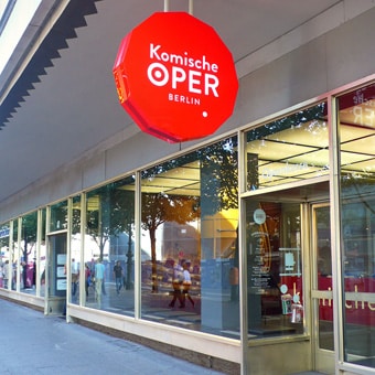
Brandon Grotesque is a bit newer so there’s not as many super famous brands using it, but it does have a classic quality and a certain class to it, that lends itself well to branding and logo design. You can buy Brandon Grotesque here.
Here are two examples of Brandon Grotesque in use in branding:
5 & 6. Matchbook & Fournier
Both of these fonts have unlimited potential. The design of Matchbook was done by someone I follow on the graphic designer social network Dribbble. You can download Matchbook here.
Fournier is an incredibly classy looking font that doesn’t get enough use in my estimation. In this case I used it as the tagline font in this logo design. You can download Fournier here.
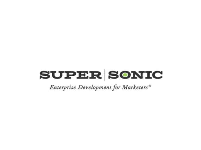
This design is my own, but I think that Matchbook could have many applications including technology logo’s, and more artisan shops as well.
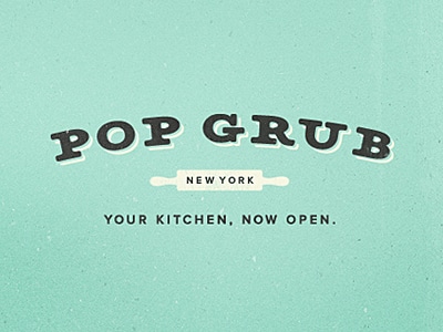
Here’s another designer’s use of Matchbook in branding.
7 & 8. Montserrat & Avenir
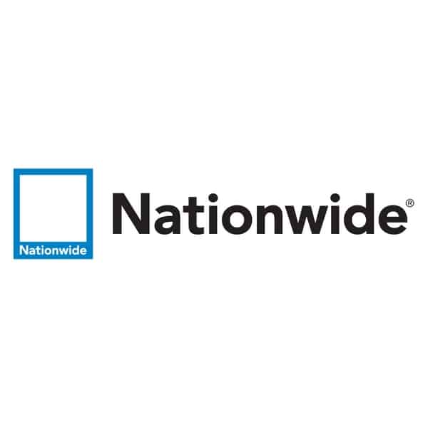
My logo uses Montserrat in the “Tim Brown” part so perhaps I’m just partial. But this font is great for high-end looking elements in all-caps. Avenir is used in the Nationwide logo below as well and has a similar feel to it, although it’s been around longer and overall is very solid.
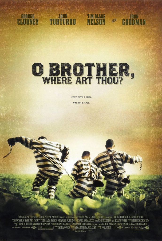
9. Brothers
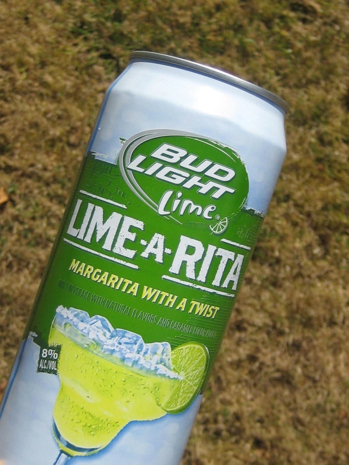
Brace yourself, here comes an example of ‘Lack of Typographic Imagination’ with the Brothers font being used in ‘Oh Brother, Where art thou,” film poster. This is referred to as “LTypl” a play on Atypl which means picking a typeface because its name matches the content.
A lesser known brand using Brothers:
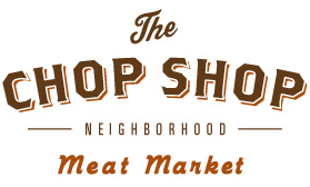
Overall I see a large number of brands starting to use this in promotional materials, such as menus and billboards. Prepare yourself world, hopefully, this beautiful font won’t get overused to the point of rendering it cheesy, like the font lobster.
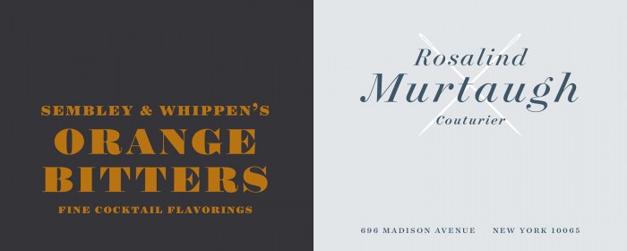
9. Surveyor
I don’t have a version of this in the wild, perhaps because it’s newer, but it is incredibly classy. Here is Hoefler using their own font in a design. You can buy Surveyor here.
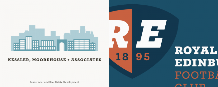
10. Archer Heavyweights
I must just really like Hoefler, because they recently released this gem and I can’t wait to use it when I get a chance. These chunky, solid feeling fonts would be perfect to kern nice and close together and get a wordmark that exudes confidence and solidity. You can buy Archer Heavyweights here.
[bctt tweet=”“One of the classiest font families for logo design of 2015 – Archer Heavyweights””]
3 Amazing Examples of WordMark Logos
Do you need some kind of symbol to give your logo/brand design an extra kick? Well… sometimes just focusing on the words themselves and creating an epic ‘wordmark’ logo can associate the company the logo is for with the high end.
I came across this beauty the other day and was struck by its balance, the feeling of completeness, and wholeness that it seems to demonstrate, with the T in tequila also crossing the A.
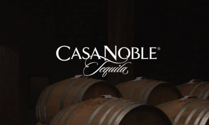
It’s hard not to assume that Casa Noble is really good tequila just because this high-end feeling wordmark leaves one assuming that the beverage is also high-end. Essentially the goal of most product-oriented logos/ wordmarks.
The wordmark for Ferrari has this classic look that seems to demonstrate it’s longstanding place in the market, and with the top of the F extending to the dot of the i, calls attention to the speed at which these cars move. It’s a magical wordmark that can actually indicate the differentiation of the product within it. Outstanding.
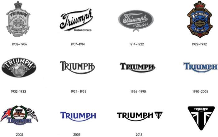
Triumph just recently re-did their logo and toned down some of the differences in letter heights.
Here is the old one side by side with the new one.
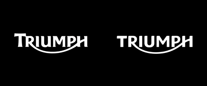
It’s hard to call it, because I absolutely love the old look as well and the swoop of the R seems to make more sense with a little bit more expressive letterforms.
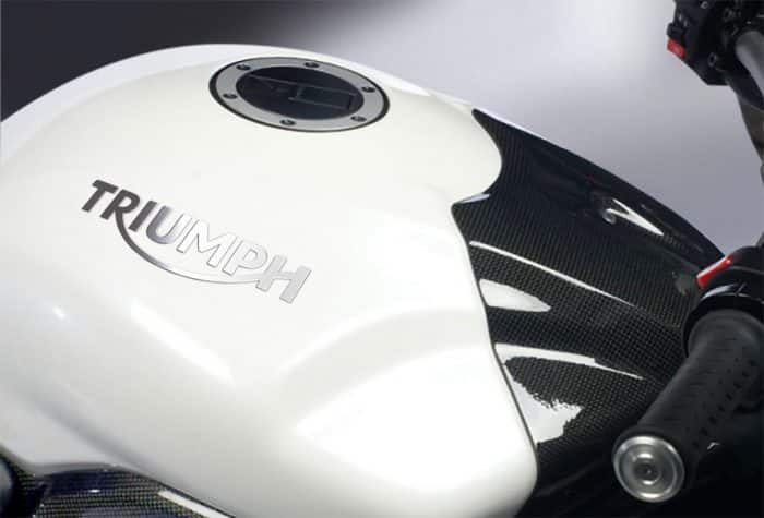
Seeing it on the product however, the new logo makes a bold statement and fits with the newer more modern motorcycle bodies that it is suppose to help represent.
Triumph has re-done their logo many times and as you can see, there is a steady evolution representative of the times. Brand is more than a logo of course.
7 Principles for Modern Logo Design
1. Keep it simple; your logo should retain its look in black and white.
– The reason: The logo should be printable on a two-color t-shirt or any product like that. It should be able to be used on a black and white design, or as a one-color design atop of something else.
– How to do it: By making the design so it’s all about the shapes and symbols that define it’s edges. Adobe Illustrator is great for working with the edges of a shape. Here are some of the basics to working with illustrator on logos.
2. Remove any gradients, bevels, or inner textures.
In this way you can create something that is compelling for it’s own merit, not for the fancy extras. Apparently, this is not common knowledge; I was just looking up resources to give a link to a decent tutorial, and it seemed so many designers (even Adobe’s tutorial!) was talking about how to do gradients, and use all of these tools that would basically ‘fill-in’ a shabby design. That’s not what we want to do.
– The reason: just as we want the logo to look good in black and white, we want it not too look completely different when simplified. If you’re relying on gradients and texture, you might lose sight of our primary purpose here; to create something that has a compelling outer form to create a bold yet simple impact on viewers. A symbol.
– How to do it: Imagine your final logo as if it needed to be a character in a font. In a font you can change the color, and the character remains the same. Use this as a guiding principle, and your design will be more iconic.
3. Use a well-thought-out symbol, steer away from the first one’s you think of.
(A light bulb for a consultant, a computer circuit for a computer company, etc.) It may not always be appropriate to use a symbol in your logo, you can rely on well thought out typography or what’s more commonly referred to as a ‘wordmark,’ but many times it will be appropriate to incorporate a symbol that will anchor in someone’s mind what the company is about.
– The reason: Because so many symbols are taken and used, we don’t want to get stuck using something that has been part of a million other logos.
– How to do it: Think about the subtleties of the product or service. Use analogies and determine if symbols related to analogies associated with the service are appropriate for use in the businesses’ logo. Take existing imagery that exists within the business’ space or language, and find a way to illustrate that in the logo.
4. Leverage the business owner, or other stakeholders within the business to help brainstorm symbols and characteristics.
Many times if you’re creating this logo for the business owner they will have some ideas.
– The reason: you may have the design eye that the business stakeholder does not, but often you don’t know their business inside and out. By leveraging that information you make use of an extremely valuable resource that is right at your fingertips.
– How to do it: Have them share those ideas with you in a brainstorming session. Make a list, and sketch ideas out. Tell them you don’t want to commit to anything just yet, but take your list and sketches back to your lab, and toil away for several hours, taking them to the next level.
5. Start on paper, and do your best to come up with solid concepts first, before doing detailed drawing or illustration.
–The reason: many of us tend to get attached to bad ideas when we’ve spent 5 hours perfecting the bad idea. This method allows you to define each idea, consider it’s merit with little investment and discard it if it’s not solid.
– How to do it: You don’t have to be good at drawing to get a rendition of your logo on paper. Is your design a bearded man knocked out of a circle? A side-profile of a smiling blueberry? A kite and a key? Feel free to find other illustrations on Google image search or what have you, of these items and use them for inspiration. Don’t copy, but for instance, in the case of the blueberry, it would be useful for me to see a picture of a blueberry so I could take not of what the top of the blueberry looks like, to make a proper illustration.
6. Once you have 3 solid concepts, move all 3 into illustrator or similar program and make a Minimum viable product on illustrator of all three.
– The reason: This method will help you stay away from being attached to any one of your design’s to quickly, and perhaps provide you with alternates if the business owner wants to try a different direction.
– How to do it: Take 15 minutes for each, blocking out the main parts on your illustrator file and be ok with imperfection. Allow yourself the necessary time for each natural phase, so that the design can grow organically. If this is your first logo job, of course, this would take longer, but give yourself a shorter period of time on this first ‘computer-centric’ phase so that you don’t get caught up in minutia right away.
7. Allow yourself to be the expert.
Remember, if you were asked to make a logo for a client, that they are looking to you to be the person to guide them in their decision. Designers often give a lot of guff about clients that are unknowledgeable, (i.e. http://clientsfromhell.net) but so many times when the design is finally squared away and legitimately good, clients tend to be more pleased for some reason. Weird.
– The reason: It’s our job to get them something they are proud of, and not to have them provide the strategy the whole time.
– How to do it: If you ask the right questions up front, you can get the information you need to make an informed decision and exploration of their logo options, and hopefully even vet out clients that have unreasonable expectations. Because in the end, ‘It’s always our job as the professional [designer’s] responsibility.’


