So you’ve decided you want to design a website from scratch? We can help you with this short guide – in 6 videos, we’ll show you the basics of website layout.
Each section will include a video that’s 15-20 minutes, and if you watch all 6 and follow along – you should ‘graduate’ the brief course with a website layout of your own.
Follow along with these 6 videos first – and then design your own creative layout after trying your hand at this guide first.
Quick Beginner Website Design Course
In this video, we’ll cover some standard practices for designing the website header including the logo and main navigation, and how to create compelling calls to action in the first section of the site, known as the ‘hero unit’, as well as some other important tips about visual indicators. In this example, we’re creating a site for a business that offers social media marketing services.
We’ll create a layout that’s clean with a clear way for people to navigate and easy to use incorporating text and images that help tell a company or organization’s story.
Possible Software Choices:
GIMP (free)
Adobe Photoshop
Adobe Illustrator
My tool of choice is Adobe Illustrator, but you should use what you’re most comfortable with.
Free stock photography:
In these tutorials, I’m using pic jumbo. Using stock photography is a great way to get either professional placeholder images or the actual images the site will use when it’s live.
Tip:
be careful of usage rights when choosing images that are going to be used for the final site design.
Begin with a Grid:
I recommend starting off with a grid. The grid is intended to create a balanced visual design. It’s helpful for making easy and accurate decisions for alignment of different objects on the page.
Download Grid:
1200pixgrid.com

Create a Header & Hero Unit:
To create a header & ‘hero unit’, start by blocking a section of the page out, to get the feeling of where content will be in the design.
Next, add a logo area and navigation links in the header. Typically sites will have the logo on the top left and navigation spanning across the top right.
Choose an image for the hero, and then play with filters/appearance so that when text is overlayed on top of it, it will be readable.
For this example, I’ve chosen a headline font ‘Geo Grotesque Bold’ for a headline font.
Following the headline, add some brief text about the company, or information that will be displayed in the hero unit.
To achieve readability, experiment with color and contrast, try adding a filter on the image to lighten or darken it, and play with color of your text until you feel like you’ve achieved the correct visual balance.

Clear Call to Action:
Create a call to action in the navigation to add visual interest to the primary action you want a user to take who is interested in your company.
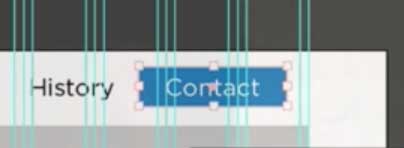
In this example we’ll highlight contact with blue. Blue is common and ‘trustworthy’, but choose a color that works for the brand.
In the hero unit you’ll commonly see two calls to action, one being more prominent and important than the other.
Initial takeaways:
- Make whatever you want visually in your tool of choice, but take note of what’s common in web design to use as guidelines and best practices.
- First is to learn what’s commonplace, and understand why it’s done that way. Then once you’ve got that down start to break rules and try to push boundaries.
Tips on Editing Your First Design
Text and Alignment:
In this tutorial we have a headline, paragraph and CTA buttons in the hero unit. Left or center align text when you have multiple text elements.
Limit the amount of text in the hero of the website. When someone comes to the site for the first time, be inviting and just give them an intro. You have an opportunity to expand on information on either the subsequent page they click through to, or in another section when they scroll down the page.
Space and Proximity:
Have some space around the text. leaving more space overall in your site will often give a more ‘high end’ impression. There should be a good balance between text size and the size of the button.
Visual Cues:
Try to keep the hero section from being so long that a user doesn’t see that there is more content below. A couple options to indicate there is more information to scroll for, is to keep the next section visible, or use a ‘visual cue’ like an arrow indicating that you can scroll.
Part of the job as a visual designer is not just to make things look good, but to be a bit of a psychologist and make things as easy as possible for the user.
Call To Action:
Choosing the appropriate call to action. What are the main things you want someone to do that is visiting your site, and relevant to the information you’re presenting in each content section of the page? If the goal of your user is to see examples of the work that you do, point them to your portfolio or case studies. If you are trying to generate leads, use the CTA to get them to contact you.
Consistent Styles:
Create something that feels cohesive using styling and color. For example, the border-radius and color choices for your buttons should be consistent.

Develop Your Own Taste:
Continue to tweak your design to your personal taste. Taste is developed with experience. It will take time to develop a style of your own. Some things like text alignment and other things are more rules and best practices to consider.
Recommended Reading:
Don’t Make Me Think is a staple read for anyone learning about usability in web design.
Listing Items, Shadows, Alternating Sections, Font Selection
Picking up where we left off before students work, we’ll continue to design the rest of the page, and consider what is the next set of important information to display following the hero unit, and some tips for standard practices for design that will highlight that information well.

Highlight Key Services or Information:
A standard practice on many site following the hero unit is to highlight a few primary pieces of information or services. For the example of a social media agency I’ve chosen 3 services.
Start by creating a box for each and align and space them evenly. Start with white boxes, and then add in some photography. We want to create a contrast between the background so I’ll darken this gray background.
Keeping up with web trends:
In this example, I use some drop shadows to help make the design pop. Shadows were out of style for awhile because earlier in web design there were a lot of more extreme uses of bevels and gradients etc. (skeuomorphic design) and then design went to more of a flat look. Now it’s popular again to subtly use shadows and transitions.
Image Selection:
The images you choose matter a lot, because these are key images in telling the story of your company or organization. The point is to help make a visual connection to the information being highlighted. In a later video I’ll cover icons that can be used in this space as well.
Fonts & Text:
It’s hard to master using a lot of fonts, so I recommend for beginners by starting with just 2 or 3 fonts.
Try to keep these short and introductory, just like the hero unit. You can write more about them farther down the page.
You want to get into the mind of the potential customer and think about what their goals are. So this is a good opportunity to quickly show the value propositions.
Increasing Importance:
I like to have a softer sell at the beginning of the page, and make a harder sell towards the bottom. if they read all the way down, that indicates they may have more interest that they want to contact you.

Alternating Sections:
For visual interest, alternate section backgrounds and font colors. A common convention is to alternate images, text and buttons from left to right.
You really want to be able to feature a good amount of content when it gets further down the page you don’t want it to be just images because you want there to be something for search engines to index and you want there to be enough information so that somebody can feel like they are being educated about the service so they don’t go looking for information elsewhere and discover a competitor.
Takeaways:
- Don’t overwhelm yourself trying to make typographic choices, stick to just a couple of fonts to work with, and styling those for their purpose on the page.
- Alternating styles using color and placement in each page section will help to distinguish the sections as well as create visual interest to the user.
How to Effectively use Icons in Your Interface Design
For this example, we’re going to turn our section highlighting the 3 main services into a carousel. Then we’ll utilize icons in place of images that we had previously chosen for our 3 information tiles.
Install Font Awesome:
Go to fontawesome.io and download the Font Awesome Font.
For our example on Mac, double click the downloaded file and click install.
Create a text box and then under Window > Type > Glyphs, and then change your font to Font Awesome Regular.
A bonus of using this font is that it’s easy for a developer to use.

Create Carousel Navigation:
Create an arrow button by selecting one of the directional glyphs. In our example I’ve moved the tiles closer together to make room for the directional buttons on each side. To better indicate that these are pressable buttons, add a circle around the arrow. For a nice balance
It should be obvious that it’s a button, obvious what the action is when the button is pressed, and large enough for a user to easily press. For mobile, that means at least 45×45 pixels which is the minimum as a guideline for size that is pressable on mobile.
My personal taste is to make the line thickness of the circle and the arrow shape the same width for visual consistency.

Enhance Your Call To Action:
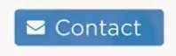
Another common use is an icon to add to your calls to action, like the mail icon to add to your contact button. In our example, increase the size of the contact button and add the icon in. Adjust the font size until it has good balance with the font size.

Save Time with Purchased Icon Packs:
A time saving hack, especially if you aren’t inclined to design your own icons is to download an icon pack. This will likely cost money for a good set, but it’s worth it if it saves you time that you can use for other valuable work.
In the video example, I have a pack that I previously purchased and downloaded. Choose icons that are most relevant for the service or other information being presented. The nice thing with these icons is that you can easily edit the appearance to match your branding.
A couple sites I like for icons:
Creative Market
Envato
Takeaways:
- Icons can help to create or enhance visual cues for the user.
- Depending on the style of the site, icons can be used as design elements in place of images.
The Importance of a Successfully Designed Footer
Most sites contain templated information that can be found on every page of the site. In this tutorial, I’ll go over how to incorporate the design aesthetic that we’ve created for the site so far, and what to include in the footer to make valuable use of the space.
It’s common to not finish the site with a next action, but I think it’s a good opportunity to add some call to action. In this example, prior to those final footer blocks, I’ll use a stock photo from pic jumbo. In the first video, I added some color and opacity to the hero unit, so I’ll copy those same filters to use on the photo above the footer.
I will commonly include some call to action that will be on every page, so I’ll choose relevant CTAs, and create an attention-grabbing headline.
Going back to balance, looking at how we started on top, we have a dark area, so I’m going to add a dark area to complete the site at the bottom.
In this example I create 2 sections, using color to indicate the difference. I use a dark gray at the very bottom to put some standard information in, like the copyright.
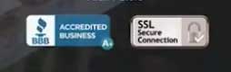
When it comes to deciding what to include in the footer section, include the things that users expect to see there. Typically this will contain:
Where it’s necessary, add a title to the section. In my example I grabbed a headline font that I used higher up on the page and labeled this ‘Contact Information’.
Font Awesome, which we downloaded in the previous video, has icons you can use for the different social media icons.
Since you can’t embed a real map in your file, grab a screenshot and add the image into your design.
Once you’ve got your footer content finished, it should align well as evenly sized columns, so for this example each footer content piece is one third horizontally.


