You can tell a lot about a construction company before they ever answer the phone — just by looking at their logo.
In 2026, contractor logos aren’t just about looking “professional.” They’re doing real work: building trust fast, standing out in crowded local markets, and signaling whether a business is budget-friendly… or premium. The best construction logos today are simple, confident, and instantly readable on everything from trucks to Google search results.
In this post, we’re breaking down 15 construction company logos that actually work, what makes them effective, and what contractors can learn from each one — without turning this into a design theory lecture.
What Construction Company Logos Need to Do in 2026
In 2026, construction company logos aren’t just a truck decal or a yard sign asset — they’re a digital-first trust signal. Most homeowners now encounter your brand on a phone screen before they ever see your crew.
That means modern construction logos need to:
- Read clearly at small sizes (Google Business Profile, Local Service Ads, social previews)
- Work in one color for invoices, uniforms, and stamped permits
- Avoid over-detailing that disappears on mobile
- Feel specialized, not generic (general “contractor clip art” is a red flag)
Logo Trends Contractors Are Actually Benefiting From
- Bold typography over complex icons: Strong wordmarks outperform busy symbols in local search and truck branding.
- Muted, confident color palettes: Deep blues, charcoal, forest green, and off-white beat loud reds and yellows for premium perception.
- Subtle symbolism: Rooflines, beams, initials, or negative space elements—used sparingly—feel modern and intentional.
- Consistency across assets: Logos are being designed as systems now, not one-off graphics. The best brands look identical on trucks, websites, hats, and ads.
3 Quick Examples of Construction Contractor Logos to Inspire You
Before we get to some of the logos our agency designed, here are a few quick examples to get your creative gears turning.
Carboni
Not every construction contractor logo needs to hit people over the head with a construction symbol. In particular, commercial construction companies often make simpler logos and “wordmarks” (just a well-crafted word version with no symbol) that have a sophisticated but simple style. (Found on Behance – by Vinicius Liberal)
2. Vanguard Exteriors (Roofing company logo)
One of the most important principles to remember is that you want the logo to work in full color, and in one solid company (like white) for shirts and other simplified uses. (Found on Dribbble by Shelby Mitchell)
3. The General Contractors Association
This brilliant mark by Carlos Fernandez demonstrates a bold uniqueness, that utilizes negative space and a silhouette to grab attention. (Found on Dribbble)

5 Rules To Design a Great Construction Contractor Logo
The principles that make a construction company logo effective are:
- It’s ability to convey the ‘unique competitive advantage’ of the business (a feeling or symbol that represents what they do that’s special)
- It’s ability to retain its shape and overall feel when presented only in grayscale and in 1-color print (like on hats and shirts)
- It’s ability to look good at any size. If it can look good in one color only, and at large and tiny sizes – it’s more likely to have an “icon” style shape that can withstand any application – and still be “iconic.”
- Its ability to have its icon that sticks out (even without the name being present.)
- Great colors that enhance the feeling the company wants to convey, when it’s in a full color format.
Here’s a few tips for naming too (before we get back to logo examples):
Examples of Our Construction Contractor Logo Design
We love working with construction companies and have the privilege to make some very cool construction company logos – and logos for blue-collar companies in general. To stay inspired in our work, and to help inspire your next project – I thought we could curate 21+ examples of amazing construction company logos and a short paragraph about what they do well.
So without further ado – here are the contenders:

1. Blue Ladder Construction Logo
Simple in it’s symbol, I think of the ladder both as a tool for the job to get done – but also as the custom home the clients are about to build (or the renovations they are about to do) are a “step up,” as well as a commercial construction logo idea – the new office space or commercial space could be a “step up”, as well. Design by us! Check out our other work Hook Agency – Custom logo design
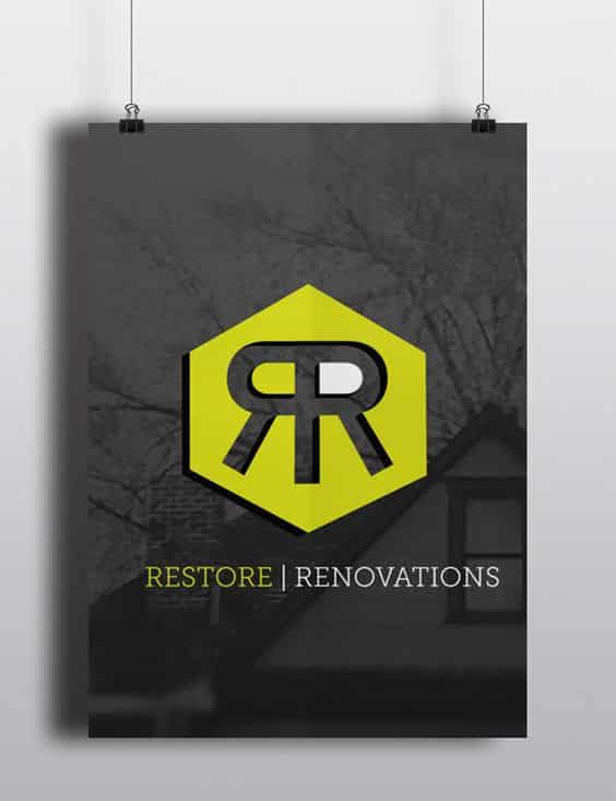
2. Restore Renovations – Remodeling Company Logo
This design was intended to work two ways as well – first as the two R’s combined, and also the structure created by the legs of the R’s. Not every logo has to have two meanings – I just find it fun when they do. Design by us! Check out our other work Hook Agency – Custom logo design
3. Treasured Spaces – Luxury Home Builder Logo Design
Working with the client on this logo design was both super fun, but also came with its unique challenges. We wanted something that had never been done before – which means no roofs, or hammers. After sorting through 100 variations, and whittling it down to a few key symbols, we settled on this key into a window design that we felt appeals to the prime demographic, older woman who want both romance and security. Design by us! Check out our other work Hook Agency – Custom logo design
Examples of Other Construction Contractor Logo Designs From Around the Web
4. Linha Mestra Construction Logo Design
Taking a bit more of a traditional stance on the approach here, 3 simple lines convey a clean modern and sleek company – potentially great for commercial construction. Design by Frederico Graca.
5. ArtHome – Construction or Interior Design Logo
A bit more free flowing and organic feeling log design, potentially for an interior designer / remodeler with an expressive style. Design by LogoWave
6. Ascent – Commercial Construction Logo
Sometimes a logo design is so simple it’s actually more powerful than the most complicated of designs. This is definitely the case with this Ascent logo. It feels iconic, it feels like it’s been around a long time – and so likely lends an air of this ‘established’ persona to the company it represents. I really, really love this logo. Design by Nathanial Goto on Behance
7. AlianCon – Construction Branding
Not sure if I’m as in love with the logo itself, or if I’m in love with the color scheme here. I will say overall, this branding package just really strikes me as well thought out, and powerful in the way it’s portraying the company. Modern, fresh, and trustworthy design. Design by OvenDesign
8. GeoOffice – Commercial Construction Branding
For a more ‘Bauhaus’ / Flat design, this GeoOffice concept both encapsulates the kinds of clients this company wants to go after, and the geometric feel that makes one think of blueprints and commercial construction plans. Design by Ramin Nasibov
9. “R” Construction Company Logo Design
A simple letter design, that is nonetheless bold and iconic can make a statement without using a symbol necessarilly. In this example the designer also opted for bold color, and strong contrast to draw more attention, for a very well put together composition. Design by Jeff Wheeler

10. GCox Construction Logo Design
For a little bit more playful, but nonetheless professional approach, this design seems to take an element of hipster design – the line art style, and apply it in an unconventional place – the cosntruction industry. Design by Mubien Studio
11. CentrePoint Construction Logo Design
Simple, bold direct – I think sometimes this mixture of the clean typography and a super simple symbol can really put a logo design into a category above all the rest – great work. Design by Jekin Gala

12. Averox Construction Logo Design
This is an example of a logo design that incorporates the appearance of 3-dimensionality into it. I definitely appreciate the outside the box thinking, although I would need to some application of one-color/ greyscale – and how the shadow would play out in that scenario. Included here as an example of a nice-looking design that may have trouble translating into greyscale or black and white. Designer Unknown.
Your Construction Company Logo Should Work as Hard as You Do
A great construction logo doesn’t just “look nice” — it helps you win better jobs, attract higher-quality clients, and charge what your work is actually worth.
At Hook Agency, we help construction companies build brands that feel established, trustworthy, and modern—without losing that blue-collar credibility. From logos and websites to SEO that drives real phone calls, everything we do is designed to grow home service businesses.
If your logo feels outdated, generic, or like it doesn’t match the quality of your work, let’s fix that.
👉 Talk with Hook Agency and build a brand that homeowners trust before they ever call.
Frequently Asked Questions
How do you design a logo?
Start on paper first — sketch bold, simple ideas that represent your business. Combine icons or shapes if it makes sense: a hammer + bow for a playful construction brand, or a window + keyhole for a home-focused company. Once you have a solid concept, move to a design program like Photoshop, Illustrator, or Canva to refine it. Don’t overcomplicate — clarity and recognizability matter most.
What are the five characteristics of a good logo?
A strong logo should:
- Be versatile enough to stitch on hats, shirts, or gear and still read as iconic.
- Instantly show what your business does. Include service cues if it helps.
- Work at any size — from tiny website icons to giant trucks.
- Look good in full color or black and white.
- Avoid relying on gradients or shadows—simplicity wins.
Why should I hire a professional to create my logo?
Yes. A great logo is a beacon—it signals credibility and draws the right customers. A sloppy or generic logo can make you look unprofessional and cost you business. Hiring a designer pays off. If you’re ready to level up, Hook Agency can craft a logo that works everywhere. On a budget? Platforms like 99designs or DesignCrowd can also help you get started.