With the ever-increasing number of commercial roofing businesses, it’s more important than ever to make sure that you stand out amongst your competitors. The best way to do that is to ensure that your website is up-to-par and represents your business in the best way possible.
Unfortunately, most commercial roofing websites are trash, and they probably do more to confuse their viewers instead of leading them to convert.
Most times, these websites are filled with:
- generic stock photos,
- unclear call-to-actions,
- and (probably plagiarized ) content that fails to connect with their ideal audience.
BUT, this is an opportunity for you to set yourself apart from hoards of other companies out there that are doing it wrong. It’s really easier than you think to improve your website if you’re just willing to take the time and initiative to do it.
To help you start, here’s some commercial roofing website inspiration from 7 of the best websites we could find!
What Makes a Winning Commercial Roofing Website?
But first, you’re probably wondering, what does an excellent commercial roofing website even look like?
From our years of experience working on service-based industry websites, we’ve developed the Winning Website Formula, a list of the five most essential elements your website needs (if you actually want conversions).
Aspects of a Winning Website:
- Visual call-to-actions throughout the site: What do you want viewers to do when they land on your website, and are you communicating this with them visually?
- Testimonials and other trust factors: Why should anyone trust your company enough to work with you? Social proof is one of the best ways to build credibility.
- Emotionally persuasive headlines + images: You want to give your prospects an idea of what it would be like to work with you. You can do this by including images and headlines that put THEM first, not your company.
- An emphasis on SEO throughout the design and development process: It’s one thing for a website to look good, but does it perform well? Is it optimized to rank high on Google and other search engines? Here’s where SEO comes in.
- Clear differentiating features and unique value propositions: What makes you different from your competitors? Can you help solve your customers’ problems in a way no one else can – and is this made clear on your website?

So now that that’s covered, let’s dive into 7 of the best commercial roofing website examples!
In light of these examples, if you find that your website needs some work, we’ll be happy to help take your website design to the next level!

Example #1 – Mint Roofing
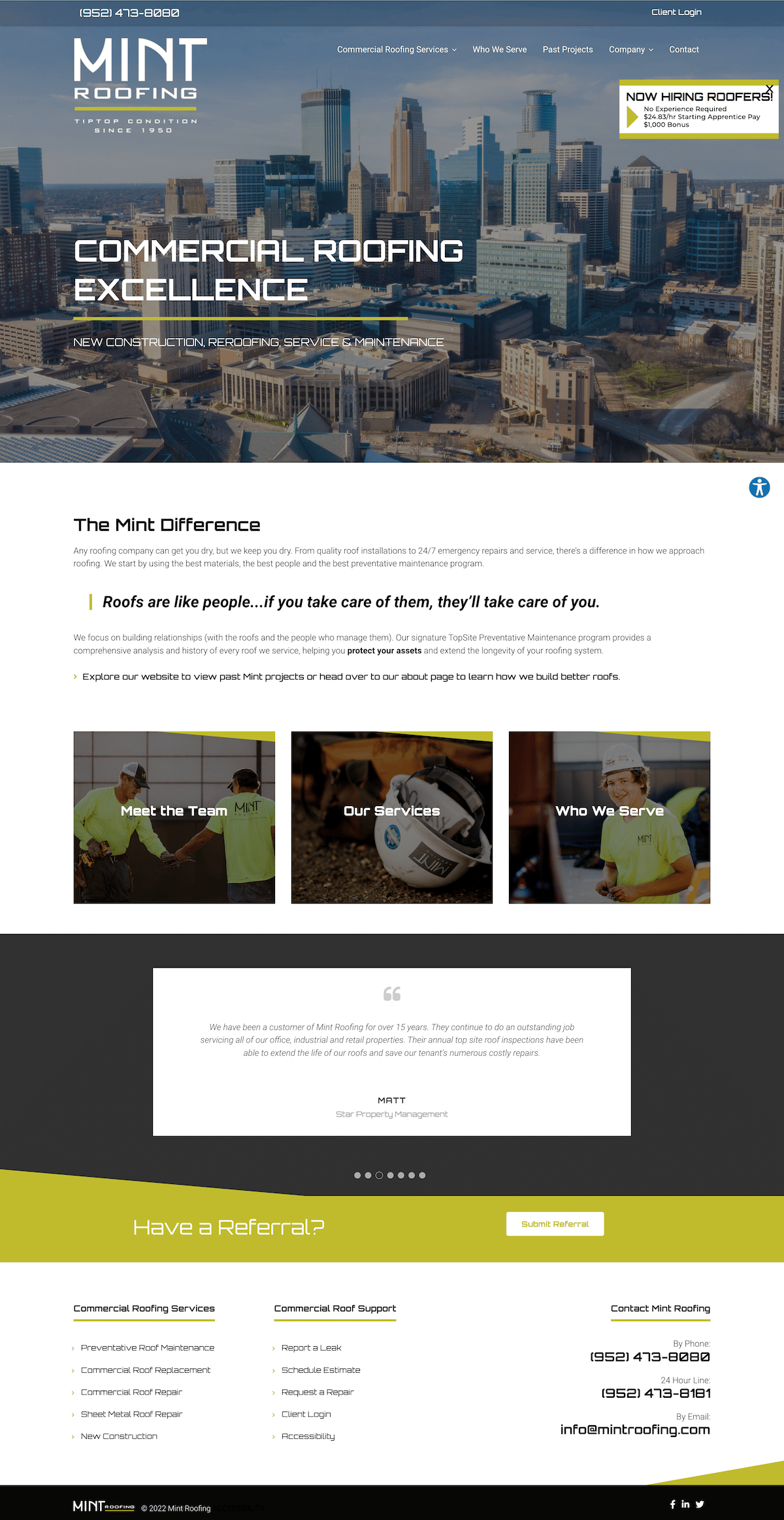
What works well:
We love this website’s use of colors! Pulling off a striking lime green is not an easy feat, and they do it in a clean and eye-catching way. They also include their phone number at the very top of the homepage, making it easy for customers to get in contact with them.
⭐️ Pro-tip: Mint Roofing has professional photography of their team included across the entire site, showing the actual people that are doing the work day-to-day. High-quality photography not only adds to the effectiveness of your site from an aesthetic standpoint, but it can help to gain credibility and trust with your viewers. So if you have the time and the means, consider scheduling a shoot with a photographer and your team!
What doesn’t work so well:
Adding larger and more prominent visual call-to-actions on the homepage would help viewers know exactly what to do when visiting the site. Also, adding logos or photos of their previous clients to their testimonials could help them to build even more credibility. They could also use more 300-500 word content sections throughout the site to help with their SEO and connect with readers.
Example #2 – A-Best Roofing (A Hook Site)

What works well:
Smiling faces, partner logos, and “You-Focused” headlines are seen right as you land on the homepage before a viewer even has the chance to scroll. CTA buttons and a form are also included above the fold, allowing their viewers to take action without having to go searching. Their branding is bold and punchy, with colors and design elements that make this site uniquely theirs.
⭐️ Pro-tip: This website includes video testimonials of previous customers, which can be even more persuasive than written reviews. Reach out to a past client of yours and see if they would be willing to give you a raving review – in person and in front of a camera.
Example #3 – Water Tight Roofing Inc.

What works well:
This site is clean, simple, and straight to the point. There is minimal clutter or distraction from the important things, such as their contact information located right in the header. They also include video testimonials throughout the site, which really helps to increase the time viewers spend on their site.
What doesn’t work so well:
I would move trust badges and reviews closer to the top of the page to build trust right away. Also, right now, their site feels a bit cold and impersonal. They could easily fix this by incorporating more smiling faces and headlines that directly target their ideal customer. Just because this is a commercial site – doesn’t mean they can’t still appeal to emotions.
Example #4 – Alpha Commercial Roofing
What works well:
This site includes a simple, clean form right as you land on the page, which is great for conversions. I also really love the icons and illustrations that are included in the design, as it helps to make it feel more unique and user-friendly. They also have really prominent CTAs running down the page, which is always a good thing.
What doesn’t work so well:
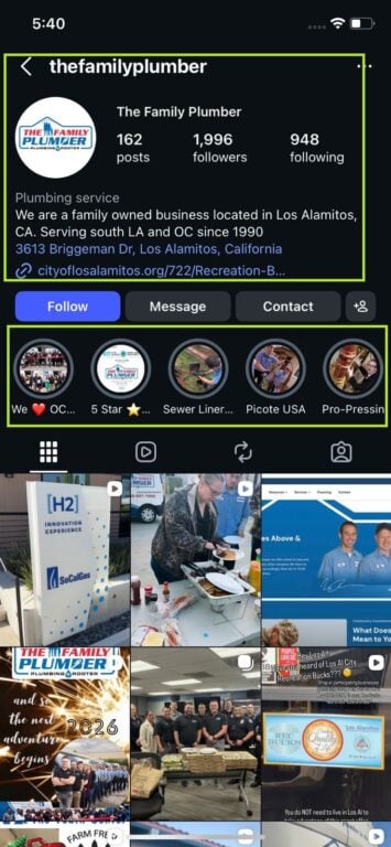
Their review section could use a bit of work, for sure. Right now, they’re only including a name and a quote, which does little to gain trust. Testimonial sections should always include a photo of the person that left the review, logos from the platform the review comes from (Google, Facebook, Angi’s, etc.), and 5-stars (if it is actually a 5-star review lol)!
Here’s a great example from one of our sites that you should definitely model after when building out your review section:

Example #5 – Impact Roofing (A Hook Site)

What works well:
This site is a bit edgy, which is unusual for a commercial roofing website, and that helps to set this company apart. The brand elements, colors, and sharp angles of the design help to make this site memorable, which is, of course, what you want.
This commercial roofing website is not only effective from an aesthetic standpoint, though. The testimonials and ratings are located right near the form, which is a perfect place for them as they help potential leads feel comfortable giving out their information.
Example #6 – MLK Construction

What works well:
This site looks super sleek and professional because of its highly contrasting colors and bold typography. No section feels too cluttered, and they kind of get straight to the point without too much unnecessary decoration.
What doesn’t work so well:
Could this site be a bit too simple? Possibly. There aren’t many design elements that make this site unique, and you could easily swap out the logo for another roofing company and have the website work in the same way. In order to stand out from the competition, try to include differentiating features with bullet points in the hero like “30 years of experience” or “Family-owned business” to set yourself apart.
Check out this example from one of our sites:

They’re also missing a big CTA in the navigation bar, which is probably hurting their conversions a bit.
Example #7 – Clean Cut (A Hook Site)
What works well:
Video + Drone footage is an innovative way to grab your audience’s attention and add a bit more professionalism to your site. This site establishes trust with it’s viewers at first glance because of the partner logos, differentiating features, and drone footage included above the fold. As you scroll down, you learn even more about the story of the company from pictures, a process section, and a guarantee from the company’s owner.
Lots of commercial roofing websites fail to tell a story about the company. Help your site viewers feel closer to you and want to work with you by not only detailing what you do as a company but who you are as a company. You’ll have a much easier time making your audience know, like, and trust you – which is necessary if you’re asking for their business.
Conclusion
We hope that these examples helped to get your creative juices flowing, or at least helped to point out some things that may be missing on your website currently. Basically, just remember that the primary purpose of any website is to build trust and credibility with your audience, and if your site isn’t doing that, it may be time to fix some things.
For more inspiration for your commercial roofing website design, check these places out:
If you’re still feeling a little lost, that’s okay! We get that taking on a website redesign can be daunting, but we’re always here to help. Send us a message today if you’d like our help creating a gorgeous commercial roofing website for your company!