This article was originally published in 2014 and was recently updated – when I was trying to find amazingly bad websites that I remember from my youth!
- When I say they’re bad – I also mean I kind of love them.
- I also found 5 websites from today that have that nineties aesthetic.
- Some are taking that old style – and making it cool.
Before we get into one’s from current day – let’s look at these terrible websites that I “ironically” love.
First – Amazingly Bad Websites from The Nineties
Yes, these websites really existed – and some of them are still functioning today. Thank you, Warner Brothers! LOL.
The Space Jam website
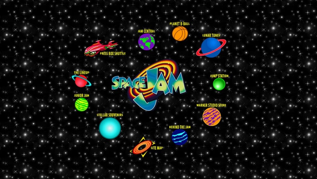
Well, this one is an honorary and terrible first entry. This website has all the perks, crazy bright colors, a movie topic that kicks up the nostalgia, and some flashing gifs. If that isn’t a …. gift, I don’t know what is.
The Space Jam Website
The World’s Worst Website
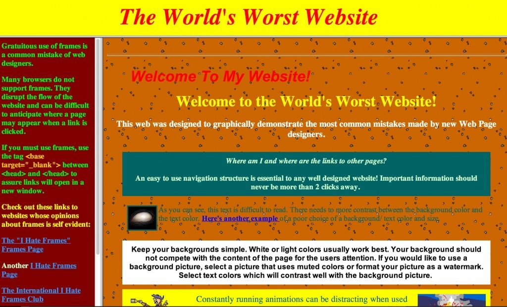
This website is purposefully bad. Welcome to the worst possible website on purpose, and if you click on the link, turn down your sound because the music plays automatically.
The World’s Worst Website
DP Graph
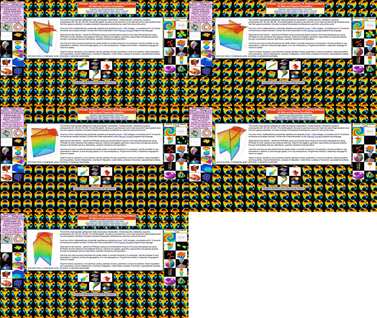
Dynamic Photorealistic 3D Graphing Software
for Math and Physics Visualization
The horror of spinning, flashing, fluorescent everything.
Ali Web
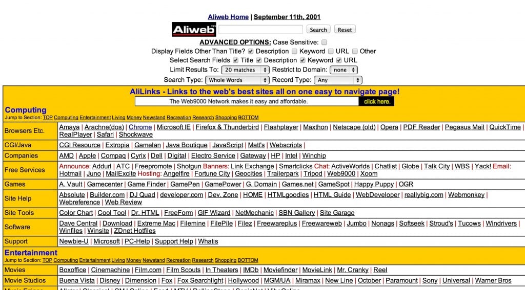
The first search engine in all of its delightful ‘prehistoric’ tackiness
Cyber Beach
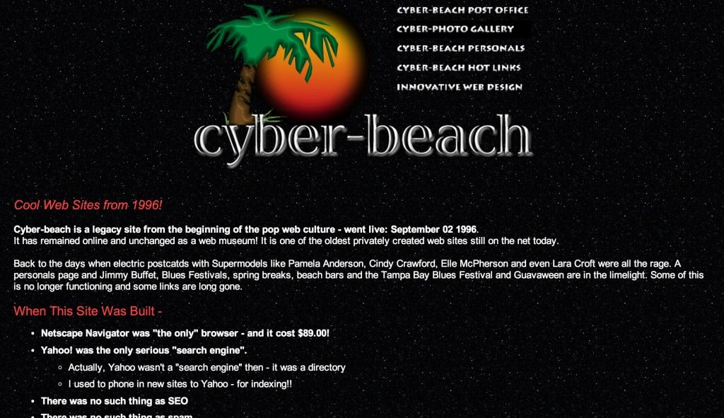
This is not only one of the oldest privately held websites still on the web; it also gives you a little backstory as well. Learn about the 90s on the web if you need a little info to jog your memory.
Home Improvement Fan Club
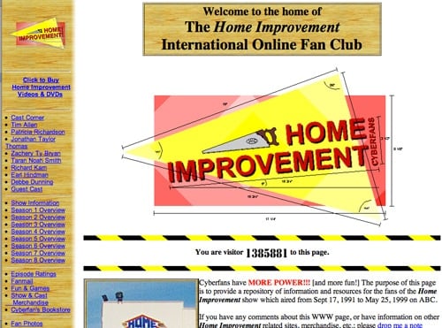
Well, this is one that I have to link through on “The Wayback Machine” at archive.org – Which is an amazing resource that allows you to view web pages in all of their awful glory back in the day. I’m not here to bash these websites; I remember how fun it was creating a website when I was 11… at the library before I’d go home and watch Home Improvement. The nostalgia factor here is pretty thick. Wow… Take a look at these images.
More Power – The Home Improvement Fan Club
I think my next web design project for fun could entail creating a weird throwback to when the web was really a wild west of strange spinning gifs, horrifyingly bright clashing colors, tons of pixelation, and whatever you could get away with, with the very limited parameters the web could process back then. Any suggestions for what it could be about?
Bad Websites From Today – Shitty / Terrible That Are More Current
The art of the shitty website takes more than just a hacky coding skill-set and a bad eye for design. It requires an understanding of what beautiful design is so you can spit in the face of that.
Here are 5 amazingly bad websites from today – that appear to be – please god, please be on purpose.
1. Fresh Meat – Ad Agency Mother in NYC’s 2015 Internship site

This gloriously bad site was clearly done on purpose, and I can’t help but marvel at its exquisitely painful vibe. Meat comes at you from all angles, people are covered in syrup, and spinning gifs attack your eyes.
Here’s a full rundown of the hideousness that was meatmeatmother.com
2. LINGsCARS.com
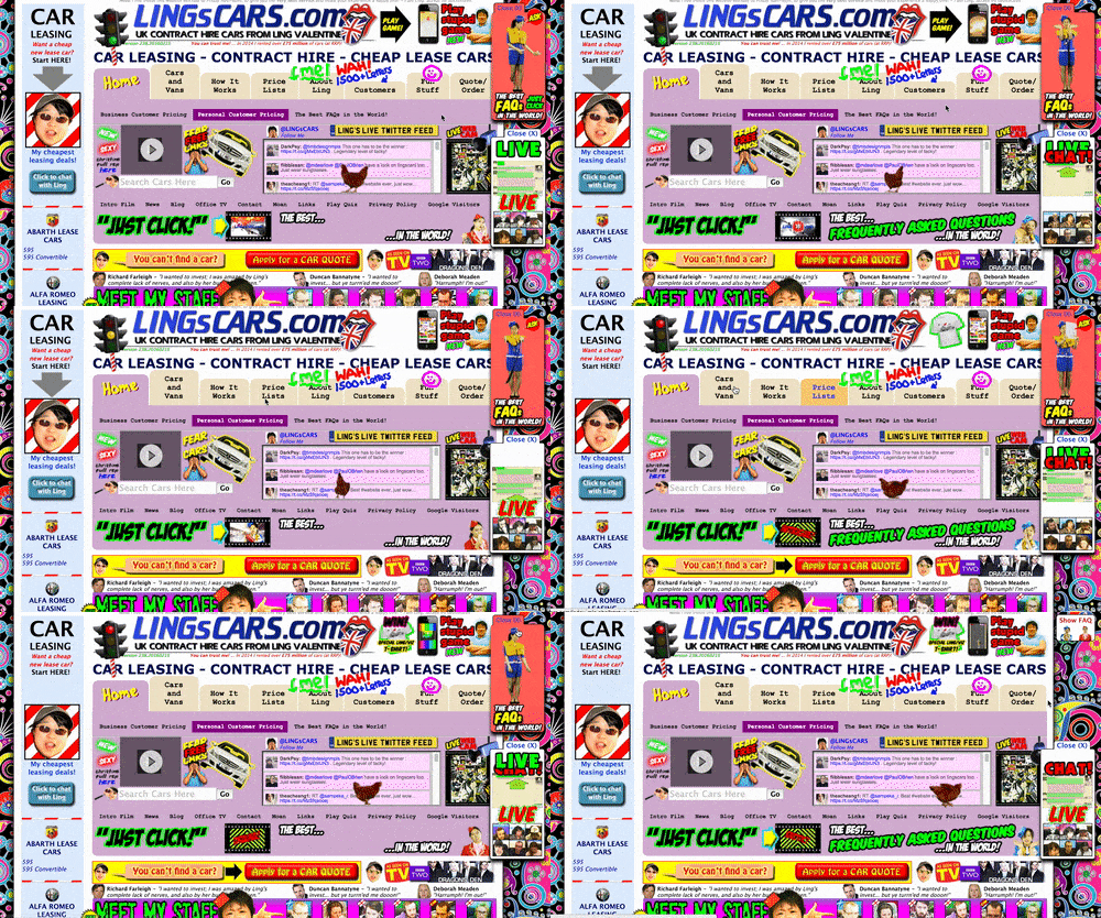
This has to be on purpose. It definitely hurts to look at; the twirling whiz-bang gifs everywhere on the page are a throw-back to all that was horrible about late 90’s websites, Angelfire, Geo-cities, etc. Do you remember that? The chicken walking along the Twitter feed is obviously very important to the user experience on this site.
Check it out at Lingscars.com
3. Jodi
This website really makes no sense, but its raw code feel and what seems like the schematics for some type of technological atrocity make it entertaining to poke around. Why did someone make this? I have no idea.
View it in all of its glorious pointlessness at wwwwwwwww.jodi.org
4.The Boohbah Zone
Yes, this one might not have been technically ‘bad on purpose,’ but it does seem to be ‘ridiculous on purpose,’ and for that, I am grateful. The creator of the Teletubbies series made this when it appears he felt Teletubbies was too dry and logical.
The best bubble to press is the second from the left, in my humble opinion. Enjoy.
View a resurrected version of ‘Boohbah Zone’ at danryckert.eu
5. Medijate
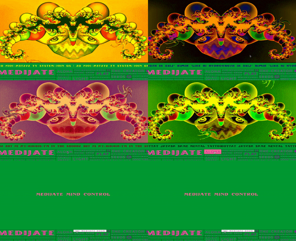
Probably my favorite ‘bad on purpose’ website that I found besides mother’s internship purely because I’m a fan of the psychedelic, and this one surely seems to have required some experience with psychedelics to be capable of making it.
From what I’ve gathered, the site is for meditation, except you’re supposed to meditate on all that is painful in the world. The visuals are pure hell-bliss, and for that reason, if you poke around one of these sites, I’d highly suggest this one.
Check out the site at Medijate.com
What Makes a Good Website?
These are obviously some of the worst websites ever created by man. When it comes to making a website good, you can basically do the opposite of everything these folks did. For some more specific steps to take to ensure your website isn’t classified as a bad site, follow these tips:
Design Your Website Using a Site Map First
One of the biggest mistakes you can make when creating a website is just making everything up as you go. Creating a site map that outlines your key pages will help you create a user-friendly site that flows from page to page. While the design aspect of a website is crucial, so is the overall layout. Creating a physical site map is smart, as it forces you to think hard about your layout decisions. Some digital site map tools make copying and pasting a little too easy, which can make your site look generic. In general, your site map should be simple, though, so keep that in mind while creating it.
Find Sites You Like For Inspiration
Don’t just steal another company’s design. That’s just lazy, and it’ll probably land you in some hot water with the law. But, looking through platforms like Dribbble will help get your creative juices flowing. You can find specific elements you like on different sites and see how they fit together to create something truly unique.
Work With a Professional Web Designer and Developer
Sure, you can try and create, design, and develop your own website to save some money, but unless you have some web design/dev experience, you’re likely going to be disappointed in the end product.
When Your Site is Done, Test it, Test it Some More, and Then Test it Again
Again, this plays more into the functionality of the site as opposed to the design. Make sure that every button takes you where you want it to, every email contact form actually sends you the emails, and every page is showing up as it should. For testing the design elements, look at the site on all devices. That includes desktop, tablet, and mobile. Doing so ensures that your site is responsive. Remember, the majority of online searches today are on mobile devices, so your website needs to look good and function well on a smartphone screen!
Utilize Hick’s Law
Going back to the idea of “keeping it simple,” Hick’s law states that the more choices or options a person has, the longer it takes them to make a decision. So, regardless of what you’re selling or offering, make sure that you clearly layout where each service or product fits. Some businesses make the huge mistake of not separating their offerings by specific characteristics or allowing the user to narrow down their search.
A great example is an online retail store like Nike’s website. Even though they have hundreds of shoes to choose from, the user can easily find what they are looking for because Nike allows them to define their search based on the type of shoe, color, width, size, and more.
At Hook Agency, we work with a lot of contractors. They’ll never have as many service options as Nike has shoes, but the point still remains. Finding ways to make it clear what services you offer, what makes your services superior to the competition’s, and how to easily attain said services is a great idea to have in mind when creating your website.


