Solar is a sexy industry, but then – why are there so many solar website designs that barely show it.
Don’t represent your solar company with anything less than these 5 incredibly well-done examples of solar website design inspiration.
All across the country – a select few, elite growth-oriented solar companies are creating a dynamic impression that not only makes them look high-end, but drives leads and keeps their sales people busy.
Don’t believe me? Here they are! 5 Stunning Examples of Solar Website Design for 2022
1. Electric City – Electrical + Solar Website Design (by Hook Agency)
This site utilizes a clean, illustrative feel that screams modern design. This site also utilizes our ‘Winning website formula’ – to drive more leads for this client.

What’s the winning website formula? Glad you asked – it’s simple!
- Trust factors / trust badges throughout the design
- Clear call to actions to nudge people to the next step.
- An emphasis on persuasive imagery and headlines that are focused on the customer.
- SEO consideration throughout the process.
- Real clear ‘differentiating features’ (What can competitors NOT say.)
2. SunBadger Solar Website Design
I absolutely love this amazing example of Wisconsin solar installer SunBadger Solar, designed by the lovely team over at Streamline Jacks.

What does it do well?
- Get a quote form right at the top.
- Clear 1-2-3 process to working with them.
- Video background shows the product in all its glory. Interviews humanize the team
Possible improvement:
- More video interviews with ideal customers that loved working with SunBadger
3. SelectEnergy Commercial Solar Website Design
I love the way this design feels fresh with the green and blue color palette, and I love the headline that really focuses on their ideal customer rather than touting their own accomplishments. (This is how it should be done.)

What else is this design doing well?
- Featuring careers on the homepage
- Testimonials pretty quick in design
- Key news stories featured support their credibility
Drawbacks to this design:
- Because text is positioned over images most of the time, the images get washed out, rather than having images full color. There are ways around this with modern design conventions like shape cutouts.
4. ProHauz Solar Technology Website Design
I like the bullet points at the top of this design, and the way the image has a 1/3rds, 2/3rds format to it that allows overlay of text without obscuring the picture. In this case it looks like this site is pitching more of the technology rather than services – but I really like the kind of dissected house illustration and the introduction of the solar panel cost to ROI calculator.
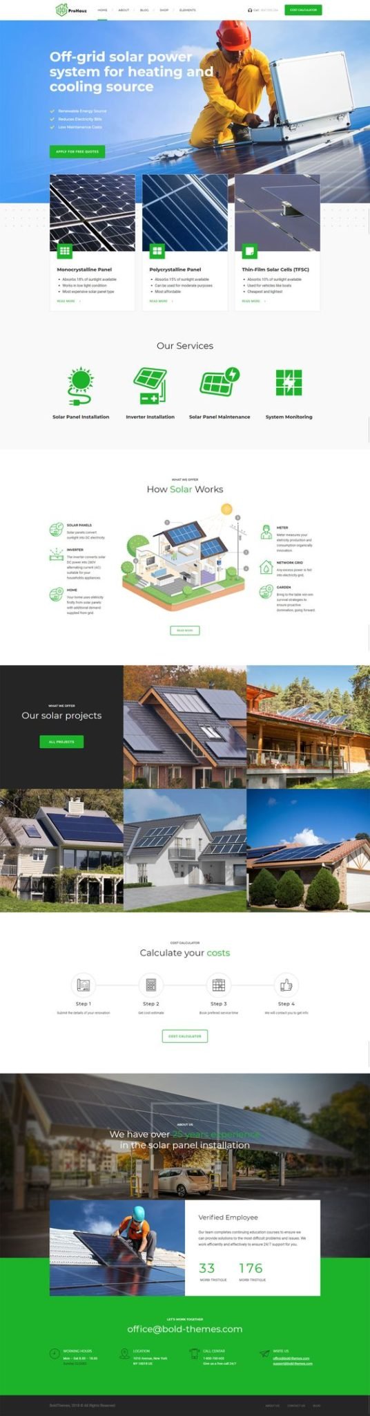
Best things about this design:
- Custom feeling icons support the theme
- Great, fresh color palette that’s simple and bright.
- Clean footer with next steps and key information.
Drawbacks:
- In this case – this is a website theme. And unfortunately working with commercial themes often bloat out the functionality of a website and lead to a slow-loading site, as well as sometimes forcing a company into concessions around the theme, rather than creating something that fits them like a glove.
5. Blue Raven Solar Website Design
What is awesome about this one – Well, I like the logo, I love the large, pleasant imagery.
I also love the value prop at the top and the financial specifics. Don’t assume that people checking out your website don’t also have 2 competitors up in the tabs next to yours.
People are price shopping – and looking for what makes you different than the competitors.

Other things that are effective about this design:
- Quick icons at the top to get you to your next page.
- Sharing ‘the problem’ with the #’s that communicate the environmental risk of the alternative.
Not so effective:
- I actually had to cut a lot of sections out of this screenshot because the site was so long scrolling. Watch out for overwhelming people, and consider offering a ‘sampler platter’ on the homepage rather than stuffing 20 sections right away. People can click into things they want to learn more about.
You don’t need to JUST focus on the green aspects
Talk to your sales team, and look into what’s really closing them deals.
Is it just the ‘green’ / environmentally friendly aspects of solar? If so – sure, make that front and center.
But also remember, that every other solar installer on the planet can say the same things.
Instead, leverage the idea of saving money – being ahead of trend etc.
People want to be SMART. Listen to them, hear why they are choosing YOUR company, and you’ll be surprised and come up with amazing new ways to talk about the value proposition, on your solar company website.
- Solar can save them a ton of money over the long-haul
- Rebates available in their area – or just sharing on rebates in general.
- People also want to look ahead of trend.
All of these are value propositions along with the obvious environmentally friendly aspects – just listen to what prospects are telling you and use their language on the website for the most effective messaging.