Have you ever come across a visually captivating image that effortlessly conveyed complex information or told a compelling story?
In the digital age, where attention spans are shrinking and information overload is a constant challenge, visual communication has become more crucial than ever. And at the forefront of visual communication stands the infographic.
Infographics have revolutionized the way we consume and understand information by blending data, design, and storytelling into a single, impactful visual format. From educational materials to marketing campaigns, infographics have become a powerful tool for conveying information in a concise, engaging, and memorable manner.
In this comprehensive guide, we will delve into the world of infographics, exploring their definition, purpose, benefits, and how to create them effectively.
Short Summary
-
Infographics are powerful tools for visual communication in the digital age. Infographics are effective in capturing and retaining audience attention.
-
Creating infographics involves defining objectives, gathering data, and designing the layout. Infographics can be created using graphic design software or online tools.
-
Infographics have a future in interactive and animated formats, as well as virtual reality and augmented reality applications.
-
Incorporating infographics in communication strategies can enhance information dissemination and audience engagement.
What Is An Infographic?
An infographic is a visual representation of complex information, data, or knowledge, presented in a concise and engaging format. It combines graphic elements, such as icons, illustrations, charts, and typography, with textual content to convey information in a visually appealing and easily understandable way. Infographic format plays a crucial role in capturing the attention of viewers and delivering information in a visually appealing manner.
The purpose of an infographic is to simplify complex concepts or data sets and present them in a visually appealing manner that captures the viewer’s attention. Infographics serve as powerful communication tools that can break down intricate information into digestible chunks, making it easier for the audience to grasp and retain key insights.
By using visual elements and storytelling techniques, infographics transform data-heavy content into compelling narratives that enhance understanding and make a lasting impact on the viewer.
Why Infographics Matter
In today’s fast-paced digital world, capturing and retaining the attention of your audience is becoming increasingly challenging. Infographics, with their unique blend of visuals and information, have gained immense popularity across various contexts.
Let’s explore why infographics matter and how they can benefit your communication strategies.
The Power of Visual Storytelling
Humans are inherently visual beings. We process visual information faster and more effectively than text alone. Infographics tap into this innate preference for visuals and leverage the art of storytelling to convey complex ideas in a captivating way. By combining compelling visuals, concise text, and a clear narrative structure, infographics have the power to engage and resonate with audiences on a deeper level.

Benefits of Using Infographics
-
Simplifying Complex Information: Infographics excel at distilling complex concepts and data into visually appealing and easily digestible formats. They help break down intricate information, making it more accessible and understandable for your audience.
-
Enhancing Audience Engagement: The visual appeal and storytelling nature of infographics grab attention and encourage viewers to explore the content further. Infographics offer an immersive and interactive experience, keeping your audience engaged and increasing the likelihood of information retention.
-
Increasing Information Retention: Studies have shown that people remember information better when it is presented visually. Infographics utilize visual cues, color coding, and graphical representations to enhance memory recall, allowing your audience to retain key insights for a longer period.
Impact on Audience Engagement and Information Retention
Infographics have the potential to captivate your audience and leave a lasting impression. The combination of visuals and concise information appeals to different learning styles, catering to a broader range of individuals.
Whether you’re presenting data-driven reports, explaining complex processes, or promoting a product or service, infographics can help you communicate your message effectively and make a significant impact.
Elements of an Infographic
Creating an effective infographic involves careful consideration of various elements that contribute to its overall impact and communicative power.
Let’s explore the key elements that make up a successful infographic.
Visual Design Principles for Effective Communication
Effective visual design is crucial for capturing and maintaining the viewer’s attention. Elements such as layout, composition, hierarchy, and balance play a vital role in conveying information in a clear and visually pleasing manner.
Understanding and applying design principles can significantly enhance the overall effectiveness of your infographic.
Choosing the Right Colors, Fonts, and Imagery
Colors evoke emotions and convey meaning. Selecting an appropriate color palette can help evoke the desired mood and enhance the visual appeal of your infographic. Similarly, choosing suitable fonts that are legible and consistent with your brand’s tone is essential.
Integrating relevant and engaging imagery, such as icons, illustrations, or photographs, can further enhance the visual impact and convey information more effectively. You can take help from an another infographic example.
Incorporating Data Visualization Techniques
Infographics often involve presenting data and statistics. Data visualization techniques, such as charts, graphs, and diagrams, help transform raw data into visually compelling and easily understandable representations.
Choosing the right type of data visualization based on the nature of your information is crucial for effectively communicating your message and facilitating comprehension.
Types of Infographics

Infographics come in various forms, each tailored to effectively communicate different types of information.
Let’s explore the different types of infographics and their specific purposes.
Statistical Infographics
Statistical infographics are commonly used to present data and statistics in a visually appealing and easy-to-understand manner. They utilize charts, graphs, and diagrams to showcase numerical information, making complex data more accessible and engaging.
Statistical infographics are ideal for showcasing survey results, market trends, demographic data, and other statistical insights.
Process Infographics
Process infographics provide a step-by-step visual representation of a process or workflow. They break down complex procedures into clear and concise segments, guiding the viewer through each stage.
Process infographics are widely used for instructional purposes, explaining how-to guides, demonstrating workflows, or outlining sequential procedures.
Comparison Infographics
Comparison infographics are designed to highlight similarities and differences between different subjects, concepts, or options. They use visual elements such as side-by-side comparisons, charts, or tables to present contrasting information in a visually compelling format.
Comparison infographics are effective for product comparisons, feature comparisons, pros and cons analyses, and decision-making scenarios.
Timeline Infographics
Timeline infographics are used to illustrate chronological events, history, or a series of milestones. They provide a visual timeline that showcases important dates, events, and their order of occurrence.
Timeline infographics are commonly utilized for historical narratives, project timelines, biographies, or showcasing the evolution of a concept or industry.
Creating an Infographic: Step-by-Step Guide
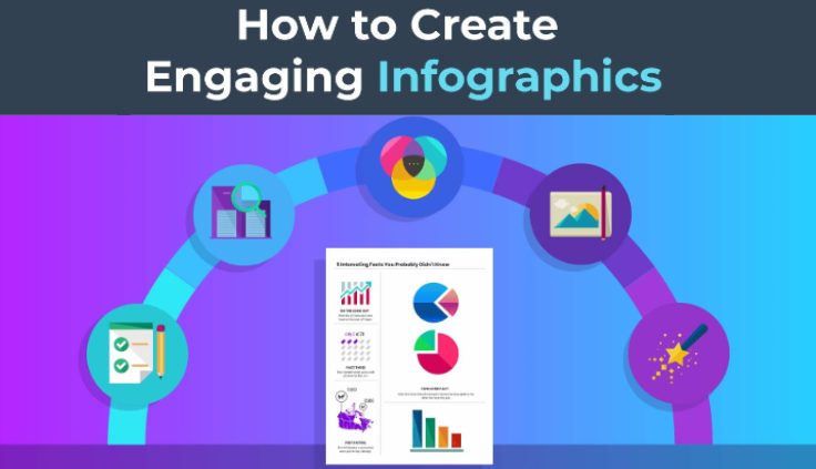
Now that we understand the different types of infographics, let’s explore the step-by-step process of creating an impactful infographic.
Defining the Objective and Target Audience
Clearly define the purpose and objective of your infographic. Determine what information you want to convey and identify your target audience. Understanding your audience’s needs and preferences will help shape the content and design of your infographic.
Researching and Gathering Relevant Data
Conduct thorough research to gather accurate and relevant data that supports your infographic’s message. Ensure your data comes from reliable sources and is up-to-date. Organize and analyze the data to identify key insights and findings that will be showcased in your infographic.
Planning the Structure and Flow of Information
Outline the structure and flow of information in your infographic. Determine the main sections, subtopics, and the logical sequence in which they should be presented. This helps create a cohesive narrative and ensures a smooth transition from one point to another.
Designing the Layout and Visual Elements
Design an eye-catching layout that aligns with your objective and target audience. Consider the visual hierarchy, balance, and spacing of elements to create a visually appealing composition. Select suitable colors, fonts, and imagery that align with your brand and effectively convey your message.
Adding Textual Content and Narrative
Craft concise and impactful text that complements the visual elements. Use headings, subheadings, and bullet points to present information in a scannable format. Write clear and concise sentences that support the visuals and contribute to the overall narrative flow of the infographic.
Best Practices for Infographic Creation
To create compelling and effective infographics, it’s important to follow certain best practices.
Here are some key guidelines to consider during the infographic creation process.
Simplifying Complex Information
Infographics are meant to simplify complex information and make it more understandable for the audience. Focus on presenting the most relevant and essential data points, avoiding clutter and unnecessary details. Use clear and concise language to convey your message effectively.
Keeping the Infographic Design Visually Appealing and Balanced
Visual appeal plays a crucial role in the success of an effective infographic. Choose a visually appealing color scheme that enhances readability and engagement. Ensure a balanced composition by arranging elements in a way that guides the viewer’s eye through the infographic smoothly.
Using Appropriate Data Visualization Techniques
Data visualizations are a key component of infographics. Select appropriate charts, graphs, and diagrams that best represent the data you want to convey. Use visual elements that are easy to interpret and understand, helping the audience grasp the information quickly.
Ensuring Accessibility and Mobile-Friendliness
Make your infographic accessible to a wide range of users, including those with disabilities. Use alt text for images and ensure proper color contrast for text readability. Additionally, optimize your infographic for mobile devices, considering the increasing usage of smartphones and tablets.
Testing and Refining the Infographic
Before publishing or sharing your infographic, test it thoroughly to ensure its effectiveness. Review it for any errors, inconsistencies, or unclear messaging. Seek feedback from others and make necessary revisions to improve its overall quality and impact.
Infographics in Different Industries and Applications
Infographics find applications in various industries and can be used for diverse purposes.
Let’s explore some of the industries and contexts where infographics are commonly employed.
Education and E-Learning
Infographics are valuable tools in educational settings. They simplify complex concepts, making them more accessible to students. Infographics can be used in textbooks, presentations, and online courses to enhance learning and retention.
Marketing and Advertising
Infographics are highly effective in marketing and advertising campaigns. They grab attention, deliver key messages, and make brands stand out. Infographics can be used in social media posts, blog content, and promotional materials to engage and educate the target audience.
Journalism and News Reporting
Infographics play a crucial role in journalism and news reporting. They provide visual summaries of complex stories, making information more digestible for readers. Infographics can be used to present statistics, trends, or visual narratives to support news articles.
Presentations and Public Speaking
Infographics are excellent aids for presentations and public speaking engagements. They help presenters communicate information in a concise and visually appealing manner, capturing the audience’s attention and enhancing understanding.
Conclusion
In today’s digital age, where information overload is prevalent, the importance of visual communication cannot be overstated. Infographics serve as powerful tools for conveying complex information in a visually appealing and engaging manner.
Throughout this comprehensive guide, we have explored the definition and purpose of infographics, delved into their various types and best practices for creation, and highlighted their applications across different industries and contexts.
Infographics hold the potential to simplify information, captivate audiences, and improve information retention. Their ability to distill complex data into easily understandable visuals makes them invaluable assets for educators, marketers, journalists, and presenters.
Remember, a picture is worth a thousand words, and an infographic can leave a lasting impression. So, leverage the visual storytelling potential of infographics and unlock new avenues of effective communication.
Frequently Asked Questions
Are infographics effective in conveying information?
Yes, infographics are highly effective in conveying information. They leverage the power of visual communication, which is known to enhance understanding and information retention. Infographics make complex data more accessible, engaging, and memorable, making them an ideal choice for presenting information in a concise and impactful way.
How can infographics benefit my business or organization?
Infographics can bring several benefits to your business or organization. They can help you simplify complex concepts, showcase data and statistics, improve audience engagement, enhance brand awareness, and increase content shareability.
Infographics can be used in marketing campaigns, presentations, reports, and social media to effectively communicate your message and differentiate yourself from competitors.
What type of infographics are most commonly used?
There are several types of infographics that can be created based on the content and purpose. Some common types include statistical infographics, process infographics, comparison infographic, timeline infographics, geographic infographics, informational infographics, pie charts, hierarchical infographics, data visualization infographic, and flowchart infographics.
Do I need design skills to create an infographic?
While having design skills can be helpful, you don’t necessarily need them to create an infographic. There are numerous online tools and software available that offer pre-designed infographic templates and intuitive interfaces, making it easy for anyone to create visually appealing infographics.
You can also consider hiring a professional graphic designer if you prefer a custom design or require complex visual elements instead of using an infographic template.
How do I choose the right data for my infographic?
Choosing the right data for your infographic depends on the objective and target audience. Start by defining your goal and determining the key message you want to convey.
Then, identify the most relevant and impactful data that supports your message. Ensure that the data is reliable, up-to-date, and properly sourced to maintain credibility.