I spent some solid time on some graphic design for our wedding, and this is the first time I’m allowed to share it to anyone besides the wedding guests. I searched through some wedding graphic design inspiration on Pinterest and at the local letterpress, and I didn’t see anything that really captured the flavor of what we were looking for. So.. I tried to create something fresh and new that matched our sense of style.
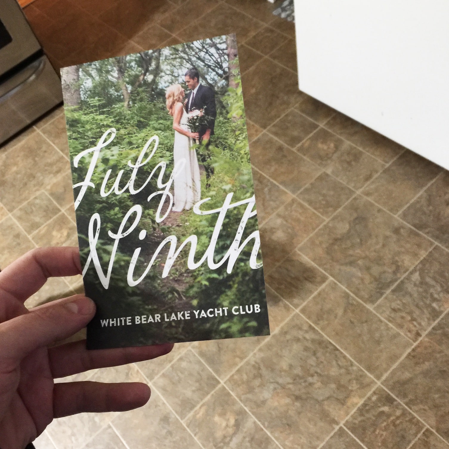
Our engagement photos were very solid – done by Jason Albus, so I took a photo heavy approach on the save the date, with a script font spanning the width of the card, and a minimalistic typographic approach with ‘weathered’ letters.
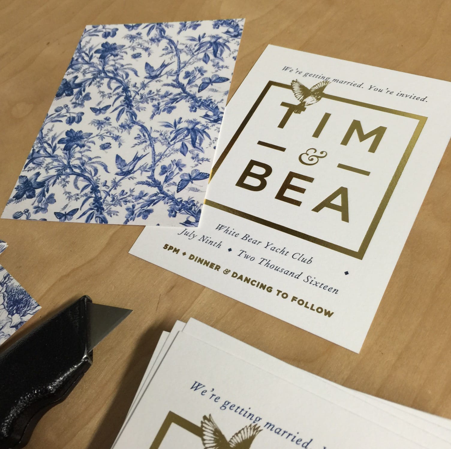
Had a blast working with Smart Set Letterpress in Northeast Minneapolis to get a letterpress invite with Gold on it. We had a kind of old ceramic, blue on white looking back with the design being somewhat minimal and bold on the front. I used Gotham Bold, Gotham Black and Fournier Italic for the invite.
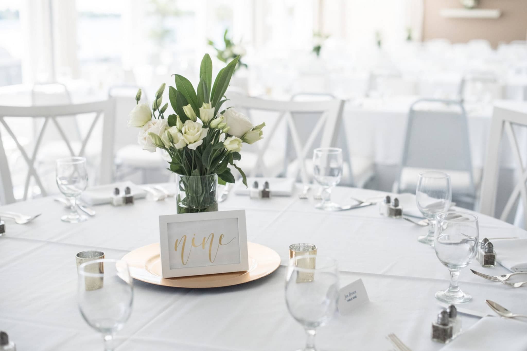
The one piece of design I didn’t handle was the excellently executed Ivory and Gold Table Numbers by GildedPaperCo on Etsy. This look worked amazing with the blue seats, gold accents, and white flowers.
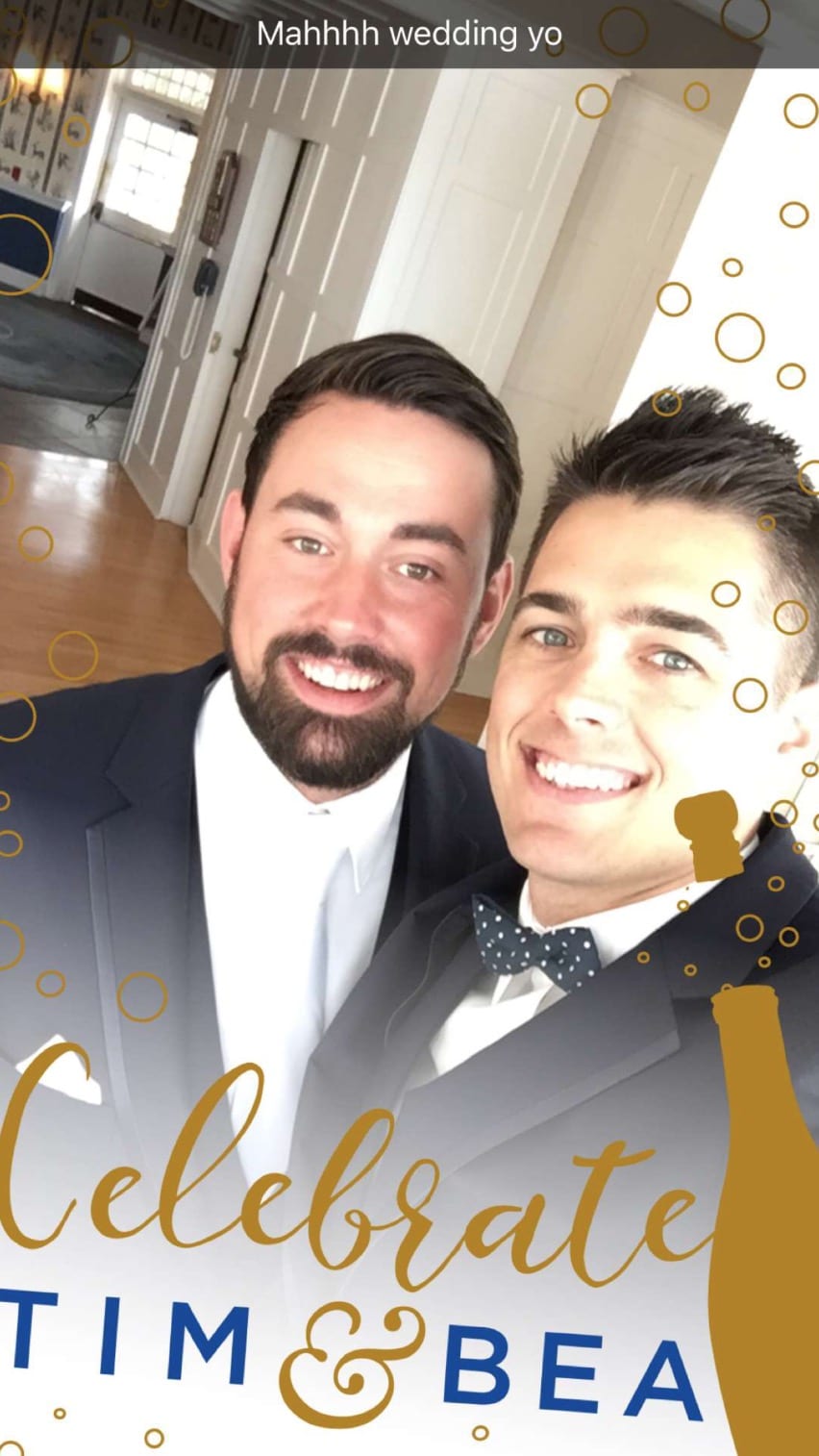
I tried to mimic the hand-lettered look on the table setting for our custom Snapchat filter. We put the filter up on the large TV screen as people entered the White Bear Country Club, and it was fun using it and watching our guests use it.
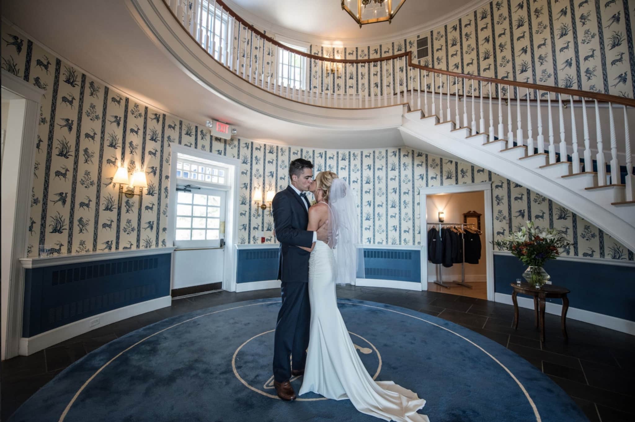
To get a flavor for the club, the invites and paper goods were totally inspired by this entry way and some of the other designs throughout the club, and the blue and white feel gave a consistency across the board.
One more – my favorite shot from the wedding photos.

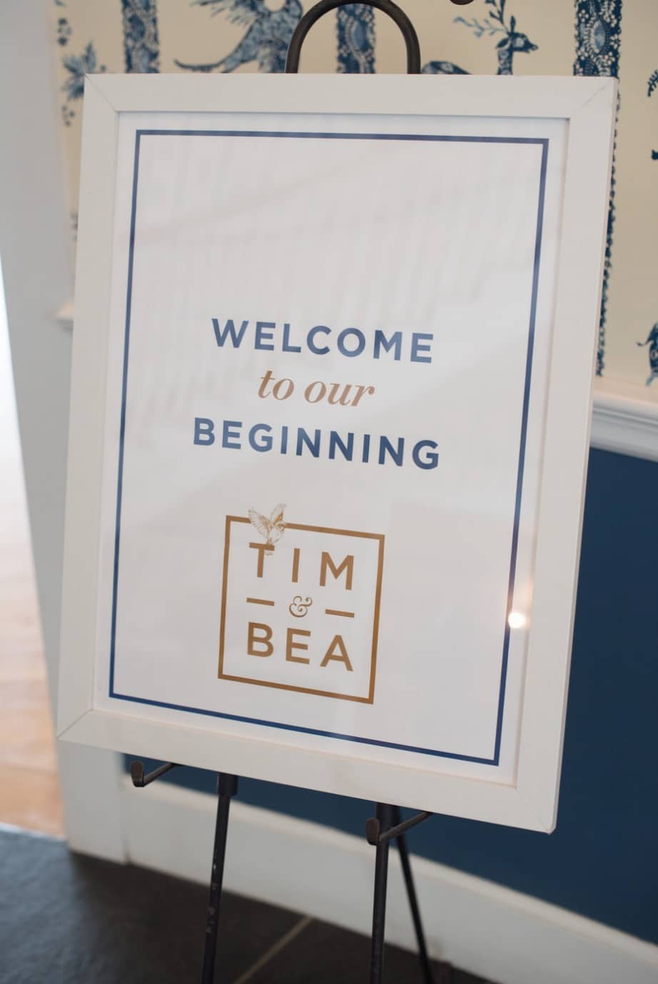
Here is our entry welcome poster in a white frame.
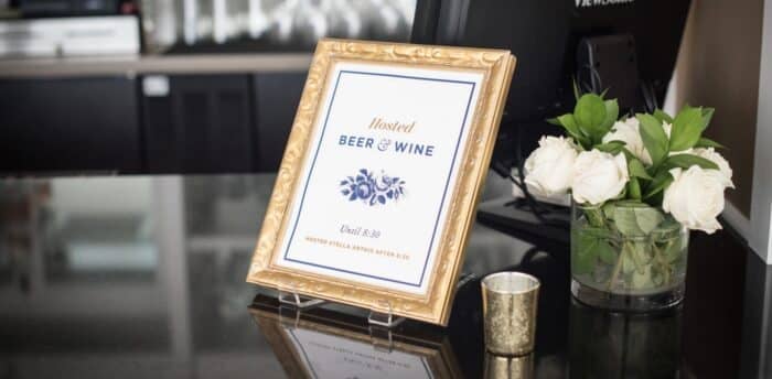
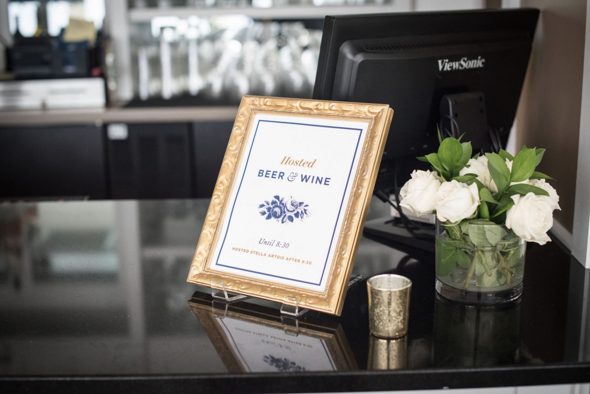
This is probably my favorite paper good from the wedding – the ‘Hosted Beer & Wine’ sign. Surveyor Display makes an appearance on most of my printed items at the wedding, along with the fonts Gotham Bold and Fournier italic.
Overall, wedding invite and graphic design is a particularly interesting challenge when you do it for yourself, because it seems so personal. I knew that people would be paying attention to the design, because of my profession – so I wanted to make it all feel nice, professional, and cohesive. Overall, I feel like I succeeded and it was a ton of fun.
Of course – your minneapolis wedding photographer is super important too!
If you’re looking for wedding invite inspiration, and wedding graphic design inspiration – I really do feel like Pinterest is the place. It’s awesome to see what people are doing, and to take a queue from some of the amazing print designers out there. I think that the opportunity to do things like letterpress, gold foil and other ‘fancy’ elements makes it quite a bit more entertaining than most print design projects.


