So I often go looking for web design color schemes on Pinterest, and beautiful web design color schemes on Dribbble. But, I thought I’d brainstorm 5 color schemes for web design from my perspective and share them on my blog to help kickstart other designers as they have helped kickstart me in my work doing Conversion Rate Optimization and Web Development. Here are my quick takes on bright, high-end, trusted, bold, and natural color schemes.
Feel free to take and use. I’ve provided Hex colors in the design and in CSS for quick use.
Bright and Airy
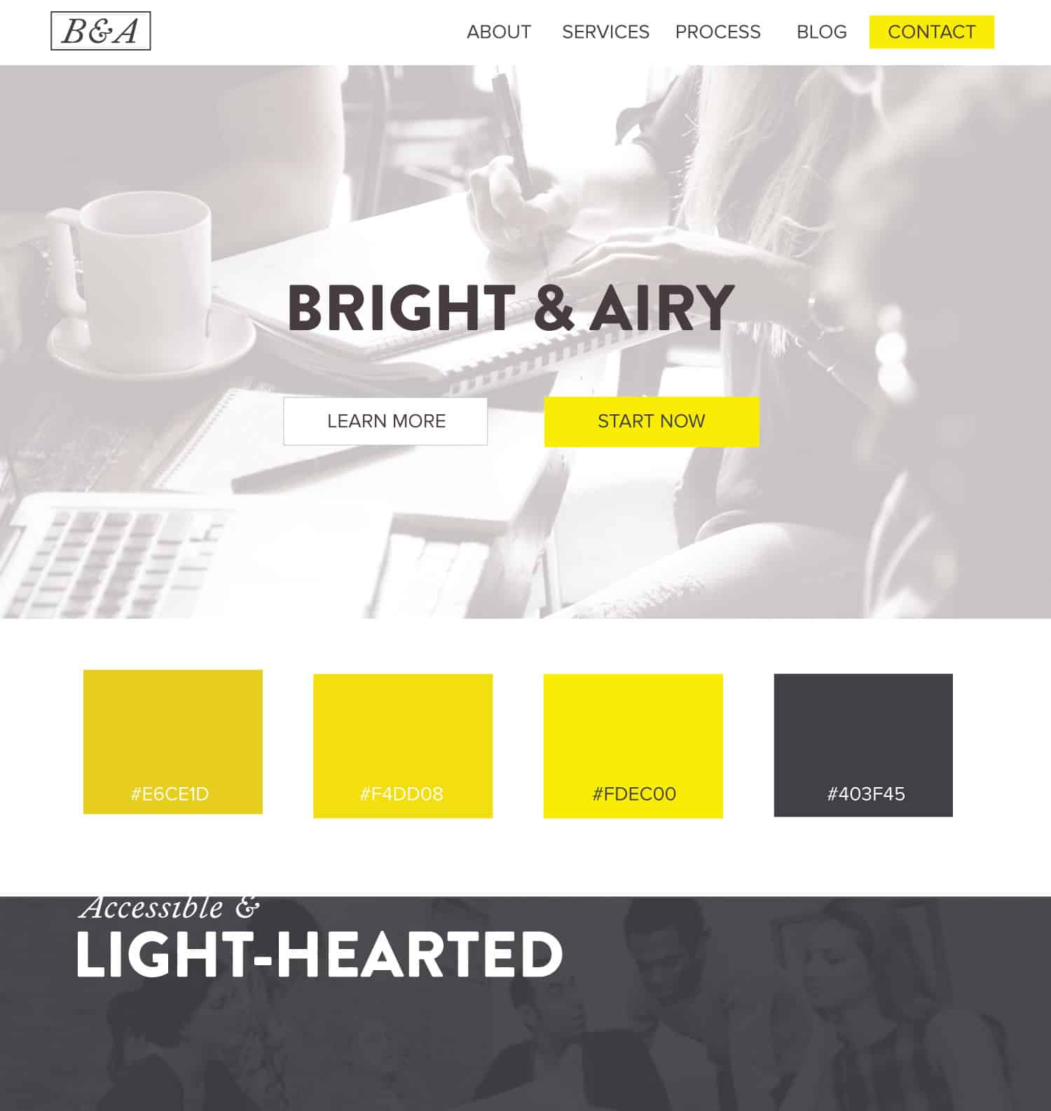
I’m a huge fan of the black and white + 1 color scheme, and herewith yellow, there are different shades of yellow. But essentially, the concept is the same. Keep it simple and add one color, the same hue, but with variations. This gives a bit of class without getting too rambunctious, but still being bold and fresh. This color scheme could go well on a lifestyle blog, a home-goods store, a product or service that was directed at women primarily perhaps but still had crossover appeal. I feel like this color scheme smacks of the site Brain Pickings, and could be lovingly referred to as intellectual lemonade.
Use this web design color palette in CSS:
.med-yellow {color: #E6CE1D}
.light-yellow {color: #F4DD08}
.bright-yellow {color: #FDEC00}
.classy-grey {color: #403F45}
High End and Classy
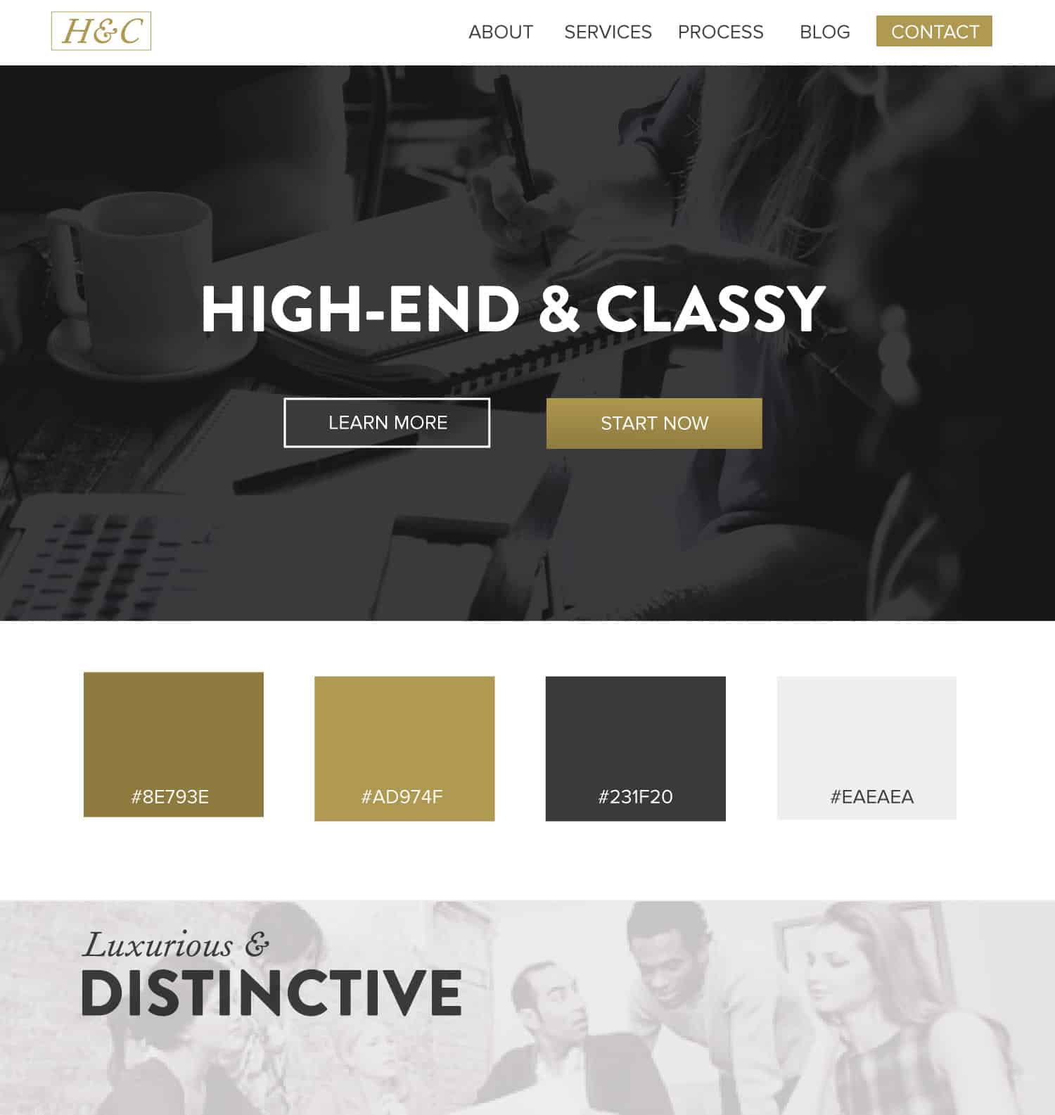
Gold always feels a bit luxurious in design, especially when paired with a deeper gold. Well look at that, I did a black and white + one color scheme again. Of course, it’s not always the case that one gets the chance to create a website without some kind of color scheme in mind. Companies often have brand standards and guidelines, but I like to test my hand and dream big as though I have complete control. Sometimes you have the opportunity to mix up new color combinations with even established brands. I want my color-wielding muscles to be fit. I call this one ‘I make shit look expensive.’
Use this web design color palette in CSS:
.dark-gold {color: #8E793E}
.light-gold {color: #AD974F}
.intellectual-grey {color: #231F20}
.light-grey {color: #EAEAEA}
Trusted and Safe
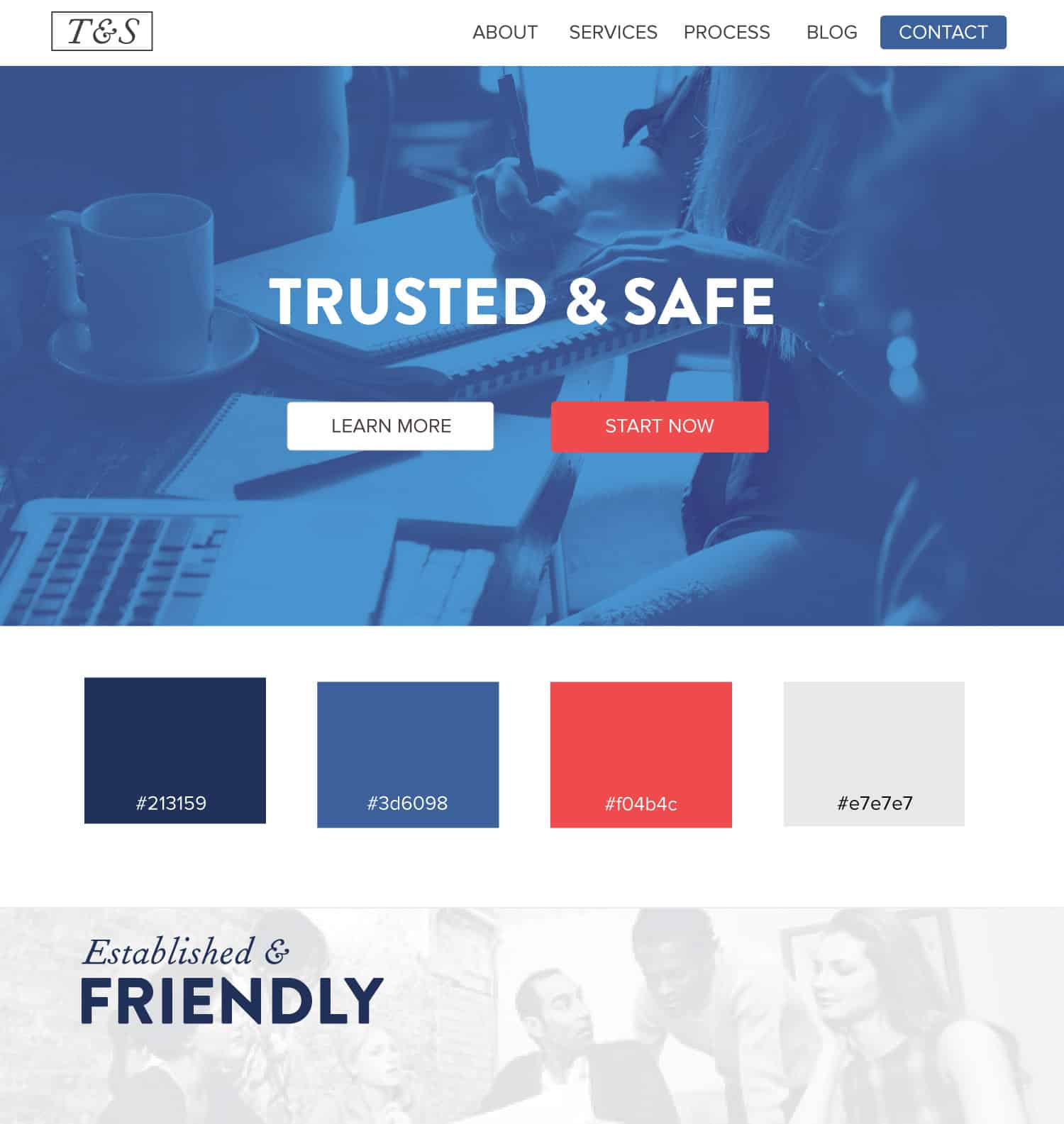
Blue is the color of trust in web design and branding, as many studies on color psychology have un-earthed. It is also preferred by many people, both men, and women, to most other colors. Thus it elicits trust and can be a great fallback if you choose to use color psychology to your advantage. I call this scheme, Always Hungry American.
Use this web design color palette in CSS:
.dark-blue {color: #213159}
.sky-blue {color: #3d6098}
.sexy-red {color: #f04b4c}
.fresh-grey {color: #e7e7e7}
Why are so many websites blue? Because we want to be seen as trustworthy! Not all blues are equal; however, my websites blue was inspired by the dusty blue with a hint of green used by a Minneapolis artist, Jesse Draxler, in some of his pieces.
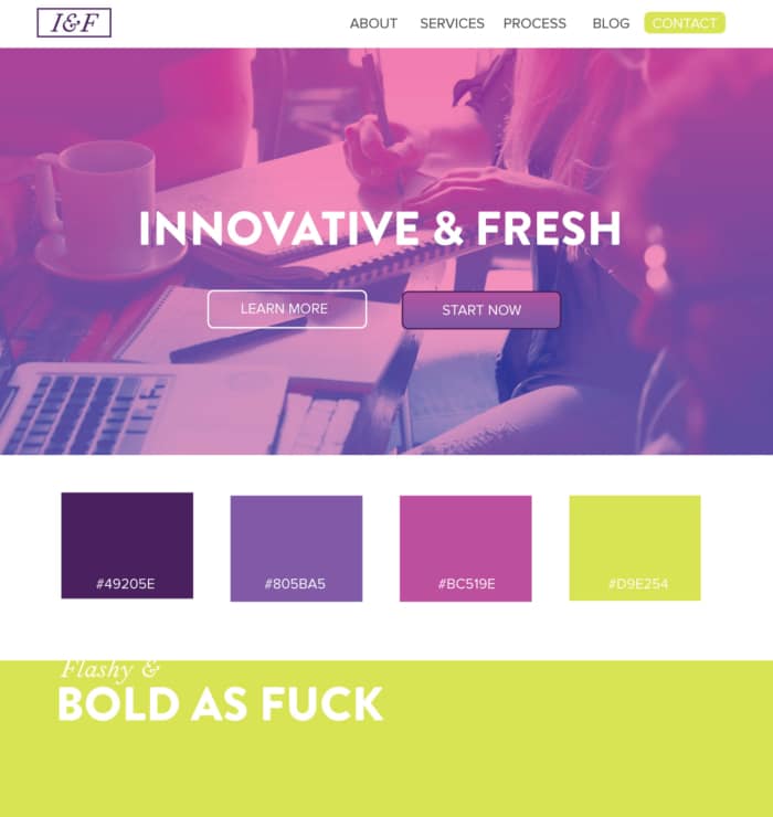
Innovative and Fresh
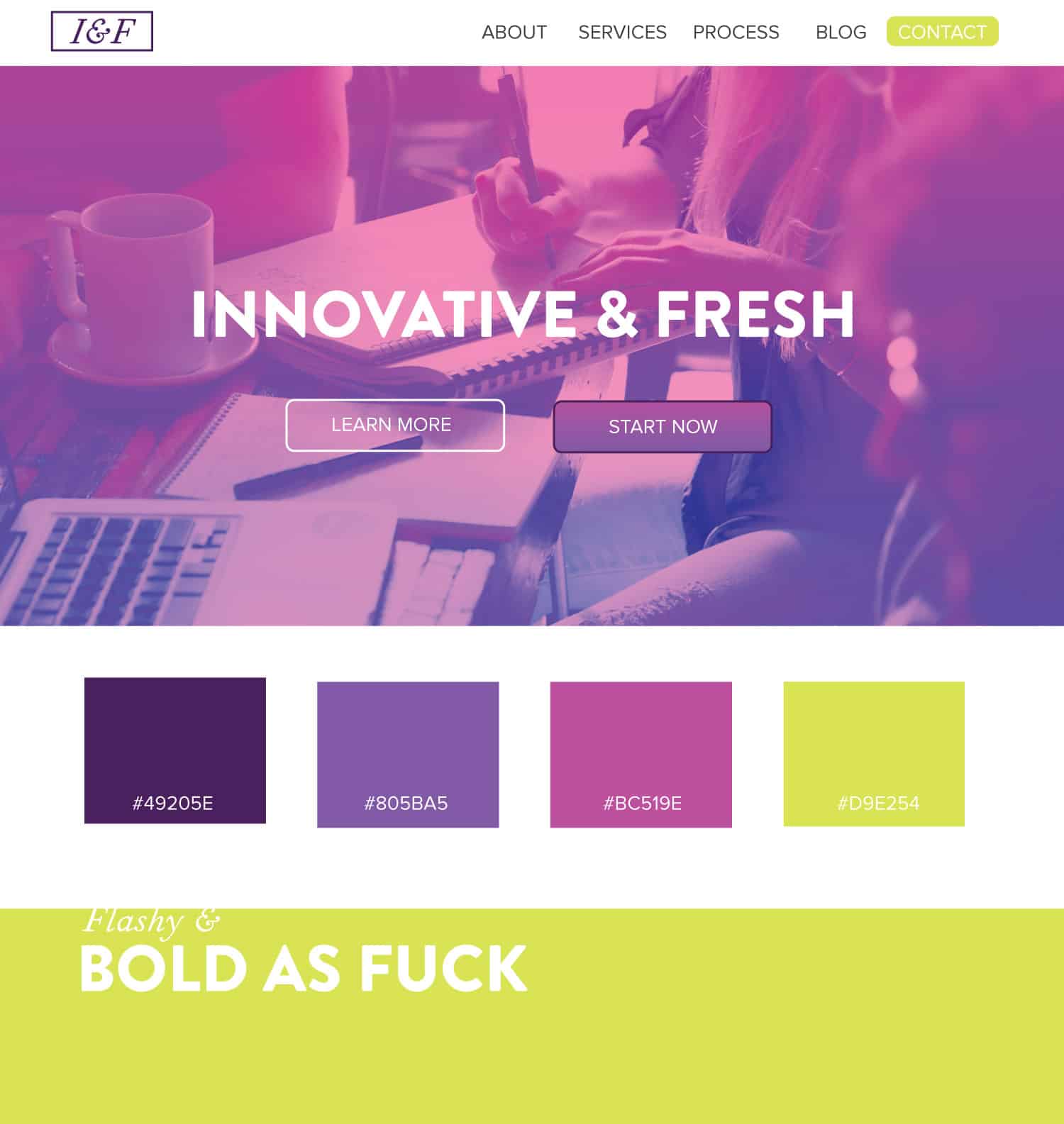
I do love the gradient in this design. I’m using color burn-in, a gradient overlay over the top of the photograph in illustrator so that the shadows come through, but the original coloring doesn’t. I deem this scheme worthy of the name ‘Now & Later,’ don’t get it stuck in your teeth.
Use this web design color palette in CSS:
.purple-rain {color: #49205E}
.purple-plain {color: #805BA5}
.purple-stain {color: #BC519E}
.canary-yellow {color: #D9E254}
Natural and Earthy
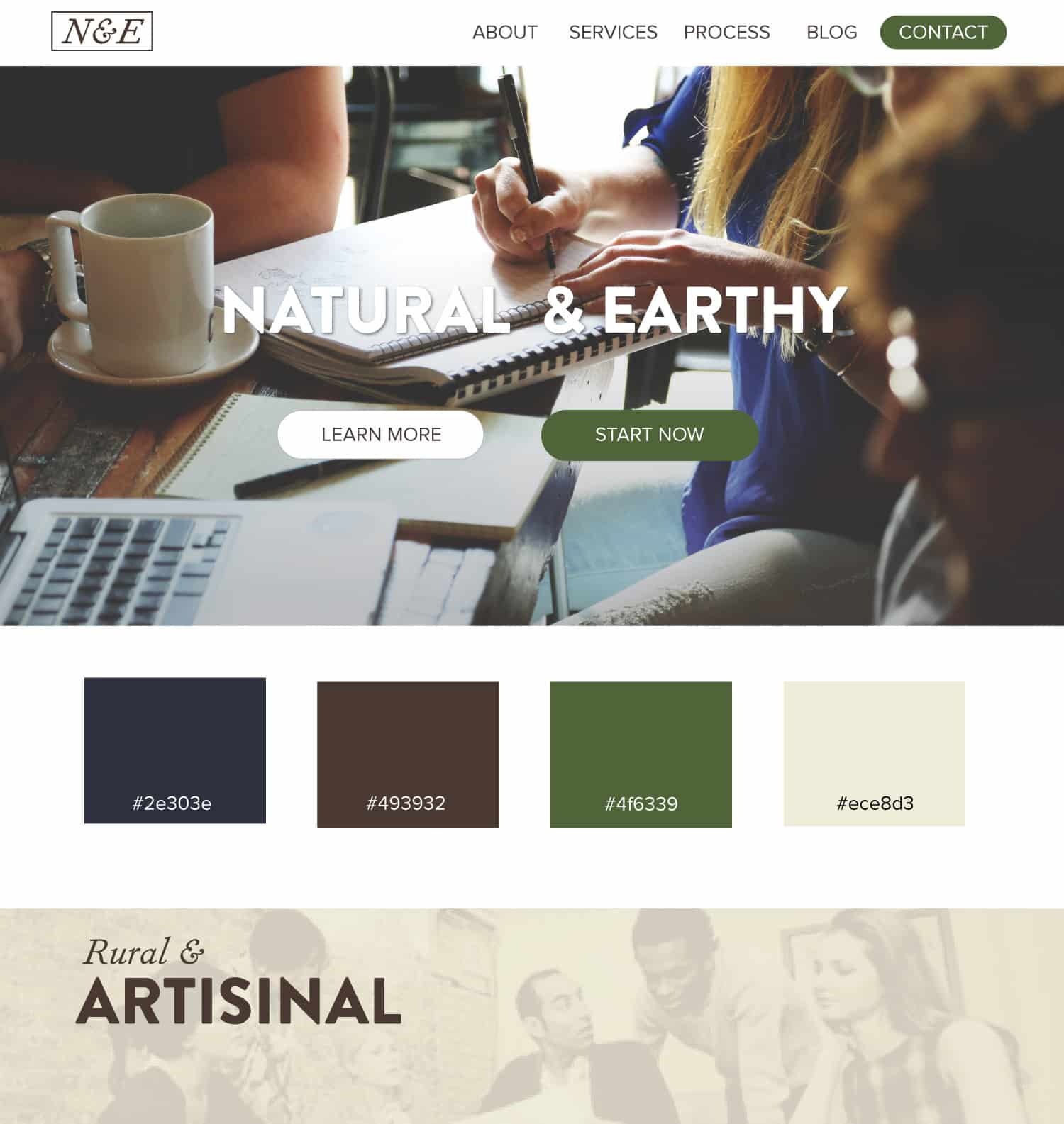
The browns and greens speak to the natural. The original photograph comes out to play in the background. The instagramy flavor of the photograph (lower contrast, and a light fade) gives a nice back-drop to some earth-tones. Simply put, this scheme could be referred to as the dirty duck.
Use this web design color palette in CSS:
.rural-blue {color: #2e303e}
.earth-brown {color: #493932}
.mallard-green {color: #4f6339}
.homey-taupe {color: #ece8d3}
Thank you for reading my random color rant here, and checking out some ideas for web design color scheme inspiration. If you’re grateful or for fun, drop your favorite hex code in the comments below and give it a ridiculous or expressive name. 🙂
Looking a savvy web design team? Web design niches we serve: Plumbing, HVAC, Law Firm, Financial Services, Construction, Medical. Some cities where we serve clients: Chicago, New York, Detroit, Dallas, Cincinnati.


