Ready to create a new website? As a Web Designer, I’ve had the privilege to create 100+ websites in my career, and have been through high’s and low’s from working with Mall of America’s marketing team to create an epic site to being 16 months past a launch date and wishing my career was over.
In all of this time though, I’ve gained some perspective. Some things are absolutely crucial, and some things are just ‘nice-to-haves’. This blog post will go through all of the most important things I’d consider crucial – join me, as I share the most important web design best practices!

Get the most important principles of small business web design in this quick video or read the full post below:

Web Design Best Practices:
- Always make the most important actions on the site easy to find (perhaps making them ‘call-to-action buttons’.)
- Show any badges, affiliations, certifications or awards in a clear visual way so visitors can trust the information, and contact or purchase if appropriate.
- Use a ‘typical’ or recognizable design for your category if you want the maximum percentage of people to perceive it as ‘high quality’.
- Make sure you use the most visited pages that are important for customers to view as part of the main website navigation (usually at the top of the page in a ‘menu bar.’
- Expend extra effort to make sure the first photo, the headline, and the first call-to-action on the page, help people imagine themselves working with you.
- Spend time on the website footer – almost as much as the top of the page, and utilize this crucial space for ‘obvious next steps’ once someone has completed a page, navigation, and contact information for trust and clarity.
- Make sure every page has some kind visual interest, often a photo at the top of the page, and leads into the content with a brief introduction – ideally that is called out a bit visually, and can lead the person into the page / get them to continue reading.
- Have as consistent of fonts as you can. For our site – we have special fonts for the blog, and for the rest of the site, but there is general principles stringing the typography together. We determined for our site there’s a bit of separation for the editorial side of the site and the rest, but the colors, sizes and spacing of the fonts are consistent otherwise.
- Keep the same color palette throughout the design. Of course use your brand colors, or if you’re still working through what your brand standards will be – take a look at our ‘Brand Standards Guidelines’ post!
- Keep your logo / brand consistent throughout, and if possible – make sure there is clarity around what service or products your provide no matter where someone is on the site. I think it can be helpful to either have a sub-title underneath your logo, or the key products or services are listed on the menu itself.
- Make sure each key page on the site allows for 500-1000 words so that it can be indexed, and so that Google knows what your web page is about. This is super important for search engine optimization.
- Mobile friendly design – in this wonderful day and age, designing the mobile version of the site first is even in fashion. If you have Google analytics installed on the site, I really like looking at where the most traffic is coming into the site first, and then if mobile traffic is higher than desktop – starting there. If the desktop traffic is higher than the mobile traffic, do mobile second!
- Capture e-mail addresses – No matter if your list is little or big, or how often you use it. Make sure you have key places that you ask for your audience’s e-mail and make a compelling pitch. E-mail is powerful, and you should be building your list, even if you’re not heavily using it yet.
- Quality Photos – Nothing is more powerful than compelling imagery, get fresh photos taken and tell your story visually.
- If you have full-width, full-height imagery – whether it be video or a background photo – make sure there’s some indication that you can scroll on the page, an arrow downward or the next part of the design slightly visible, as some people won’t necessarily automatically think there’s more site below. (Have observed this user-testing. Sometimes what seems obvious to us, isn’t obvious to everyone.)
When I say web design ‘best practices’ – I’m just referring to things that I’ve seen work really well before. For every designer it might be different, but I do have the pleasure of monitoring analytics for a lot of the clients I’ve built websites for, and have done A/B testing and User Testing – so there’s some level of objectivity to some of this, particularly when I’ve done some testing around it.
My whole philosophy is that we, as web designers – should be aiming for effectiveness, not originality.
Sometimes effectiveness and originality go hand-in-hand, but the data shows that familiar systems, when paired with aesthetic design – leave the strongest impression.
So before you turn to your designer and say “I want something a little bit more unique” – read this amazing article by Peep Laja on ConversionXL – “First Impressions Matter: The Importance of Visual Design.” Peep goes into detail about how ‘prototypical design’ does very well in tests versus more experimental design. I believe it’s because things are where people expect them to be, so they don’t get frustrated and blame the design.
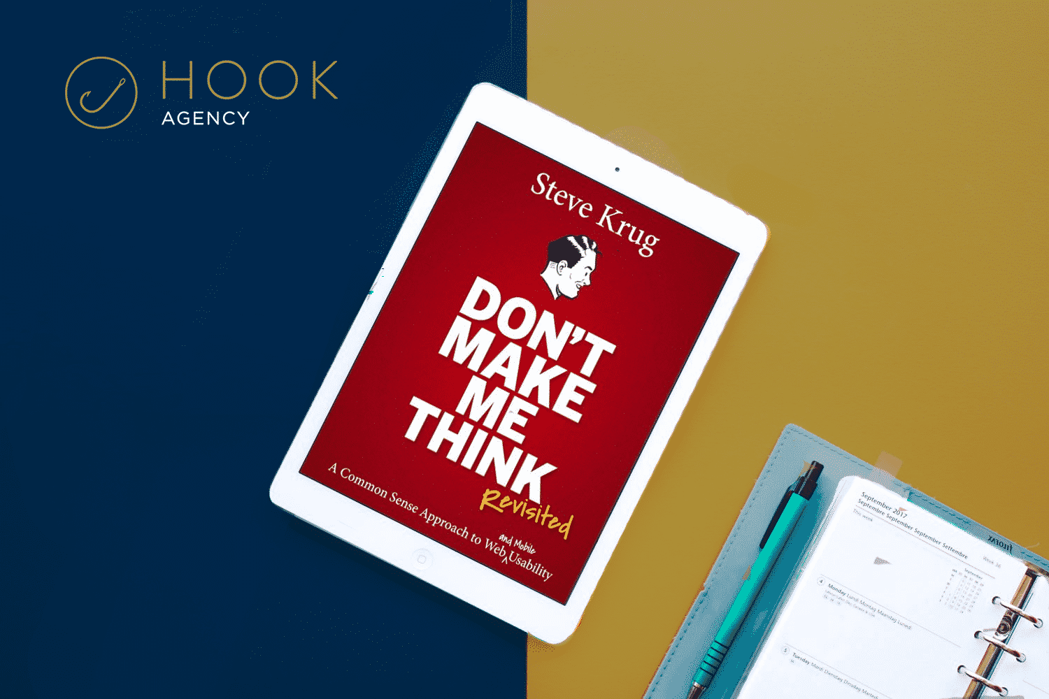
If you’re a web designer and you haven’t yet – you absolutely have to read “Don’t Make Me Think- A Common Sense Approach to Web Usability”, it goes into detail about how to ensure you’re giving website visitors as little friction as possible, ways to test your sites, and web design best practices based on years of user testing. It’s complete with silly illustrations, and a very ‘user friendly’ and readable feel throughout, as clearly the author Steve Krug takes his own medicine – even in the book writing department.
If you’re looking to redesign your website – and want to make sure it’s done right, by a team with experience with User Testing, A/B testing, and monitoring analytics for sites they’ve designed – reach out to us today, and we’ll help you create a website that makes you proud of your company.


