
Picture this: your potential customers are browsing your website on their desktops at work, only to switch to their mobile devices while commuting home. How do you be sure that your site remains visually stunning and highly functional across all platforms? This is where the art of Responsive Web Design comes in – optimizing user experience and enhancing site performance.
At Hook Agency, we delve deep into the world of responsive web design (RWD) to unveil the strategies behind crafting websites that adapt effortlessly from desktop screens to handheld devices, providing a smooth and engaging journey for every visitor who lands on your pages.
Let’s explore how you can increase your online presence and captivate audiences across all devices with our expert insights on responsive design strategies that are bound to revolutionize how users interact with your brand.
Discover our expert tips to make your website visually appealing, easy to navigate, and fast-loading on any screen size. By optimizing your site for all devices, you can improve user experience, SEO and conversion rates.
Understanding Responsive Design

A website with responsive design can adjust to various screen sizes. Responsive design allows your site to look good on any device, improving user experience.
By using fluid grids, elements on your website can adjust proportionally based on the screen size. This ensures a consistent layout regardless of the device used to access your site.
Media queries play a vital role in responsive design by allowing you to apply specific styles based on the device’s characteristics. This customization enhances the user experience and readability of your website.
Creating a seamless user experience across various devices is essential. Your audience expects a consistent and easy-to-navigate interface whether they’re visiting your site on a desktop, tablet, or smartphone.
Incorporating responsive design principles not only improves user engagement but also boosts your site’s SEO performance. Search engines favor mobile-friendly websites, giving you an edge in online visibility.

Importance of Mobile Optimization
Over 50% of web traffic comes from mobile users.
Think with Google
Nowadays, more than ever, mobile traffic is on the rise, with a significant portion of users accessing websites through their smartphones and tablets.
Optimizing your website for mobile devices is not just a trend; it’s a necessity. By keeping your site mobile-friendly, you enhance the user experience, leading to higher engagement levels. A responsive design that adapts seamlessly to different screen sizes can significantly impact your conversion rates.
Statistics show that over 50% of web traffic comes from mobile users. This means that if your website is not optimized for mobile, you could be missing out on reaching a large portion of your audience. Imagine the potential growth in user engagement and conversions by catering to this expanding segment of users.
SEO Benefits of Responsive Web Design
- Improved search engine rankings
- Enhanced visibility in search results
- Consistent user experience across all devices
When you implement responsive web design, you can improve your website’s search engine rankings. By having your site adapt to different devices, Google recognizes it as mobile-friendly. This helps your chances of appearing higher in search results.

Google also prioritizes mobile-friendly websites. When users search on mobile devices, Google favors sites that offer a seamless experience across all screens. This preference directly impacts your site’s visibility and organic traffic.
Responsive design helps in reducing bounce rates, which are a factor in SEO performance. A responsive website provides a consistent user experience, keeping visitors engaged and exploring different pages. As a result, lower bounce rates signal to search engines that your site offers valuable content.
Top 8 Design Elements for Better Usability
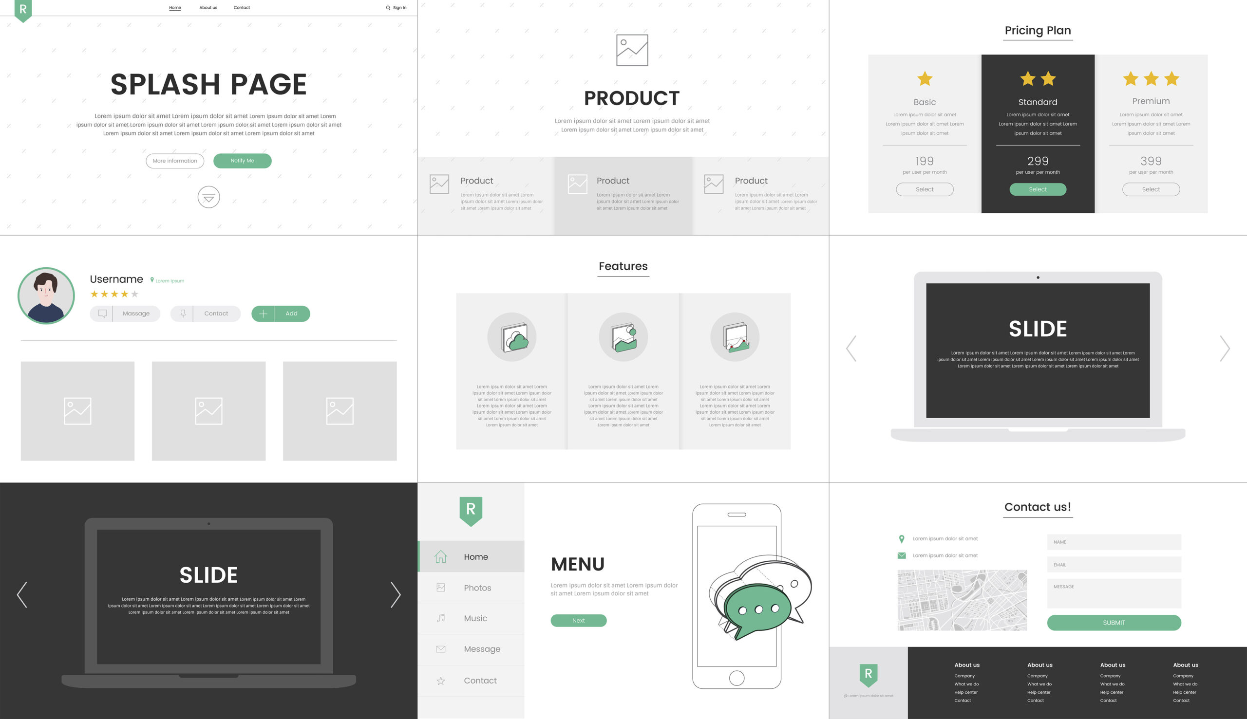
- Focus on intuitive navigation to ensure users can easily find what they are looking for.
- Incorporate user-friendly menus and search functions.
- Clear call-to-action buttons are guide visitors towards desired actions such as making a purchase or signing up for a newsletter. Make them prominent and visually appealing.
- Consistent branding across all devices helps in building brand recognition. Use the same colors, fonts, and imagery to create a cohesive brand identity that resonates with your audience.
- Establishing a visual hierarchy is essential to direct users’ attention to the most important elements on your website. Utilize size, color, and spacing to prioritize content effectively.
- Whitespace plays a vital role in enhancing readability by providing breathing room between elements. It reduces visual clutter and improves overall user experience.
- Typography choices impact how users engage with your content. Use easy-to-read fonts and maintain consistency throughout your website for a seamless browsing experience.
- Incorporating all of these design elements into your responsive web design will not only enhance usability but also contribute to creating a visually appealing and engaging online presence.
Optimizing Images for Faster Website Loading
For optimizing images for your website, reduce file sizes by compressing them without losing quality. Make sure images are in the right format like JPEG or PNG for web optimization.

To speed up page loading, use responsive images that adjust based on screen size to enhance user experience. Also implement lazy loading to prioritize image loading when users scroll down.
By optimizing images, you enhance website performance and reduce bounce rates. Faster-loading pages lead to better user engagement and higher conversion rates.
- Use tools like Adobe Photoshop or online platforms such as TinyPNG for image compression.
- Consider using SVG (Scalable Vector Graphics) for simple graphics and icons to further optimize loading times.
Incorporating these image optimization techniques into your responsive web design ensures a seamless user experience across various devices. By prioritizing fast-loading images, you improve usability and overall website performance.
Implementing Flexible Layouts

When designing your website, implement flexible layouts to ensure it looks good on any screen size. These layouts adjust based on the device being used, providing a seamless user experience.
Using CSS frameworks like Bootstrap can simplify the process of creating responsive designs. Bootstrap offers pre-built components and styles that are responsive by default, saving you time and effort.
By utilizing flexible layouts, your website becomes more adaptable, enhancing its responsiveness across various devices. For instance, when viewing a website on a smartphone, elements rearrange themselves neatly to fit the smaller screen size.
Benefits of flexible layouts:
- Ensures a consistent user experience
- Improves accessibility for all users
- Boosts search engine optimization by catering to mobile-friendly criteria
Incorporating these flexible layout tips into your web design approach will result in a visually appealing and user-friendly website that engages visitors effectively.
Enhancing User Experience with Media Queries
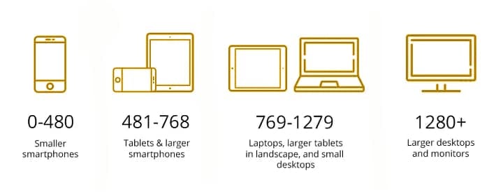
When customizing styles based on device characteristics, media queries allow you to adapt your website’s layout and design to different screen sizes seamlessly. By properly adding media queries, you can ensure that your website looks great whether it’s viewed on a desktop, tablet, or smartphone.
Breakpoints are key in this process. These are specific points where the layout of your website changes to accommodate various screen sizes. By setting breakpoints in your CSS code, you can create a smooth and responsive design that adjusts effortlessly as users switch between devices.
Using media queries effectively can significantly enhance user experience. For instance, consider a scenario where your website’s navigation menu collapses into a dropdown on smaller screens to optimize space utilization. This simple adjustment makes it easier for visitors to navigate the site on their mobile devices without compromising functionality.
Incorporating media queries doesn’t have to be complex. By following best practices and experimenting with different breakpoints, you can fine-tune your website’s responsiveness for improved usability across all devices.
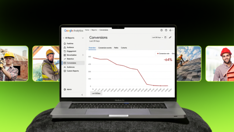
Testing and Improving Your Design

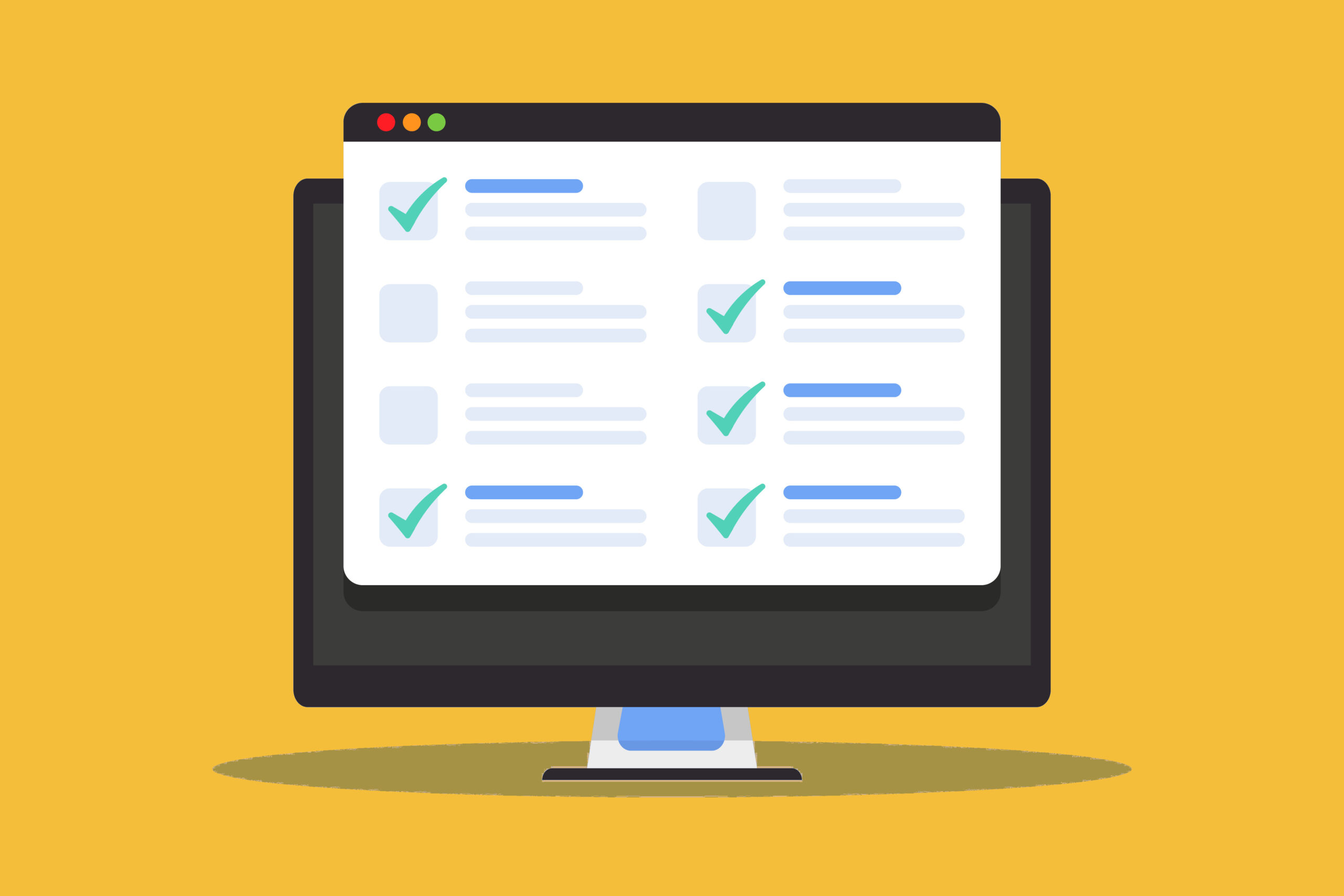
To be sure your website is responsive on all devices, test across various browsers. Utilize tools like Lighthouse in Chrome DevTools or a browser screenshot tool like LAMBDATEST to evaluate the responsiveness of your website. This step helps identify any issues that may affect user experience.
Gathering user feedback can help with improving the responsiveness of your website. By understanding how users interact with your site, you can make necessary adjustments to enhance their experience. Continuously monitor user behavior to refine and optimize your design further.
Consider A/B testing to compare different versions of your design and determine which one performs better in terms of responsiveness. This method allows you to make data-driven decisions based on user preferences and behaviors.
Regularly update and maintain your website to ensure it remains responsive over time. The internet and technology evolves rapidly, so staying up-to-date with the latest trends and best practices is essential for providing an optimal user experience.
- Test website responsiveness across browsers
- Monitor user behavior to refine and optimize design continuously
- Conduct A/B testing to compare design versions for better responsiveness
- Regularly update and maintain your website to keep it responsive and user-friendly
Incorporating these responsive web design tips will improve your site’s usability and also increase its search engine visibility and user engagement. Take action today! Apply these strategies to create a seamless and user-friendly browsing experience for your audience.
