
Most pest control websites? Forgettable.
Stock photos of bugs. Cheesy “family-owned since 1999” taglines. A big phone number at the top. And that’s it.
But the best sites? They work.
They stop a homeowner in their tracks. They make booking pest control feel urgent. And they turn casual visitors into paying customers.
That’s why we pulled together 7 pest control website design examples worth studying. Real-world proof of what gets clicks, calls, and contracts in this industry.
Ready to see what makes the difference between “just another site” and one that dominates your service area? Let’s dig in.
What Makes a Pest Control Website Convert
A pest control website has one job: turn a freaked-out homeowner into a booked inspection. The way you design it either builds instant trust or pushes them straight to a competitor.
Here’s what separates websites that convert from ones that collect dust:
- Clear CTAs: Buttons like “Schedule a Free Inspection” or “Get a Quote” should sit above the fold, visible before a single scroll.
- Trust signals: Reviews, certifications, BBB logos, and before-and-after photos show homeowners that you’re legit.
- Fast load speed: If your site lags longer than three seconds, most visitors won’t stick around to wait.
Now layer in design. This is where credibility and usability collide.

- A clean layout matters. Too much clutter feels chaotic and makes visitors bounce. Think streamlined sections, easy-to-read text, and space that lets your brand breathe.
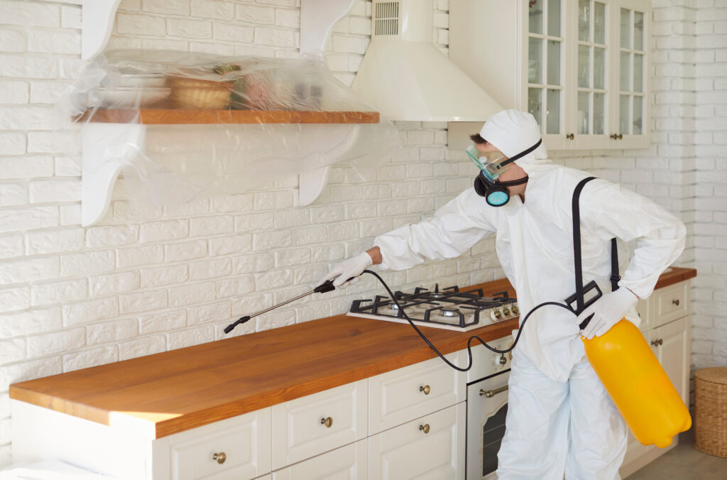
- Real photos hit harder than stock bugs. Show your team shaking hands with a homeowner, your trucks parked on the street, or your crew mid-job. Authenticity connects.
- Navigation should feel obvious. Pricing, services, and contact should never take more than a click or two to find. If someone has to hunt for your phone number, you’ve already lost them.
When you combine strong calls to action, instant trust, quick load speeds, and simple, authentic design, you create a site that doesn’t just look good but actually drives calls.
Many of the best-performing pest control sites follow the same playbook used in home services website design, where every piece of the layout is built for clarity and conversion. And if you’re thinking about platforms, remember that WordPress websites for contractors are still one of the most flexible, reliable ways to build a site that’s both beautiful and functional.
Why Mobile-First Design is Non-Negotiable in 2026
Pull out your phone. Search “pest control near me.” That’s exactly what your potential customers are doing, right in the middle of a bug emergency. If your site doesn’t look sharp and load fast on that tiny screen, you’re out before the game even starts.
Over 55% of global website traffic now comes from mobile devices. That means more than half of your audience is never even seeing the desktop version of your site. And when people do pull out their phones, they expect everything to just work fast.
A mobile-first site does three things really well:
- Speed: Pages pop open in under three seconds. No lag, no spinning wheels.
- Click-to-call buttons: One tap and they’re connected to your team. No copy-pasting phone numbers.
- Thumb-friendly layouts: Buttons, menus, and forms sized for fingers, not tiny cursors.

Think about it this way: if your site frustrates people on a phone, you’ve already lost the lead. They’ll hit back and call the next name on Google. That’s why mobile mistakes like clunky layouts or hard-to-find contact info are some of the biggest home service website mistakes you can make in 2026.
7 Pest Control Website Design Examples That Get It Right
Some pest control sites chase “pretty.” The smart ones chase performance.
These examples don’t just look good, they convert. They grab attention, build instant trust, and make it almost impossible for a homeowner not to call or click.
Let’s break down 7 pest control website design examples that actually get it right.
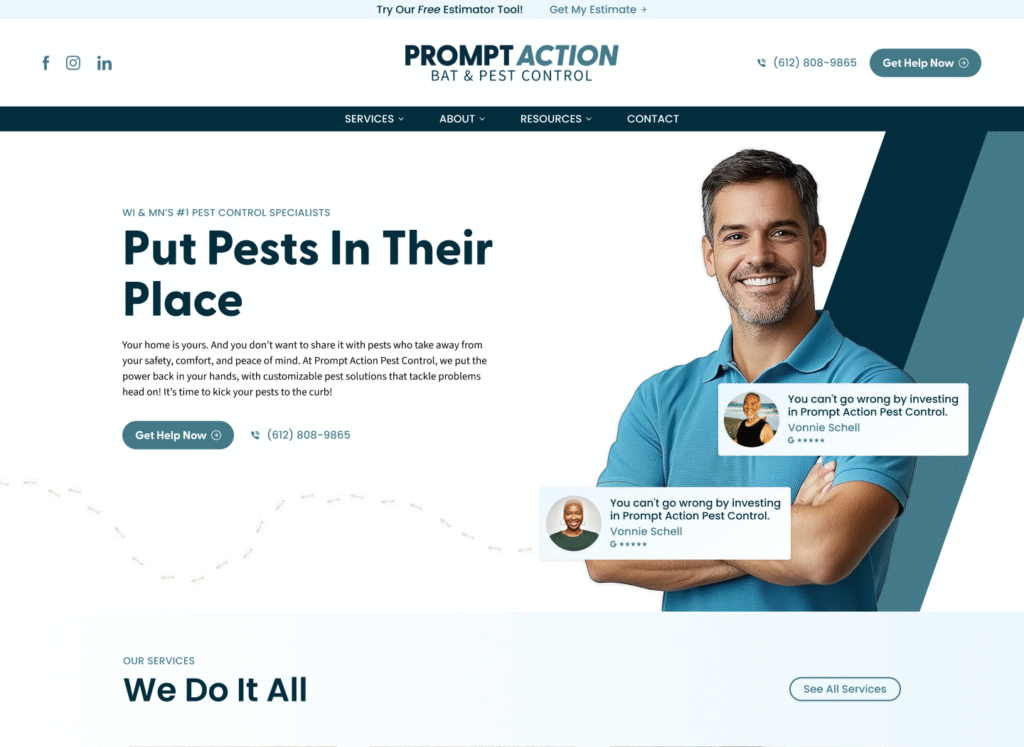
1. Prompt Action Pest Control
This site nails the balance between friendly and professional.
- Faces build trust: Instead of generic bug stock photos, the homepage leads with a smiling, approachable team member. That human touch makes it feel safe to invite them into your home.
- Messaging that hits home: “Put Pests In Their Place” doesn’t just sound bold, it speaks directly to what every stressed homeowner wants. Paired with promises of safety, comfort, and peace of mind, it’s hard to ignore.
- Calls-to-action everywhere: A bright “Get Help Now” button shows up in all the right spots, alongside a visible phone number for quick contact. No hunting, no hesitation.
- Credibility on display: By claiming their spot as “WI & MN’s #1 Pest Control Specialists” and showcasing their service number, they make it clear they’re the trusted choice.
- Polished but clever: The clean design feels professional, while the subtle ant trail crawling across the page is a fun nod to their industry that keeps it memorable.
2. Truly Nolen
When you land on this site, you know instantly who you’re dealing with.
- Brand power front and center: That bright yellow splash and the quirky mouse cars? Unmistakable. Truly Nolen leans on its iconic identity, and it works, it feels familiar, trustworthy, and established.
- Straight to the problem: The “What is your problem pest?” form immediately pulls you in. Instead of hunting through menus, you’re already on the path to a solution.
- Options that convert: Whether you’re just browsing or ready to commit, the top of the page delivers. “Free Estimate” for the cautious, “Buy Now” for the decisive. Phone numbers are right there too because nobody wants to dig for contact info.
- Credibility you can feel: Eighty-five years in the business plus a 100% money-back guarantee? That’s experience backed by confidence, and it makes the choice easy.
- Playful but effective visuals: An oversized ant illustration, those signature mouse cars – it’s fun, it’s memorable, and it keeps Truly Nolen top of mind long after you click away.

3. HomeTeam Pest Defense
This site nails the balance between professionalism and approachability.
- Trust starts with people: A smiling technician helping a happy homeowner makes the brand instantly feel safe, reliable, and easy to welcome inside. That human connection matters in pest control.
- A headline that reassures: “Exceptional Service, Your Strongest Defense” doesn’t dwell on pests, it emphasizes protection, peace of mind, and partnership. Customers see value, not just extermination.
- Smart local focus: The “Find My Branch Now” tool takes guesswork out of the process. One click, and you’re matched with nearby service.
- A modern, calm design: With a crisp layout and a polished color scheme, the site feels both authoritative and welcoming. Nothing distracts from the calls-to-action or the trust-building message.

4. Orkin
When you land on Orkin’s site, credibility hits you right away.
- Strong Branding: The red and white Orkin logo jumps off the page, instantly signaling authority and nationwide recognition.
- Benefit-Oriented Messaging: Headlines like “The Orkin Pros. The Best in Mosquitoes” position the company as an expert while keeping the tone approachable.
- Clear Call-to-Action: A bold “Get a Free Quote” button is front and center, repeated in smart spots so it’s always within reach.
- Trustworthy Visuals: A smiling Orkin pro working with a customer makes the brand feel both credible and personal.

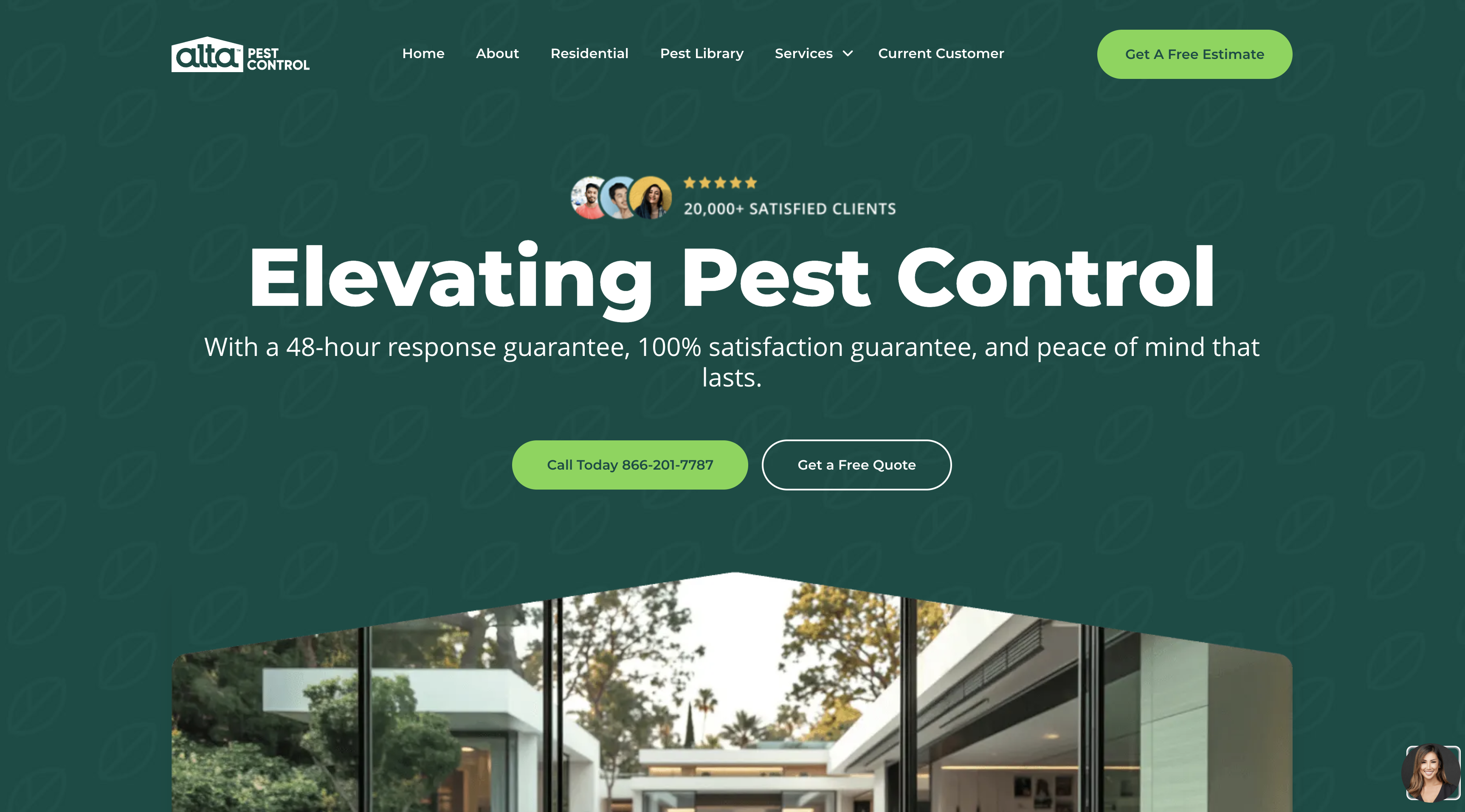
5. Alta Pest Control
- Emotional & Benefit-Driven Headline: “Elevating Pest Control” feels bold and aspirational, while backup promises like a 48-hour response and 100% satisfaction guarantee give it teeth.
- Powerful Social Proof: 20,000+ happy clients and wall-to-wall 5-star ratings instantly show visitors this team is proven and trusted.
- Dual Calls-to-Action: Whether someone wants to pick up the phone or click a button, options are clear with “Call Today” and “Get a Free Quote” right in view.
6. Pestie
- Benefit-Oriented Headline: “Save hundreds on pro-grade pest control” goes straight for the wallet and wins. It’s cost-saving and confidence-boosting all at once.
- Empowering Visuals: A friendly couple tackling their own yard sends a clear message, this is simple, doable, and you don’t need to be a pro to get pro-level results.
- Simplified Call-to-Action: A bold “Get Started” button cuts the fluff and gets users moving right away.
- Credibility & Social Proof: Over 20,000 reviews with a solid 4.68 average rating lock in trust and show this DIY solution really works.

7. Urbanex
- Urbanex doesn’t just sell pest control. It sells peace of mind. The headline says it outright: “Peace of Mind Is a Great Feeling.”
- The visuals back it up. A family at ease, a child smiling, a friendly tech by their side, it feels safe, trustworthy, and real.
- Key concerns? Covered. “Safe for Kids & Pets” speaks directly to what matters most in a home.
- The path forward is simple: one bold “Get My Free Quote” button. No risk, no pressure. Add in the 100% Satisfaction Guarantee, and hesitation disappears.

SEO and Conversion Design: The Power Combo (and What Not to Screw Up)
Ranking high is half the battle. If your site shows up first for “pest control Dallas” but looks sketchy, homeowners click back faster than you can say exterminator. SEO pulls them in. Design convinces them to stay.
But here’s the kicker, most pest control sites lose leads not because they can’t rank, but because they kill conversions with avoidable mistakes:
- Layouts crammed with endless text that nobody reads
- CTAs buried at the bottom or weak enough to ignore
- Stock photos of ants or cartoon bugs that scream generic
- Mobile experiences that frustrate instead of convert
The good news? These aren’t massive rebuild issues. You can fix clutter, swap in real photos, and make sure your “Schedule Inspection” button is bold and visible, literally tomorrow.
SEO gets you the traffic. Conversion-focused design turns it into booked jobs. Ignore one, and you’re leaving money on the table.
If you want to see what this looks like in action, check out this breakdown of the 5-part winning website formula for home services.

The Hidden Conversion Killers Most Pest Control Websites Never Fix
A pest control website can look sharp, load fast, and rank well on Google. And still lose leads every single day.
Not because the SEO is broken. Not because the design is bad. Because of small, specific friction points that send ready-to-book homeowners quietly to a competitor without anyone noticing.
These are the conversion killers most pest control websites never fix.
No After-Hours Capture System
Pest problems do not happen on a schedule. A homeowner finds something crawling across their kitchen at 10pm. They pull out their phone. They find your site. And there is no way to book, no chat option, no form confirmation that tells them someone will call first thing tomorrow.
So they keep scrolling. They find a competitor with an instant booking option. That job is gone.
An after-hours capture system does not have to be complicated. A chat widget that collects name and number. An online booking tool with real time slots. A form confirmation that sets expectations clearly. Any of these keeps the lead warm until your team is back online.
Generic Trust Signals That Nobody Believes
“Licensed and insured.” “Family owned since 2003.” “100% satisfaction guaranteed.”
Every pest control website says some version of this. Which means none of it registers anymore. Homeowners have seen these lines so many times they scroll right past them.
Real trust signals look different:
- Named reviews with specific job details and a recognizable suburb
- Photos of your actual technicians, not uniforms from a stock photo library
- A guarantee with real specifics, not vague promises
- Certifications with logos from recognizable bodies, not just text claims
The difference between a trust signal that converts and one that gets ignored is specificity. Vague claims blend into the background. Specific proof stops the scroll.
Pricing Anxiety With No Relief Valve
Pest control pricing is confusing to most homeowners. They do not know if a treatment costs $80 or $800. That uncertainty creates hesitation. And hesitation kills conversions.
The best pest control websites address this head on. Not by publishing an exact price list, but by giving homeowners enough context to feel comfortable taking the next step.
A starting price range. A “most homeowners pay between X and Y” line. A financing option for larger treatments. Any of these removes the anxiety that keeps someone from clicking the booking button.
Slow Follow-Up That Lets Leads Go Cold
This one happens after the click but it is still a website problem.
A homeowner fills out a contact form. They do not hear back for four hours. By then they have already booked with someone who responded in ten minutes.
Automated follow-up sequences triggered the moment a form is submitted are now a standard expectation. A confirmation text. An email with next steps. A calendar link for self-scheduling. The leads your website generates are only as valuable as the speed at which your system follows up on them.
Fix these four things and the same traffic your website already gets starts converting at a meaningfully higher rate.
The Digital Front Door You Can’t Afford to Ignore
Homeowners don’t give you minutes. They give you seconds. In that split-second scroll, your website is either screaming “trust us” or sending them straight to your competitor.
A sharp, mobile-first design. Calls to action that pop. Real photos that make you look human, not cookie-cutter. All of it adds up to one thing, credibility that gets calls.
Your website isn’t just a brochure. It’s your #1 sales tool. And if it’s not pulling leads, it’s not doing its job.
Schedule a call with Hook Agency to build a high-converting pest control website for your business.
Frequently Asked Questions
What makes a pest control website convert well?
Fast load time, a clear CTA above the fold, real photos, and trust signals that are specific rather than generic. Every page should give a homeowner a reason to stay and a clear next step to take.
How many CTAs should a pest control website have?
One primary CTA per page. Too many options create hesitation. A single bold button like “Get a Free Inspection” consistently outperforms a page with four different options competing for attention.
Do pest control websites need a blog?
Yes. Blogs targeting specific pest problems, seasonal issues, and local infestations build topical authority and drive long-tail search traffic. A post about “termite season in [city]” can generate consistent leads for years.
How important are reviews on a pest control website?
Critical. Reviews should be visible without scrolling on every key page. Specific named reviews mentioning the pest type and location convert better than generic star ratings alone.
Should a pest control website show pricing?
Not exact pricing, but context helps. A starting range or a “most treatments cost between X and Y” line removes the pricing anxiety that stops homeowners from filling out a form.