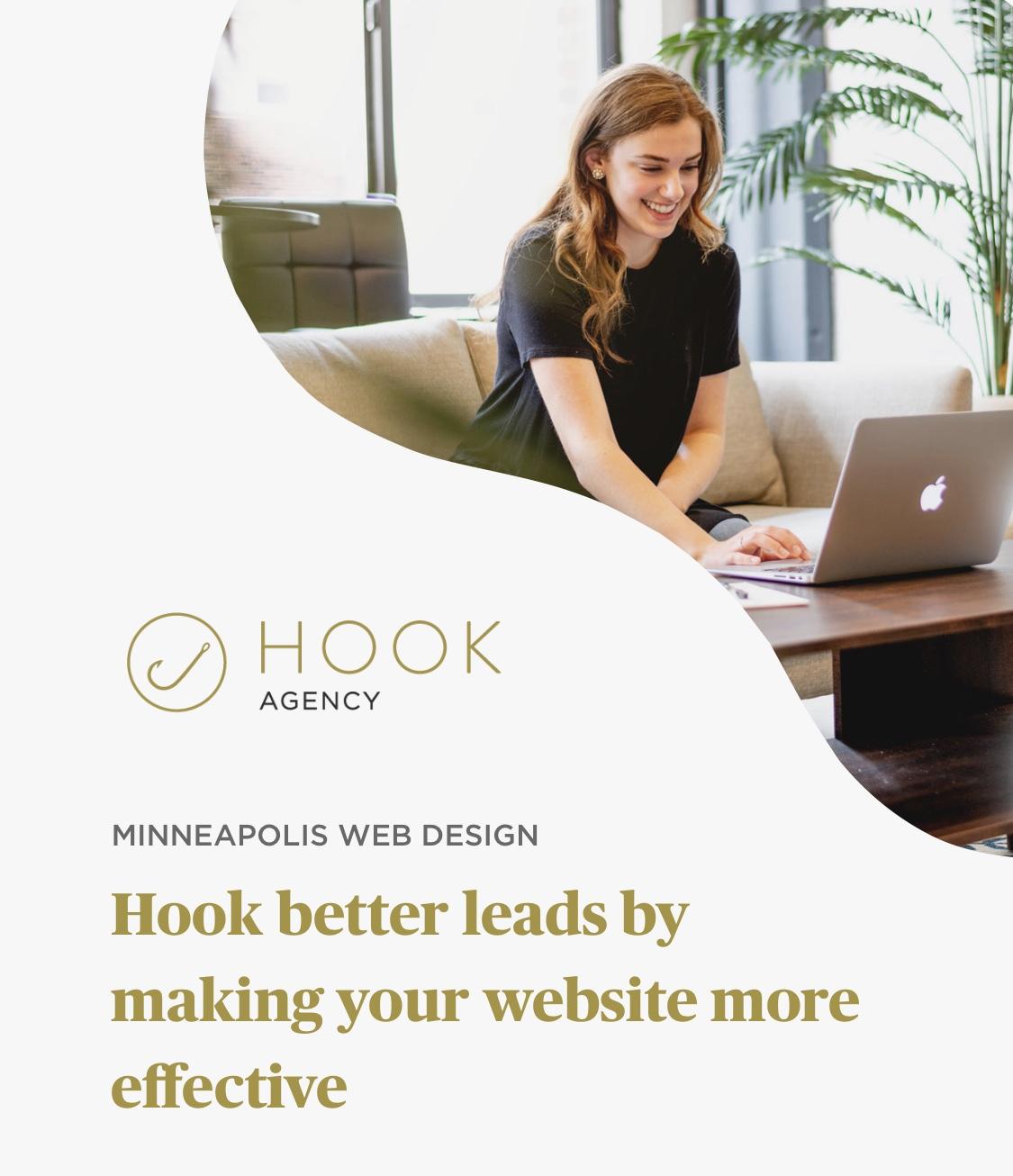
These are my 12 of favorite tips for increasing leads on websites that I think all websites should have – and most of them are not that crazy hard to do.
But first – why should you trust that these changes are worthwhile? Because our methods get our average client 39.7% more leads year over year.
Many of these changes – you could make pretty quickly, or delegate to your current website designer to have done in a few business days. So what are you waiting for – get more leads with these 12 top methods for increasing conversions!
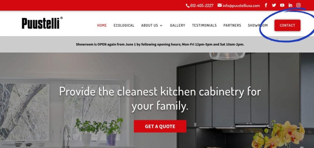
1. The top right call-to-action
I think all websites should have it.
Why? It looks modern, it reminds folks what the key action we want them to take on the site, and provides a visual anchor continually calling people’s attention to an obvious next step.
It’s not about being pushy – it’s about making things EASY for people to do business with you. I’ve been to people’s site where it’s not immediately clear what I would do if I wanted to work with someone.. **Don’t Make Me Think** (by the way great book by Steve Krug.) Check it out. 🙂
Client example: Puustelli USA, who’s ultra clean, strong, and CLEAN kitchen cabinetry is modern, sleek, and in the highly trendy Scandinavian style and who’s showroom is open. Check them out!
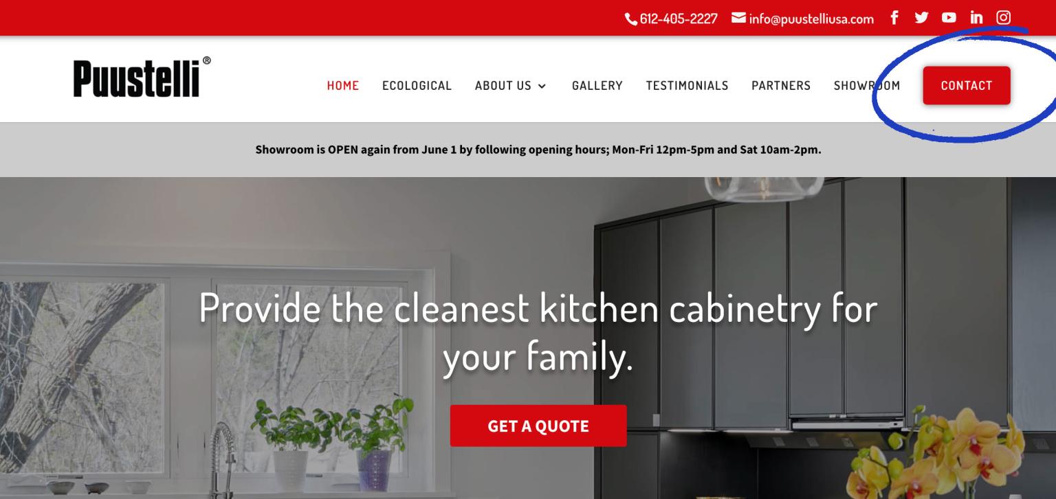
2. An interior page -end of page call-to-action
Do you have a call-to-action at the end of every interior page (and blog post) on your website?
The opportunity is huge with universal elements on your website to increase the # of people turning into customers.

With this client – mobileAxept we chose to highlight their ideal customers in a story form, along side the call-to-action, and thus every page and post gives a little, inspirational excerpt (and social proof) before offering an obvious next step.
3. “Helper Text” on your contact form
Do you have ‘helper text’ next to your contact form?
It’s sad to see contact pages that get 12 hits a day and no conversions.
Invite people on your contact page in! Be human, use a real photo of someone who would be reaching out after they send their message – and let them know you’re looking forward to chatting. This little improvement to your contact form could be the difference of 0 in 12 contacting you, and 1 in 12.
Their new high-end website design just launched: Amazing work to the custom WordPress developer on the project Matt Pearce Anderson
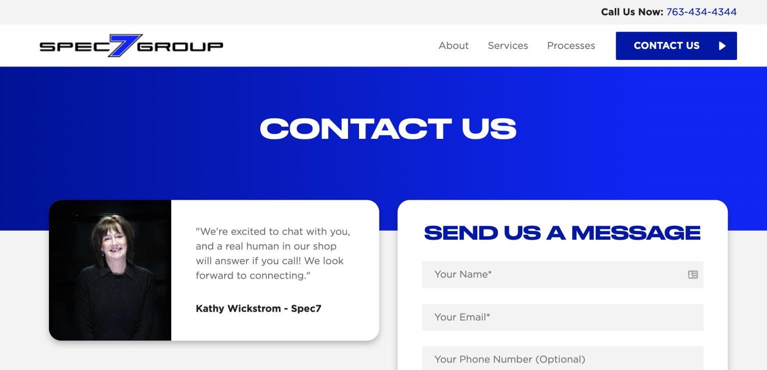
Client example: Spec 7 Group Commercial Waterproofing in Minnesota, Check them out, and hit them up. Very kind, and extremely professional. Chat with the very radical Cole Wickstrom and Brian Price
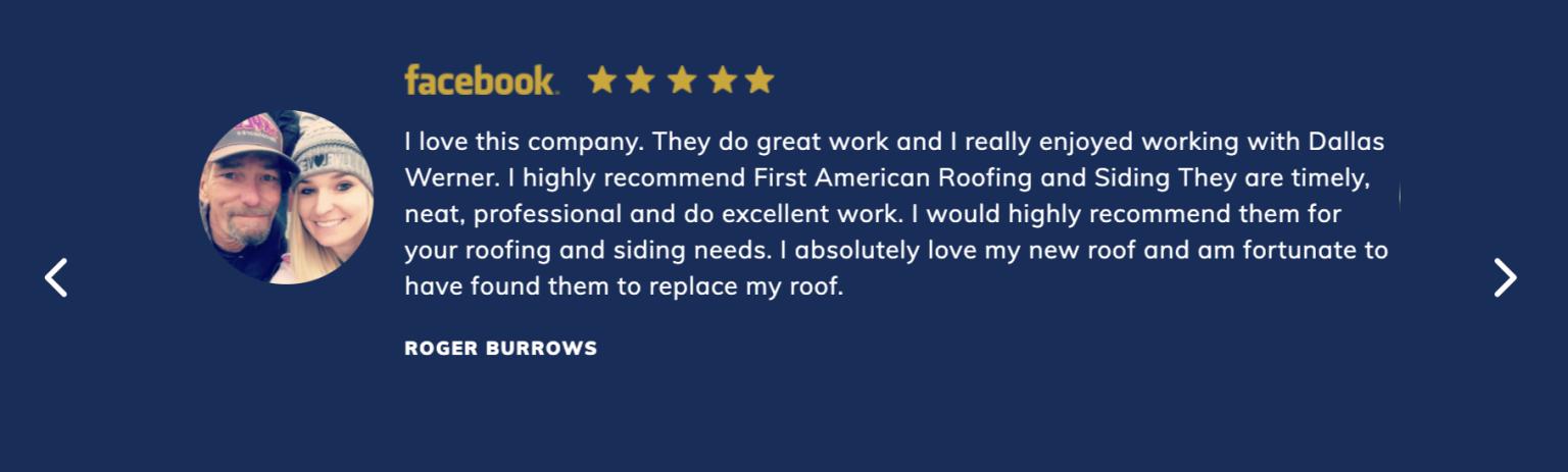
4. Social Proof like testimonials / reviews
You should be using testimonials that look like REVIEWS. Complete with a 5-star icon, the logo of the place where the review (often Google or Facebook) was left + photo of reviewer.
A human being’s smiling face next to what they said about your company, and an indication that the review exists and can be cross-checked elsewhere on the internet is more compelling that the most eloquent review with none of these things.
Join the rest of the week and next for number 6-12 of the 12 Days of Conversions – Where I’m sharing the top 12 things every website should have to get more leads.
Amazing client: First American Roofing & Siding, Dallas Werner out of La Crosse Wisconsin – check out their website, for the full gorgeous website design by Hook Agency’s Art Director Zach Morin
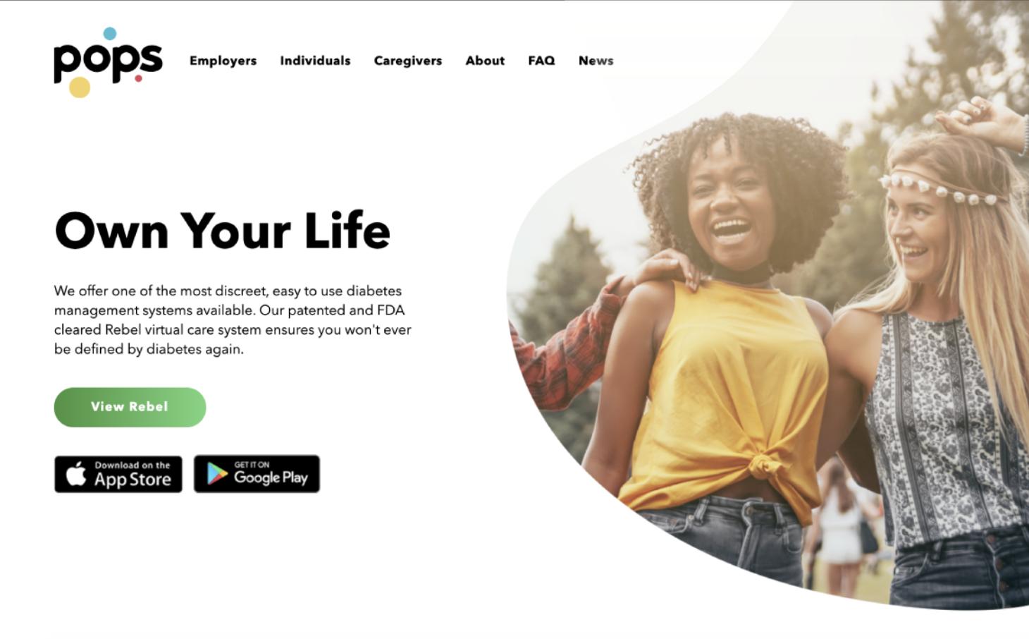
5. Your headlines should be YOU-focused(YOU as in your ideal customer.)
In the pictured client website example – Pops (an amazing product for managing diabetes that attaches to your phone and has a corresponding app) and Tamara Welter changed their headline on the site – it used to be ‘Putting a POP of personality in diabetes management.’
Do you like the old headline or the new headline “Own Your Life” better?
6. A clear 1-2-3 step process for how to work with you
If people don’t know what the process is for working with you – fear of the unknown may stop them from pressing ‘Contact’, or filling out a form.
Spell it out.
Make it simple.
Make it easy – and make it clear. More people will find it easier to get started.
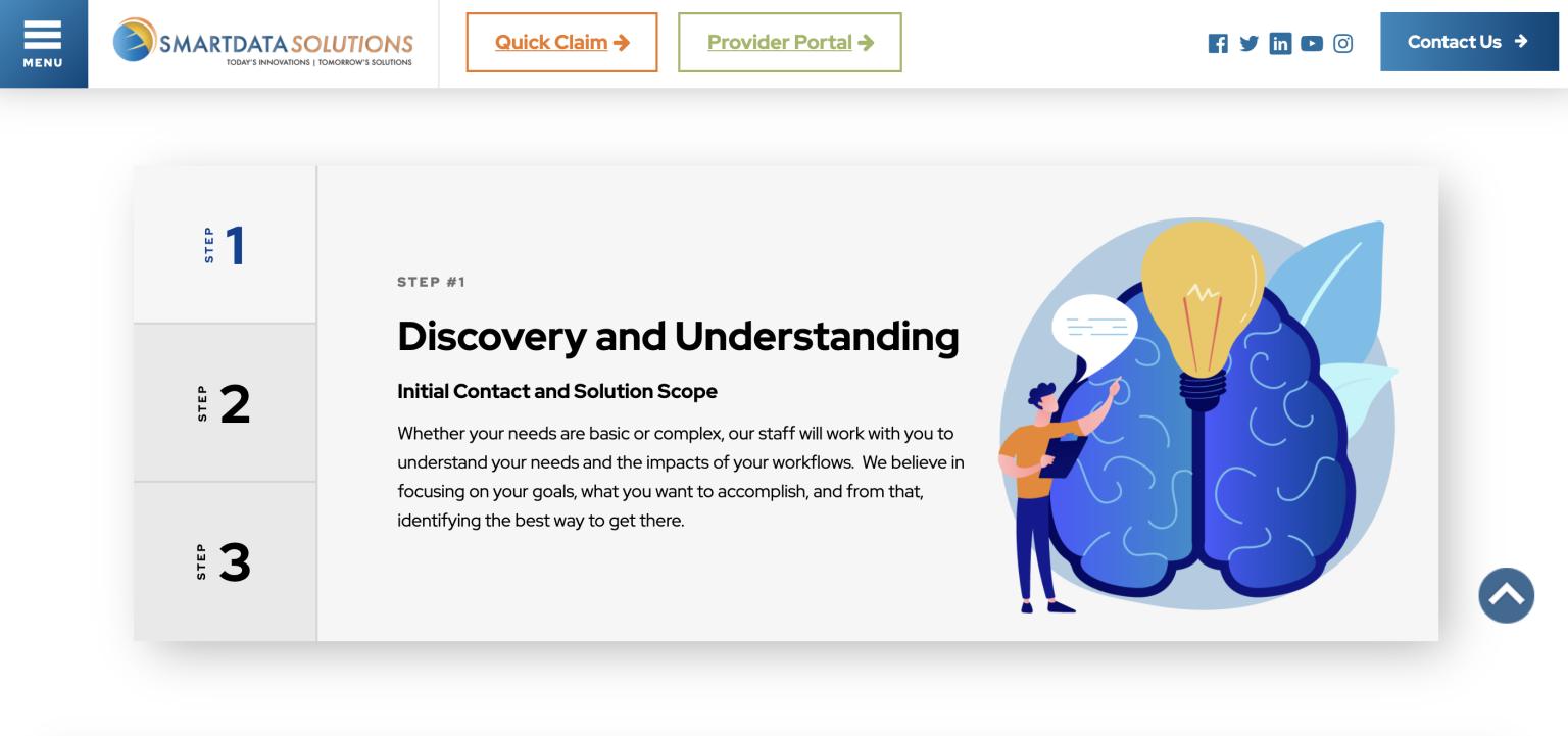
Client example – Smart Data Solutions helps you streamline your complete healthcare data workflow
7. A table comparing your offering with competitors.
This time I’m going to go with an example from Hook Agency’s site instead of a client (but we do this for a lot of clients as well.)
I have done A LOT of user testing, and a big question we always ask is “What does this company do than competitors?”
A table comparing you with competitors – is like a CHEAT SHEET for people to learn those differentiating features quickly.
Even just going through an exercise, determining what those differences are with your team is a super useful experience.

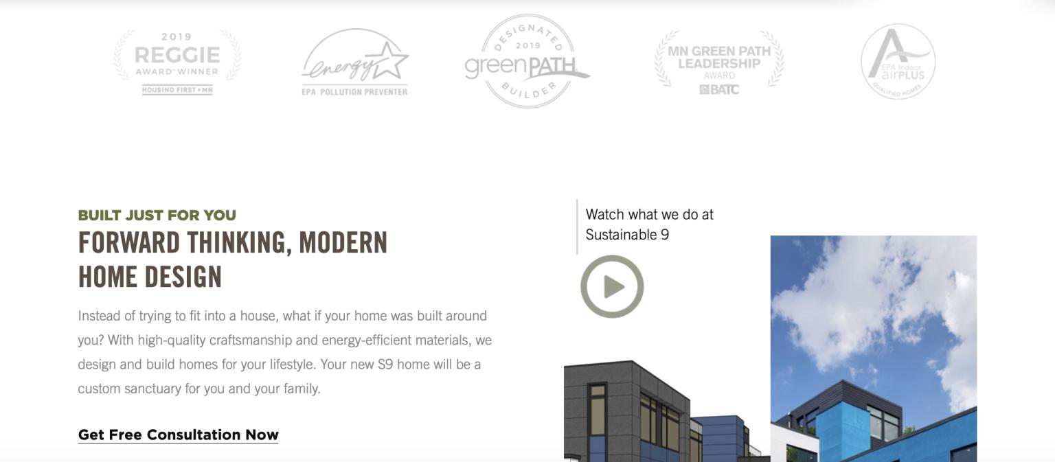
8. Trust factors like badges throughout your site
Do you have the organizations you’re apart of, awards, certifications & warranty’s or guarantees clearly visible around your whole site in a way that sticks out?
Whether you’re a top contractor for a certain type of manufacturer, or you’ve won a Housing First Minnesota Reggie award, or you adhere to certain sustainability practices – clearly showcasing these types of badges, gives clarity that you’re a top company in your field.
Literally – credibility from these types of trust factors happens almost subconsciously – they don’t have hit a visitor in the face or be cheesy.
Here in our amazing Minnesota sustainable / modern home builder client Sustainable 9 Design + Build‘s website– they’re subtle & almost in a watermark like style that gives an air of credibility without negatively affecting the color palette or aesthetics of the site.
Almost forgot my 12 Days of Conversions post – where I’m sharing my top 12 web design tips to get more leads. I’ll keep today’s simple – use…
9. Real photos around the office or work site, humanizing your team
Yes the quality matters somewhat, but real photos of your actual team are almost always better than stock photos — even though I know they can be hard to get! It’s worth it If you’re a photographer that takes office shots – feel free to leave a comment below if you’re open for business.
Our site here, for example – Hook Agency SEO Specialist Emily Greene pictured, we’re lucky as well to have a talented web designer Zach Morin who also takes great photos.
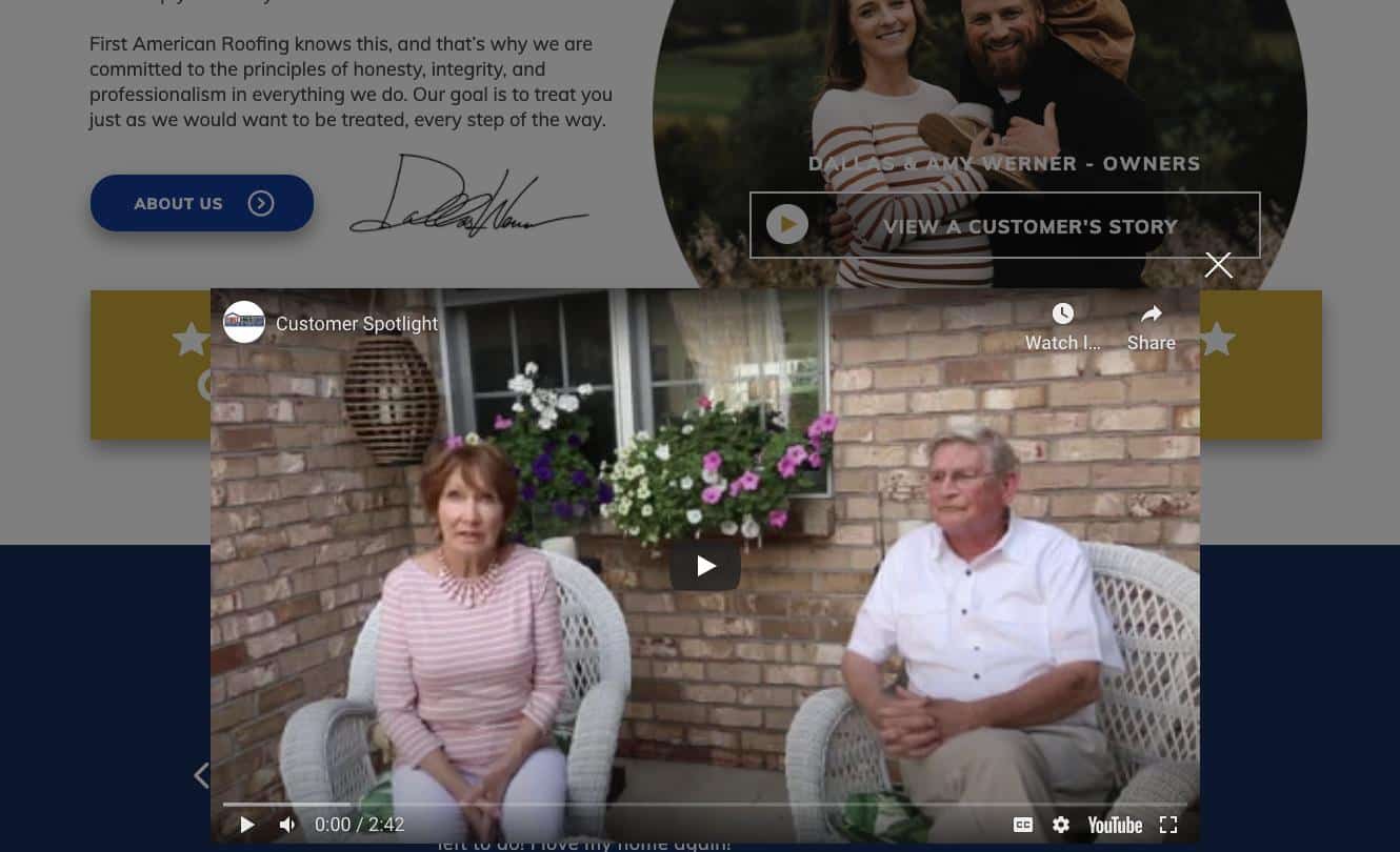
10. A video of your ideal customer sharing their experience with your company
Why do you think video testimonials are so much more persuasive than when we talk about our own services?
Do you have one of these featured on your selling pages?
Client example – First American Roofing & Siding
11. Logos of your clients if you’re B2B
“People like us do things like this”
This is a crazy effective principal in marketing, if you wrap your head around how to position your offering with it in mind.
If you are a B2B Services provider, sharing the logos of who your customers are on your website is one way to legitimize yourself to new clients.
Sound scary?
Maybe – your competitor will come try to steal them.
They probably already are going after them – especially if you’re in a specialized niche. ‘The glass is already broken.’ – Old Zen Koan
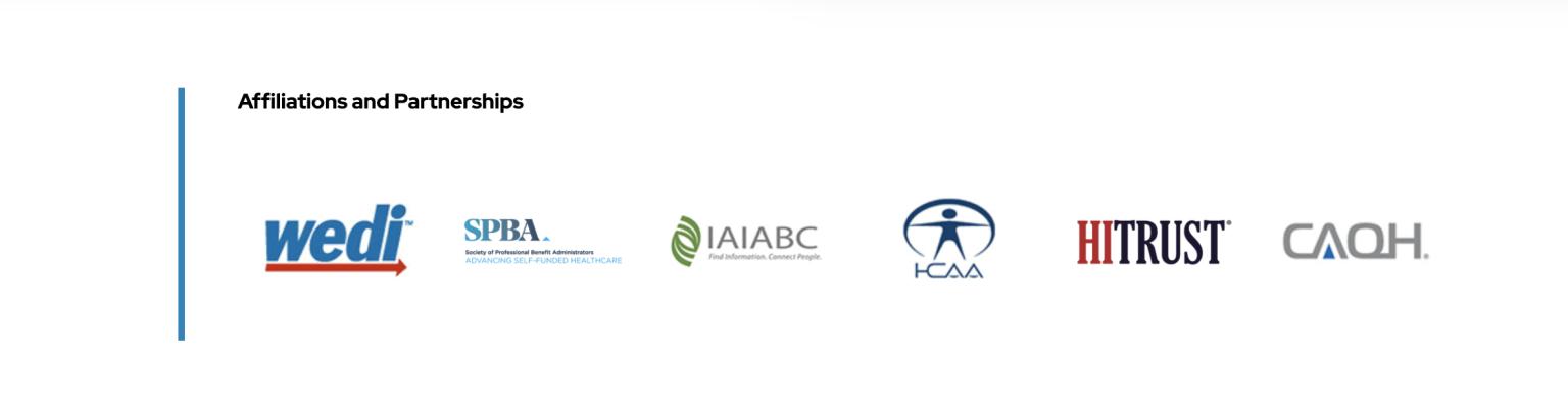
Client example – Smart Data Solutions
“He can’t be a man because he doesn’t smoke, The same cigarettes as me…” The Rolling Stones, 1965
Inspired by Seth Godin
12. Have your call-to-actions buttons finish the statement “I want to..”
What is the “burning desire of your prospects?”
What if you used that as headlines, and had the text on your call-to-action buttons finish the statement – “I want to…”
– Have a Partner in My Home Remodel
– Drive More Leads Online
– Get a Free Demo
– Get a Roof That Protects My Family
– Get a Free Roofing Inspection
This is all part of the process of writing your website FOR YOUR CUSTOMER, not for your company.
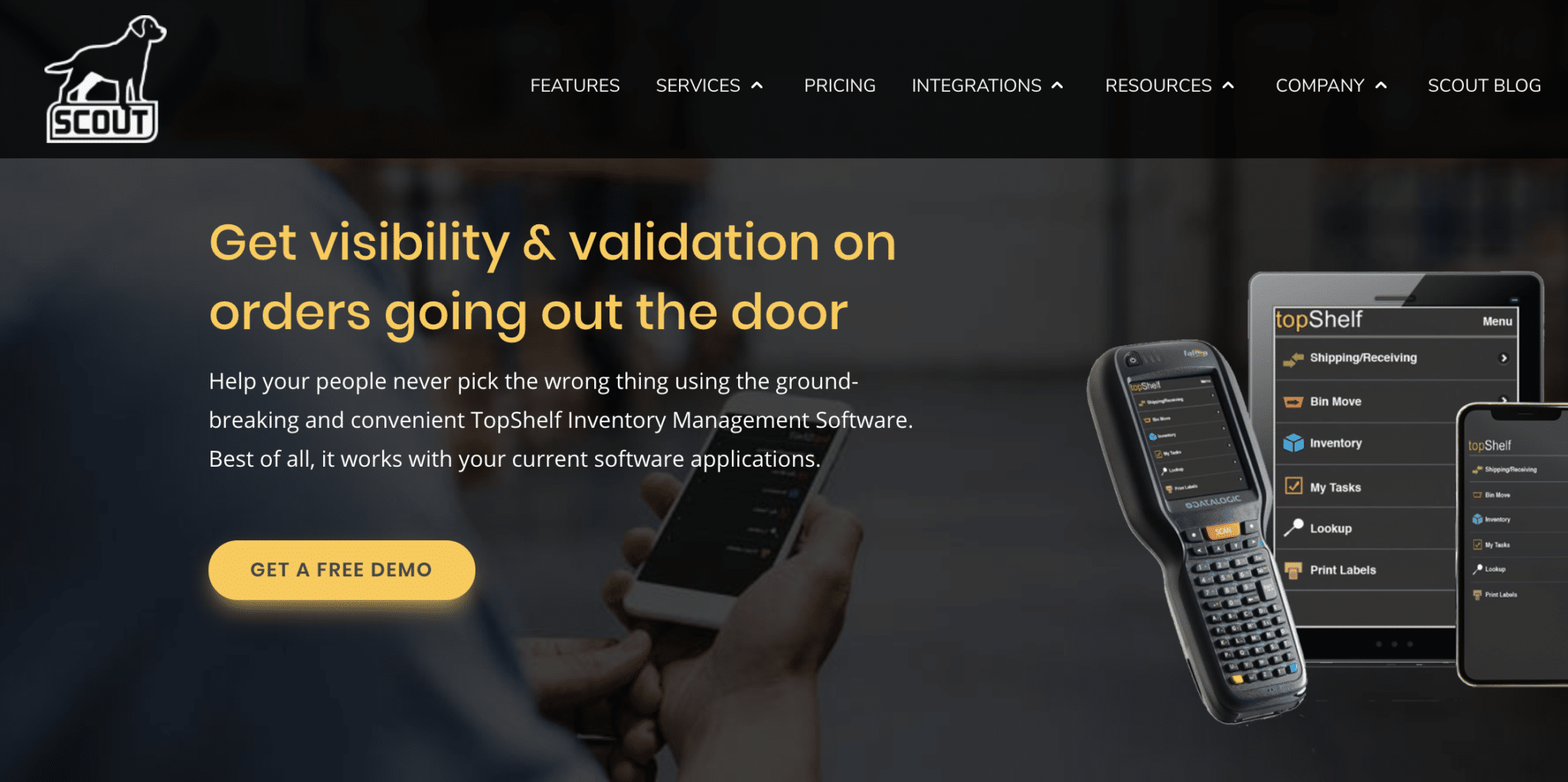
Client example – Scout Software, which helps warehouse… well.. get visibility and validation on orders going out the door.


