
What’s makes a modern website design? Taking advantage of new visual elements, that we wouldn’t have been able to use 10 years ago. In 2009 – website design was simple, sad, and full of bevels, shadows, and spliced images. Modern javascript, CSS functions, and interactive possibilities make websites today incredibly engaging.
So I thought I’d curate these 10 brands websites – that excel at modern website design.
Here are some of my favorites – enjoy!
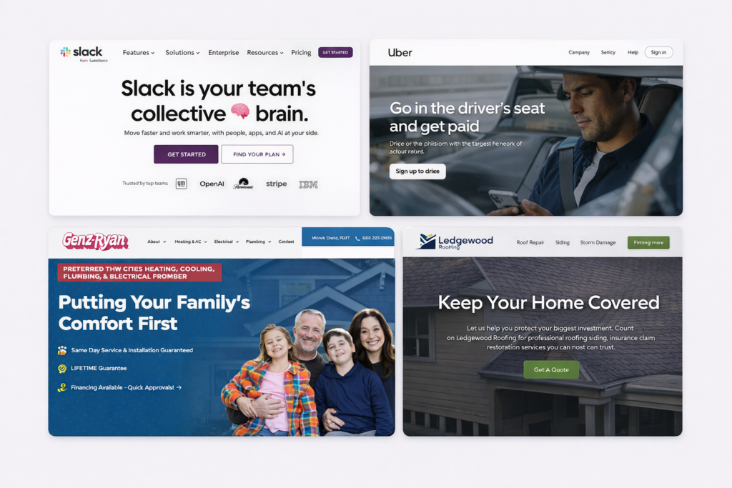
1. Slack – Modern website design through a different kind of carousel, and overlaying rectangles.

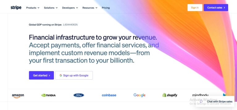
2. Stripe – Geometric gradients and clean device mockups

3. GenieBelt – Image cutouts in organic shapes

4. Kraus Anderson – Giant rotating typography to create visual interest

5. Uber.com – Modern brutalist web design

6. Quickbooks.com – Gradients, video cutouts out of shapes in the design.

7. Everlane – Clean, half and half photography and centered modern fonts.

8. Mailchimp – Unique, branded illustration style

9. LendLease – Bright gradients + simple iconographic navigation for key elements

10. Luxe.com – Modern White Space + Simple Video Demonstration

What Modern Website Design Looks Like in 2026 (With Real Examples)
Modern website design in 2026 isn’t about copying Stripe gradients or adding motion because you can. It’s about clarity, speed, and controlled visual hierarchy. Here’s what that actually looks like in practice.
1. Strong Above-the-Fold Messaging Beats Visual Gimmicks
Take Stripe. When you land on stripe.com, the headline is clear. The supporting copy is tight. The call to action is obvious. The design enhances the message. It doesn’t compete with it.
Modern sites don’t overwhelm users with visual tricks. They prioritize:
- A dominant headline
- A subhead that clarifies value
- A primary CTA that stands out
- A secondary CTA for lower-intent users
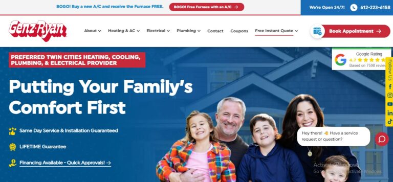
We apply this same principle to home service sites at Hook Agency. For example, on GenZ Ryan’s homepage, the above-the-fold area clearly states what they do, where they operate, and how to act. The layout is clean, but more importantly, it’s decisive.
2. Controlled Motion, Not Overloaded Animation
Slack uses motion strategically. Subtle animation reinforces product interaction. It doesn’t hijack attention. The outdated version of modern design was autoplay videos, parallax overload, and flashy scroll effects.
Today, the best sites use:

- Micro-interactions
- Subtle hover states
- Smooth, intentional transitions
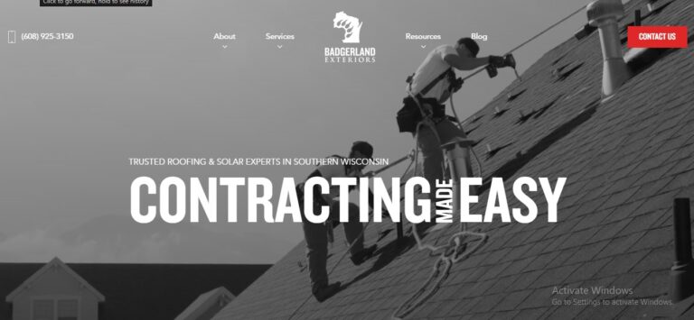
When we build contractor websites, we use motion carefully. For example, on Badgerland Exteriors, animations are minimal and functional. Buttons respond. Sections fade in. Nothing distracts from the call to action.
If animation doesn’t improve usability, it’s noise.
3. Modular Design Systems Instead of One-Off Pages
Stripe, Uber, and Mailchimp all design with systems. Components repeat with variation. Typography stays consistent. Spacing rules don’t change randomly. That consistency builds trust.
A modern website is not just visually impressive on the homepage. It’s structurally consistent across:
- Service pages
- Landing pages
- Blog layouts
- Case studies
When we design for home service companies, we build scalable component systems, repeatable layouts that allow future growth without redesigning every page. A site that only looks good on the homepage is not modern..
4. Speed as a Visual Feature
Here’s something designers still underestimate. Speed is part of modern design.
Uber.com feels modern partly because it loads fast. Stripe feels modern because transitions are smooth and responsive. In-home services, we see this constantly. A site may “look” modern but load slowly because of oversized images or bloated scripts.
Modern design in 2026 means:
- Optimized images
- Minimal script bloat
- Clean code
- Mobile-first layout
A fast, clean website feels premium. A slow “fancy” one feels outdated instantly.
5. Design That Drives a Measurable Result
This is where many design showcases miss the point. Modern website design is not about impressing other designers. It’s about influencing behavior.
When we redesigned certain contractor sites at Hook, the design changes weren’t aesthetic experiments. They were conversion-driven:
- Stronger CTA placement
- Cleaner form presentation
- Better trust signal positioning
- Clearer service hierarchy
The result wasn’t just a cleaner look. It was higher lead volume.
A modern website in 2026 should answer this question: What measurable action is this design pushing toward?
If the answer is unclear, it’s decoration.
If the answer is obvious, it’s modern.
3 Things That Make a Website “Modern”
If you’re wondering to yourself whether your website is modern, or whether the websites you make are modern – one place to start might be comparing to them to the designs above, but I don’t think it’s as simple as using the fanciest new technology, video backgrounds, gradients, or organic shape cutouts.
I think it’s about finding a way to tell a companies story in a way that’s emotionally persuasive – and I’ll tell you why.
Back in the day (circa 2009) web designers couldn’t do half of the stuff they wanted to, and thus it almost gave more attention to the design elements that they could implement.
Now that almost anything is possible – the design itself isn’t enough.
It’s much more about the headlines, and the way the imagery and interactive elements achieve a RESULT – in the ideal customer of that company. That being said – here are a few cheats to know whether your website is modern.
- One principle of modern website design – is creating open spaces. “White space” is a principle that has now become indicative of a high-end brand, and almost every client that comes to us – if asked about their desired design, almost always admits they want more of this clean, ‘apple-esque’ feel.
- Full-width design. Boxed designs, with white or some kind of pattern or color in the background, and with a ‘container’ with 70% width centered in the middle – are looking more and more old-school every day.
- Lastly – and this isn’t even design related on the surface level. Having a content management system, a search engine optimized site, and a broader marketing plan to promote your website is part of having a modern website + marketing system.
The old-school and out of date concept here is that some people think just ‘having a website is enough,’ and this is basically ludicrous.
If you build it – they will NOT COME.
If you go into website design with this philosophy – you’re site is going to get very little traffic, and all that hard work into the design will be wasted, and that’s sad.
If you’re interested in getting more traffic – check out our ‘Beginner’s Guide to Search Engine Optimization – Do these 3 things if nothing else‘!
Frequently Asked Questions
What actually makes a website “modern” in 2026?
It’s not gradients or fancy animations. A modern website loads fast, guides attention, feels intuitive on mobile, and converts visitors into action. Trends are optional. Performance is not.
Is minimal design always better?
Minimal only works if it clarifies. Some brands need bold storytelling. Others need simplicity. The real goal is focus, not emptiness.
Does modern design help SEO?
Indirectly, yes. Faster load times, better structure, and clear hierarchy improve user signals and crawlability. But design alone won’t rank you. Strategy does.
Should I redesign my website every few years?
Not necessarily. If your site converts well, loads fast, and feels current, small iterative updates beat full rebuilds. Redesign when performance drops, not when trends change.
Can a “modern” website still fail?
Absolutely. If it ignores messaging, positioning, and conversion strategy, even the best design will underperform.


