In preparation for a homepage redesign – I wanted to take a look at some inspiring best marketing agency websites. I found a lot of similarities amongst the best websites that were designed in the last couple of years.
I think my favorite new trend for delicious looking websites is having ‘quotes’ instead of headlines. I like it even more when people use ‘testimonials’ or quotes from ideal clients as the headlines. This one is for other agency people looking to get inspired for their next website – so… a little message to other marketing agency folks: “Hi guys! nice to meet you, let me know if you ever want to grab coffee sometime :)”
10 Gorgeous Marketing Agency Websites:
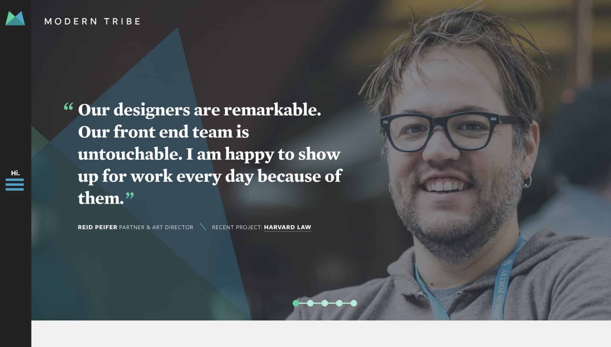
1. Modern Tribe – The Next Generation of Digital Agency https://tri.be/
I love the clean feel to this site, the smooth transition of the mobile menu, that thought out elements from the bottoms of the pages to the blog post featured images. Comfortable, inviting, and refreshing – with thoughtful and simple typography, and clean design.
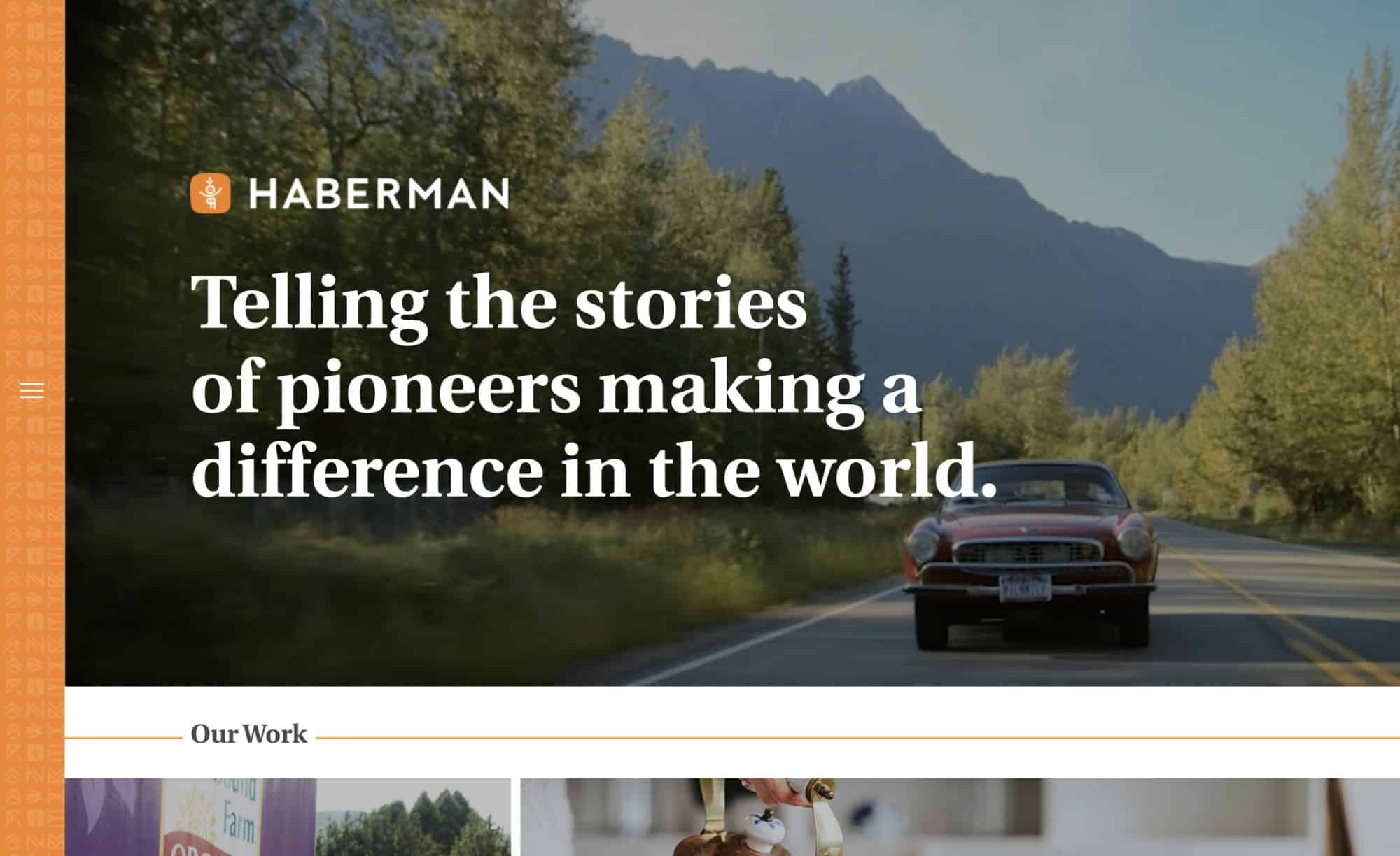
2. Haberman – Modern Storytellers – ModernStorytellers.com
Lovely creative of course on this site, solid typography, video-focused. I love how well Haberman is niched, and how there’s almost a classic feel to this site, but once-again is using this very modern and smooth side menu, to give a little interest to the vibe.
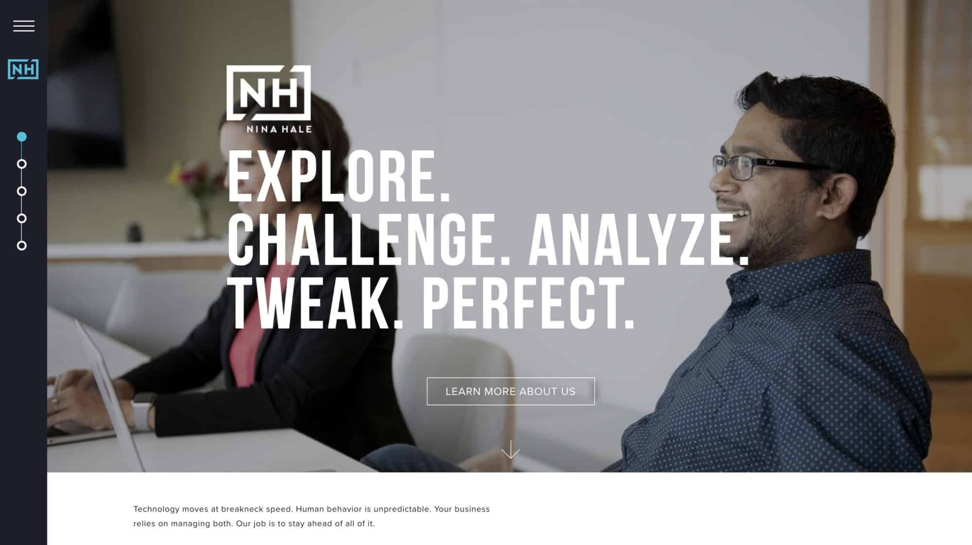
3. Nina Hale – apparently I really like these left-side opening menus.
A clean, strong design that cuts through the noise. Nina Hale has a high-end look that makes me feel comfortable quickly that they know what good design entails. I love the branding, and the color choices on this site as well. Amazing video and photography assets bring a stylish, and kind look, with great photo choices.
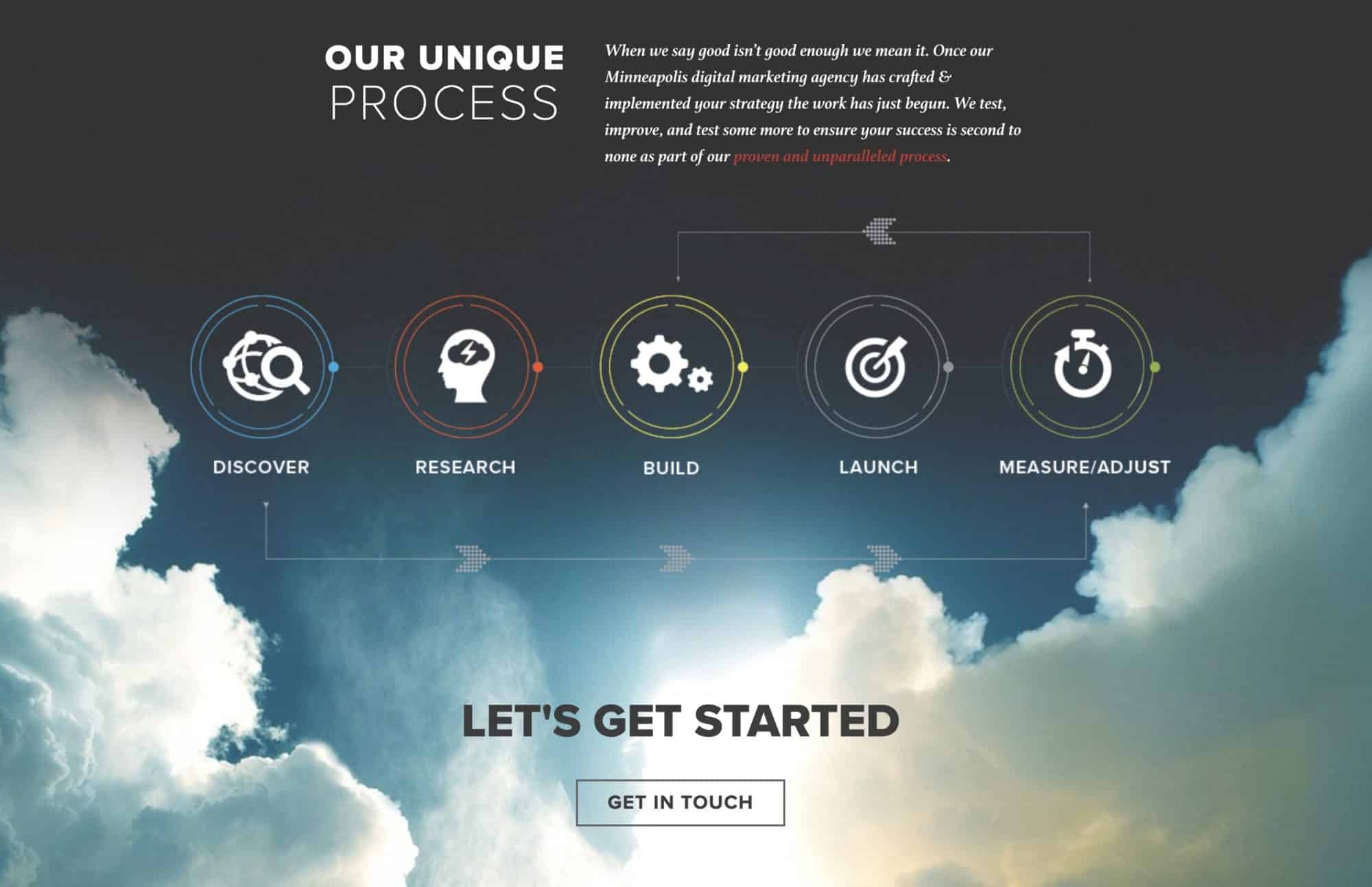
4. Rocket55 – I love this process piece, extremely aesthetic!
Rocket55 has it’s own very distinct style, but strangely it’s not the top of their site that I like the most, but the process element on the bottom of their homepage. The lovely aesthetic of the cloud shot, and the soft dark blue it fades into, provides the perfect backdrop for this unique approach to icons. It feels almost like a digital dashboard of the future, and I think that leaves a powerful impression on visitors to their site.
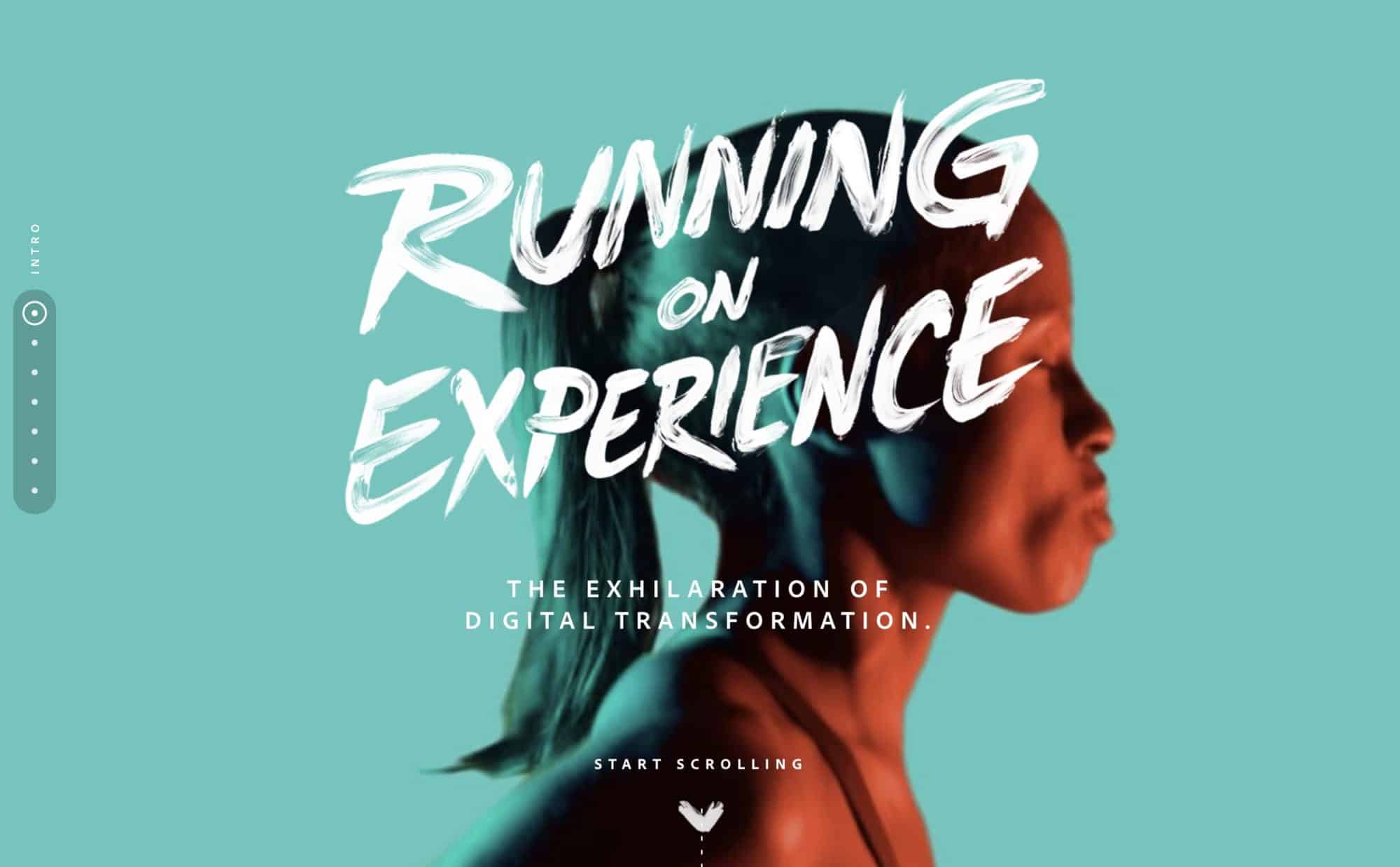
5. Adobe Marketing Study – delightful color palette and hand-lettering (Maybe not quite an agency, but it relates) – Adobe.com
The bold color choices, along with the dramatically lit faces, and high-end photography lend themselves to a powerful tone / aesthetic from this agency-focused digital study landing page. Very smart move by Adobe, making something with original statistics, but also with a look that would make it eminently shareable by marketing agencies who are often very visually fixated.
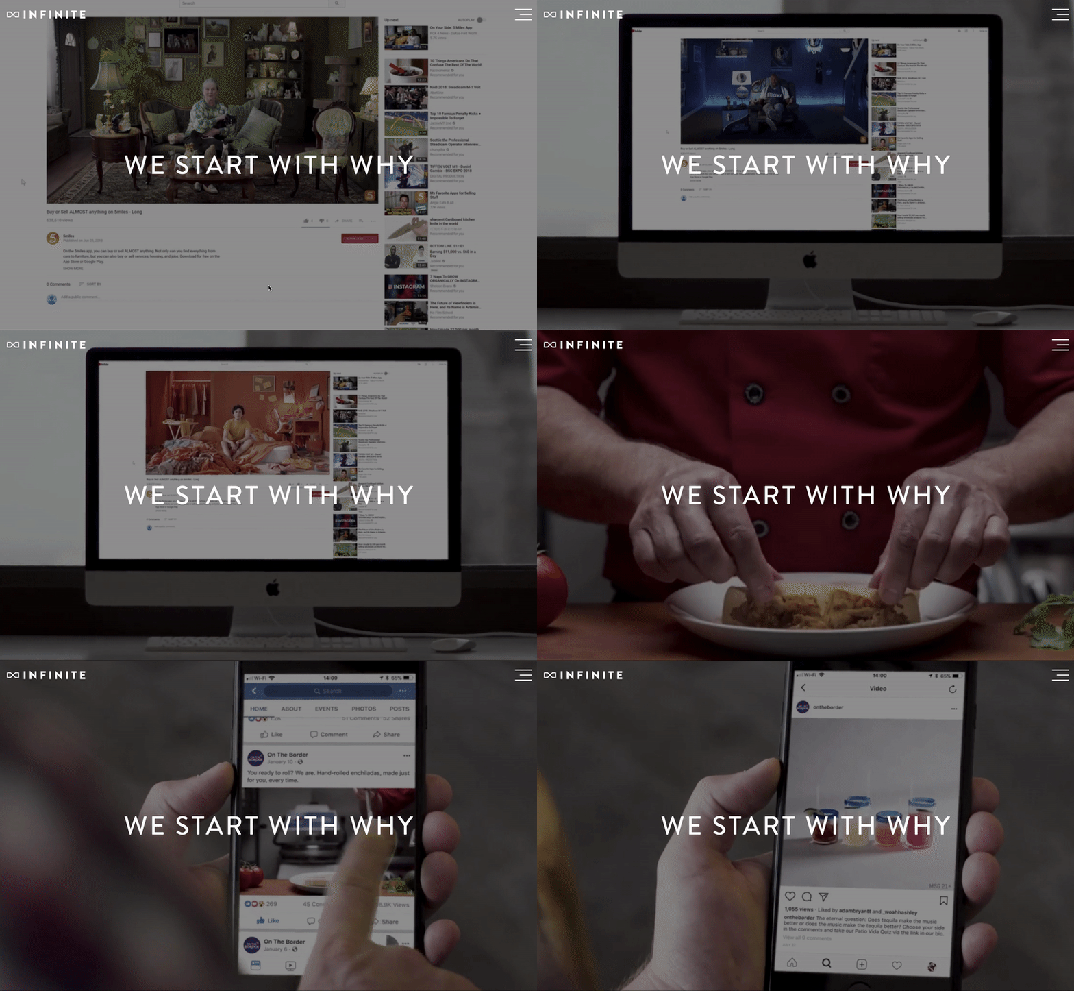
6. Infinite – I love how this site – pulls out from the creative work, to the devices that they’ll be viewed on to give perspective. TheInfiniteAgency.com
The chemistry between the copy and the visuals on this site is lovely. “We start with why” – leads you into a couple instances of creative videos they’ve done before, but then zooms out to see how people would be consuming those videos. It allows you to understand what working with them would be defined by, as the application of the creative – seems to drive their process. It just kind of comes across seamlessly, and feels obvious quickly.
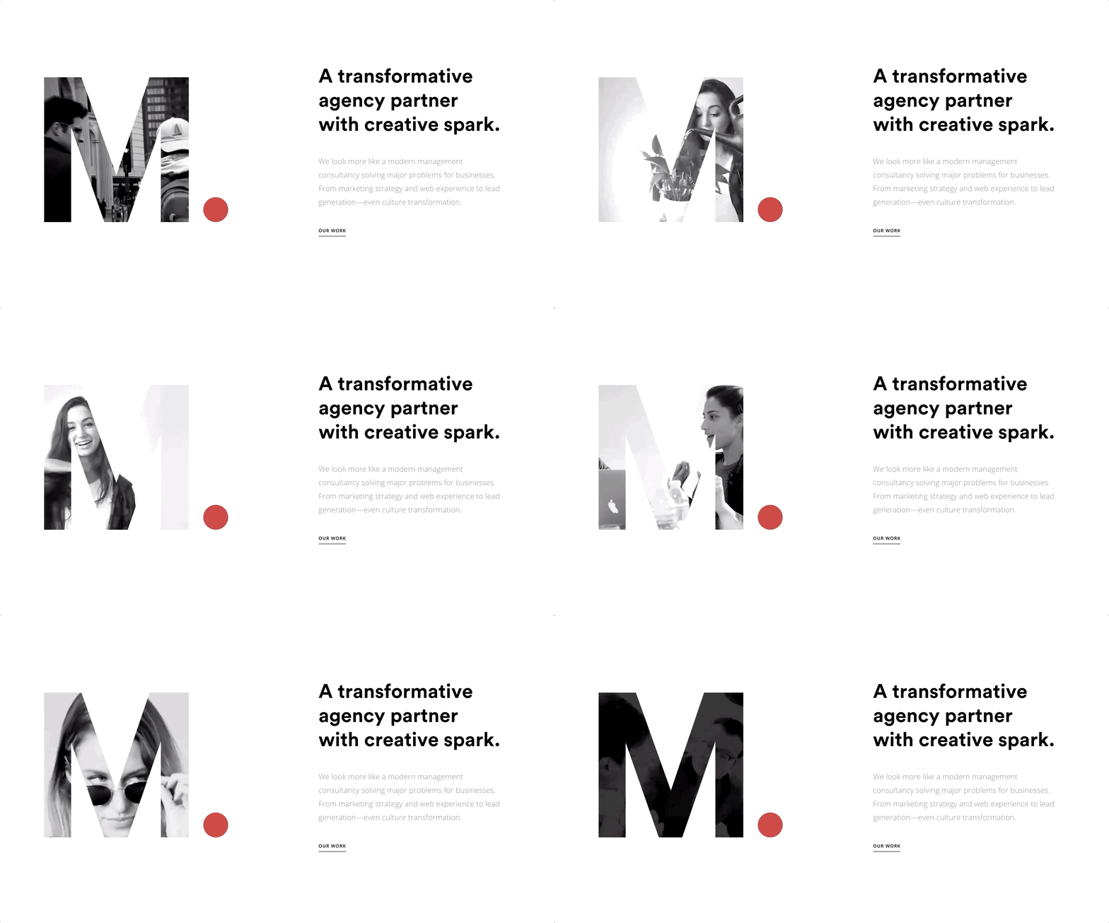
7. Mabbly – Amazing typographic cutout with video showing through – Mabbly.com
This whole site is pretty good, but the cut out of the letter, with the red period is my favorite part. The next example also uses a cut out, but being a giant typography fan, I think this one is even more powerful.
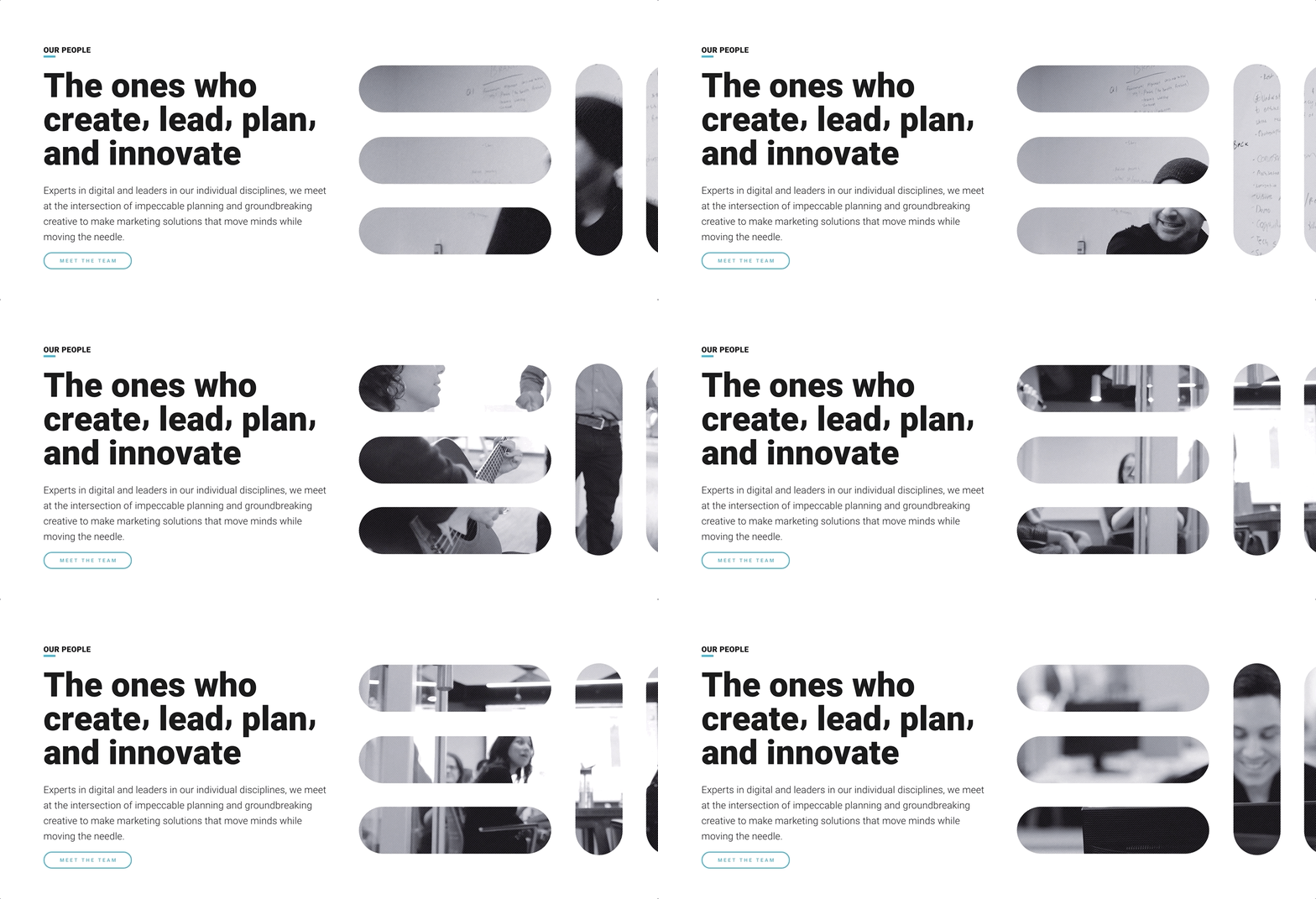
8. EnvisionIt Agency – I absolutely love this trend, here’s another chicago agency that’s on board. EnvisionIt.com
This site as a whole is a little weaker, but the cut out with shapes is lovely, and I’d say – two makes a pattern. Definitely excited to try the cutout letter with a background video in a website soon.
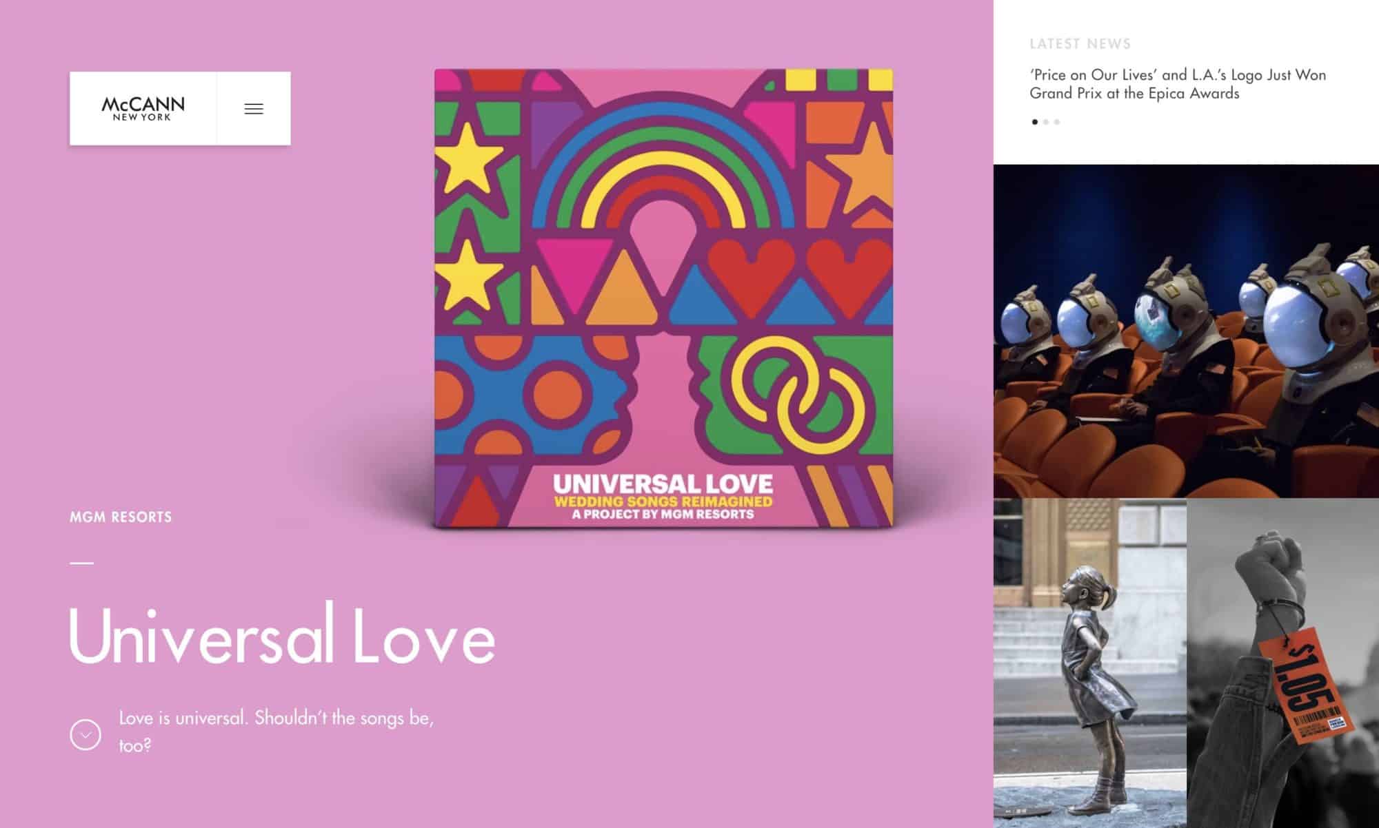
9. McCann New York -Bold color, news focus – www.Mcannny.com
I love the dynamic nature, news-oriented elements of McCann NY, and the bold color with white typography. One of the key reasons I want to redesign our homepage is to create a more dynamic approach that will catch people eye and make them want to read a little bit, as well as having elements that change out on a regular basis, and I think Mcann NY’s site accomplishes that very well.
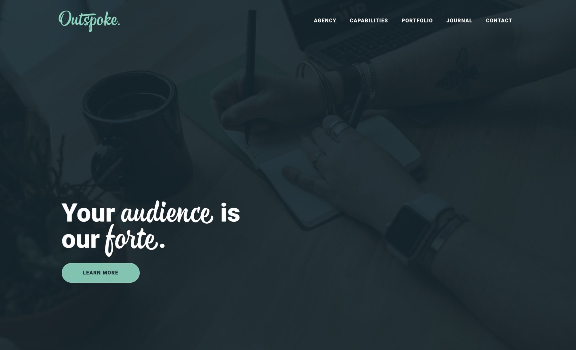
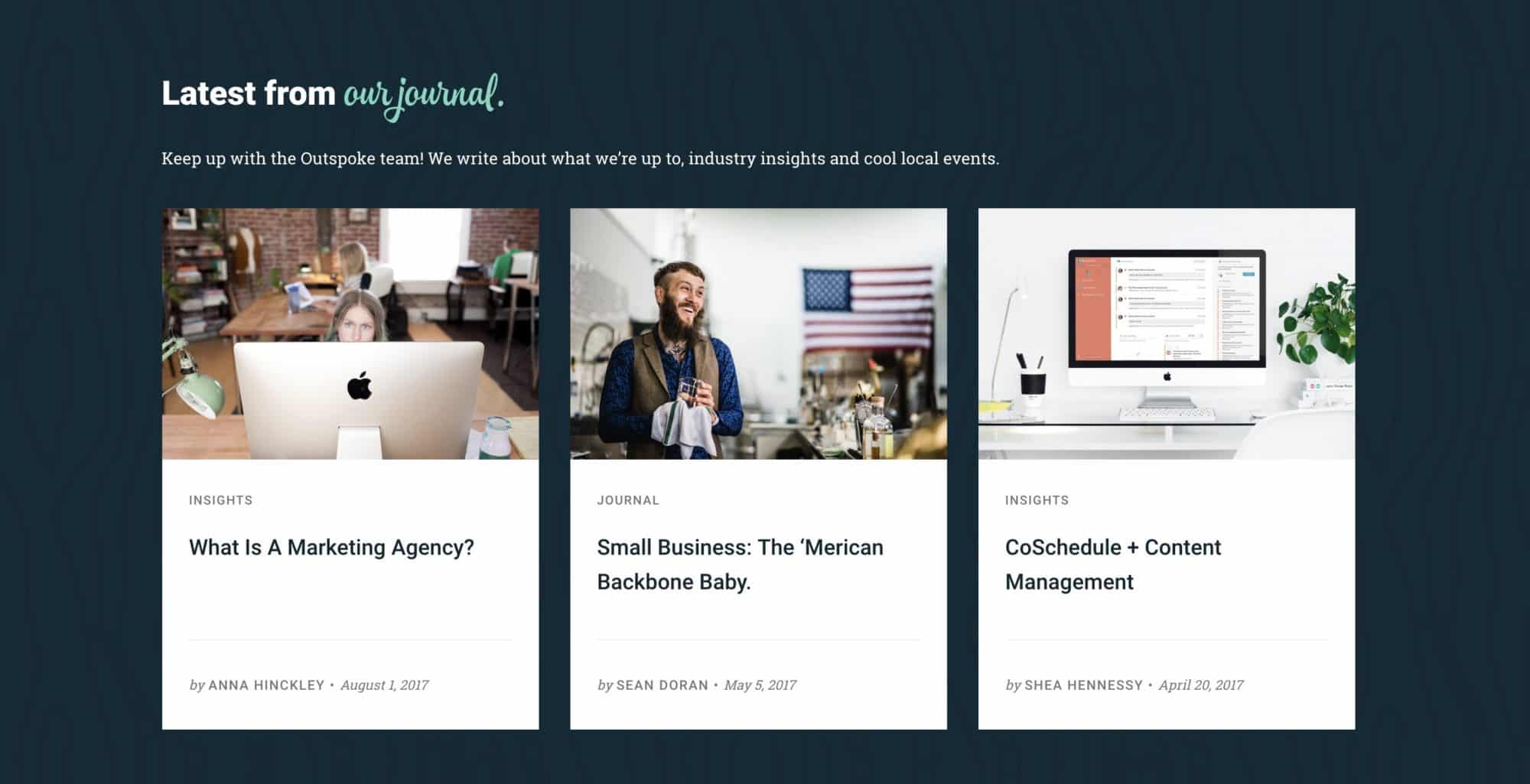
10. Outspoke – Digital marketing agency website inspiration. Love the news on the homepage of this site! Outspoke.co
The mint green on dark blue provides a striking, but clean look. More than that I really love the clean design of the articles, and how their worked into the site in a seamless and inviting way. Not to mention – just googling ‘marketing agency’ brought up the most recent article from their site, and they’re nowhere near me – so they must be doing something right for their SEO. Congrats! 🙂
What makes for the best marketing agency websites?
Marketing agencies have it good – when you’re the client, you make crazy and fun decisions, and truly exemplify your aesthetic no-matter-what.
When you’re doing client work, you have the clients feedback to contend with.
For this reason, advertising agency websites are some of the most beautiful websites in the world – often the result of a singular creative vision / or the result of a team exerting their collective ego into a pillar of powerful design. The best marketing agency sites in the world generally seem to have at least 3 or more of these key components:
- Super clean, and dynamic navigation.
- Editorial elements, and portfolio elements that bring people back to see the latest work.
- Storytelling elements that help people imagine themselves working with the agency.
- A simple but bold color palette, that demonstrates strong contrast – in an iconic way.
- A crisp simplicity throughout, with each element thoughtfully placed.
- Emotionally resonant photography – often with smiling members of the team or leadership.
Hope these were inspiring for you as they were for me. What’s your favorite agency website besides yours? Take 30 seconds to bless the other readers – and leave it in the comments below!


