Websites can be complicated.
Take it from me, I’ve been designing and building them for over a decade.
The strange part is that while it has become easier to both design and build a site over the years, it simultaneously has also become more difficult. That’s because as your skill increases, so does the level of detail and thought that you put into the work as well.
Eventually, you end up at this weird place where you begin to understand that there is no such thing as the perfect website and that there is, in fact, a large number of ways to accomplish the same goal.
Often times we don’t know which way is the best unless we test with our users in a live environment. The reality of that situation though is that not everybody can afford user testing. I mean that both monetarily and in the sense of time (although time = money so yeah, I guess just monetarily). Testing is a slow process. There needs to be implementation, then data gathering, the analysis, then revision, the implementation again, then more testing, then analysis, then the cycle repeats. Yikes, that can go down the rabbit-hole quickly.
So instead of jumping into user testing, we’re going to look at some well-known brands who have very likely already done a lot of this testing and research. We’ll examine a few styles of navigation and go a little bit into why those would specifically work well in the way that they do.
Because at the end of the day, you could have the coolest, best design on the face of the Earth, but if your navigation isn’t helpful for your users and doesn’t get them to where they need to go on your site, then good luck trying to convert and win any business.
Burying important pages is likely one of the WORST things that you can when designing and building a website. Our goal is to help you avoid that by seeing how others avoid that within their design.
First American Roofing
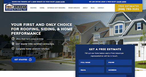

At the top of our list is a company we (Hook Agency) just finished a site design and build for – First American Roofing & Siding. From the get-go, it’s pretty easy to visually break down the navigation. Branding, Menu, a big call-to-action to get a free estimate, and even two little promo slots at the top. This menu has it all and is on the more complicated end.

Why it Works
This navigation works because it directs the users to the most important pieces of information right when they enter the site.
First, we establish credibility with a brand name and logo. Then we immediately have a menu that starts with the most important pieces of the business – roofing, siding, exterior softwash, then other services. These three were chosen because Roofing & Siding are the breadwinning products for the company, and Exterior Softwash is something they’d like to build further.
So we have Roofing & Siding which statistically speaking is what they’ll likely be looking for first, then we expose them to Exterior Soft Washing as well. Because if you’re looking for roofing and siding, that means you own a house. And if you own a house, you could also use some Exterior Soft Washing whether you know it yet or not, so we expose the users to that possibility.
Next, we have a large callout for a FREE estimate. Since it’s placed on the far right, and English speaking users read from left to right, there’s always the possibility that they’ll glaze over anything on that side of the screen. So this is where we use design to attract them further to that space making it stand out visually. We do this by making this big callout the only place above the website fold where Gold is used. This is a technique used a lot in print mail design – it’s called a violator because it’s a big gaudy interruption in design that draws your attention to it. You’ll likely see them in the Sunday Ads in a newspaper for your local hardware store.
Anchor Builders
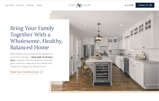
Next, we’ll take a look at a build we’re currently working on (shh it’s not released yet!). This is for a construction company out of St. Louis Park MN called Anchor Builders.
We shook things up a bit here by putting the actual menu on the left side, with branding in the middle, and then putting call-to-actions on the right far side.
Why it Works
This navigation is about ultimate simplicity, accessibility, and readability.
Because English speaking people read left to right, we put the navigation menu at the top left. That makes it easily accessible to users as it will be the first thing they see when entering the website.
There is also consistent data that shows people find Serifs easier to read than San-Serifs.
Finally, we had to consider the order of menu items in order of importance. Since this company does high end home remodels, visuals of their work will be the #1 thing that gets someone to convert on their website. So naturally, we placed “Our Work” as the first menu item they see.
Now, when we say that users read left to right, that’s not to say that the information on the far right isn’t important or that they miss it. It’s about visual real-estate and using design to make elements stand out. In the case of this navigation, we’ve separated the brand logo and the call-to-action to “Contact Us” on the far right. This makes the CTA more impressionable and more impactful. It carries a deep visual weight with a solid background and arrow. And of course, when the user scrolls down the page, the navigation stays sticky at the top.
Total Construction & Maintenance
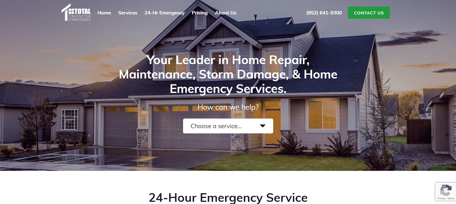
Last on our list is a home repair & maintenance company out of Eden Prairie called Total Construction & Maintenance. By now you’ll start to see a pattern with these three navigations and what’s working with them. So this really serves as a means to drive those points home.
Why it Works
This navigation works because we’ve once again we’ve identified the most important parts of their business and displayed them in an easy to navigate way. We have branding on the left, navigation menu, then call to actions on the right. Right away with the branding, we establish visual credibility. This is a business that does actually exist because they have a logo.
Second, we get into the navigation and lay it out with “Home, services, 24-hour emergency, pricing, about”. It’s not always common to put “home” into a navigation, but when a business tells me their general demographic is of a slightly older age group, I like to. Technology has a tendency to be less inherently intuitive to older folks so they may not always know to click on the logo to go back to home. Next, we have services, 24-Hr Emergency, Pricing, About, Phone, and Contact.
The reason we show 24-Hour Emergency in the main navigation and all of the services under a drop down is because the 24-Hour Emergency is a core piece of their business whereas all of the other services are sort of secondary to that. Pricing is always helpful for users so they can easily understand what type of cost will be associated with the company. And finally, we display the phone number and a green call-to-action to contact the company. By having both of these in the navigation at all times, it makes it easy for users to convert off of the website as needed.


