The short answer
The best web fonts today are readable, fast and free. Use a clean sans serif like Inter, Source Sans 3 or Archivo for body text, pair it with a bolder heading font like Montserrat or Oswald, and stick to two families.
- Body text 16px or larger on mobile
- Two font families, three or four weights
- Google Fonts are free for commercial use
- Test on a real phone before launch
Originally published July 18, 2015. Updated November 5, 2026.
It’s true that the smallest details can make the biggest difference and nowhere is that more evident than in modern web design. Designing a truly interactive and appealing website is hard enough, but nailing the typography is one factor that many web designers overlook.
You can see evidence of this effect by changing any aspect or main heading type to see how drastically your font choice can alter your website. What may have looked professional and modern can rapidly look comical or even garish.

Selecting a font isn’t easy work however, and it can take a long and arduous path of trial and error before you are satisfied. Try to remember when looking for your ideal font type, that often times less is more and keeping things simple may yield better returns.
When you want a modern looking website that appeals to everyone, here are some of the best fonts for web design online in 2015.
The best fonts for web design in 2026
The fonts that win today are readable on a phone, load fast and are free to use. For most business websites, that means a clean sans serif for body text and a bolder font for headings. Here are reliable picks and pairings, all available free on Google Fonts.
Proven font pairings for business websites
A heading font, a body font and the feel you get.
Swipe sideways to see every column →
| Headings | Body text | Feel | Good for |
|---|---|---|---|
| Montserrat | Source Sans 3 | Modern and confident | Contractors, agencies, local services |
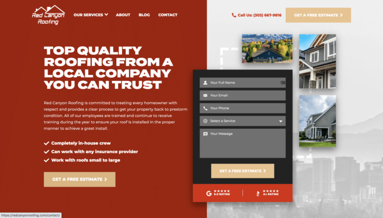
| Archivo Black | Archivo | Bold and industrial | Roofing, construction, trades |
| Oswald | Lato | Strong and condensed | Sports, trades, big headlines |
| Playfair Display | Inter | Premium and classic | Remodelers, design-build, real estate |
| Poppins | Inter | Friendly and clean | Service businesses, startups |
| Merriweather | Open Sans | Trustworthy and readable | Long articles, professional services |
How to choose a website font
Pick for the reader first and the brand second. A font that looks great in a logo can be tiring in a paragraph. Test your choices on a real phone, in sunlight, with real content, before you commit.
Readable web typography checklist
Run your site through these before launch.
- Body text at least 16px on mobile
- Line height around 1.5 for paragraphs
- About 50 to 75 characters per line on desktop
- Text contrast of at least 4.5:1 for body copy
- No more than two font families
- Bold, clear headings that scan in a second
- Avoid thin weights for small text
- Use font-display: swap so text shows while fonts load
Where to get web fonts, and what it costs
Check the license before you launch.
Swipe sideways to see every column →
| Source | Cost | License notes |
|---|---|---|
| Google Fonts | Free | Open licenses, fine for commercial websites |
| Adobe Fonts (formerly Typekit) | Included with a Creative Cloud plan | Fonts are licensed while your subscription is active |
| Foundries and marketplaces (MyFonts and others) | One-time or per-pageview web licenses | Read the web license: limits on pageviews or domains are common |
Fonts for contractor and home service websites
Homeowners skim. Your fonts should make the phone number, the service and the next step jump off the page. Bold, condensed headings feel rugged and confident for roofers and builders. A clean, open body font keeps service details easy to read on a phone in a driveway.
Font style by brand feel
Match the font to how you want customers to see you.
Swipe sideways to see every column →
| Brand feel | Heading style | Example picks |
|---|---|---|
| Rugged and dependable | Bold, condensed sans serif | Oswald, Archivo Black, Barlow Condensed |
| Modern and clean | Geometric sans serif | Montserrat, Poppins, DM Sans |
| Premium and established | High-contrast serif | Playfair Display, DM Serif Display |
| Friendly and local | Rounded or humanist sans serif | Nunito, Lato, Source Sans 3 |
The 2015 list: fonts that defined that era
Our original 2015 picks are below. Many still hold up, especially Open Sans, Playfair Display and Raleway, which remain free on Google Fonts. Others, like Proxima Nova and Gotham, are paid fonts that are still popular but have free alternatives above.
Proxima Nova

Concise and elegant, the Proxima Nova font is an excellent choice for affiliate marketers, designers, corporate/small businesses and bloggers alike. Clean cut and easy to read, this font type looks good and clear on against any color and matches well with other popular fonts as well. I find this easiest to use through Adobe Typekit, but you can buy it for web straight up as well.
Get it on Adobe Fonts (formerly Typekit)
Gotham

Bold overtones and large block font lettering are the highlights with Gotham, one of the best fonts for web design in 2015. Whether you need italic headings or large impactful font type, this font delivers on many fronts for all of your web design needs.
Where to buy this font
Open Sans

Long recognized for its clean typeface and easy to recognize characters, the open sans font type is excellent for any educational or informative website. Businesslike and professional, it can also serve as an excellent type face for your marketing site as well.
Use Open Sans through Google fonts
Geogrotesque

Utilitarian and highly specified, the Geogrotesque font type is an excellent choice for bold lettering and impactful design. This bespoke font is great for sports themed blogs or even informative websites build on sports themes and outdoor activities. I love the organic feel of this fonts design while still feeling sturdy. A delightful juxtaposition of character and strength.
Buy the Web Font on MyFonts.com
- Leads from Google, Maps and AI search
- Nobody else is buying the same lead
- You own your website and ad accounts
“Hook Agency has been an incredible partner for our digital marketing growth.”
Kristin Sullivan, Bob’s ACFocused on the map? See Google Maps SEO
Playfair Display

Classically designed and with a hint of royal flair, the Playfair Display font can lend a vintage tone to your website. Perfect for newspaper type print, or duplicating the look of script belonging to days long past, Playfair Display is a good retro font to build your website with. Did someone say Editorial vibe?
Use this webfont free on Google Webfonts
Didot bold italic

Uniquely original and even a bit quirky, the Didot bold italic font lends a certain showman flavor to the text. Accents in this font are minimal and helps keep your site easy to read and parse upon first glance. There’s something to be said about a highly readable font that makes your product or service feel high-end… Delightful.
Where to buy this font
Brand

When you need a solid corporate font Brand is one that’s easily recognized by consumers and professionals alike. Create an instant brand connection and give your products the look of credibility with this font type.
Museo slab

Striking in italic and bold, the Museo slab font is one of the best fonts for web design in 2015. Much like the Playfair font, this font type is very nostalgic and works well for quotations and excerpts. Oooo la-la.
Helvetica Neue

Common among ecommerce websites and blogs alike, the Helvetica Neue font is perfect for use in large headings and banners. Highlight your services or product and communicate your message to your viewers by using this font type.
Futura

Take a leap into the future with this advanced looking font type, which is highly stylized and very specific. This font may not work on every website out there, but it’s still very well suited for headings and particular messages as well as paragraph headers.
Abril Fatface

One of the best fonts for web design in magazine type websites and banners, the Abril Fatface font gives your headings a classic magazine feel. Vintage websites and retro themes rejoice because this font truly communicates a meaning beyond its words.
Where to get this font – on font squirrel or use it for free on Google fonts
Raleway

Minimalist design and thin elegant features are two of the main characteristics of the Raleway font. Curved design and minor influences are some of the finer aspects of this font type, and perfect when you are looking for author credits or additional footnotes.
Where to get this font on Font Squirrel or Use it for free on Google fonts
Using any of these superior fonts for your web design can help your website stand apart from the crowd and increase your user interaction as well as traffic. Designing a website that’s impactful and interactive, you must leave no stone unturned so make sure to adjust and spend time on your your typography for maximum results. It all effects the mind of the visitor to the site, sometimes subtly and sometimes powerfully and undeniably.
Never be afraid to experiment with your font type or think outside of the box, and you may very well surprise yourself with how well your changes look. Please, please, please if you know of another amazing font for web design, please leave a comment below saying something about it. Thanks for reading!
Frequently Asked Questions
What is the most readable font for websites?
Clean sans serifs like Inter, Source Sans 3, Open Sans and Lato are among the most readable on screens, especially at 16px or larger.
How many fonts should a website use?
Two families is plenty: one for headings and one for body text, with a few weights each.
Are Google Fonts free for commercial use?
Yes. Google Fonts are released under open licenses that allow commercial use on websites.
What happened to Typekit?
Typekit was renamed Adobe Fonts and is included with Adobe Creative Cloud plans.