Imagine you’re a ‘dock rat’ at a port on the Mediterranean. The blue sea calls out to you, the stories of Gold and adventure are boisterously proclaimed at the pub, but you know the danger is there as well.
This is the metaphorical position of marketers who know it’s time to amp up their website’s effectiveness. “Am I really equipped for this adventure?” They say to themselves. If you’ve read my content before about getting more leads or using video and sales, then you’ll know step one is usually “JUST START.”
And in that spirit, I challenge you to get far enough in this guide to hear ONE curious but exciting modification you can make on your website TODAY. Don’t wait until you’ve got every piece of knowledge in existence, test out one modification.
Keep your eyes peeled matey, because when you see the glint of gold, I challenge you to grab onto that loot with all the force in your body and invest it as soon as you are humanly able.
Oops! We could not locate your form.
“The best way to persuade and grow customers is through the delivery of consistent, valuable information that truly helps the target audience. This could be done with a regular blog, podcast, video series, etc, with a companion consistent enewsletter. The platform becomes blog+enewsletter or podcast+enewsletter or YouTube series + enewsletter. If done correctly, those that sign up for your enewsletter will become your best customers…the most likely to open your emails, to buy from you, to refer you and to stay loyal to you. Literally, this model has worked for every successful media company on the planet (and can work for any-sized business).” – Original Contribution from Joe Pulizzi, Epic Content Marketing (absolutely amazing book)
Table of Contents


Website as Central Hub

You may think to yourself, I am only a “marketing manager”, “small business owner”, or [INSERT WHATEVER EXCUSE HERE] – I will pay the experts for that.
Possibly…
But the problem with that—we’re going to call it ‘remaining a dock rat’ for the purposes of our storytelling here—is that not being able to actually make changes on the most central marketing platform in your arsenal, is far too limiting.
Dex is a lowly dock rat who longs to make a name for himself and for adventure on the high seas, so when the chance to join the crew of a schooner in the Queen’s armada is presented to him, he readily conscripts.
Without a central platform—or being unable to modify the platform heavily, you will always be at the whim of someone else’s system.

Website design—especially the kind where you take control over your own destiny unlike Squarespace, Wix, Weebly or Webs, but rather a fully self-contained site where code is truly built to edit it, like WordPress or Magento—is RISKY.
It’s risky because you are now serious about your marketing and are preparing for growth. You’re mobilizing real business resources, and taking off the top of your limits.
This guide is really for GROWTH-ORIENTED BUSINESSES that are ready and serious about making a company of substance that is going to exceed their vision of success.
This article is for GROWTH-ORIENTED BUSINESSES that don’t mind getting their hands dirty, taking some notes while reading, and making changes to their website this week.
This article is for GROWTH-ORIENTED BUSINESSES that know to own their marketing systems is crucial to scaling, and are willing to do things the right way for the long-term.
The adventure is calling, but first, we must learn from being ‘aboard someone else’s ship.’ There’s a ton to learn from posting on social media, using Google maps, ClickFunnels, HubSpot, etc. and even from website themes and templates – as long as you don’t get stuck there, limiting your greatness.
Eventually, you will be “called” to own your own destiny with a fully-custom website design for the purposes of creating the most persuasive thing possible, 100% customized for your needs.
First – join the queen’s armada as a Privateer…
But how do you create a persuasive website? We asked 5 respected experts “What’s your #1 strategy for increasing the persuasion on a website to increase leads?” – Here’s what they said!


Josh Braaten, Founder – Brandish Insights: “”Message match” is one of the most important and overlooked aspects of landing page performance. Make sure that the headline of your landing page contains the same or nearly the same copy as the ad/content/experience that precedes it. It tells the person that they landed on the right page and helps increase conversion rates.”

![]()
Jeff Sauer – Founder – Data-Driven University: “My #1 strategy for increasing persuasion on a website is to make all content accountable by focusing not just on the content itself, but how that content helps your target audience take action. In other words, building action into your content from the ground up to make the next step obvious. Blogging about a topic? Add a guide to help them follow along. Sharing details about a product? Provide clear next steps for how the product can help them solve their needs. Being persuasive isn’t all that difficult when you match the messaging to the outcomes your audience seeks.”

![]()
Peep Laja, Founder – ConversionXL: “Offer something people actually want. The actual offer is everything, forgot gimmicks. It’s all about the value proposition.” Peep talked more about this further in a post on his LinkedIn account “When trying to increase your online sales, conversion rate – you have 2 key levers: reducing friction and increasing motivation. Reducing friction is important, especially if you have usability issues – e.g. it’s hard to figure out stuff, too many options, overall confusion. But focusing on increasing motivation is typically more impactful. People wouldn’t mind filling out 100 forms fields if they’d get a free Tesla at the end. How much they want what you’re offering is key. Focus on your offer, and copywriting in general.”

![]()
Nick Leroy – NickLeroy.com: “As cliché as it sounds, my number one strategy for increasing persuasion is to offer the user an amazing amount of value as soon as humanly possible. This might be content through video, a downloadable guide or even a blog post. Not only are you offering immediate value to the user but you are also showing your expertise in your area. This will undoubtedly help in getting your user to take action.
A secondary persuasion technique I’m a big fan of is social proof. Take, for example, the #SEOForLunch newsletter. It’s one thing for it to simply exist (among all the other marketing newsletters) and ask people to sign up. It’s another thing to point out that folks are subscribed from world-renown brands such as General Mills, 3M, Cars.com, etc. So in this instance, anytime I have a CTA to sign up for the newsletter I also leverage logos to show social proof that further persuades people to sign up.”
Example: https://nickleroy.com/newsletter/”

![]()
Stephan Bajaio – Chief Evangelist & Co-Founder Conductor: “I think too often in CRO the value we are providing the user is forgotten. We obfuscate it with vague language or promises of great things post form fill out or button press. Or worse we primrose path our user with an enticing guided quiz (of course I want to know what kind of SEO spirit animal I am) making them click away until they are too invested in knowing the answer and are forced to take that step of trading off their personal data in exchange for some all too often drivel.
I’m a fan of telling users what value we plan to provide them upfront with no string attached. Then we explain how this information we give them (the value) can be augmented if they are willing to share their information/take the action requested. If they then choose to move forward we then provide them immediately with exponential value. This builds trust, qualifies the user is willing to take calculated actions and was enticed enough by our second value proposition that our follow up outreach may have common ground to build off of.”
Limitations of Social Media

Aboard the schooner, Dex realizes he’s a natural sailor and he quickly rises through the ranks to petty-officer, and then to midshipman. But no sooner than Dex begins to enjoy his authority, the schooner is beset by pirates.
When you post on Facebook it gets 5 likes… and the company has only ever gotten 2.
When you tell your boss the company page needs a puppy… it goes what can only be described as viral.
Facebook – and other platforms like it are amazing. I remember the first time I was given the opportunity to run a company page, I did all kinds of silly things and we could feel that it positively affected actual business into the restaurant, in 2011.
But then Facebook clamped down on company pages, limiting the ‘reach’ you could get without paying – and I realized there is an inherent limitation with depending on another platform for your business.
Now – my company focuses on premium service companies, and I’ve realized the best use for social media is to TEST.
- Test messaging and imagery and see what actually performs the best.
- Test angles and approaches, as well as different demographics to help you identify niches.
- Test timing and algorithms in a way that you actually get immediate feedback.
But once you realize you need to OWN your marketing platform – The “Pirates” start coming aboard – the platforms that invite you into their world. In our case – the pirates aren’t evil, in fact, they are often geniuses. We just can’t get sucked up into their web of DEPENDENCE.
However you drive people to your website – you can still test your CONTACT FORM with this checklist:

✓ Simplify the fields – get down to nuts and bolts (you can follow up w a questionnaire)
✓ Fields should match the expected size of the answer
✓ The button should Fit it to the current design – but pop-out
✓ Skip the phone number or make it obviously optional
✓ Social proof – where, who, what
✓ Explain what happens next – make a promise
✓ Don’t be picky – validation should be looooose
✓ Convey the value… your jobs not over when they get to the contact form
✓ Indicate required fields
✓ Trust, trust, trust
✓ Clean it up on mobile
✓ Use ‘send message’ or something more personal, the word submit has bad connotations and it actually matters
✓ Make the headline benefit-driven – or more personal
Becoming dependent on Facebook and other social channels for your traffic and exposure isn’t the only threat to your long-term dependence. In fact, it might not even be the most dangerous.
Meet… the pirates.
Learn from Clickfunnels

Dex and the schooner’s crew stand no chance against the pirate Dreadnaught, and many are killed, but Dex finds himself among the captured. Dex’s spunk catches the eye of the Pirate King, who is looking for a new apprentice, and so it would seem that Dex’s luck hasn’t run out just yet.
Why are Clickfunnels and LeadPages seen here as ‘pirates?’ because once again – you can become dependent on them.
I’m overstating here – but they promote ideas like conversion rate, affiliate marketing, and money at all cost.. And are not as often associated with ESTABLISHED BUSINESS.
If you learn on their platform – and build your business on them, they will take a VIG for the rest of your life. They are charging you more because you can’t build your own empire… you don’t know how to create a custom, persuasive website on your own.
Why do I call them ‘smart phantoms’?
Because they disseminate a ton of brilliant information – they often have done a ton of testing.
They are OPTIMIZED from the get go.
“You don’t need to learn your own system for converting leads! We’ve got it for you…”
But the ‘free candy’ van has a thin dripping of blood coming out from the back door.

What can we learn from these ‘brutal’ bad-asses though? – Some quick notes
- We need to find a high-converting landing page style
- Be able to roll them out quickly
- Ideally be able to A/B test them
- Make quick changes across the board.
- We need to be able to follow up with drip campaigns – You need to promote your website with automated email follow-ups after someone says they are interested.
- We need to be able to do a multi-step sales process – particularly if we start with a cheap ‘foot in the door’ offer.
- Sometimes leading with a button instead of a form right away is more persuasive.
Amazing Resources From “The Pirates”
- Create a Website That Converts – Free Course from LeadPages
- Website Goal Setting Workbook – Free Download from LeadPages
- Landing Page Lookbook – Free Download from LeadPages
- Landing Page Design Checklist – Free Download from LeadPages
- Ultimate Guide to Landing Pages – Free Guide From LeadPages
- Expert Secrets, Dotcom Secrets, Traffic Secrets and Copywriting Secrets by Russell Brunson and Jim Edwards from Clickfunnels
- 108 Split Test Winners – Russell Brunson from Clickfunnels
- 15 High Converting Landing Pages, 6 B2B Landing Pages, Beautiful Landing Pages – Unbounce
- Oli Gardner teaches you how to optimize landing pages in 12 videos – Unbounce
- The Landing Page Analyzer, Get a Score for Your Landing Page – Unbounce
Do I really think ClickFunnels, Unbounce, and LeadPages are bad for business? No – if you’re a professional marketer, perhaps you should experiment with each or some of these so that you can LEARN from what they do well.
In the end – It’s important to own your website, the landing pages on it, and to create it in a way that the landing pages can also give you SEO credit and be indexable and crawlable on your MAIN domain, not on a subdomain. Sometimes these tools let you do that, but sometimes they force you to use a subdomain, and they often encourage bad practices – even though they basically convince people THAT’S FINE. That’s why I dislike these tools for long-term, legitimate, and real marketing and the whole premise they cultivate is not great for marketers that promote organic traffic as a key opportunity to growth.
7 Insane Statististics about Making Your Website More Persuasive

- 70% of Marketers are Unsatisfied with their conversion rate.
- 68% of small businesses don’t have a documented CRO strategy. – Source: CXL
- 7% of internet users say they won’t recommend a business with a poorly designed website on mobile. Source: SocPub
- 7 in 10 marketers practicing CRO use results of experiments to inform offline or other marketing initiatives. – Source: Marketing Sherpa
- #17 Using videos on a landing page can improve conversion rates by 86%. Source: Eyeview Digital
- Imagescape saw a 160% increase in submissions when they decreased form fields from 11 to a mere four. Source: LinkedIn
75% of consumers admit to making judgments on a company’s credibility based on the company’s website design – Source: Kinesis
Problem With Hubspot

Months pass and Dex has grown close to the Pirate King, learning to navigate the high seas while biding his time until he can escape and return to the royal armada. The Pirate King drones endlessly about a prized Queen’s ship carrying untold royal riches that sank beyond the reach of any known map, save the one he holds–this is his one true obsession. But along the way on their quest, the Dreadnaught passes through a siren’s cove, and the Pirate King and many of his crew fall victim to their song. Dex takes this opportunity to free what remains of his captive crew and stage a mutiny, securing control of the pirate ship.
Everyone thinks that Hubspot or Salesforce is going to save them.
In truth, it often lulls them into a period of inaction on anything that’s going to seriously move the needle as far as their marketing.
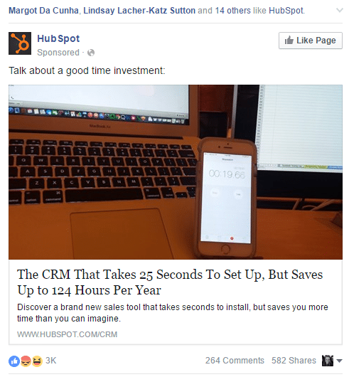
Real marketing happens when you write a blog post, publish a Facebook ad, create a landing page, or write for another website and link back to yours.
Your automated Hubspot sequences can only follow up on opt-in’s that got there somehow in the first place.
So many people get HubSpot and Salesforce before they even have 15 leads a month on their website.
This is a good benchmark because you can’t sort your loot until you have loot to sort.
Stop acting like Hubspot and Salesforce are going to save you.
Mature companies that have a lot of leads – often have Salesforce and Hubspot, but that doesn’t mean they have a lot of leads BECAUSE of Salesforce and Hubspot – don’t get it twisted.
What to do instead of relying on Hubspot and Salesforce:
- Focus on habits above software.
- Identify the habits that actually drive leads and systematize and delegate those habits.
- Identify the habits that seriously drive brand awareness amongst your ideal customers and ensure there are systems/habits around those as well.
- Find cheap and free ways to do the things that expensive marketing tools do – and spend your money instead on awesome people, until you reach a certain size.
- When you reach a certain size where you can have heavy-duty effort through humans AND either Hubspot or Salesforce, add the one that makes the most sense for you.
5 Persuasive Websites – Examples & Why
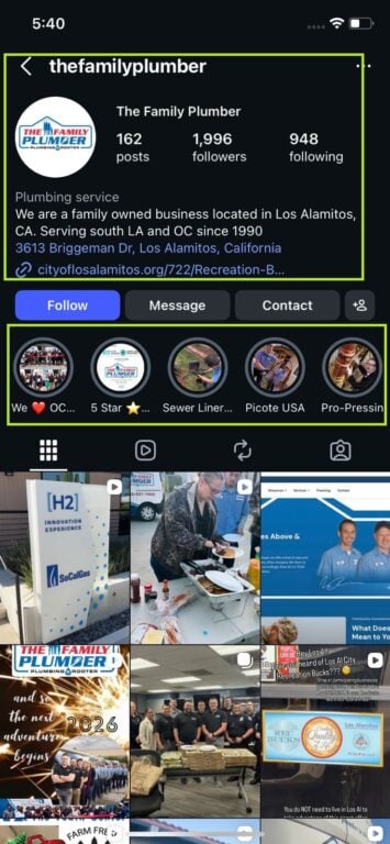
Ryan Crozier, Agency Boon
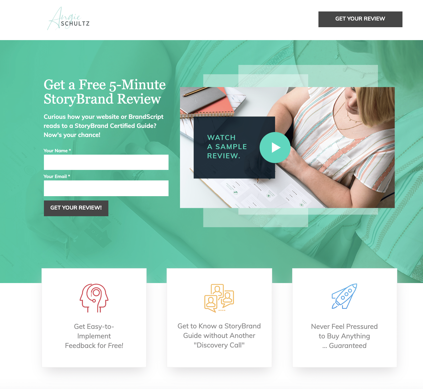
I think this is a great landing page, because it offers a highly tangible benefit to the user with asking very little in return. The StoryBrand guide offers custom insight and tips which allow the user to get a sample of what it would be like to work with her.
Trevor Stolber – Stolber.com
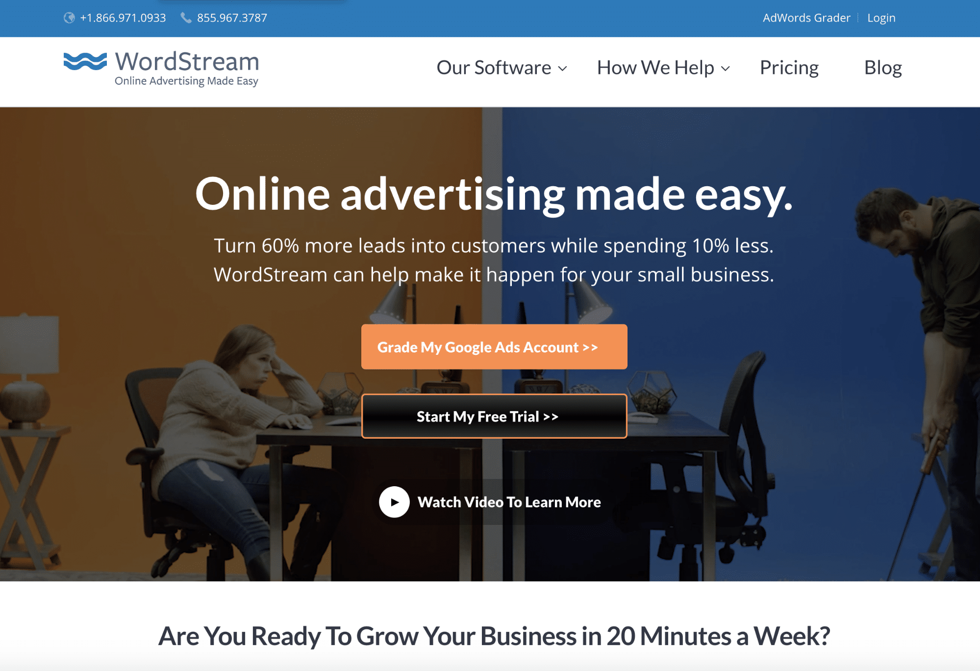
Wordstream is a digital marketing company specializing in paid advertising management software. They publish a lot of very good information and studies that their target audience are very interested in. Their clear offer or hook here is “Grade my Google Ads account.” Just about everyone with a Google Ads account, especially digital marketers will be interested in this.
The hook is clearly displayed on their homepage and stands out because of the color contrast and the clear and obvious click button type graphic that entices a user to click through to get their offer. And once they do that they are basically already hooked – the conversion rate from this initial click through will be very high.
Once you have clicked through you are presented with a simple graphic that clearly shows you are quickly going to get a grade. The quickness (creating a sense of urgency) is further emphasized with the 1 minute text – in just 1 minute you will get what you want you just need to enter your email address. This page is clear and simple and give you only one option (this is very important for conversion).
Dale Dupree, Sales Rebellion

I am a big believer in curiosity and the power that can be wielded by it when used appropriately. Products and services are great but, when my imagination gets lit up by what you are saying on top of my need and the whole reason I am searching you out… WHAMMY! You have my entire brain lighting up and are creating emotional context for me to draw from. Humans are emotional beings and we make decisions based on those emotions. Unless, of course, you fail to impact me in that sense when I hit your website.
Here is an example of a website that I believe does this fairly well – especially if I choose to click the video. The video portion of this subject I believe can be the most powerful and impactful: https://www.wakeupwarriormovie.com/access
Spencer Powell – BuilderFunnel.com
https://www.copperskyrenovations.com/
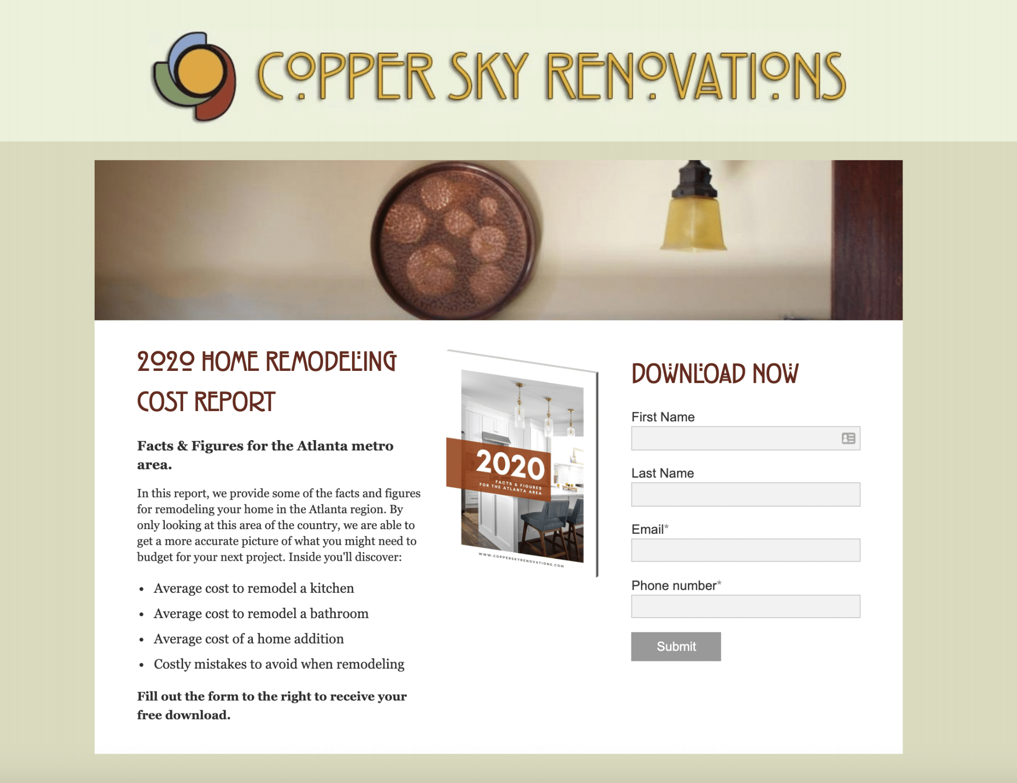
This website converts extremely well because the blog content focuses on topics prospects actually want to learn about. As they Google questions, they end up on the blog and then the conversion offers are super congruent to the blog content. (Example: A free cost guide is available on the blog post about kitchen remodeling cost. Or a design guide is available on a blog post about kitchen design trends)
Steve Slater

This is an extremely niche page, which is why I like these guys. They know their audience and speak their language. They frame the entire lead generation as an application to see if you are qualified to work with them. Which is a great way to differentiate from competitors who are asking for your business. Final thought. They do have a “free video series CTA” further down the page. That is the softer sell option but still drive leads. The cost to view the free content is name and email address.
Persuasive Web Design Tips

Now captain of the pirate ship, Dex decides the only way to return to the Queen’s Armada is with the fabled treasure in hand, and so he sets off to complete the Pirate King’s quest. But the treasure is guarded by a fierce Kraken, who Dex and his crew must defeat if they wish to survive let alone lay claim to the treasure.
You want a website – that you can own, modify, and let others modify with ease.
This chapter is going to teach you how to get over your technical hurdles and knock out key initiatives on your website regularly.
Systems to increase your conversions regularly:
- A website that is editable and you can make design changes on quickly. You should be able to roll out a change once on an item and it be present and visible on the front end of the site all over in a matter of minutes. If you can’t move that quickly – your site is bloated and unusable. For small to mid-size growth-oriented businesses, this flaw can be fatal for your digital marketing effectiveness. If you can’t move quickly with your current setup, consider a website redesign project, or get it nimble however you can.
- A team that actually knows what they are doing. A conversion-focused website dream team would consist of: a persuasive copywriter, a visually-savvy website designer who understands persuasive imagery, A front-end web developer who writes clean code and makes things easy to edit with WordPress or similar content management system, an SEO specialist to advise on the implications of the landing pages for SEO effectiveness, and a PPC specialist to advise on the implications for rolling out ads quick and how they’d fare when sending traffic ad traffic to them.
- A/B Testing/ways to run tests quickly through Optimizely or Google Optimize – Add or remove elements, A/B Tests allow you see whether this or that approach does better with your audience. If you have low traffic – you may need to do more dramatic changes to see any statistically significant changes in leads.
- Google Analytics as a sounding board. There are so many cheap and free ways to improve your website based on data it’s crazy. Check out our guide for setting up your Analytics tracking code + 10 ways to improve your website based on analytics here.
- UserTesting.com as a sounding board. – Ask real people questions about the site and see how they interact on your site while trying different tasks. Very helpful for uncovering issues and potholes in the site that you may have overlooked.
- Inspectlet to check out how people are using the site. It records user sessions when they are on the site – you can find where people are dropping off and seemingly getting confused and improve those areas. It also does heat mapping.
- Crazy Egg or others for heat mapping. Crazy Egg now offers similar functionality with recording users as Inspectlet. So either of these tools are somewhat interchangeable. For pricing sake – I might consider Inspectlet over Crazy Egg.
5 Great A/B Tests for lead generation sites if you do nothing else
- Contact form/lead generation form number oriented trust factors – Split test with different number of oriented trust factors. Adding a number oriented call-to-action “Join 271 Marketers Now” or number focused headlines, or other trust factors right around the contact form are much more likely to have a serious impact.

- Removing half the stuff on your landing page / or increasing the number of sections on a landing page dramatically. It seems as though prospects that need more info or have anxiety about buying like longer, and people that understand it already need less. If the item is expensive longer may do better as well. It totally depends on the offering, so it’s a great option for an A/B test. This example for the tool CrazyEgg – the longer page performed 30% better:

- Phone number in the header. Try adding your phone number to the header, or alongside your button or form CTA to see how it affects contact form submissions and calls. A test on Zappos.com just increased the size of the phone number on their site and “Calls driven by digital marketing spiked almost immediately after our style changes to the header, and continued to climb weeks after the test went live. If you look at the graphs below, you can see the growth. We started the test right at the second peak from the left.”

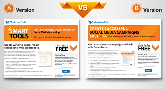
- Test your main headline – Why not try “You focused” / benefit-driven copy and “Us focused” copy once and for all and see which drives conversion over the next month. “The benefit-driven copy drove nearly 28% more sign-ups for the SmartTools newsletter.”

- Form length, Form placement, Form label alignment, more personal CTA copy, Data privacy copy – Skeptical about chopping company and phone number from your forms? Take a couple of months to allow half of the visitors to see the form without, and see how your percentages improve. If it’s only .01 percent increase in conversions, perhaps you’d rather get that info, and of course, it could always go the other way and people WANT to fill in more info. Stranger things have happened for me in an A/B test! And of course if your swamped and only want the highest quality leads – perhaps you take a hit on quantity – just know you may filter some of your better leads too.


10 Principles of Persuasion in Your Website Copy
- Use the Word “You” – Nothing is sweeter in the English language. In that vein, talk like you speak – stop being overly formal, and make sure your copy is customer-obsessed, not about your company. People get bored and check out if you just talk about you – think about if you were at a party… ask questions, be interested.. Help them solve THEIR PROBLEM.
- Capitalize on FOMO – “Fear of Missing Out’ – So rather than quantity – you may be able to use pricing… We are offering XX price before Q3 for instance – but know that you should be offering a price before a certain time rather than a discount on services – for brand positioning sake.
- Use Bulleted or Numbered Lists – I am a notorious scanner, chances are half of the people reading this guide are scanning at this very moment. Just write for scanners – people that are strapped for time are more likely to buy anyway. 😉
- Support your calls to action with a little explainer text “this is what you can expect next.” – What happens when I submit a contact form? Am I going to be called immediately? Giving people the 1-2-3 of your sales process before they submit a contact form will alleviate anxiety, and allow them to imagine themselves doing it at the same time!
- Go ‘benefit driven’ rather than ‘feature driven’ with it. – Assume every possible customer has one song going on in their head constantly… ♫ “ME, ME, ME…. ME, ME, ME, ME ME ME ME ME ME” ♫ Go down your homepage copy and circle every “feature” in red, and every “benefit” in blue. Now see if you can shift the balance in the favor of benefits.
- Scarcity – This is a little harder in lead generation as it’s hard to say “we have 1 slot for a kickoff in March, and 2 spots in April” and come off serious / not potentially shoot yourself in the foot if someone is thinking about your company’s capacity. But perhaps – ”we only take one client in any market – so be the first from your market to discover this insanely powerful consultancy!”
- Consistency – like Josh Braaten mentioned in the expert roundup portion of this guide, you really need to the messaging on the landing page to line up with the messaging on your ads and how you’re driving traffic. It also goes throughout the site as well, if it says you “Streamline manufacturing costs and workflows”, that messaging should resonate throughout it shouldn’t say something that feels like it’s at odds with your previous copy. That’s why it’s important to look over your copy and make sure it all flows and feels consistent, somewhat regularly. Reading your copy out loud with 2-3 of your absolute smartest sales and marketing people is a great way to make sure it’s all consistent. The salesperson shouldn’t be contradicting the website copy either!A test from CrazyEgg – ”In our A/B test, we changed that headline to match the ad headline. Now, both the ad and landing page headline read, “Fill out the form to see if you are eligible for a $10,000 grant!” This simple headline tweak improved conversion rates by 123%.”

- Authority – Case Studies / Testimonials – Lead with a couple of stats that establish you as a credible source of information. “We cut manufacturing workflow costs by 33% on average for the client,” could be a great way to get them to PAY ATTENTION. Don’t assume someone knows everything about you because you’ve been in the industry 30 years because they often don’t – give a few statistics, scientific studies, your credentials, or any other clear-cut “why you should believe me” statements up toward the top so they keep on reading and actually care.
- The principle of “Liking” / Writing conversationally – Humor/humanity – If you can make someone laugh 3 times on a landing page, do you think they’d be more likely to work with you? Absolutely – because people want to work with people they ‘like, know, and trust.’ Show a little personality – you ARE likable, you just aren’t showing your humanity on your landing pages.
- Cut out the fluff and be concise – Cut through the noise and challenge them, be a pain-killer, not a vitamin. Be the challenger. Write it out with 300 words and then figure out how to say it in 30. It’s a lot easier to be concise when you know exactly who your ideal customer is and you can talk directly to them and the challenges you know they face.

Advanced Tactics

With the Kraken defeated, Dex secures the treasure and returns to the armada, where he is heralded as a hero, appointed an admiral and given command of a fleet of ships.
Now – smart folks will tell you ‘there’s no best practices for persuasive web design.’
And I believe they are right in a way.
You should always test things. But with that being said – I will do my best to only share with you the things I’ve seen in my 100+ websites changed based on Analytics, A/B Tests, User Tests and Screen Recordings – things that have actually moved the needle.
Do it Now – Things that have actually increased conversions – CRO Tips for Lead Generation Websites & Examples for each
- Trust factors, around the point of conversion.

- Use a 2-minute explainer video to reduce friction and tell the story.

- Clear and heavy-duty call-to-actions that are visually prominent.

- Cut down to only the most essential elements on your home page

- Create a call-to-action that goes above the footer at the bottom of every interior page.

- Call to actions that show half-way down your blog posts.

- Call to action in the header.

- Friendly, real images from around the office and worksites to humanize the website.

- Better boil down what makes you special – make the unique value proposition dead obvious, benefit-driven, and laser-focused on your ideal customer.

- Remarket the shit out of everyone that comes to your site – especially niche visitors, for the segment that they belong to.

- Prominent telephone number.

- Tell them what happens next.

- Make your process DEAD SIMPLE. Particularly clarify the 1-2-3 steps it takes to work with your company.


Advanced Tactics for Persuasion
- Get your core messaging right with Storybrand – a mini-guide for using Storybrand to improve your website
- Fill out this tool (Storybrand Brandscript) with the 3-4 key stakeholders and smartest people on your leadership, marketing and sales team. It takes a half-hour, and you’ll end up with a succinct, clear – customer-focused “Story” to then work into all of your marketing materials. You may want to do multiple versions for your different verticals.

- Identify elements from the ‘script’ you can communicate with visuals, trust badges, testimonials and case studies – work those into the layout of your page.
- Now boil down the messages into customer-centric headlines, and cut out things that don’t actually focus on the customer / that will distract from the story.
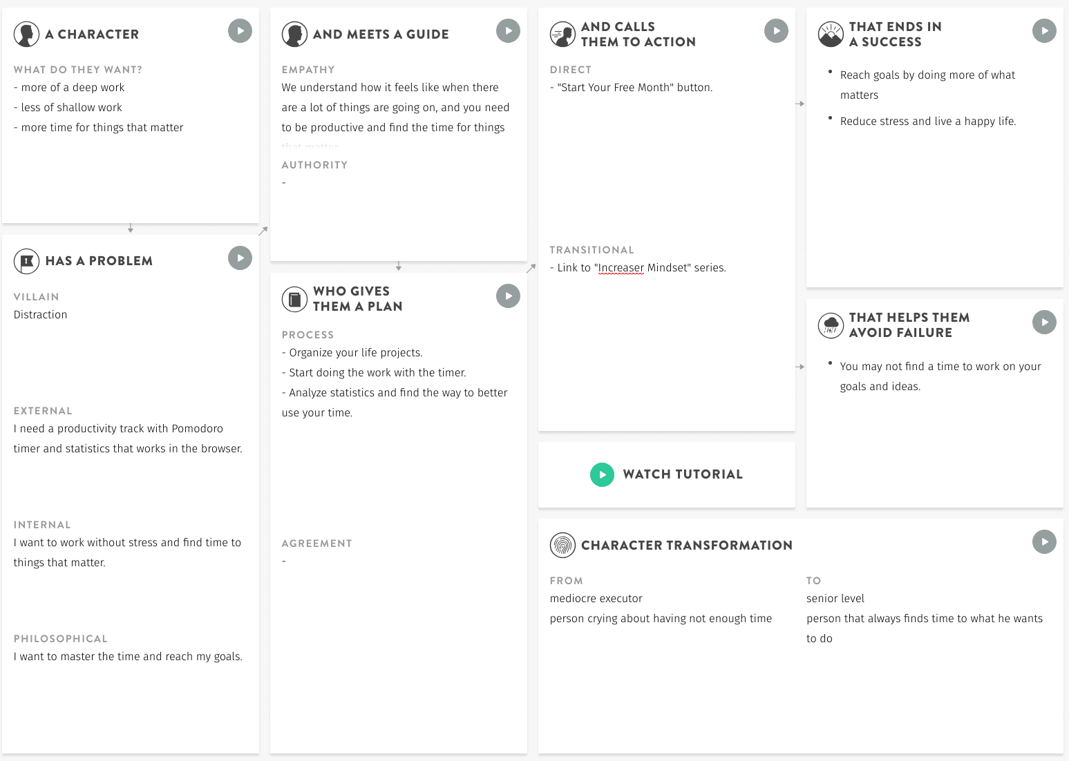
- Mirroring – Help your ideal prospect imagine themselves working with you with savvy photo selection and persuasive headlines
Help them imagine themselves working with you.
That’s really all I should say here – because the specifics will depend so heavily on your offering, but a few possible ways to use this insanely powerful concept.
- Use ‘presumptive language’ – ”When we kick-off, you’ll want to bring information about 3 existing ideal customers with you.” Saying it as though they actually would be doing this, even though they haven’t reached out – cuts right to the point with the people that WILL become customers.
- Remember this mantra – “People like me, do things like this” – Seth Godin’s take on how to help people ‘enroll’ mentally. This means showing people that actually look like your ideal customers.
- What is that exact moment look like when your actual customers feel the pain-relief of working with you… can get a picture of what that would look like? Can you make that the first image someone sees when they land on the page?
The point of all of this – is to get the person to IDENTIFY. RELATE. and want to EXPERIENCE.
- Humor, White space, Color Theory, Trust Factors, and Friction Reducers – 5 More Delicious Add-ons to ensure you’re not getting categorized as a commodity
I can’t 100% teach you everything I’ve learned about persuasive web design and conversion rate optimization in the past 10 years in 6,000 words… but what I can do is some up some of the remaining concepts I believe lead to a high converting / high-end looking website:

- Humor – Showing personality on your website humanizes you and your team, and people work with those they “like, know and trust.”
- White Space – Don’t clog everything “above the fold” let people unravel the story, and learn to subtract – in order to give more emphasis to the things that ARE there.
- Color Theory – Blue is the most trusted color, black is associated with luxury, white is medical, but having a bright and friendly color pallette that allows your UI designers some range is great for giving meaning to different elements and creating an approachable brand. Look at Microsoft and Google for examples of color palettes with range.
- Limited Options – You’ve heard of “analysis paralysis” – just remember Donald Miller’s “if you confuse, you’ll lose” anytime you want to try to stuff too many options on the site. Clarity – what is this page about, what am I suppose to do here? The bigger the company, the harder this can be – but it’s an art, and can sell you more stuff if you understand it.
- Brand – ”Sometimes the way people run paid ads, it’s like they have all of this seed and instead of sewing it – they’re gobbling it up right from their hand.” This is what it looks like when people focus 100% on LEAD GENERATION and don’t build their brand. Build your brand – create campaigns that focus on brand, get a real community-focused / people-focused mission, sponsor events, deck your people out in swag, and find ways to elevate your brand. Both by proliferating your logo out there in every form possible, but by doing P.R. and making it mean something too.
Be The Change

In the name of the Queen, Admiral Dex commands the high seas; hunting down pirates and saving their victims from destruction.
Now that you are becoming the king or queen of lead generation conversions –you have a choice:
- Go out and start your company hocking $300 a month subscriptions to your bloated software?
- Be the Ambassador for good change in the world and help tell the growth-oriented businesses of the world they need to OWN THEIR MARKETING.
The Admirals I know and love – take this heavy but powerful knowledge and educate the owners and marketing managers they come across – that if a tool looks too good to be true, it is.
How can you spread the news that it’s time to OWN YOUR MARKETING, and not let anyone else take it from you?
Spread this guide far and wide.
- Always tell your teammates that it’s better to own your marketing, take the right route not just the convenient one, and go for the long-haul/slow-burn/on our own website approach for the most part. Unless a tool is a compliment to that.
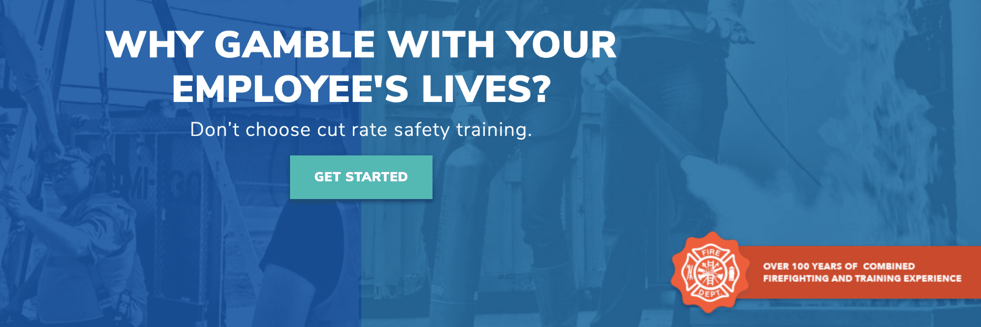
- If you are a Lead Generation Champion at a Premium Service-oriented company who wants to OWN YOUR MARKETING – send us a message now and we can help you with high-end visually persuasive website design, and driving more leads with SEO and conversion optimization.
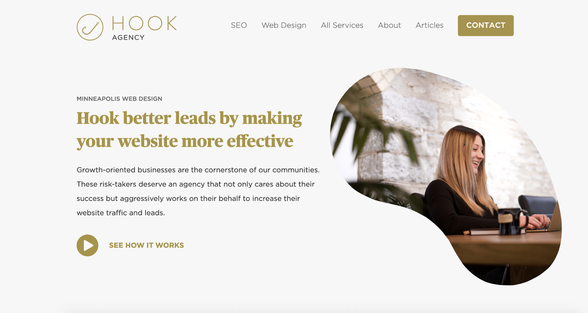
Hook better leads with hard-working digital marketing
We help small businesses get more traffic and leads with Professional Visibility™ through web design & SEO