What is a logo refresh? A logo refresh – is more along the lines of retaining much of the original character of a logo than a total redesign.
A logo refresh maintains some of the elements about a logo that made it successful in the first place, but may change subtle to not-so-subtle elements in an effort to modernize it and bring it into the current style. Ideally, not in a ‘trendy’ way but in a way that’s appears both established and relevant to the current aesthetic.
For instance 5 years ago, many brands decided to ‘flatten’ their design and remove bevels, shadows, and gradients for the sake of simplicity – and to look more iconic. This not only made them feel more current (as flat design was trending at the time,) but did so in a way that didn’t feel like it would go out of style quickly.
So let’s start with a logo refresh example where the company moved to flat design:
Netflix – Logo refresh, going flat
Netflix decided to simplify their brand, partly it seems so that it would transfer to more devices without appearing different from device to device. Strangely enough, the simpler the logo – the more it seems the logo can transfer from application to application and retainer the character of the original.

How to apply the principle of the logo refresh: Remove bevels, shadows, and gradients from your logo. See how it looks when it’s tiny, very large, or inverted on light and dark backgrounds. Does it retain it’s shape, and character – if not, try subtracting elements for a more iconic and simple look.
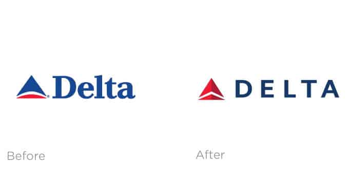
Delta – Logo refresh, going deeper, bolder
Certain elements on this refresh just really seem to create greater contrast and a more sleek presence. Removing the sans-serif font was probably an attempt at creating a boldness – and in that bold simplicity, leave an impression of Delta as a modern, technology forward company. Gone is any organic curve at all, and the piercing arrow up is cleaner than ever.

How to apply the principle of the logo refresh: Make your primary colors to one’s that are strong, deep, and bold – so that they contrast with backgrounds in a clear and obvious way. Consider that even though a sans-serif font doesn’t have a ton of frills or character, it can still make a great logo – and often simpler is better.
NFL – Logo refresh, partly to make it easier to embroider
It’s funny that something as seemingly as simple as the embroidery process does effect where a logo should go. According to Logo Design Love it was said of the new logo – “…this (logo) has to be embroidered on everything from knickers to headbands to shoelaces so minimizing the number of stars and opening up that space was the best thing to do. And to be able to justify it with the teams per division argument is even better.”

How to apply the principle of the logo refresh: Consider deeply where the logo will be used. Will it be embroidered? Will it be on car wraps, will it be turned white and used on shirts? Make a list of all the possible applications, and this should guide the level of detail that you may want to use, or in your discussion with the graphic designer or marketing team that’s creating your logo and branding.
If you need a logo refresh – we’d be happy to chat, as we creating custom logo’s and help companies with their branding and marketing strategy! Let us know if we can be of service.


