So you’re obsessed with looking at the best? You’re about to have your company’s website redone and want to know what the gold standard is or just a designer looking to get inspired? Good web design examples by today’s standards span from Starbucks and Warby Parker, down to that delightful farm-to-table restaurant downtown – in Minneapolis designed by Shea Design of course 🙂 . You perhaps don’t have the budget for marketing that Starbucks does but you can learn from their team’s hard work, and get inspired by the extra special sauce that’s gone into their site.
I’ve recently shared 7 Places to get inspired for your web design inspiration, 3 amazing websites and why, and the best font for web design in 2015, but I thought I’d bring to light some more good web design examples for your edification and mine.
What all of these websites are doing well is utilizing solid, vibrant, or tasteful color palettes and generally keeping the visuals somewhat simplistic right away drawing a visitor to think of them has high-end, I believe this is the kind of design that Millennials love. So let’s start:

Refinery 29 – Clearly the people from Refinery 29 have designers on staff to continue updating the featured image examples and refresh the imagery on a regular basis. The shifting imagery is partly what makes the fact that this site looks classy all the time even more astounding. Literally I’m writing this early on a Monday morning and they have 10 facts from the weekend news that you should know, and spoilers from last night’s Walking Dead, so they are creating this content, like, immediately. 💁 Check it out

Huge – Digital Agency – These guys are implementing an example of tethered scrolling, where you scroll down but the screen locks in for a second before you can continue scrolling. The design allows you to focus on the element at hand that you’re looking at and makes sense for something that’s accentuating the design for a product of digital product. Check it out
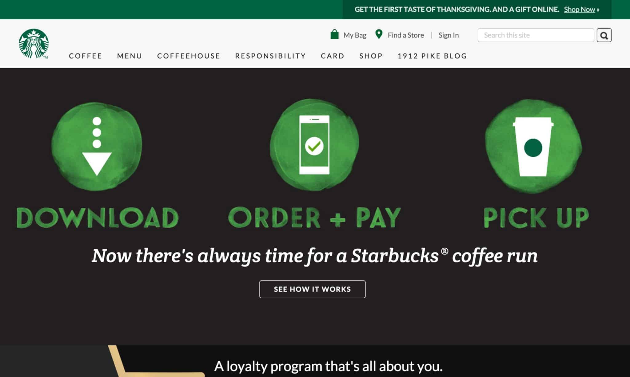
Starbucks – Finally we mix in some commerce. What some of these examples suffer from is the lack of immediate financial pressure from products to perform. Without this eCommerce element I start to think that perhaps they’re like a petulant teenager who hasn’t gotten out of his parents house yet. We’re designers, we only create minimalistic designs! But Starbucks of course has to sell coffee and so the emphasis on their order-ahead and loyalty program keeps it minimal, but clearly is meant to sell. Check it out

Trellis Animal Feed and Supplies – MMM… Here’s an example of utilizing the hand-lettering look on the front page of the website. This is actually just the font, ‘Butternut Rough‘, but it gives the appropriate hand-made feel that makes a lot of sense for a animal feed and supply store. This kind of rustic charm might also look great in a farm to table restaurant, an artisan or small-business shop that thrives on the rustic look, or even a behemoth like Chipotle. Bigger companies like Chipotle and Starbucks have embraced fully this handmade, handwritten look with their typography in a lot of online and in store promotions. Check it out

Leodis Lager – Delicious. The centered navigation, with the logo and nav that shrinks when you scroll is a refreshing move that I’ve seen many times before, but haven’t seen it a lot lately. However, this is a great example of that design convention done right. You can satisfy the age-old ‘make the logo bigger‘ demand, with the desire to keep it from blocking half of the screen so your visitor’s experience doesn’t suffer. The idea of ‘no chrome’, or stripping off un-necessary bells and whistles like they did for the most part on cars, feels solid in this example. The panels go edge to edge, and the header and footer are pretty well integrated with the rest of the site without calling a lot of attention to them. Check it out
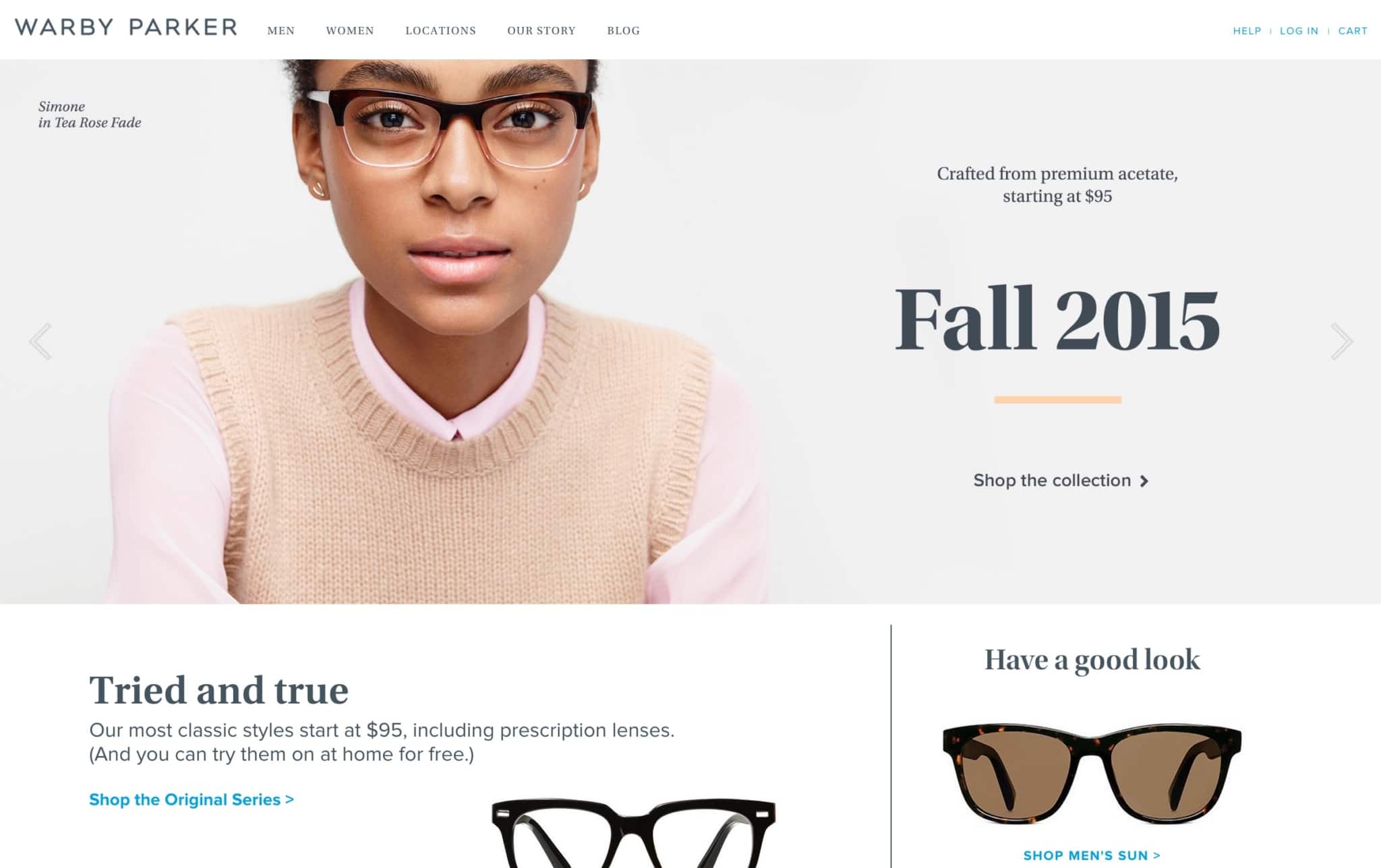
Warby Parker – I realize that many people reference Warby Parker’s website if they are talking about good web design examples, but it’s never a bad idea to be looking for the gold standards of any particular discipline. This site is characterized by their high-fashion feeling and super high quality photography, and super simple color scheme. Remember that when you’re trying to achieve this feel. If the photography doesn’t exist, the sites not going to reach this style, and you’ll have to be extremely cognizant of color and white space. Check it out


