The art of the shitty website takes more than just a hacky coding skill set and a bad eye for design. It requires an understanding of what beautiful design is so you can spit in the face of that.
Here are 5 amazingly bad websites – that appear to be – please god please be on purpose.
1. Fresh Meat – Ad Agency Mother in NYC’s 2015 Internship site

This gloriously bad site was clearly done on purpose, and I can’t help but marvel at its exquisitely painful vibe. Meat comes at you from all angles, people are covered in syrup and spinning gifs attack your eyes.
Here’s a full rundown of the hideousness that was meatmeatmother.com
2. LINGsCARS.com

This has to be on purpose. It definitely hurts to look at, the twirling whiz-bang gifs everywhere on the page are a throwback to all that was horrible about late 90’s websites, Angelfire, Geo-cities, etc. Do you remember that? The chicken walking along the twitter feed is obviously very important to the user experience on this site.
Check it out at Lingscars.com
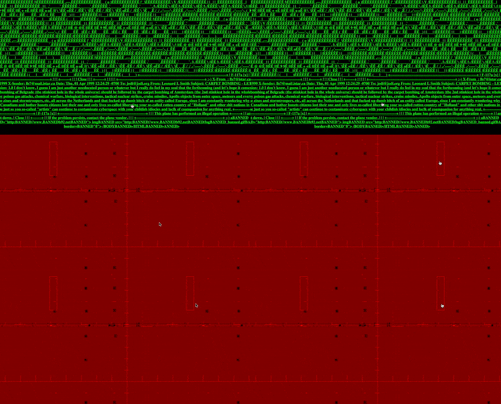
3. Jodi
This website really makes no sense, but it’s raw code feel and what seems like the schematics for some type of technological atrocity make it entertaining to poke around. Why did someone make this? I have no idea.
View it in all of it’s glorious pointelessness at wwwwwwwww.jodi.org
4.The Boohbah Zone
Yes this one might not have been technically ‘bad on purpose’ but it does seem to be ‘ridiculous on purpose’, and for that I am grateful. The creator of the Teletubbies series made this when it appears he felt teletubbies was too dry and logical.
The best bubble to press is the second from the left in my humble opinion. Enjoy.
5. Medijate

Probably my favorite ‘bad on purpose’ website that I found besides mother’s internship purely because I’m a fan of the psychedelic and this one surely seems to have required some experience with psychedelics to be capable of making it.
From what I’ve gathered the site is for meditation, except you’re suppose to meditate on all that is painful in the world. The visuals are pure hell-bliss, and for that reason if you poke around one of these sites, I’d highly suggest this one.
Check out the site at Medijate.com


