
Having a good looking website can be a difference-maker for your business. It is the first impression that is left on your customer and if you leave a bad one, it can cause you to come off as unprofessional and disorganized no matter the type of quality work you have done in the past. Check out these 23 amazing commercial construction websites and see the type of website you could have to separate yourself from the competition.
According to a survey conducted with over 500 people, this content ranked in order of importance should include, but not be limited to:
- Contact Info With an Easy Way to Connect
- Customer Reviews
- A Portfolio With Clear, High-Quality Photos of Completed Work
- Background info on the company/Contractor
- Pricing
- List of Services
- Online Estimating Capability
- Design Ideas
These elements are what potential customers are looking for to make an informed decision about who is best to hire for their project. By providing the information they want to see, construction websites can build customer loyalty and trust, as well as generate future business.
Below is a list of sites that we have determined to be the 7 Top Commercial Construction Websites. These sites are well designed and feature spectacular, high-quality photos of the work they can produce. They are prime examples of amazing content with innovative design, and usability.
1. APX Construction Group

Website: https://apxconstructiongroup.com/
Designed by Hook Agency, the APX Construction group site features drone videos that capture the size and quality of work done by this company. We used a lot of large, overlapping shapes to keep users scrolling throughout the page. We really wanted to feature the range of project types that APX specializes in with an interactive service grid, as well as large, full-width images of their work. We included an expansive About page, highlighting each team member as well as the group’s community impact.
2. Trader Construction

Website: https://traderconstruction.com
Trader Construction takes a more modern approach to construction web design. We utilized overlapping elements as well as full-width sliding images in the hero section. The red/pink color is bold and unique to the construction industry, which allows for Trader’s website to stand out amongst competitors. We loved throwing in user touch-points – things like arrows for sliders and secondary call-to-actions like the careers link in the hero. Overall, this site (designed by Hook Agency) is clean, polished and simple, which is everything web design should be.
3. Renovation Systems

Website: https://renovationsystems.com/

Gradients are growing more and more popular in modern web design. They allow for a more well rounded brand presence, and really make this website pop. Many construction sites use a lot of dark sections, so we implemented bright colors like these greens and yellows bring a level of friendliness overall. Additionally, we incorporated different levels of interactivity throughout with complex sliders and a multi-level filtering system for client projects.
4. The Korte Company

Website: https://www.korteco.com
The time-lapse video on the homepage of this site instantly grabs your attention. It also speaks to the brand story by incorporating a quote and a photo of its founder, Ralph Korte on the bottom of the page. The projects section is innovative and features a button that links visitors to related projects completed. Overall the site is original and engages users to explore all the services they have to offer.
5. Mortenson Construction
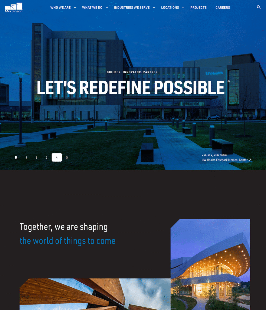
Website: https://www.mortenson.com/
Mortenson’s website stands out as a masterclass in clean, confident design. From the moment you land on the homepage, the bold headline “Let’s Redefine Possible” captures exactly what the brand stands for — innovation and partnership at scale. The use of striking architecture photography, dark backgrounds, and subtle motion effects conveys sophistication without distraction.
Navigation is simple and intuitive, allowing visitors to easily explore who they are, what they do, and the industries they serve. Each page reinforces credibility through powerful imagery, concise copy, and real-world project highlights that speak louder than any sales pitch.
6. Schimenti

Website: http://schimenti.com
This website design incorporates high-quality images and innovative design that effectively incorporates whitespace. The projects page takes you on a slideshow tour of completed projects, and lists project details, along with related jobs that help build credibility with future customers.
7. Bam Nuttall

Website: https://www.bamnuttall.co.uk
Messaging is key, especially if your company did 7 billion Euro worth of business in 2019. Bam Nuttall has put their message front and center on their home page: “Creating sustainable environments that enhance people’s lives.” By putting their message in such a prominent position, Bam Nuttall creates a first impression that becomes a lasting brand identifier.
The Bam Nuttall website follows up with consistency, continuing their messaging throughout their website. From their about us: “We’re driven by a desire to make a difference to communities, the environment and people’s lives. Our goal is to build sustainable infrastructure that helps economic growth and allows us be kind to our planet – today and in the future.” To their sustainability statement: “Our sector provides value to millions of people, but uses many resources in the process. In engineering, a sustainability strategy is no longer a ‘nice-to-have’. Now is the time for change. We are striving to lead our industry to a positive, sustainable future.”
When your brand message is clear and obvious, you will begin to attract the people you want to work with and bid for the jobs which align with your core values.
Build a Website That Builds Your Business
A standout construction website doesn’t just show off your projects — it shows who you are as a company. The best sites tell a story of trust, quality, and expertise while guiding visitors toward action. As these examples prove, great web design isn’t just about visuals; it’s a growth tool. When your digital presence matches the level of your work, it becomes one of your strongest assets for winning new projects and lasting clients.
Frequently Asked Questions
What makes a construction website “the best”?
The best construction websites combine stunning visuals, easy navigation, and clear messaging that showcase expertise, credibility, and craftsmanship.
Why does web design matter for construction companies?
Your website is often the first impression homeowners or developers get. A professional site builds trust and helps turn visitors into clients.
How were these top construction websites selected?
We chose them based on design quality, user experience, brand consistency, mobile responsiveness, and how well they communicate the company’s value.
What features should every construction website have?
High-quality project photos, clear service descriptions, client testimonials, and strong calls-to-action are essential.
How can a construction company website generate more leads?
By using conversion-focused design, fast load times, SEO optimization, and strategic content that answers what potential clients are searching for.
Do these websites work well on mobile devices?
Yes. Every site featured is fully responsive, ensuring a seamless experience whether viewed on desktop, tablet, or mobile.
How often should construction companies update their websites?
Ideally, review and refresh content at least once a year to stay current with design trends, technology, and new projects.
Can smaller construction companies achieve this level of design?
Absolutely. With the right strategy and web design partner, even smaller firms can create a site that looks professional, builds credibility, and drives leads.


