1. Test how long or short you can make your contact form.
The number one thing people who haven’t done a lot of work optimizing contact forms should try is removing form fields down to the bare minimum to get people in the door. But it also can be interesting to allow people the option to add more information and see how people react to it. Generally, the rule is ‘less means more’ submissions when it comes to contact forms.
2. Test your submit button copy.
Remove the potentially weird ‘Submit’ for a softer ‘send message’ or ‘get a free consultation.’
3. Test getting rid of field bottlenecks like asking visitors for their phone number.
It’s scary for some people to reach out online, especially in a world of junk mail, sales calls, and random people pestering us… particularly for executives who are bothered every day, so this is even more important for B2B companies looking to get their foot in the door. Lose the Phone number fields for better results, or at least test making it optional.
4. Test adding a little block of helper text next to the contact form to explain the process.
Sometimes people might want to know what the process is after your company receives the contact form, or how you implement on the free consultation or whatever and adding a little explainer text (perhaps in a little outlined box or something) next to the form will help some people over the communication hump and on into your sales funnel.
5. Test the headlines above your form.
Explain the value proposition for why they’d contact you, or say it in a new way and see what verbiage gets the best results.
6. Test putting the form in a different place on the page.
If your form is normally on the bottom right of the page, try testing it on the top left, or vice versa.
7. Test having a little privacy policy link, indicating security next to the submit button.
Some people don’t feel comfortable submitting their info online, and adding a little text that tells them their information is safe can be helpful, particularly depending on the demographic. Older people generally appreciate more indications of privacy protection.
8. Test reminding them of a feature or guarantee right after the button to decrease friction and help them take the next step.
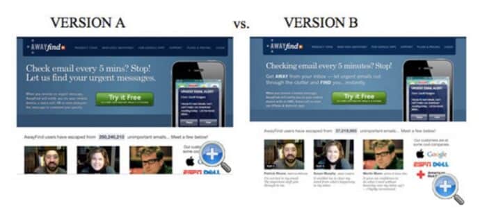
9. Test taking advantage of the hidden benefits of ‘copy blocking.’
Copy blocking means placing larger text, then medium text, then smaller text all in a sequence that keeps them reading and doesn’t lose eyes. Copy blocking is the reason the test below’s results surprisingly skewed in the direction of version B (38% higher conversion rate.) Utilize this on your contact page, or area and see if you can get similar results.

10. Test adding different badges, trust factors or social proof around the contact form.
Better Business Bureau, social indicators such as reviews or testimonials, and badges and guarantees look great on a business especially when they have a high-quality, branded feel. Sprinkle on liberally or test adding different ones to see what works most effectively.


